The first area of importance in the Asos email was the subject line before the email was opened. It stated ‘Get up to 60% off party wear’ this title is catchy as it is coming up to the season where there will be a lot of Christmas parties and events, so customers may be looking or planning outfits for this busy period. Even if this isn’t the case they may be inclined to have a look anyway as 60% off is such a large discount. In seeing this email myself, I would have been tempted to see what was available even if I wasn’t committed to buying anything. Managers, according to Chadwick’s article, stated that the subject line is the most important message conveyed and they always try to produce something that will attract the reader to click through e.g. ‘up to 60% off’ will not necessarily mean every item offered in that sale but it is the most attractive offer they have to portray.
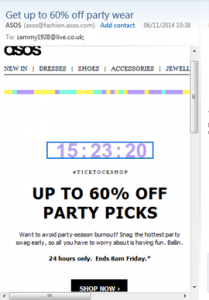
Once the email was opened, the first prominent feature was the countdown clock showing how long the sale lasted. Instantly a time scale is put on the reader as they would feel pressure not to miss out on a possible bargain, or kick themselves later for having to pay full price for something they knew they would need at some point. It is quite a simple email on first look with only the clock, a small description explaining why this sale would help any possible party season challenges, a #tick tock shop, another 60% off title and a ‘shop now’ hyperlink. This appears to do everything the email set out to do which was click on to shop at Asos for the sale, but there is no personalized touch for the customer, which I have experienced in other emails with ‘suggested buys’ or my name at the top.
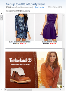
After first look the email continues further to another 2 pages. The article by Chadwick states that some companies like the fashion industry do produce longer mailings, for example, this email has taken a catalog approach. The only issue I found with this is it got less an less relevant to the party wear subject e.g. Timberland boots were advertised at the bottom of the page. This agrees with management comments stated in the Chadwick article that the longer an email appears the weaker the subject matter gets.
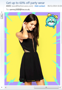
The other aspect that was included as you scrolled down the email was pictures and animation which made the email seem brighter and more interesting. As a result of this I wanted to keep scrolling through whereas the top page felt more clinical and to the point. According to the article by Chadwick less that 2% of emails use animation e.g. twinkling stars for a Christmas advert, as they questioned whether they resulted in any more ‘click through’s’. I felt that it did add something to how visibly attractive or interesting the email was but wouldn’t have necessarily visited the website as a result.
To be continued…
Ellis-Chadwick, F., & Doherty, N. F. (2012). Web advertising: The role of e-mail marketing. Journal of Business Research, 65(6), 843-848.


Great job on your blog post! The content was well-organized and easy to follow, and I found the clear structure of your arguments to be persuasive. To gain further insights, click here.