

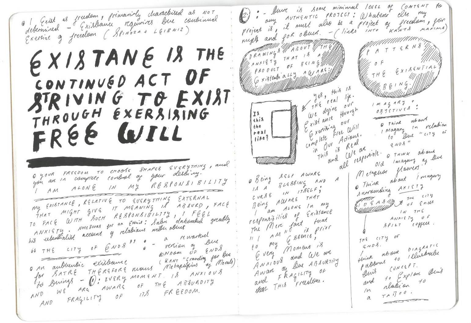
 As the topic of existentialism is quite an abstract concept, I wanted to find something about Sartre that would allow me to embody some of the similarities I felt him and myself had in the physical world. Strangely I came to find that Sartre was also prominent in the post war Cafe society, – the idea that the Cafe had became the new house for the intellectual, Sartre intact wrote a lot of Nausea in a Caffe. This was another strange connection I felt like I had with him. This allowed me to come to create some drawings (finally) after doing a lot of writing.
Month: March 2017
Narrowing Down a Theme – Coming to Existentialism
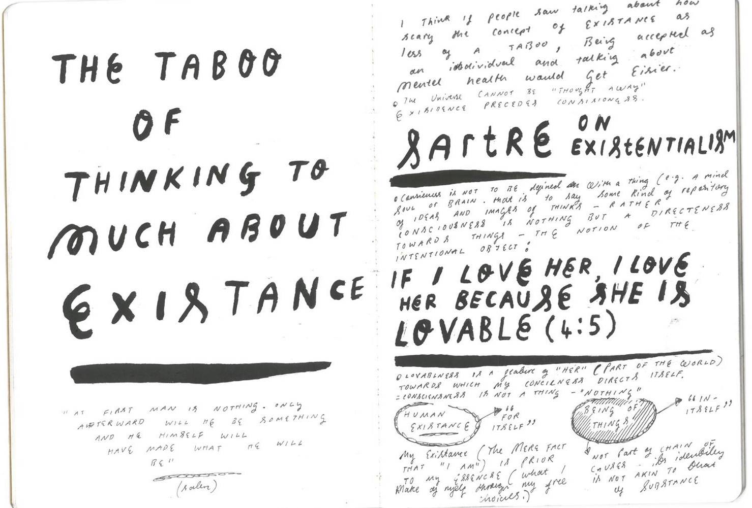
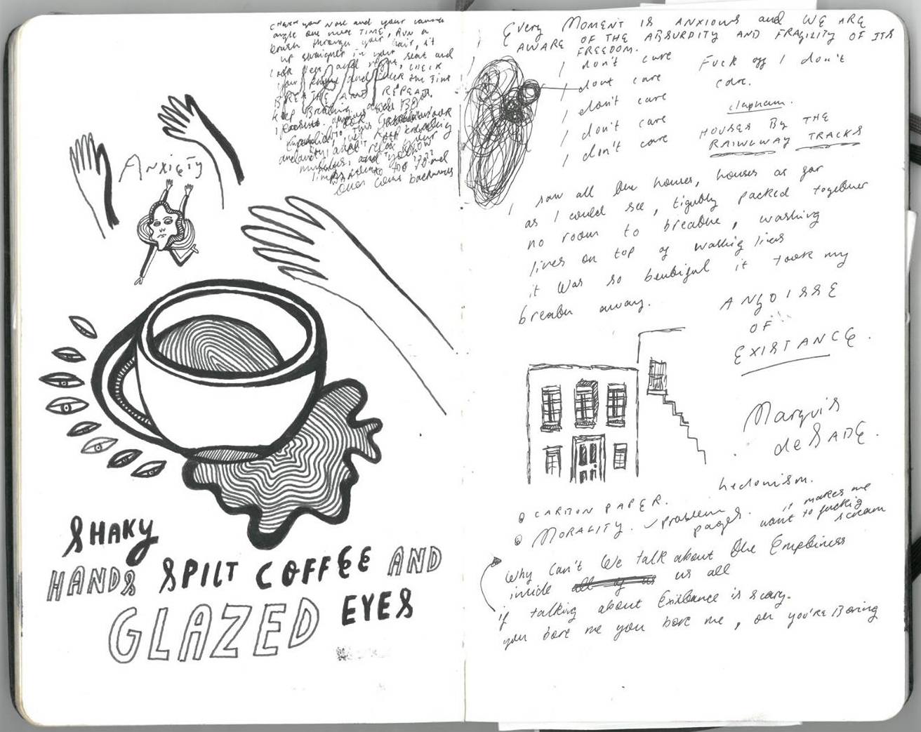
 After looking at individualism, I came across Jean Paul Sartre – the founding father of the existentialist movement. One of my friends gave me his book – Nausea , for my birthday and it was one of those (cliche I know) life changing books, I had never read anything before in my life that I felt I could relate too more than this book. The book is in a diary format where Sartre records his everyday thoughts and observations of life, and the struggles that come with being so painfully self aware. It got me thinking how in society it is often frowned upon to be so open with our existentialist thoughts, making us alone in this responsibility.
One Eye Sees, the Other Feels – Semiotic Challenges to Enhance Perception – Taboos

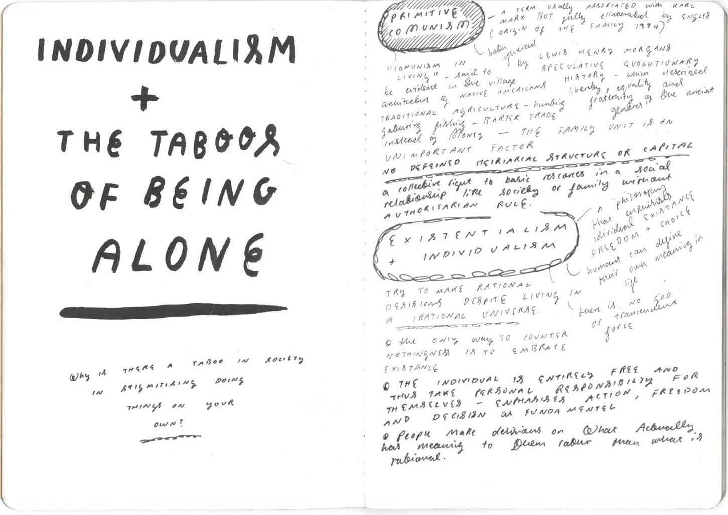
 I decided the choose the topic of a taboo for this project. The project aims where too explore comment and creativity react to societies perception of a taboo. I started to look at obvious modern cultural taboos in society, and then taboos that where more personal to me. I firstly started looking at the taboos of belonging to certain sub-cultures but I found this wasn’t really inspiring any creative thoughts for me as it wasn’t something I could relate to, so instead I started to look at the taboos of of being alone, and the concept of individualism – a social theory favouring freedom of action for individuals over collective or state controll.
Visual Play Collage Experimenting


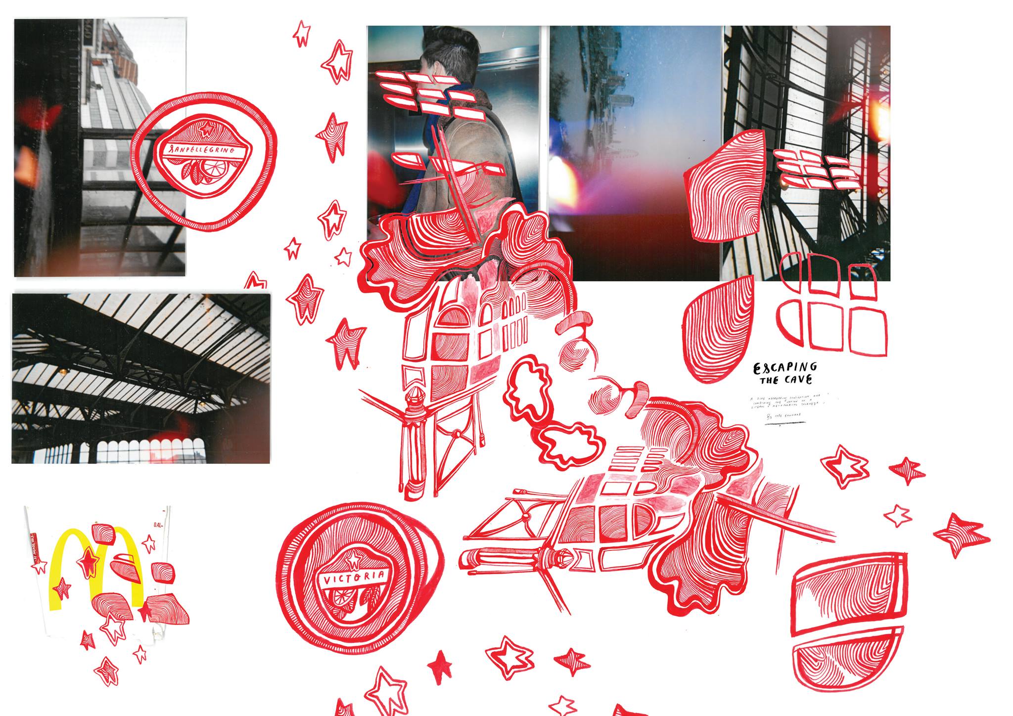
 I started to experiment more visually, by directly drawing over the top of newspaper adverts and making digital collage on Photoshop. I liked the effect of these images, I think the imagery from the adverts linked well with the topic of romanticisation and relationship break down, and the processed typography completed the illustrations well, adding more structure and format the the individual images
Character development – Life drawing
Observational Drawing : A study of dead flowers

 I started off with some observational ink drawings of some dead flowers I had in my room; I bought these flowers after the break down of a relationship, and did not throw them away. I started to think about the meanings behind the act of giving flowers, and also what had made me keep them. I wanted to explore the semiotics, and metaphors I had created around the flowers, and how one can create such a memory association with objects.
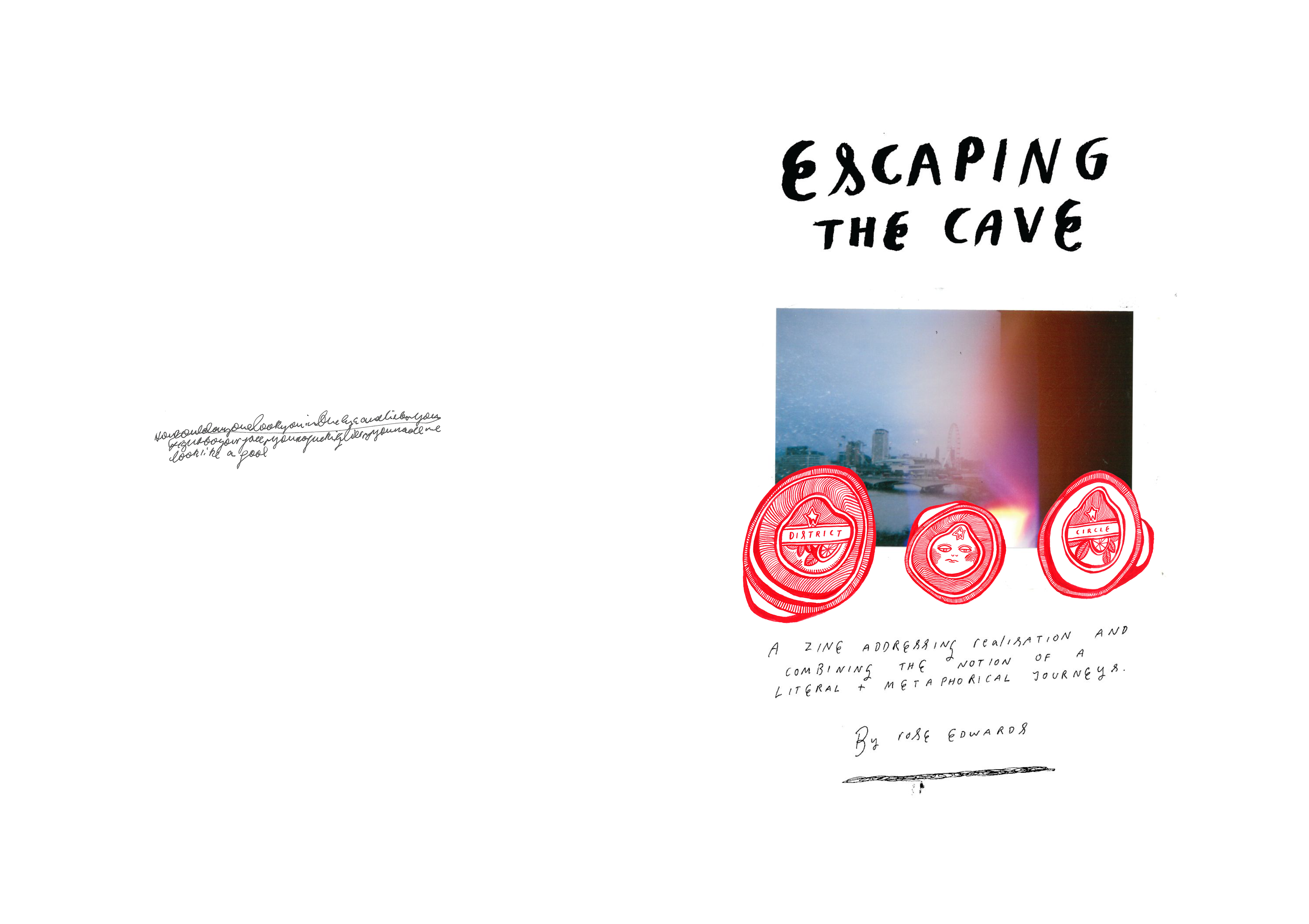
Starting A Return Journey
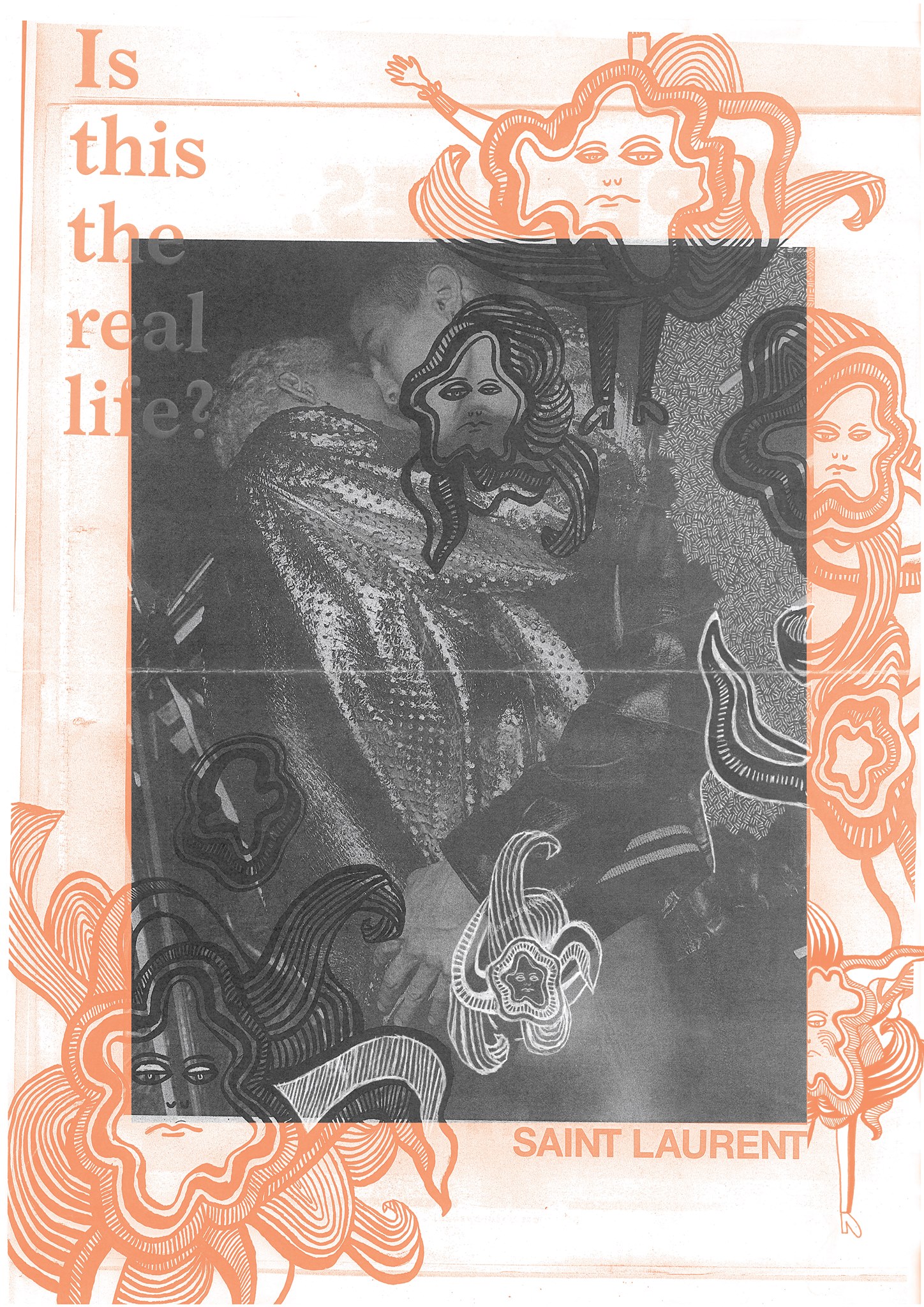
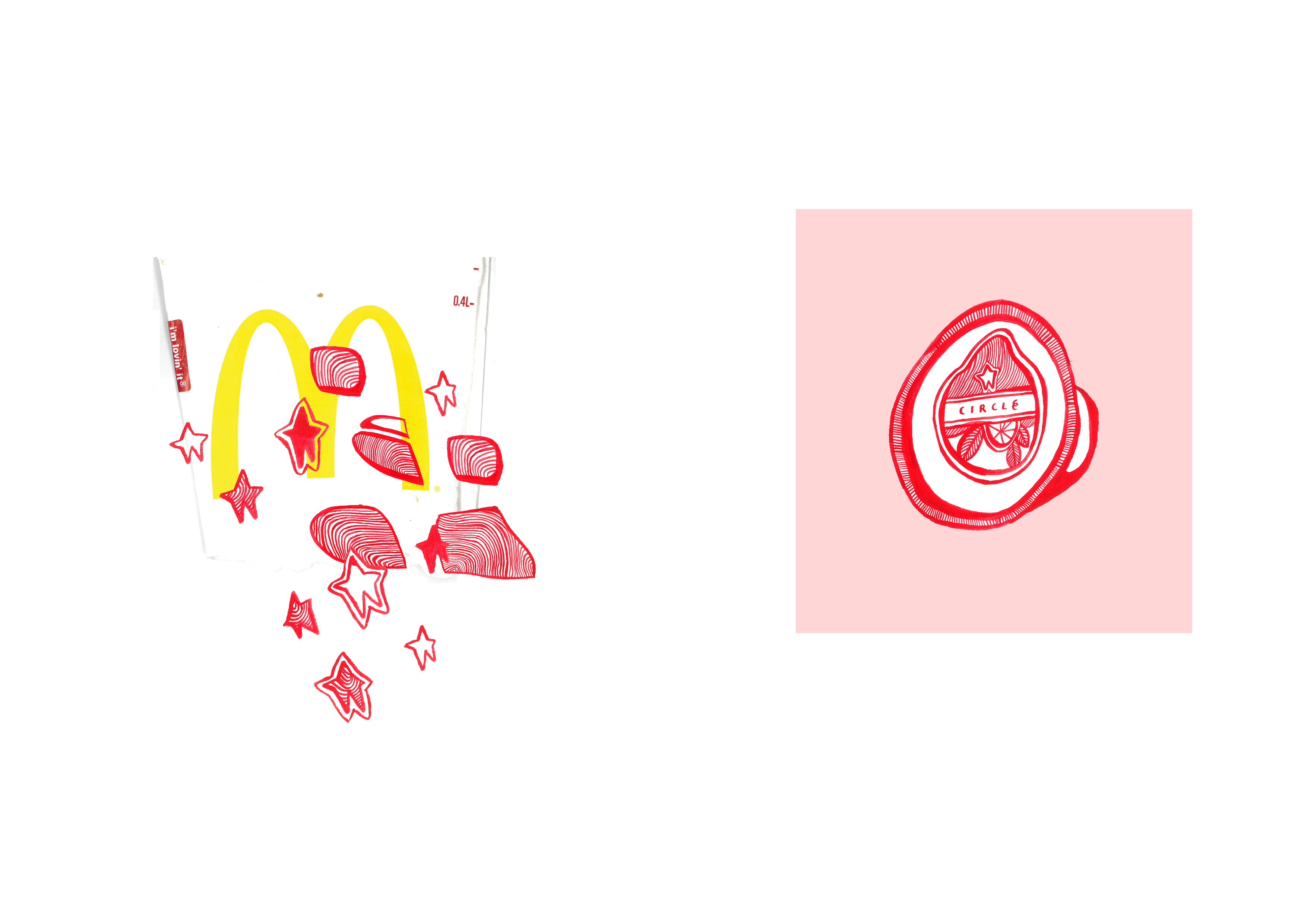
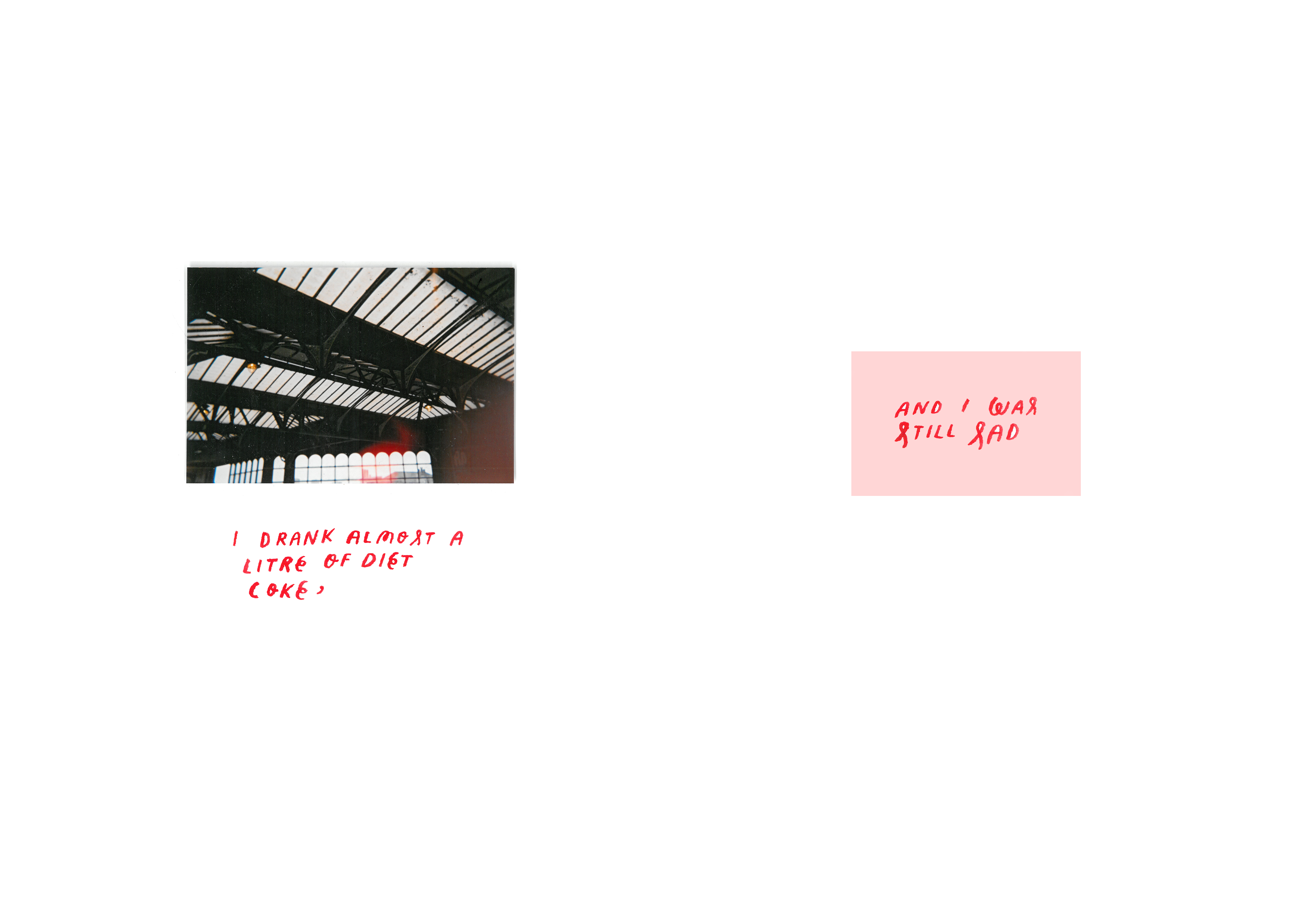
 After Having enjoyed the process and creating the outcome from the first part of the project, I wanted to create a sequel zine, that would carry on the theme of exploring a journey of self realisation. I decided I wanted to focus on a metaphorical theme of exploring unnecessary romanticisation of specific places or objects after the break down of a relationship. I wanted to explore a journey of trying to live in ‘The real world’ and the journey of stopping association of things with a certain person or past memories, in order to move on into another stage of life.
Concluding Journey Part 1
I Haven’t Been Feeling Myself Lately

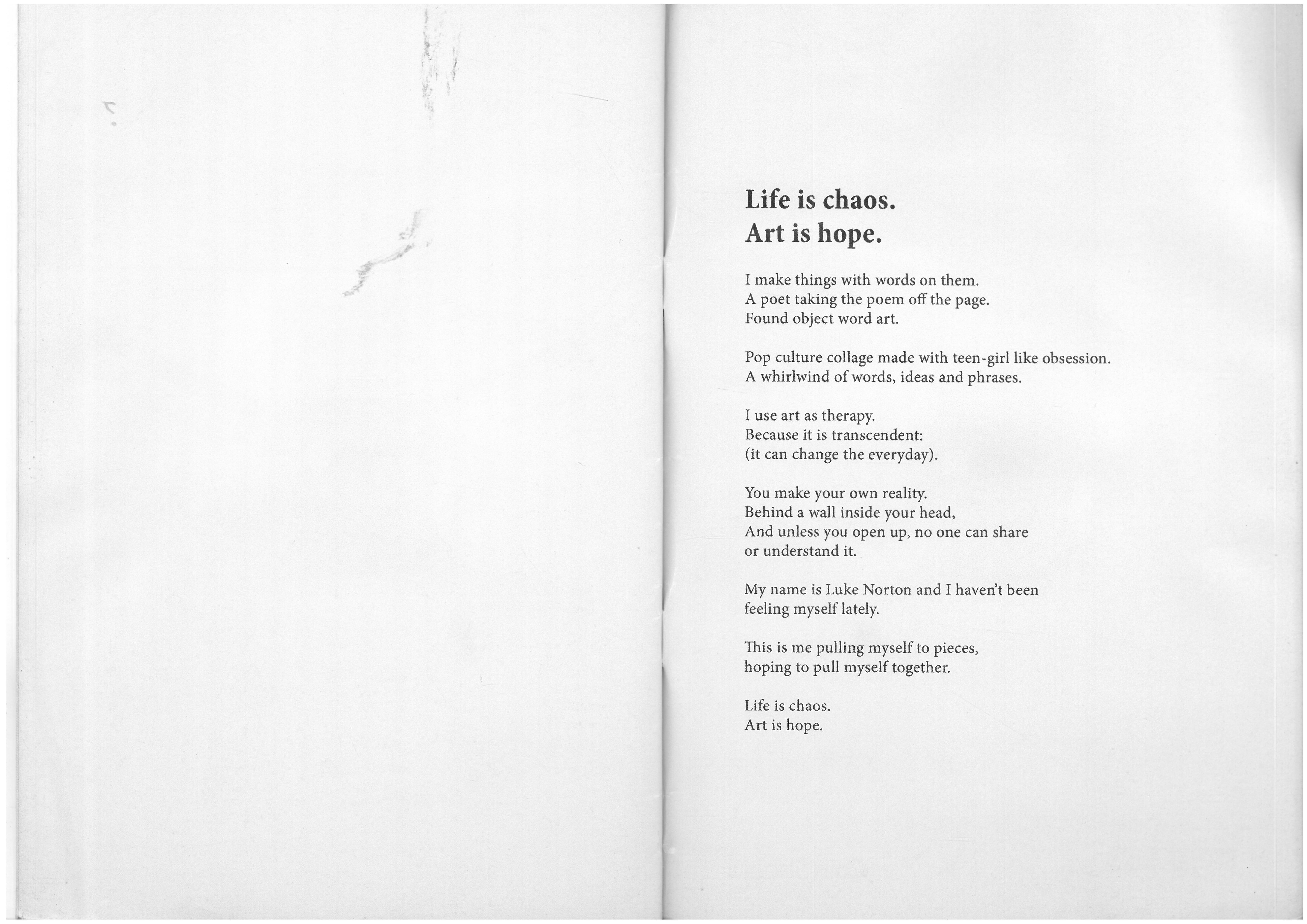

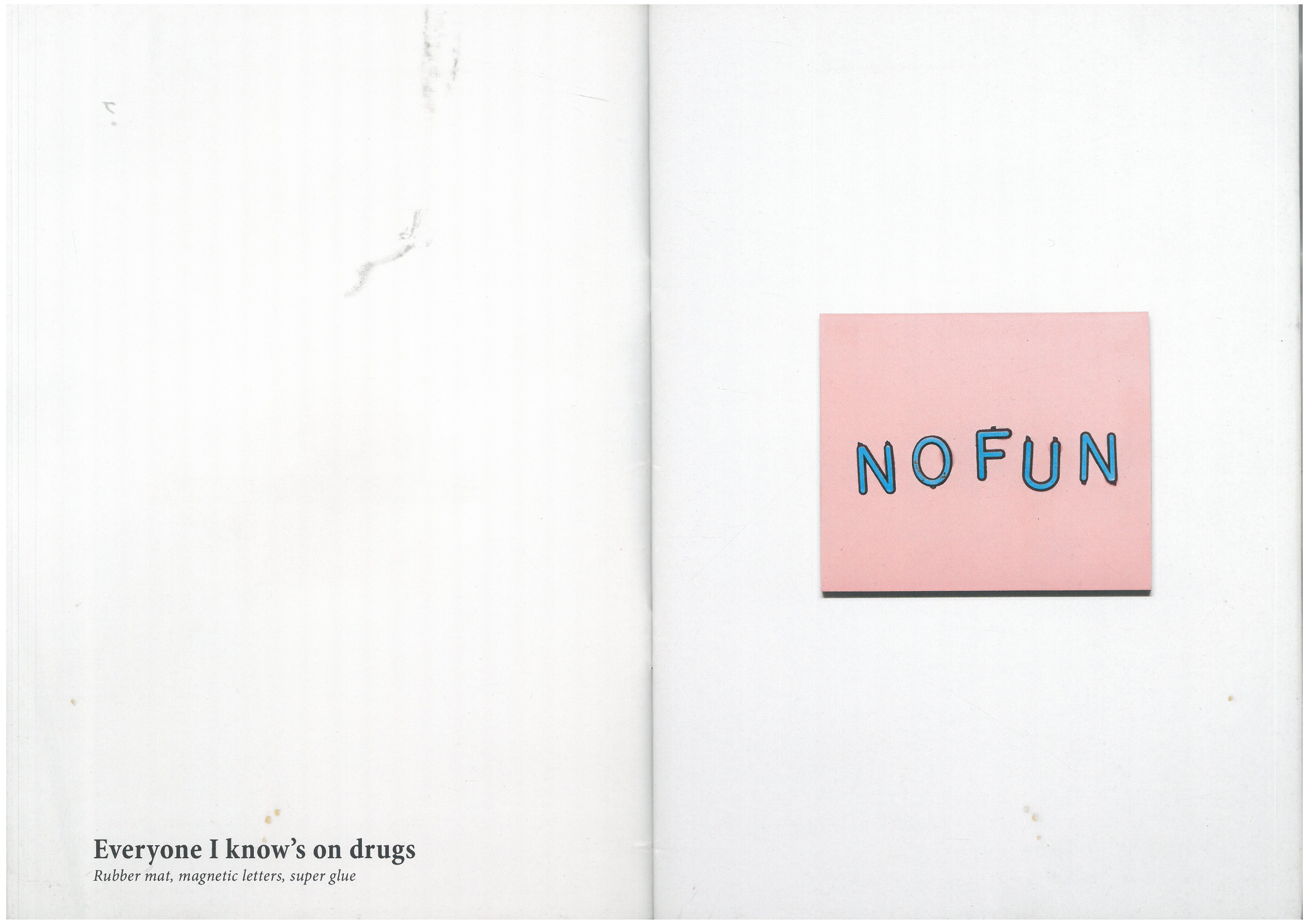
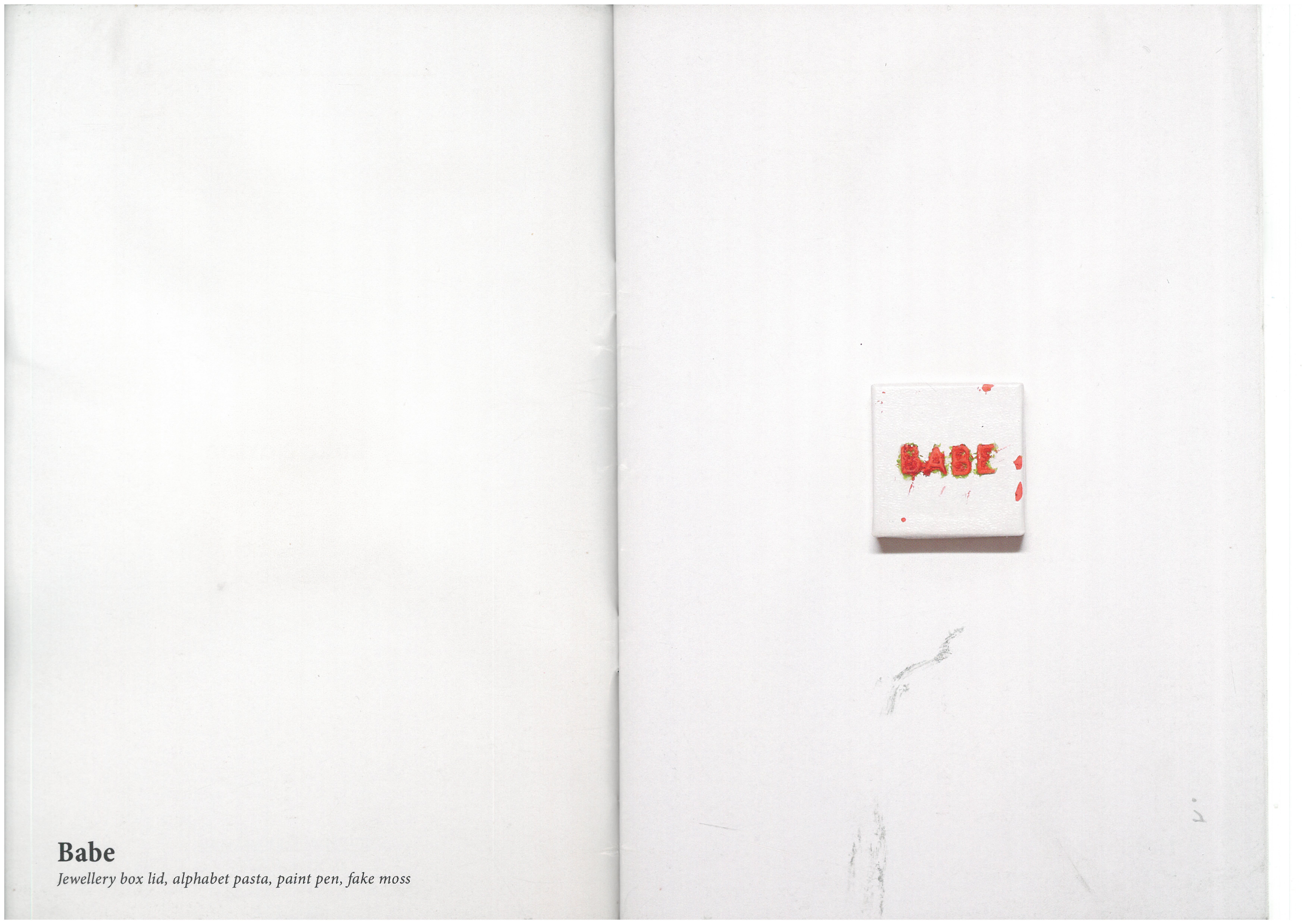
I recently saw an expedition at the oxo tower in Southbank, by an Artist called Luke Norton. I picked up this Zine at the gallery that had a summary of the work in the exhibition in it, I really liked the minimal composition and use of negative space in the zine layout. The exhibition itself was also very good, I really enjoyed the element of ‘found object word art’ , as this is something I enjoy about using text in my own work
”You make your own reality
Behind a wall inside your head
and unless you open it up, no one can share or understand it”
Thinking about layouts
lets just say that graphic design isn’t really my forte, even though I am not very good at making things look uniform and linear and straight, I always have a very specific vision in my head of the aesthetics oh how I want things I create to look. On this particular zine I really struggled on the layout when arranging how I wanted the image, text and type to look – I really wanted to experiment with negative space, with a quite minimalist composition of image, photos and words on each page, I often find a minimalist composition harder to get right that a more visually busy one, so I spent a lot of time making sure things where Simi straight. In hindsight I probably should have used Indesign, instead of Photoshop to orange the actual pages of the zine and it would have been a lot less time consuming . I thought my decision to use so much negative space in the layout was a good one, as I think it focusses the audience to notice the small details of the image or photograph.