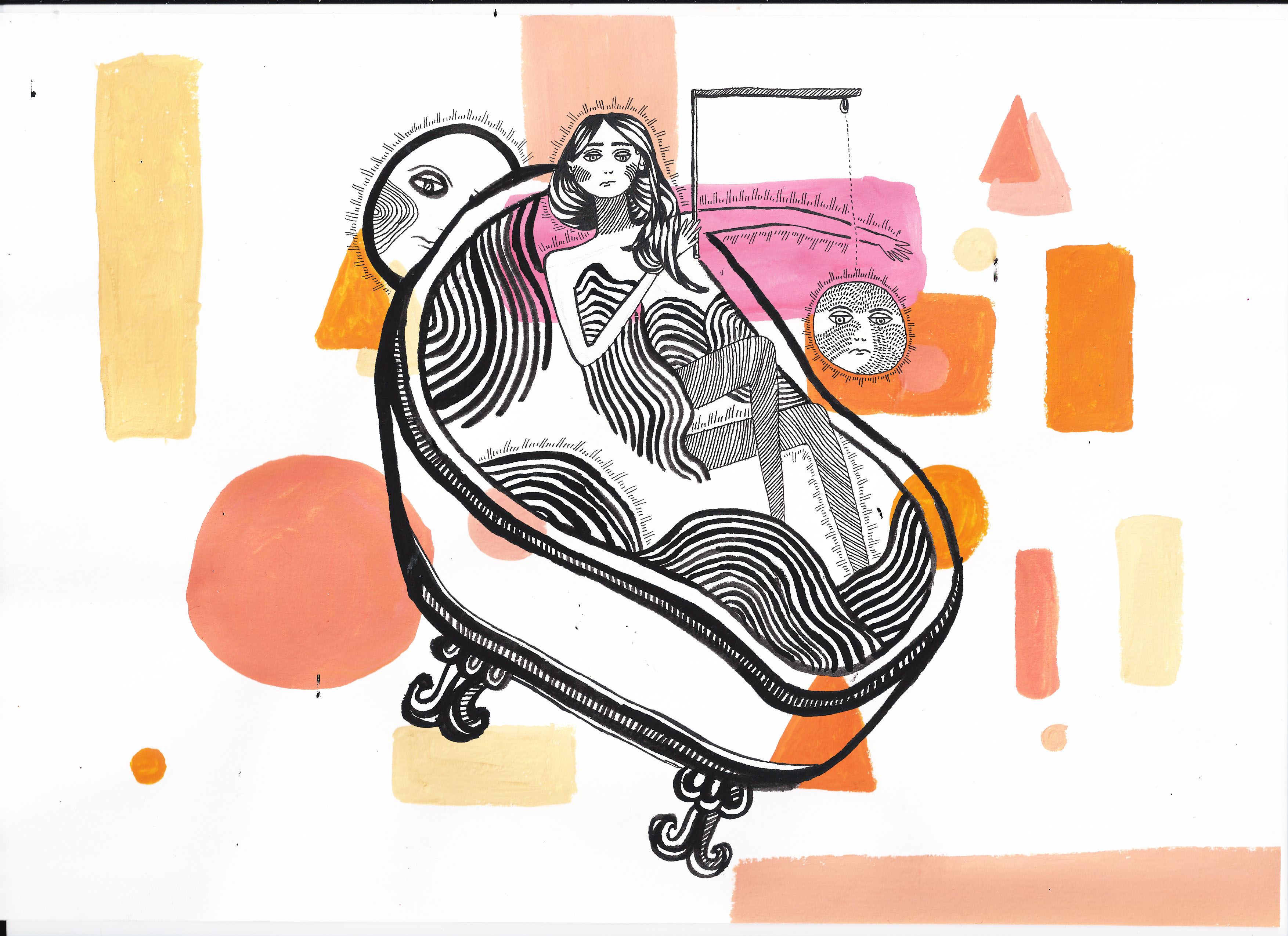
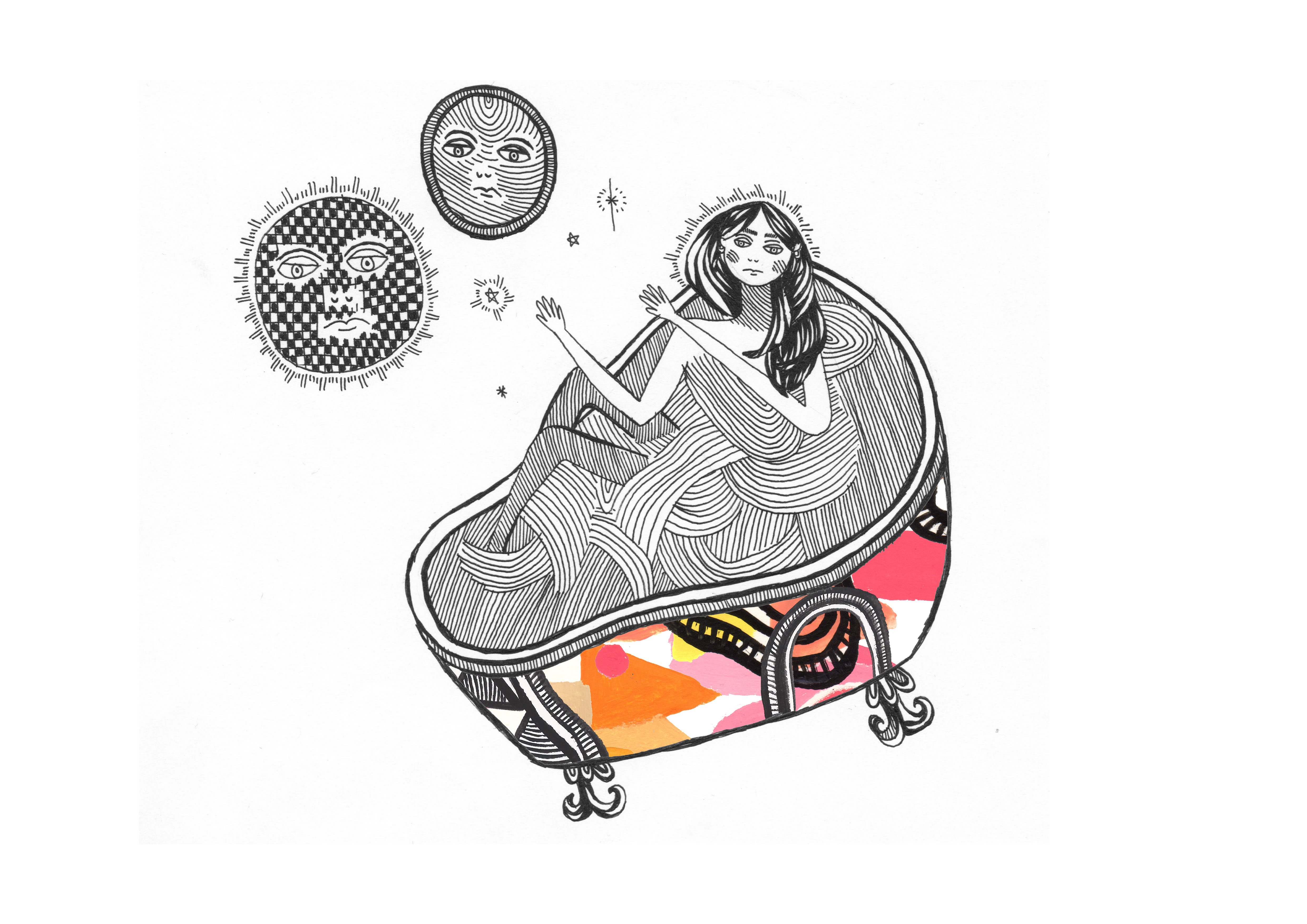
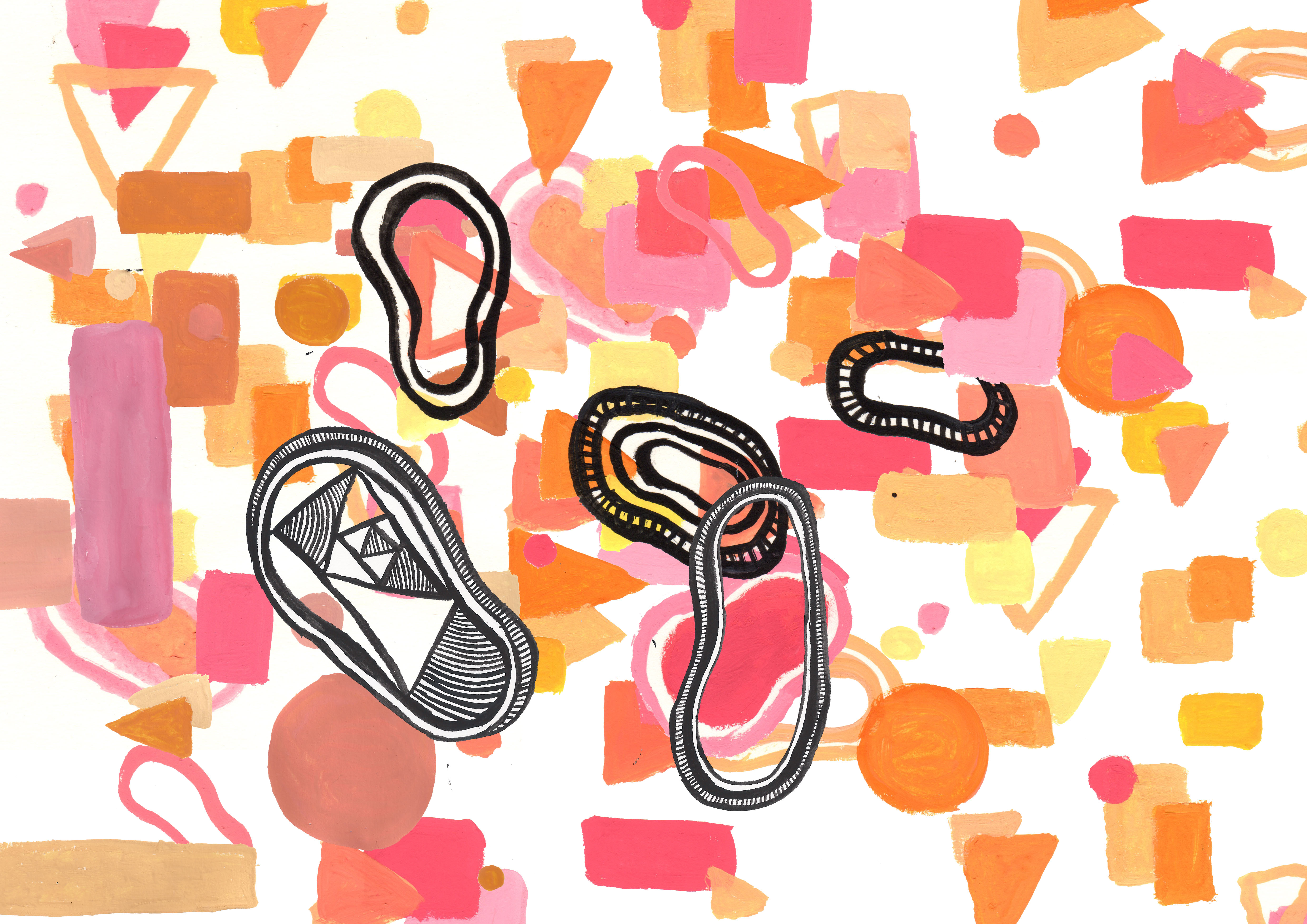
For my final images before my crit, I decided to experiment visually colliding The abstarct patterns I had been working on, with the previous more figuritive illustrations about the personal philosophies of bath time. I was very pleased with these final outcomes as they created the effect that I wanted of visualising thought processes when taking a bath. This collide I think also related quite well to the topic of the microcosm, as I had visually made the bath into a microcosm of my thought processes. again with these compositions I experimented with minimal composition, and more ‘busy’ ones. I think I enjoyed the process and the final aesthetic of the compositions that had more going on in them because, for me they really helped create that feeling of a multitude of thoughts occurring in time in the bath. 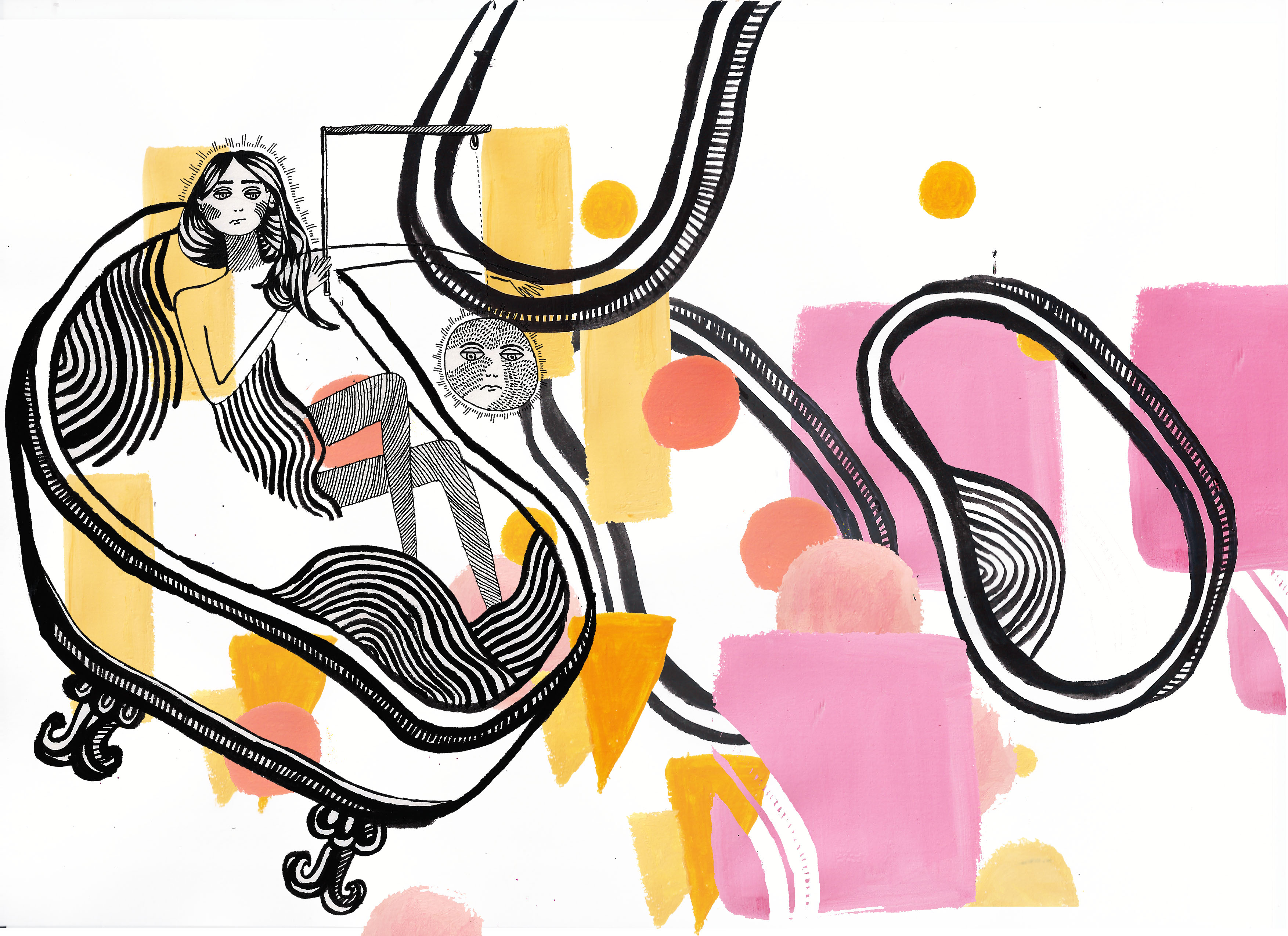
Month: December 2016
Creating Patturns of Personal Philosophies
Staying along with the theme of keeping things quite abstract I started combining the coloured and black ink Patterns together; Firstly just by hand, and then combinding them digitally on photoshop. I was really pleased with the outcome of these patterns, I think the colours I used seemed really aethetically pleasing and did create the illusion of warmth, I also thought that the combination of the black ink patterns with the colour created an interesting effect of depth. I experimented with more minimal compositions and then more ”busy” looking compositions too. 

Abstraction + Choosing Colour Palletes
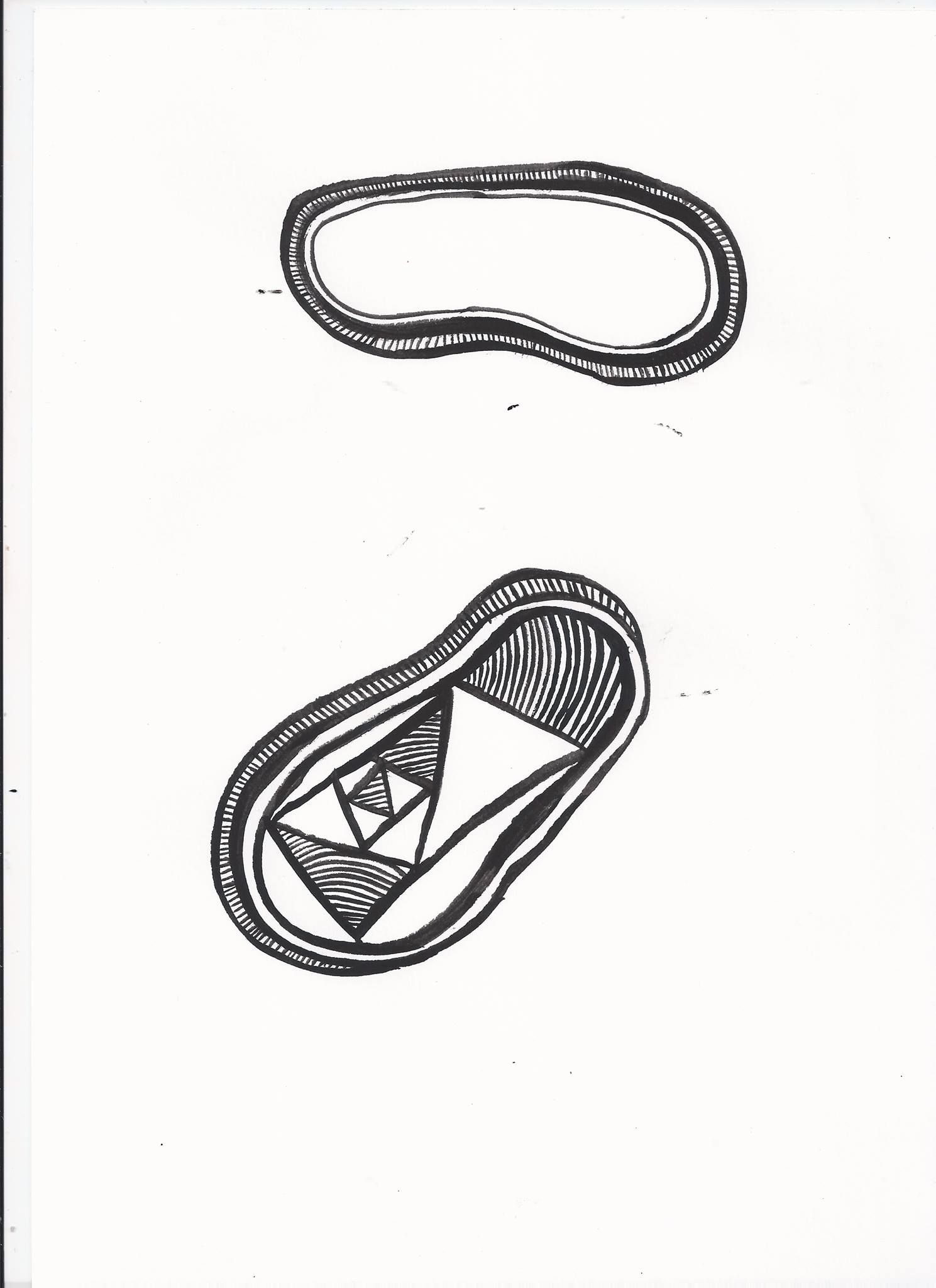
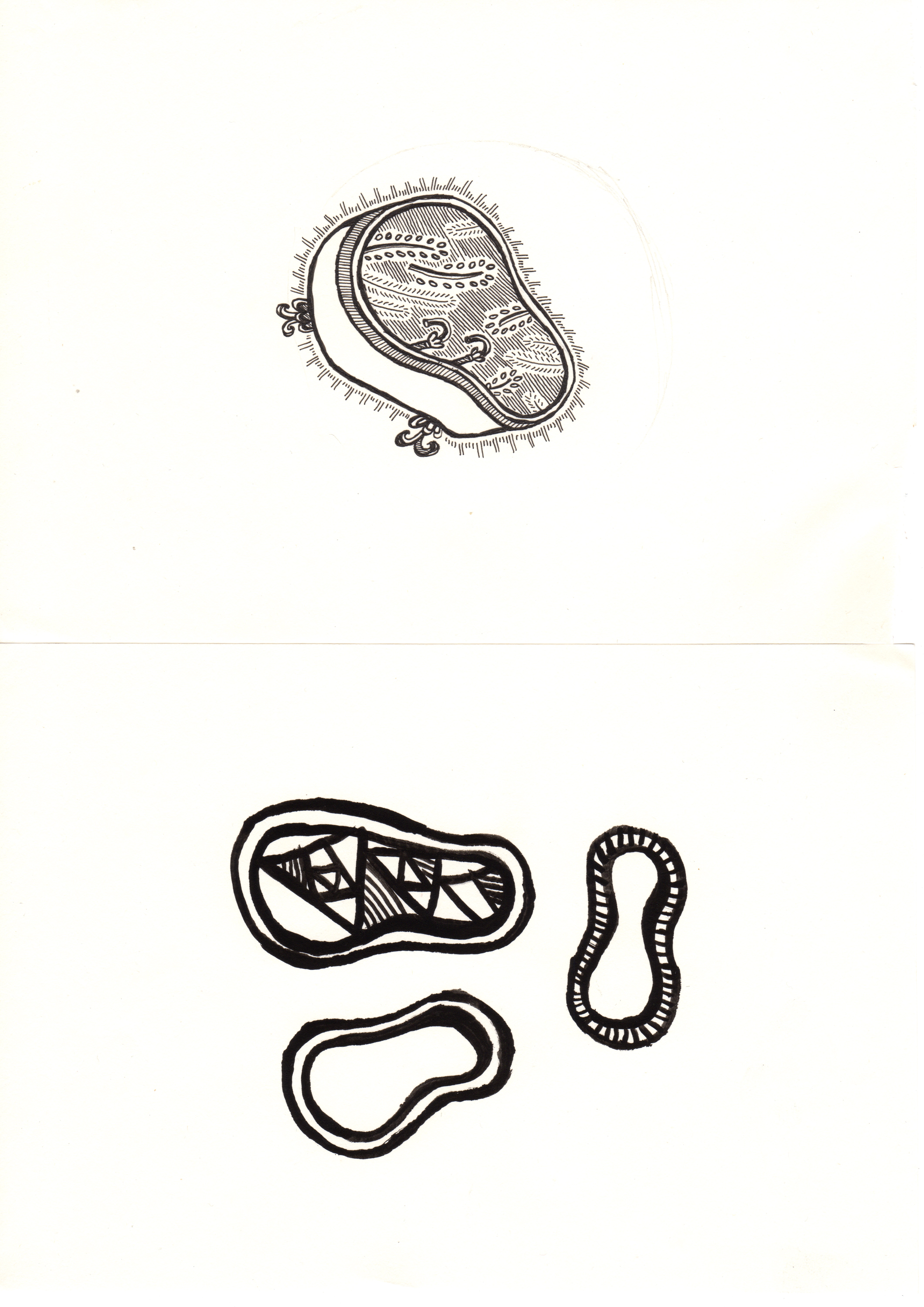
As I was working with quite abstract concepts, I decided to think about abstraction, from my previous drawings of the Baths; I firstly started by eliminating some of the pictorial quality, and focusing on the shapes and forms of the baths. In my work so far, I have often struggled to use colour, so usually stick to grey scale, I wanted to challenge myself, so I contacted a colour palette that I wanted to re create these abstract patterns in. The colour Palette I chose was mainly warm pink and yellow toned colours, I wanted it to add warmth to the black ink patterns I had already drawn, to kind of mimic the premise of the origional bath drawing, about replacing the warmth of the bath for human contact. 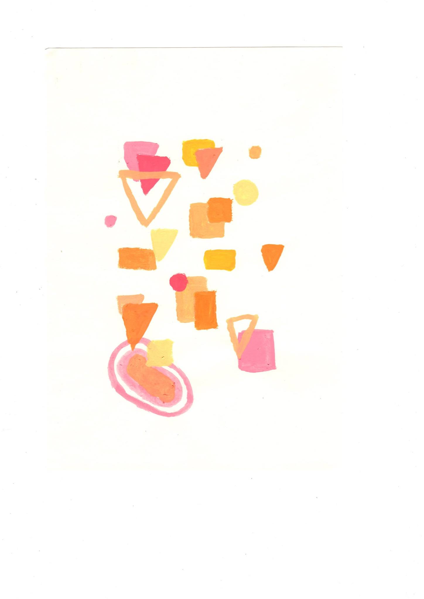

Create a word that is a microcosm of personal philosophies : Reflective – Post Initial Research
I was struggling slightly, onto thinking where I wanted to take my work next, however I was talking to a friend over Christmas and something of what he said really resinated with me, and I really wanted to bring it into the next part of my work – apparently people who spend a lot of time in the bath replace the warmth of the bath for human contact. I am one of those people who spends a lot of time in the bath just thinking about life. I thought about all the ‘Personal Philosophies’ I had constructed when in the bath. ( I know sounds lame ) I also thought how the bath could become some kind of veichle, to construct personal philosophies , or a Microcosm infact.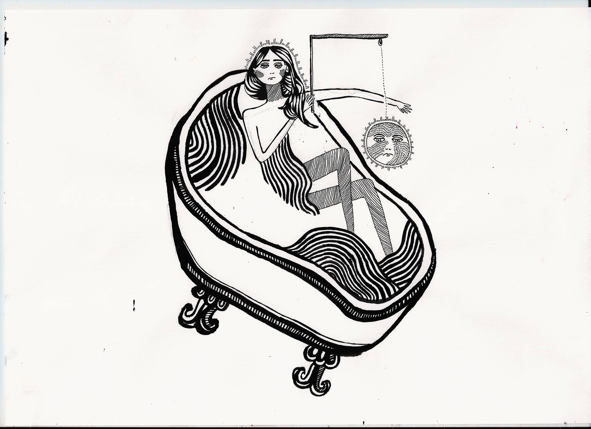
Defining Microcosm and Macrocosm
Before researching more into the concept of a microcosm, I had no idea how much microcosms can link to philosophy. I discovered that it is probable that the initial concept of a microcosm was formulated by Plato. Plato explained the distinction between a Microcosm and ‘macrocosm’ , I initially found it quite difficult to get my head around Platos explanation of these two concepts, luckily I have several books on post socratic philosophy, and I constructed some illustrations to visually depict the distinction between the microcosm and macrocosm. Essentially The miocrocosm is an extended metaphor for humanity or society (the epirical world – the world we live in distinguished by the 4 senses) , and the Macrocosm is the concept of the ”greater world” , something outside the realms of empiricism. Thus the little world is a microcosm for the greater world (the macrocosm) . This concept links to the most well renowned works of Plato – His analogy of the cave , in book 5 of the Republic, as the Cave was a Microcosm for society. This research spurred me on to look at different philisophocal view points of the macrocosm and the microcosm, and most of all led me onto the idea of looking at things with a wider perspective. 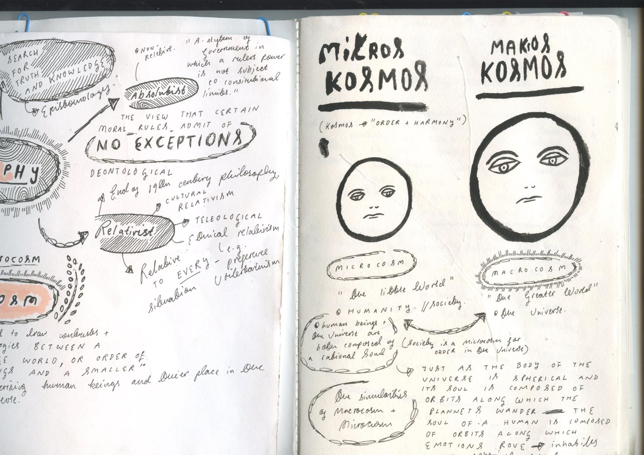
When Worlds Collide : Philosophy meets Microcosm
 Upon receiving this new brief I was very very exited, mainly because I saw that one of the ‘Worlds’ we could pick to collide was philosophy. If you have read the rest of this blog you’d probably understand that one of my (for want of a better word) ‘Passions’ is philosophy. As for the second ‘World’ to choose I was bit stuck, I knew that I wanted to pick a word that I knew little about, so I could investigate into something new. I decided to pick Microcosm, as I knew little about what a microcosm really was.
Post Crit : Reflection – Revisiting Part 2
After my Crit, I decided to think more carefully about the ‘Crops’ I had made for Part two of the project, I re collaged the materials I had collected and used my cropping tool more efficiently, choosing areas with more thought that would look good as a final A2 print.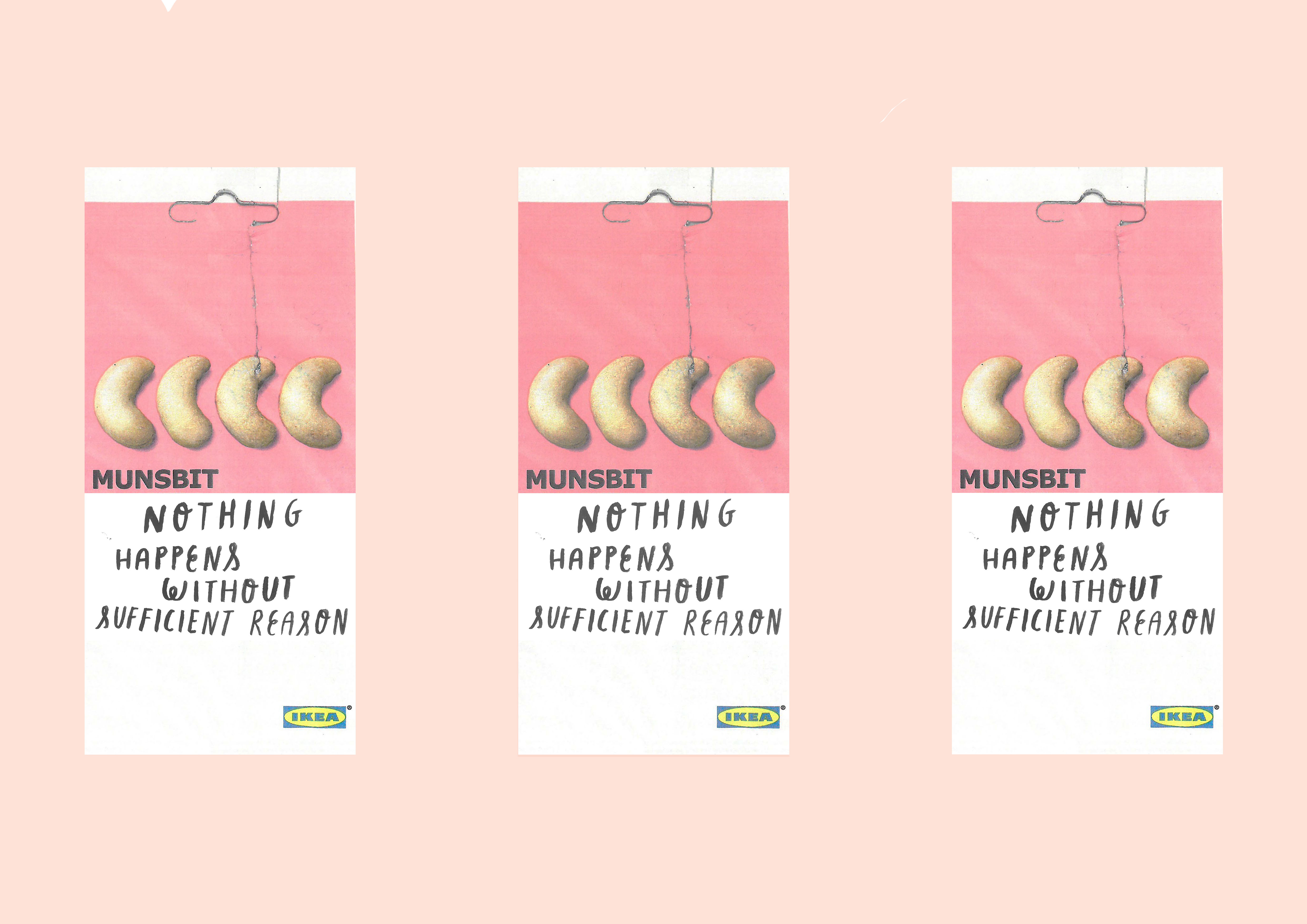
Using the Cropping Tool
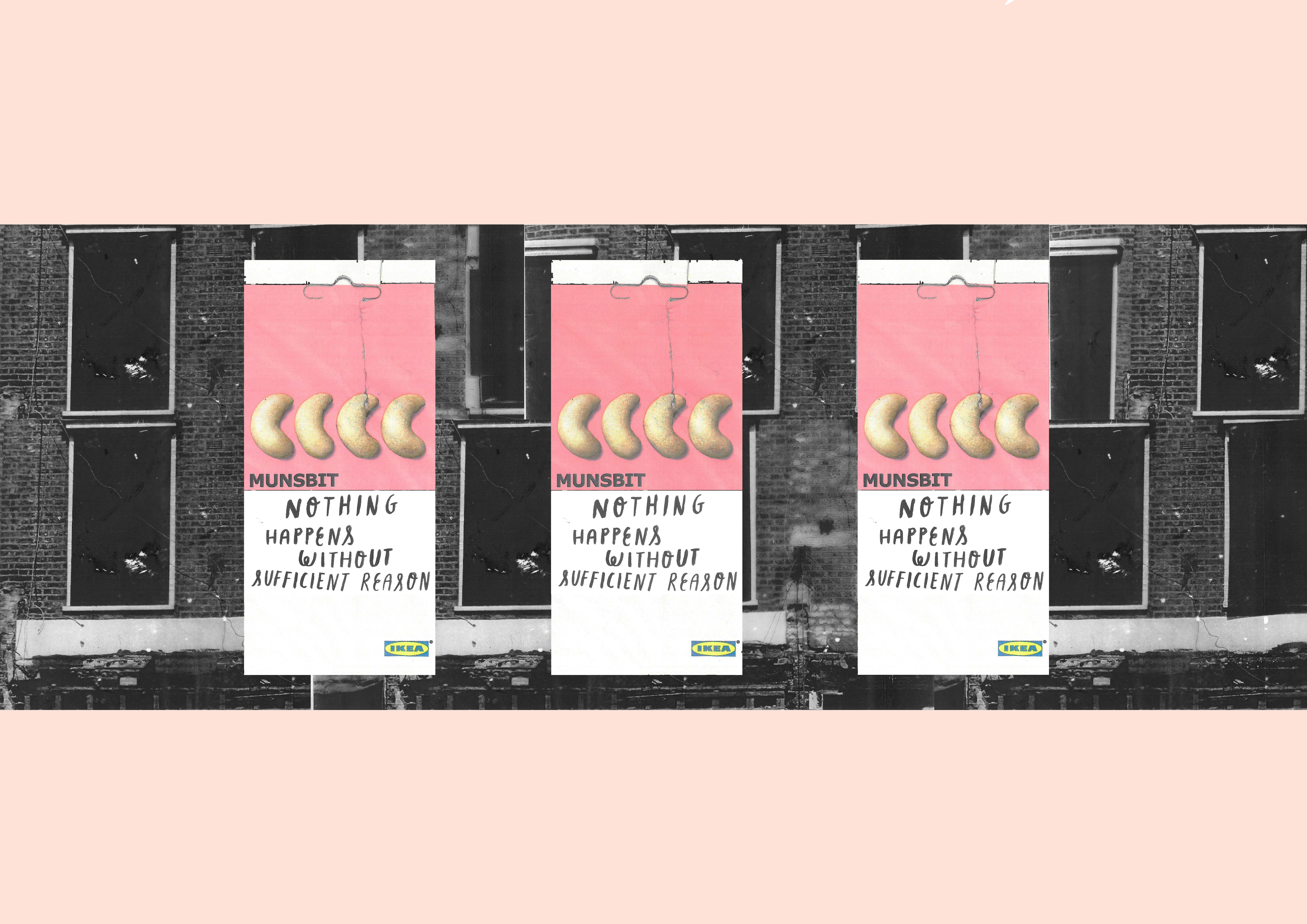
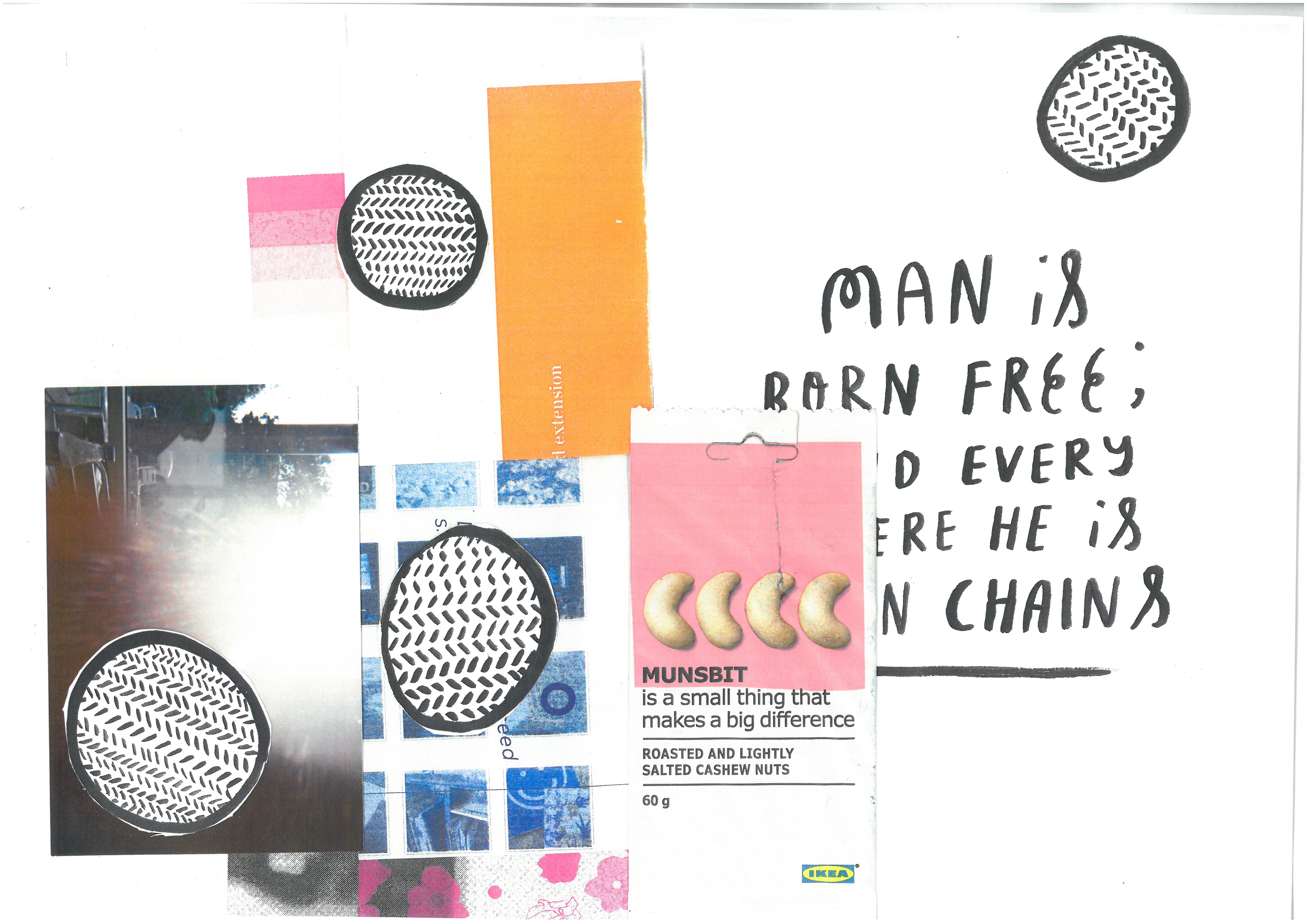
After I had collected all my materials more the topic ”visualiuse what you can’t see” I decided the most efficient way to produce the compositions was, to collage the different materials on an A3 scanner and print them out and then use a trial and error process with layering different materials for the desired effect – I really enjoyed layering different drawings and prints underneath the abstract photos printed on acetate – as the acetate was translucent it partially obscured some of the patterns on the paper. After I had printed out a multitude of different experimental compositions using the gathered materials, I got to work with the cropping tool, selecting parts of the compositions that would work as a final piece – as depicted bellow. 
Gathering Materials – Visualise what you can’t see
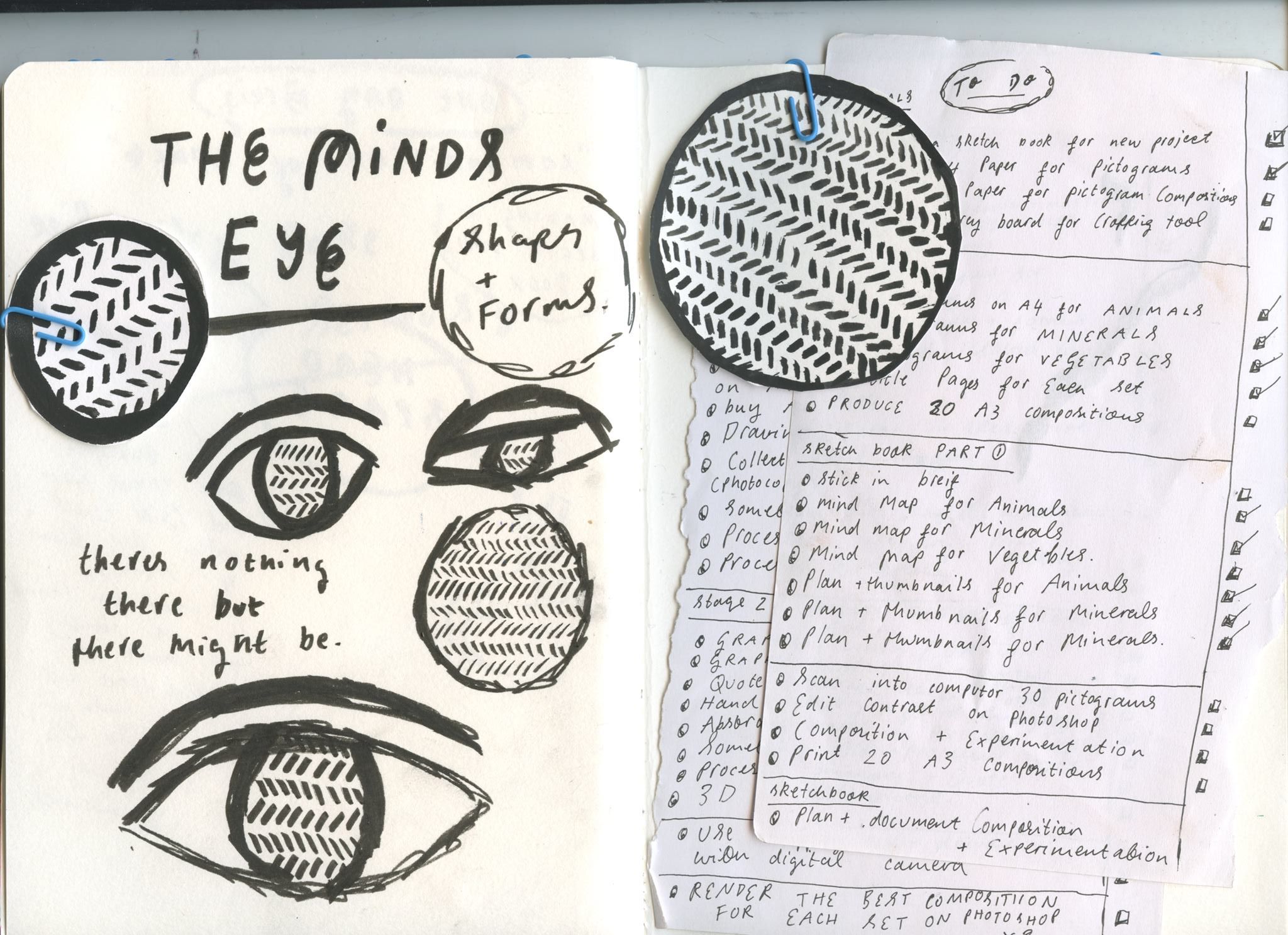
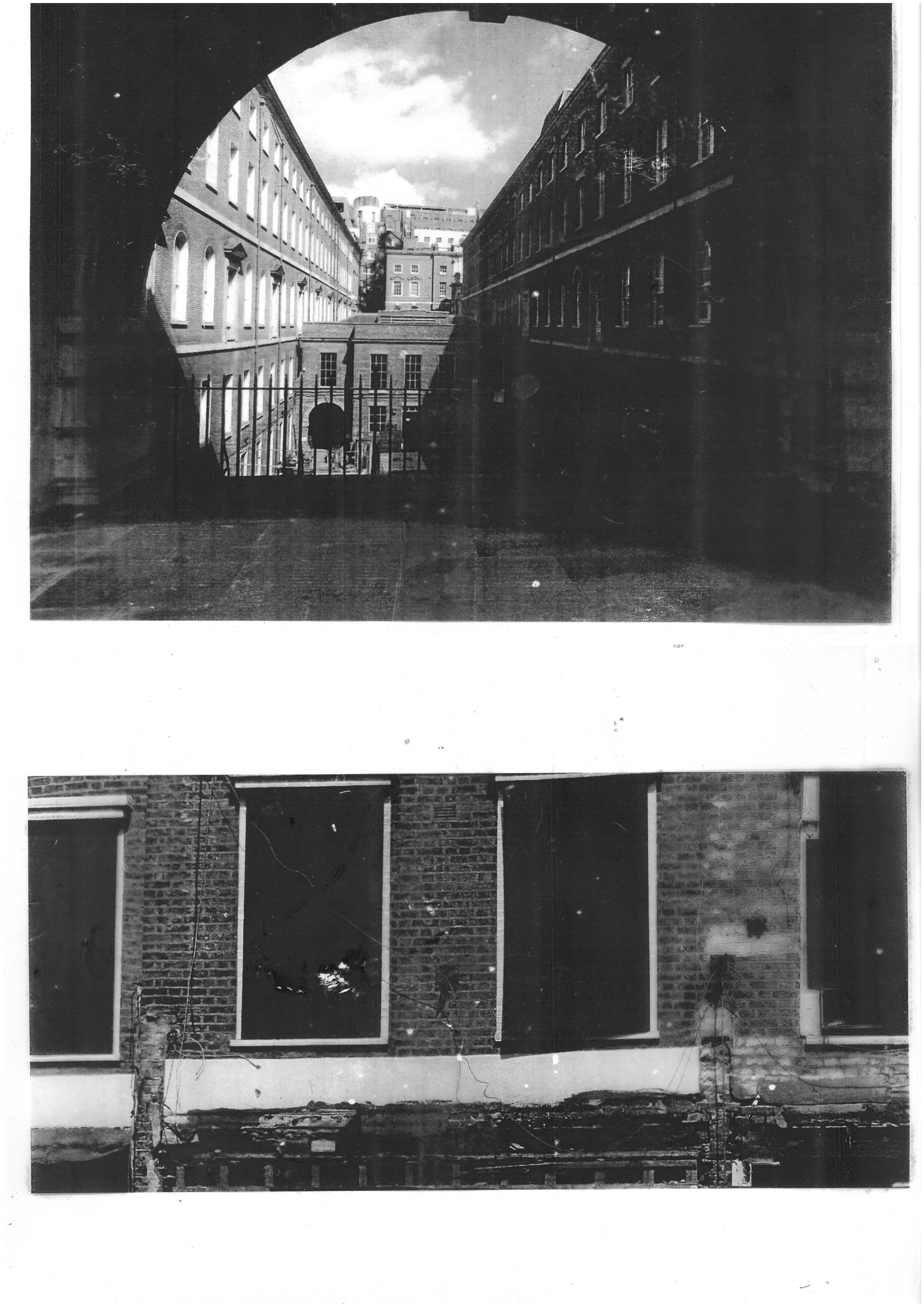
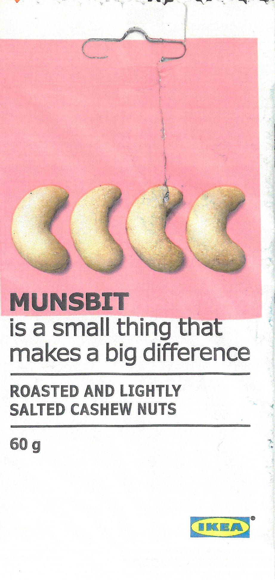
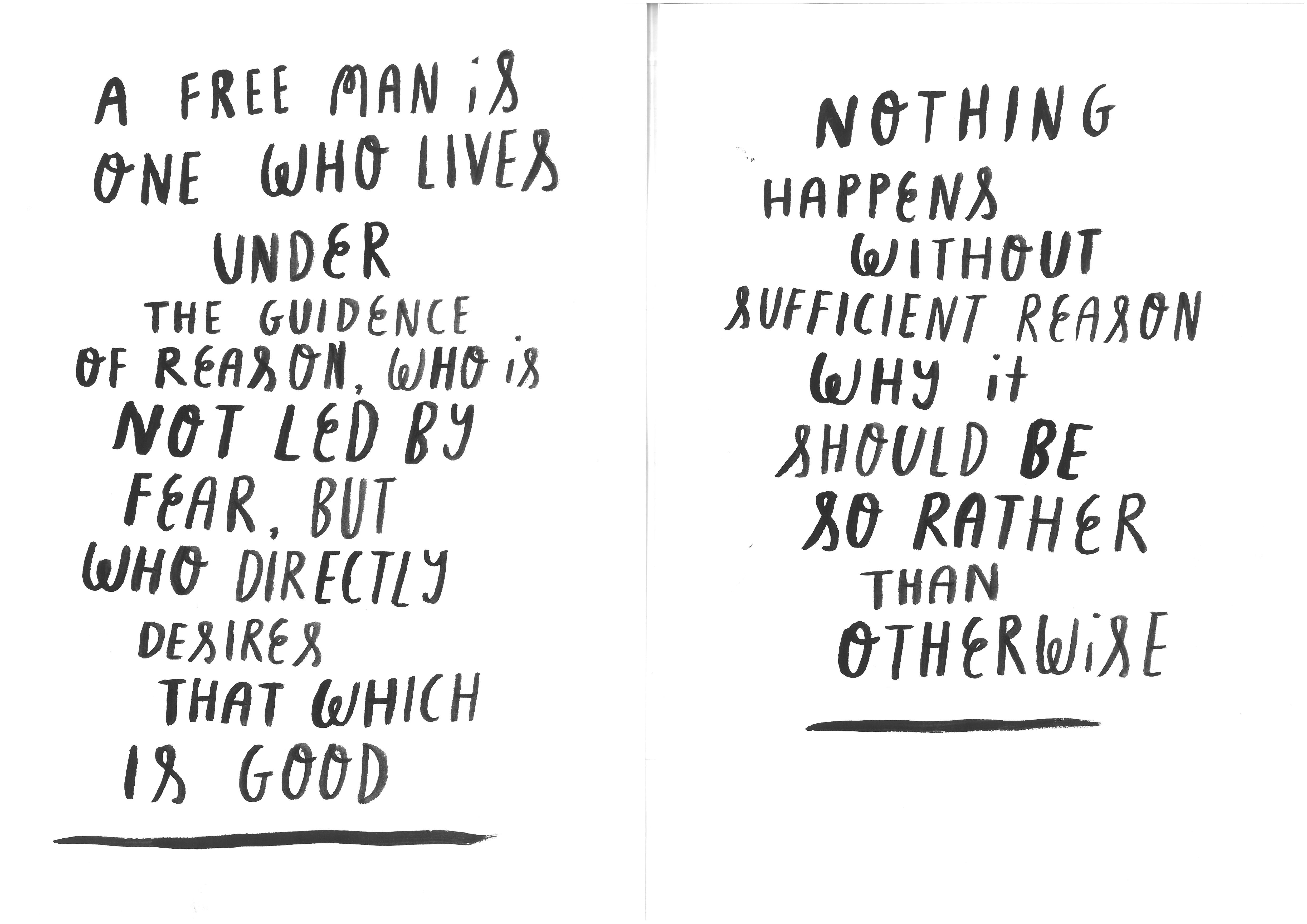
Pictured bellow is a small selection of the materials I gathered for part two of the Composition project. I picked the theme ”visualise what you can’t see” for my next series of compositions. In my sketchbook I investigated more into this theme, and I chose to try and depict ‘the minds eye” and the study of knowledge. For an object ‘old or weathered’ I emptied out the contents of my bag and found an old Ikea cashew nut packet, I thought the bright colours of the packet would work well for spot colour in a composition. For the Abstract photography I chose a selection of the more abstract photos I had taken on a disposable camera for the ‘let there be light’ project, I also found a couple of old photos I had taken around London and printed on acetate, I thought the translucent quality of these photographs would work very well in a composition. For found imagery I chose a couple of ‘scrap prints’ from a book I picked up at pick me up graphic arts festival last year, by hate press. As these prints where scrap prints they had an elusive unfinished quality too them which I though would link well with the theme visualise what you cannot see. For the 10 hand lettered quotes, I chose 10 quotes about epistomology from a philosophy summary book called ‘I think therefore I am’ (wasn’t by Descartes was just a summary book) . I spent a lot of time thinking about what I wanted my ‘abstarct shapes and forms’ to look like. I decided to do some expressive line ink drawings of what I thought my minds eye mig


Compositional Awareness : Part 2, Organisational skills
As this was a very short deadline the planning and lists I had made (as pictured bellow) at the start of the project massively paid off as I approached Part 2 of the project; out of the list of themes given, I decided to choose the theme ”visualise what you cannot see”, to base my next pieces of work on.