
Looking into various slogans to place under my masterhead to create a lock up;
- Made by Satan
- She’s No Angel
- Revolution is Coming
- A Woman’s Nature
- Support Your Local Girl Gang
Looking into various slogans to place under my masterhead to create a lock up;
Having a night in to practice and learn the basic skills on illustrator. I asked one of my tutors, Martha, today how you can create similar digital images to the ones that i have drawn up in my sketchbook. Playing around now with my graphic tab and little knowledge – i have created a few different designs from my original. The cherry is a playful take on the fruit, as to my generation this picture reminds me of my childhood and seems tacky and kitsch, perfect for my idea.


Developing 3 main ideas for my final masterhead for the zine..
“Femme Forte” is a french word for ‘strong women’, which i thought would be perfect for highlighting my theme of hidden purity against hidden sexualisation. Relating a lot of my work to religion; virgin mary, nuns or the devil – I have always known i wanted similar, bold and basic text to the bible or another holy book. But I also liked the take on almost a french ‘romance’ font, reminding me of the moulin rouge film. Next I need to link my slogan to create a lock up.


Pen/Pencil drawings based on John Willie’s work – potential zine content.
Having absolutely no experience on illustrator and very basic skills on photoshop, hopefully I can influence my designs and learn how to possibly trace or re-create these with colour or in a more formal way.
Looking for inspirational ideas for drawings and my next illustrations, I came across John Willie’s magazine covers, where he worked for Bizarre in the late 1940’s/1950’s, basing his images on fetish and bondage. I think the way he allows the viewers to witness these extreme themes (especially for an iconic magazine cover), is really sophisticated and playful; opening up this idea of intense sex to a much wider audience.


S/S 07 Collection: Redeemed as one of the most conflictual and irrelevant symbolisations of the Holy Virgin Mary, these designs caused uproar for many, but for me – I see the clothing as innocent and delicate, with an outstanding urge for controversy, like many top designers in the industry.


Gregory Crewdson photograph’s large scale landscapes acting upon a dream-like effect. I think the photographer aims to show much more than beauty in his images, playing with the idea of irony and contradictory – but also, very much highlighting the beauty of this irony – specifically death or of such horrible, similar nature. Although i am not representing death or even beauty in my theme, his idea’s are similar with the contradictory. I can also take away the purity of the settings for potential shoots and the vintage look of the scenes and styling.

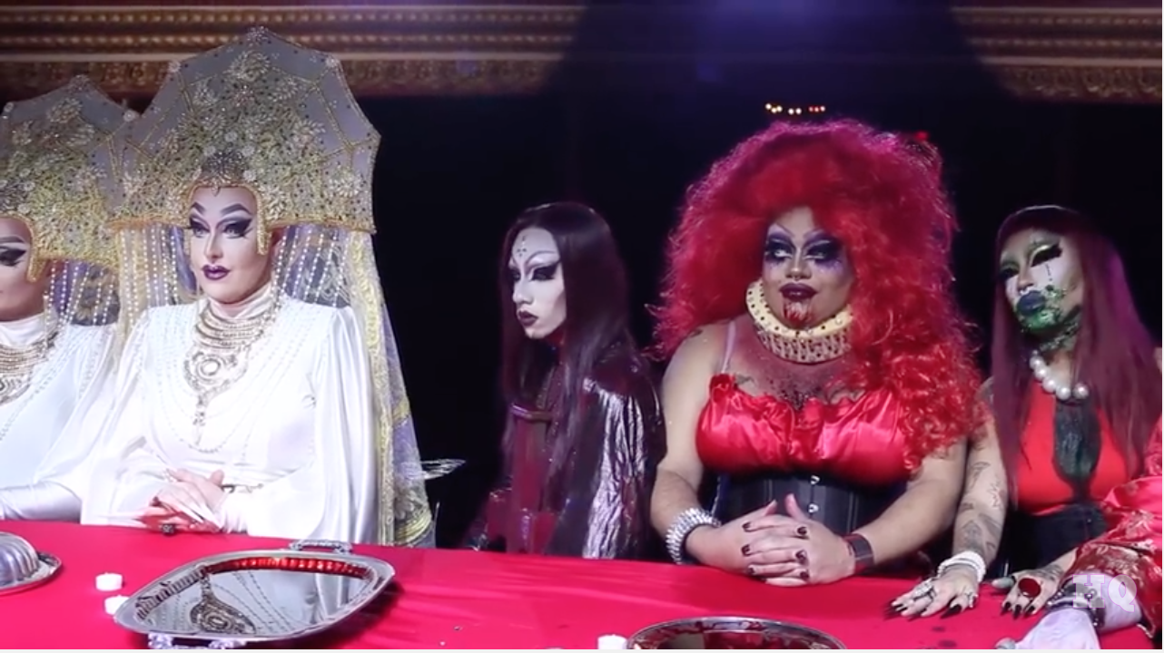
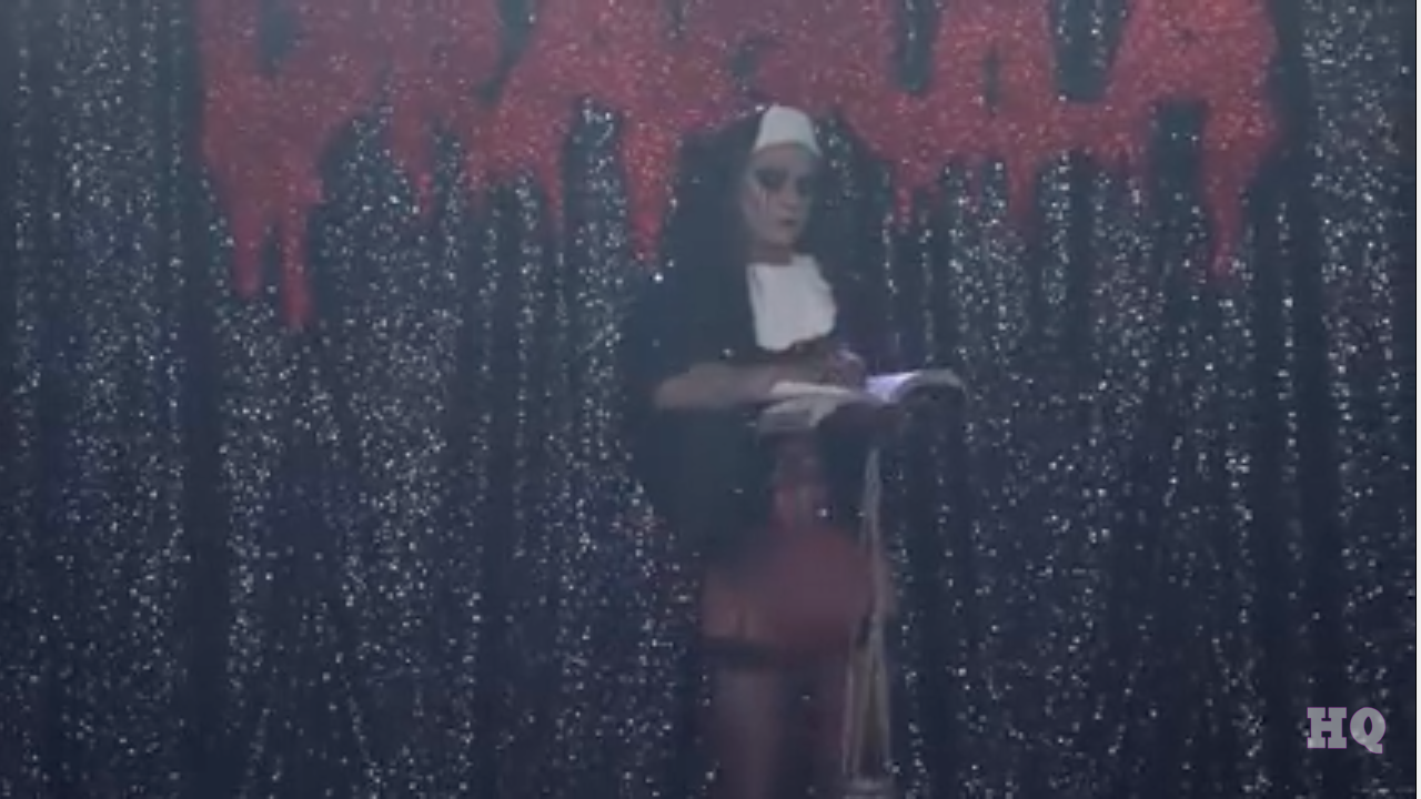
SCREENSHOTS FROM “DRAGULA / FINALE EP”
Wanting to look into the juxtaposition and contradictory of the theme of purity, i came across the TV Show ‘Dragula’, based on men in drag outfits which are typically based on a horrific theme. This one theme was ‘FILTH’ and encourage a drag in a nun’s outfit, carrying holy beads through the underwear and ripping pages out of the bible. I was really amused from this idea, completely contradicting the idea of a nun and the religion within. Adapting on my theme of purity, I will start to look into the contrdicatory elements – possibly bondage, or even based my illustrations on these nuns!
contrast:
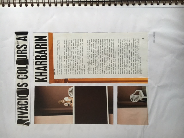
hierarchy:
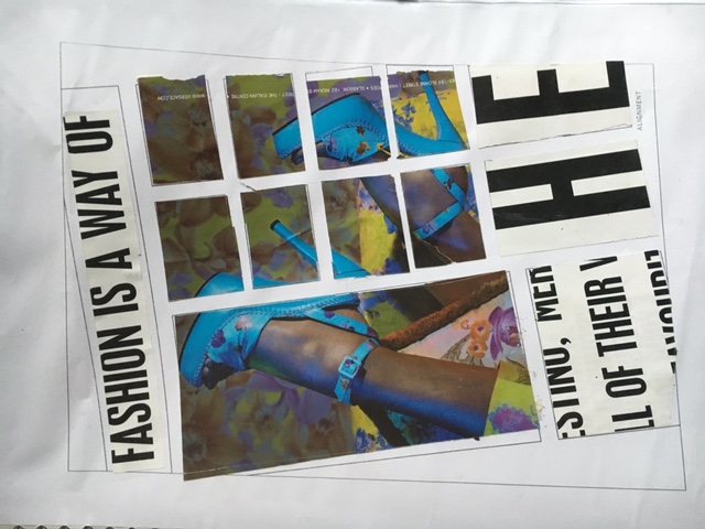
alignment:
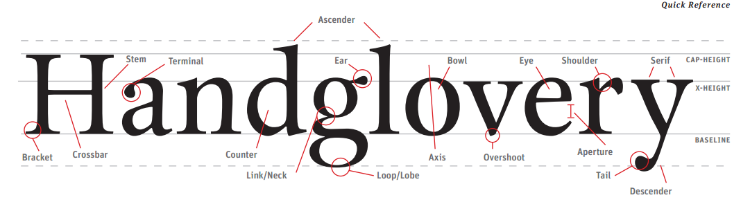
HANDGLOVERY – The correct anatomy for proportion of type!
Looking into typography and various titles for our zines; i discovered the 5 main elements to a magazine page, which actually involve the type of text used too. These being;