MODEL CITIZEN MAGAZINE ISSUE 18


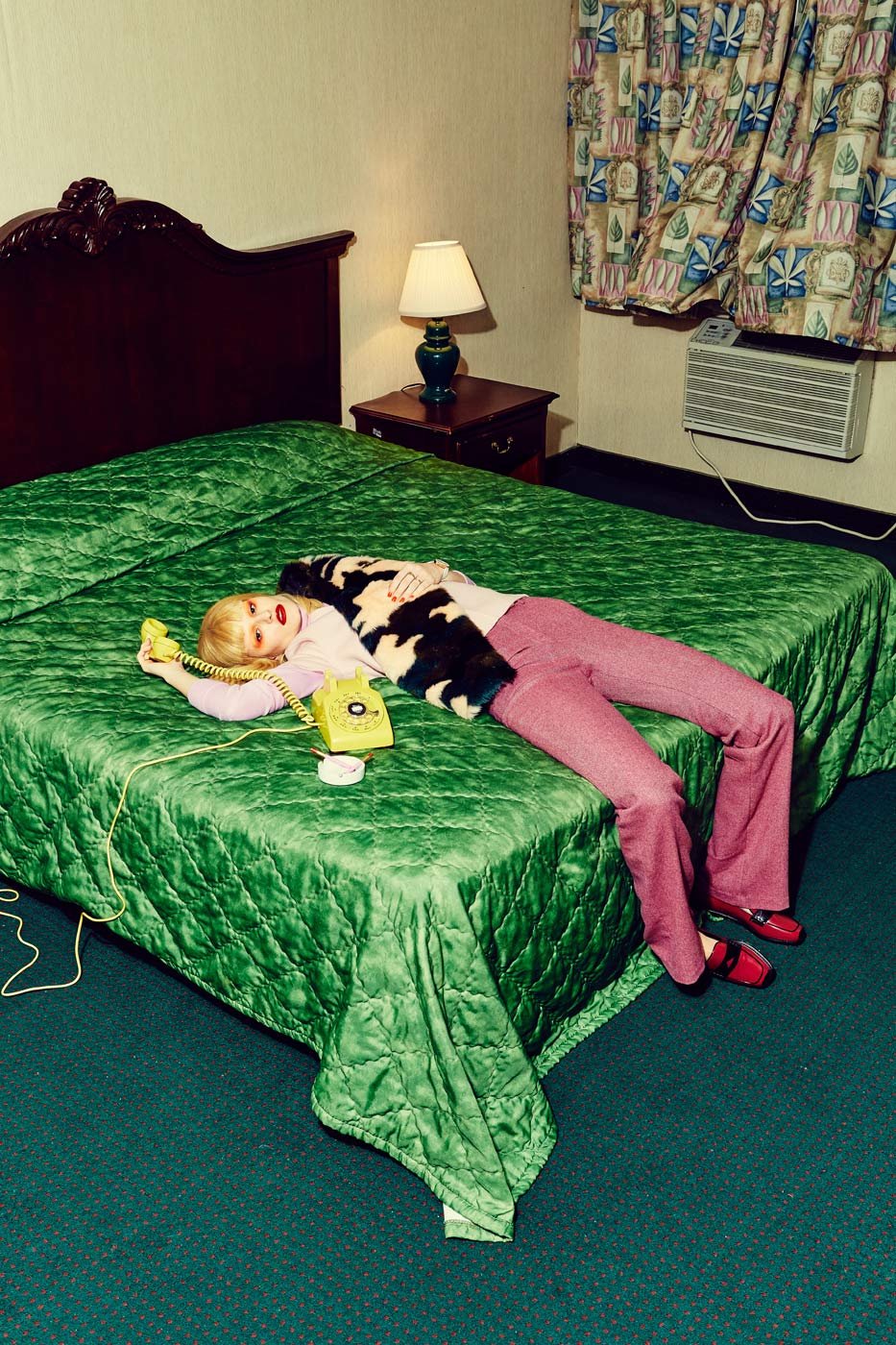
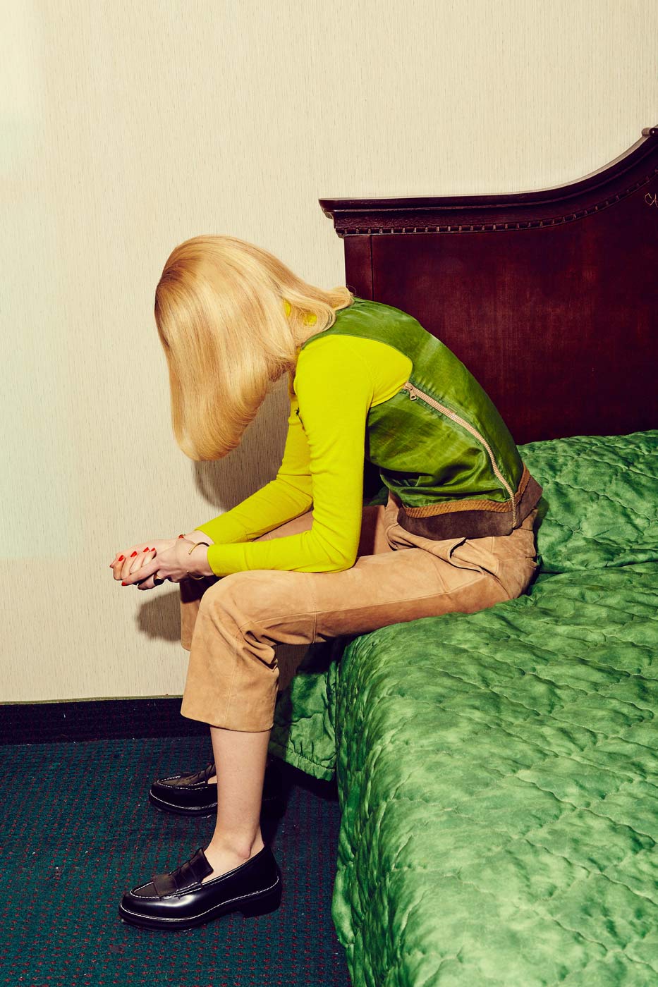
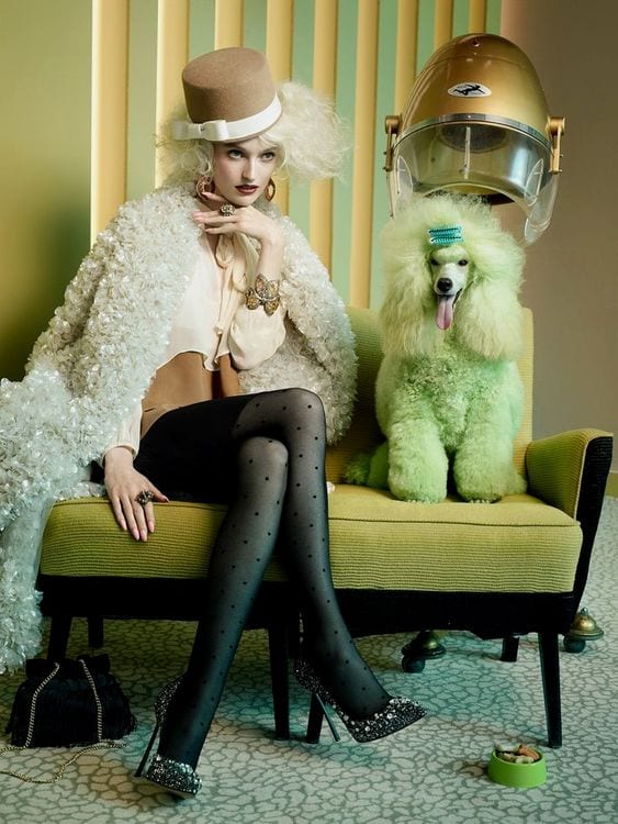
This style of direction and photography is completely different to my normal interests or inspos, but i was really drawn to the overall theme of this and how in the best terms, it seems quite tacky and shows very obvious signs of a 60’s era. Not only the big hair from the model and her dog beside her, but because of location, use of technical equipment – especially above the dog which seems quite ironic and unconventional in some way- and glamorous clothing in such a normal, everyday location.

LOCATION HUNT – EXTRA


I came across this retro style hairdressers on my way back from university this evening and it is styled in the exact ways some of these past editorial locations have been presented in too. After speaking to the manager, she confirmed that it would be an amazing idea to do some shots in here as well as my bedroom because it might give my concept a completely different dimension, but then really targeting the concept of beauty through the actual setting. I think ill concentrate mainly on my bedroom shoot first, however after shooting there it could be really fun to do some here too!


VIRGIN SUICIDE SCREENSHOTS


I thought if i wanted the images to become quite cinematic and almost awkward in posing, the best examples to help influence me would be to actually look at films and the bedroom scenes within them. Virgin Suicide was a prime example to follow because of the characteristics of the girls involved and how they are growing through womanhood, with the concerns of beauty ahead of them.


GUCCI S/S 17 CAMPAIGN


Gucci has undoubtedly been a key inspiration of mine throughout this entire project and somehow relates to every part of my work, regardless of theme. Here the campaign has been useful to study just because of how the models are shot in quite unconventional ways but seen as if it is the norm. For example, a random tiger on the bed but the woman seems unnerved and not really realising the ‘danger’ of what any other person in her position would be feeling.

A NIGHT AT THE METRO MOTEL”


The storyline for this editorial was based around the horror perceptions that come with a night in a motel. It reflects back to this idea of Miles Aldridge’s 1950s Americana and a sense of cinematic themes because a typical American Motel is globally seen as quite a scary film setting or story. The styling used within this shoot helps identify the direction much more with the use of block colour against paisley, vintage-like backgrounds. There is a major contrast between each element of the outfit, for example the trousers against the bedding against the animal print scarf. The image on the left then becomes completely visible and made very aware of with this block coloured phone, that is the first part of the image you see because of its block colour. This editorial has taught me to play around with this use of block colour against pattern against block again because i feel that it gives the styling various dimensions of layers and ideas surrounding the concept. It also creates a much more pop art feel that i want to portray in the shoot so that the era of the 50’s/60’s is pulled through, but in a modern concept.

MILES ALDRIDGE PHOTOGRAPHY


Miles Aldridge is a British fashion photographer, who a lot of his work surrounds this similar block colour aesthetic. He is best known for depicting at first glance a glamorous but very surreal world, then looking deeper; hidden messages confronting themes of religion, pop culture and 1950’s Americana. This depiction of a retro America is possibly why these chosen images look like this, the vision of old cinema and having a story line. Looking into how Aldridge positions the models in his screenprints to be seen so mannequin like and focused. The images, although they are now screenprints, seem so story-like, almost like the characters have been pulled out of a 60’s film. The posing of the model is the element i will take from these as i found it so inspiring for my own working techniques and this cinematic idea is completely different to how i typically work.

SCREENSHOTS FROM “GLASS ANIMAL” MUSIC VIDEO


I loved the aesthetics within this video, especially how the lighting is made up of various orange tones that are then reflected with colour made by the sofa or table. Another aspect im interested in taking away from this video is how the composition seems quite parallel. Im unsure as to why this really drew me in at first, however now examining the images all over, i think this idea of parallel compositions helps create a really retro feel and would help me achieve this in my photography too. I will need to see how i can manipulate my bed space to reflect this aesthetic but it should definitely be a qaulity used. Lastly, this has inspired me on how i can show beauty and the techniques that make up beauty for women. The front of these screenshots where all the variety of food is thrown around is how i want to now have my props such as hair rollers, make up, money maybe – anything that will reflect a retro era but still be very obvious of beauty standards or techniques. Remembering how the Renaissance painting highlighted pearls as a flowing accessory in her hair, i will also use these as an obvious prop too – within the styling and setting.

HARPARS BAZAAR GERMANY

“PRINCE CHARMING”


I thought this editorial was quite relevant to my study of this theme not only because of location and how i feel a bedroom setting could enhance a retro feel, but because of how it is shot. The model is shown eating, however seems so unnatural and again, sitting on a bed but like a mannequin. The entire editorial reminds me of a scene from a Gregory Crewdson’s series, of which as a photographer, he aims to showcase such a morbid, unnatural setting that looks as though it has been taken out of a thriller flm. However, it is obvious that Crewdson depends on this idea of cinematic photography, similar to this editorial. I also like the dark lighting in this setting and i think if i was to use my bedroom area, the lighting is quite dark and retro-like anyway so it could easily be achieved.

MAC OFFICE HOURS CAMPAIGN


It has become evident that i want to maintain a pop, 60’s vibe for my shoot and this mac campaign highlights the aesthetics i aim for completely. The use of all pink as a colour scheme helps create this pop art visual along with how the model almost seems so cinematic that she becomes part of a still life shoot, like a mannequin. This use of continous colour could be fun to play around with, but maybe with a strict selection of 4 vibrant, block colours which will overall help me create a strong retro mood. I also will take the posing of the model into consideration and how she is so still and unnatural in front of the camera. Doing something similar to this will additionally reflect a retro feel for my images as it was a very common technique of this period in fashion photography to almost seem so unrealistic, like a mannequin.