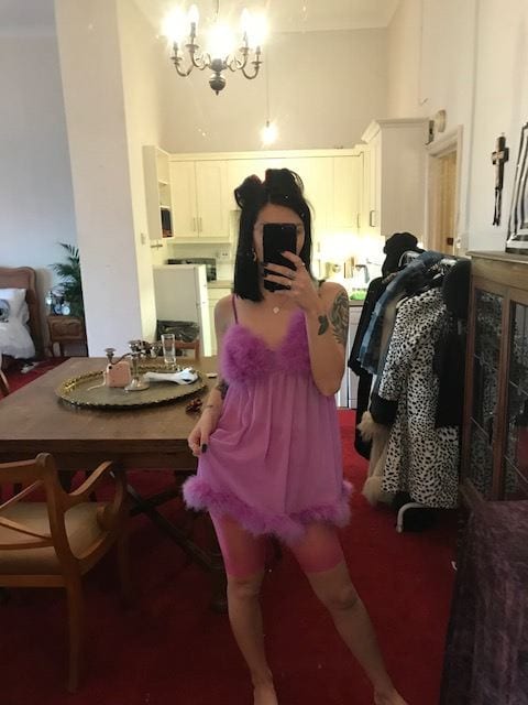
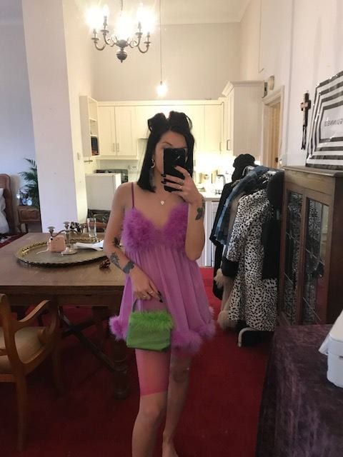
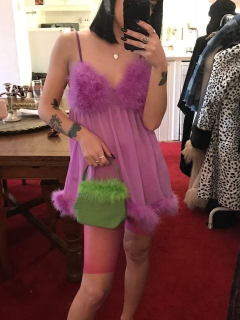
L’OFFICIEL USA


As i used a lot of colour for the previous shoot that gave of a complete retro feel, i thought that using a more darker palette could be a bit different for this shoot. Its interesting to see how a monochrome colour scheme here has been adapted upon to seem more luxury and almost more professional – which would give an entirely new dimension to my understanding of ‘teenage beauty’ and make it more of an overal topic. Again, accessories have been a key factor of styling here and i am keen to play around with oversized parts, such as the earrings and diamante belts. The monochrome palette could also be interesting to see how pattern could be placed on top and show various layers of block colour and pattern structure – like the painting.

VOGUE RUSSIA 2018


Again, just showing how various textures and patterns can come together to actually create a really strong look; instead of completely clashing and overpowering one another. My choice of shape of garments will be most important for this look because of how expressive the silhouettes were typically in the 80’s. It will need to be obvious of this era i think, but also sustain my own style throughout each look so it doesn’t become too ‘tacky’. Looking into luxury brands on Vogue Runway will be best for me to achieve this, especially the likes of Isabel Marant and YSL. These designers manage to filter through great aspects from the 1980’s and leave behind what wouldn’t be considered as ‘on trend’ now. This image on the left particularly interested me because of how different each garment is that is styled on the model but it all combines together to form a really smooth silhouette. The contrast between the blue bow heels with the lace material tights is the key influence i will take away as a strong aesthetic taken from the 80’s period. It shouldn’t really work together – in my opinion – but actually, it really does and is really obvious of this period’s fashion.

VOGUE PORTUGAL 2018


This editorial mainly attracted me because of how they have used such relevant examples of stereotypical 80’s clothing but ones that are so on trend in current fashion. I also loved the balance of colour within the garment, especially the use of subtle animal print on small parts of the body. Animal print could be a great way of involving pattern and also a way of pulling a retro era in the modern day, similar to how i am pulling elements of the Renaissance paintings into contemporary fashion.

VOGUE MEXICO 2018


This editorial showcases luxury, modern day wear but in a very obvious 80’s style. The way the styling has developed layers of luxury brands such as Cavalli i found inspiring because still, they manage to show every garment clearly. They have shown a great understanding of typical 80’s elements, that goes for the excessive patterns used, large accessories and almost a disco-like aesthetic. Following through with similar aesthetics could be effective in really showcasing an 80’s feel but it would ideally need to reflect beauty in someway. The pattern i need to achieve through terms of styling could be influenced from this editorial. I like how only subtle hints of it is shown, especially in this image on the left and i could try and get the same proportions of pattern in the looks as is it shown in the Renaissance painting. Im unsure of how this would work but i should definitely start playing around with patterns and working out what kind of colours or definite patterns i want.

80S VOGUE ADS


Research into how 80’s Vogue mag has actually portrayed themes of beauty within their editorials or adverts. I typically love to use excessive amounts of accessories in my styling – normally because i relate a lot of my looks back to the 60’s-80’s – so physically seeing this in Vogue has encouraged me to keep doing so especially for this last shoot.

RIOT OF PERFUME EDITORIAL


Riot of perfume has also been another exceptional influence through this project, especially when identifying if i wanted to create a magazine or not for my final piece. This editorial stood out for me when reading the magazine at the start of the term, i think mostly because of how unusual the setting is for the focus to be on the fashion. It actually looks as if it has been pulled out of a legitimate 80’s book of some kind with relations to the styling, hair techniques and unconventional use of posing. I just found this relevant to this shoot because of the location and how they have managed to succeed in having the fashion still as the main focus; obviously the key factor i need to show as a stylist. Not only this, the textures of the fabric could be interesting to develop on as a unusual way of showing classic pattern structure in my work. The detailing in the lace, the floral of the dress and even how the nude tights are placed over the ice-skater’s knickers which form a certain shape too. All of this could be a subtle reflection of the Renaissance painting, but i do need to realise an idea on how i can take a more obvious adaption from the painting. Maybe this could be how the characters within the painting are all in various places, almost segmenting the entire painting completely. I could use this idea and make the model position herself / himself in similar places in similar positions around the location. After taking the photos, post production could help highlight this use of positioning even more as i can locate the images in a certain way.

PETRA COLLINS GUCCI CAMPAIGN


This advert i completely fell in love with when it first came out. Not only do i love Petra’s style anyway, but it manages to tie together two opposing aesthetics from Gucci and herself to create one entirely new image. However, still being very obviously work of Petra’s and beauty products of Guccis. I thought using this would be quite relevant in regards to this further shoot because of the colour scheme and how even the smallest of details here is made to look authentic or retro; again, fulfilling both Guccis and Petra’s styles. I know i want to use the retro hairdressers for this final shoot anyway, but having similar guidlines such as this would help me a lot with how i can position the model or just use the hairdressers to its best potential.

SANDRO BOTTICELLI

“PRIMAVERA”

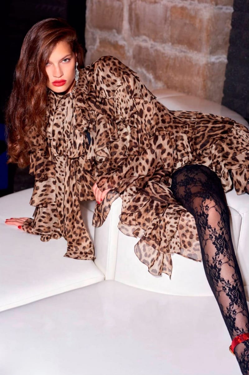
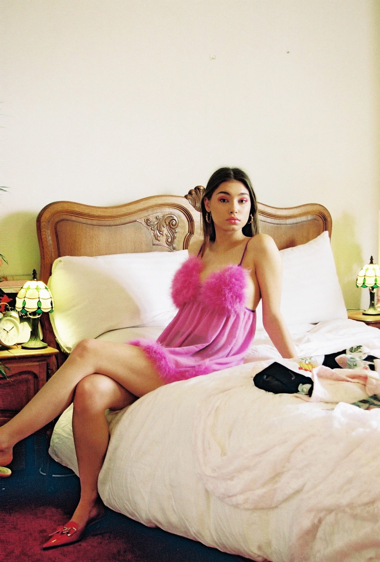
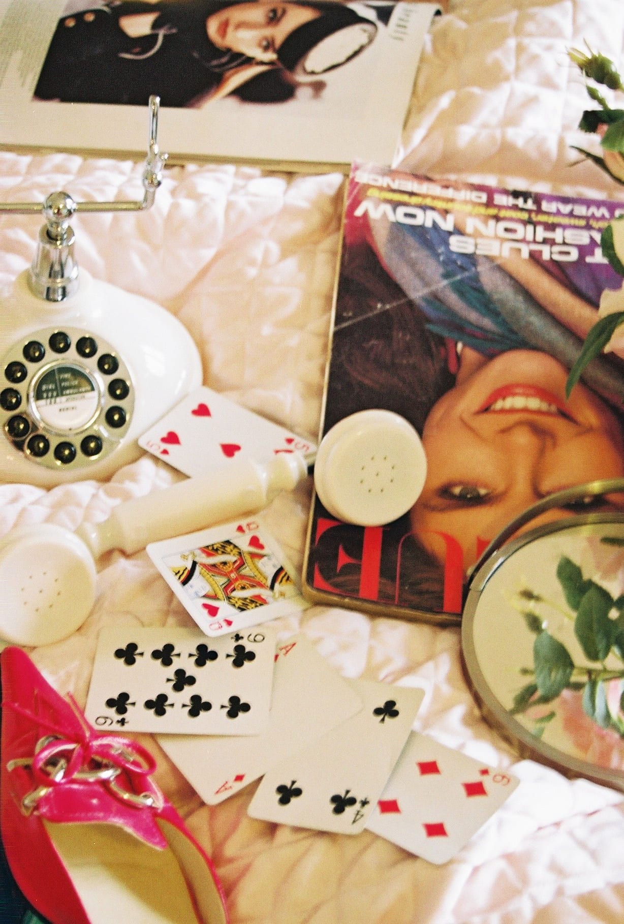
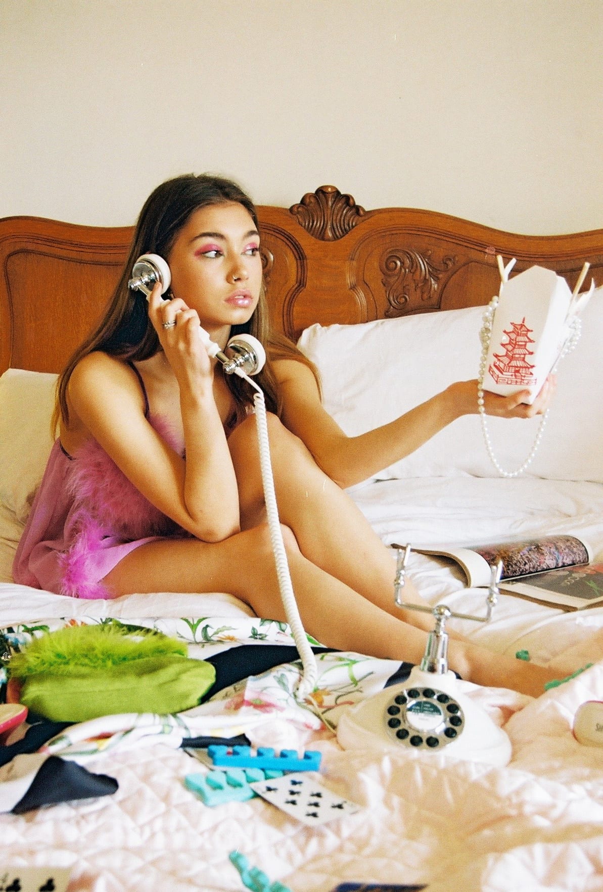
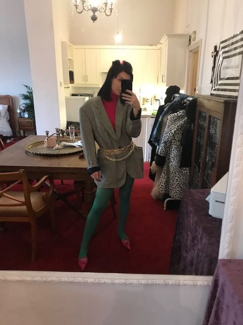
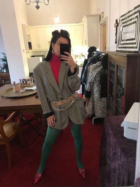
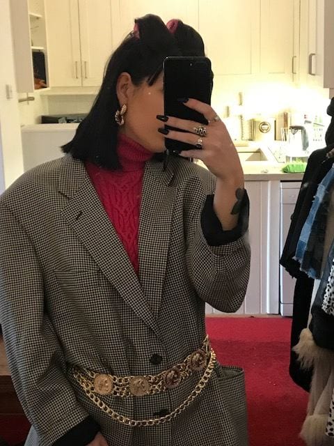
I have previously studied this painting for my past research project, where i took away the element of the pattern structure and how various parts of the painting is more importantly highlighted with pattern and other areas not so much. I want to develop this idea of beauty furthermore for this final shoot, especially after feeling like i had quite a succesfull shoot previously depicting the beauty technqiues within women’s routines. I loved the retro-glamour feel the styling and location showcased for the previous shoot and definitely want to keep running with this for my last shoot. This is because i feel most comfortable portraying these past era’s through my styling, i can reference many of my favourite designers such as Gucci for one last time and lastly, i am so eager to use this chosen location which will really identify the key theme of beauty in someway.

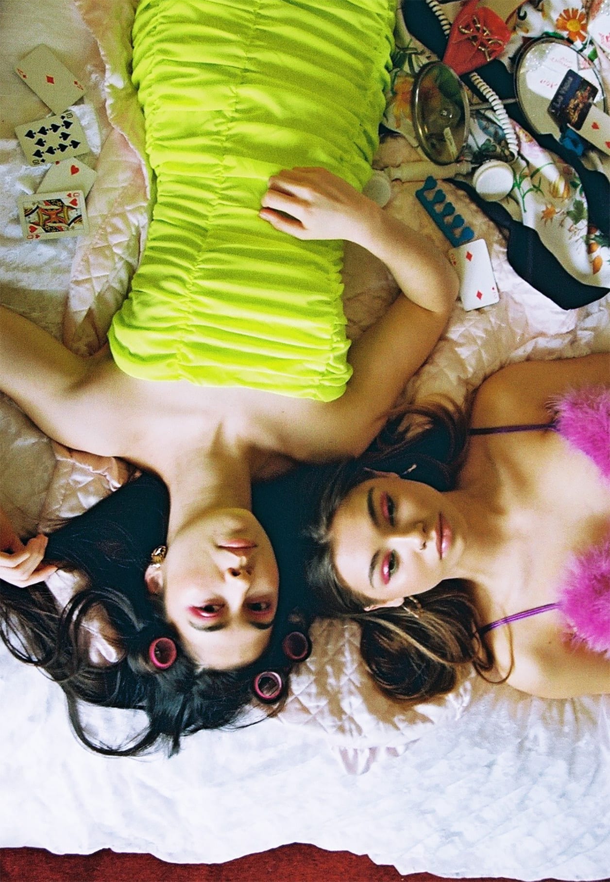
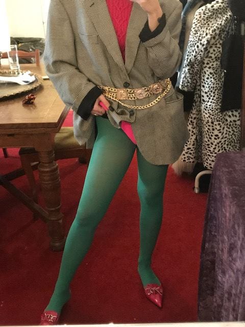
However, from this chosen Renaissance painting, i want to re-do the same element i chose last term. This is just because the shoot was quite dissapointing in terms of structure and as this is one of my favourite Botticelli paintings – it should be a very important shoot. Therefore, pattern will also be filtered through this overall developing image of beauty and i will showcase the pattern balance through the styling techniques. To really modernise this concept but enable the outcomes to remain in this retro effect, i could use animal print as the key focus pattern which i could clash and balance out in similar ways to this image – of which i failed at when interpreting this painting last time. Looking into retro aesthetics through fashion editorials would be best effective for me to produce successful styling that reflects my own ideas and also the pattern structure that i have taken influence from, from this painting.

FINALS


Unfortunately, this site won’t allow me to place the images in a better way so in reality, they would be placed a lot different. This has happened with all the finals i have shown on my blog 🙁