
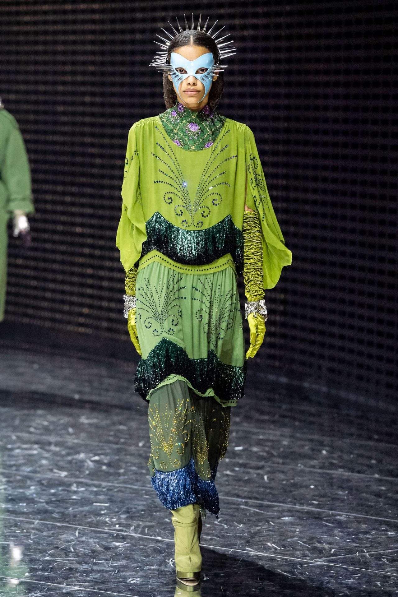
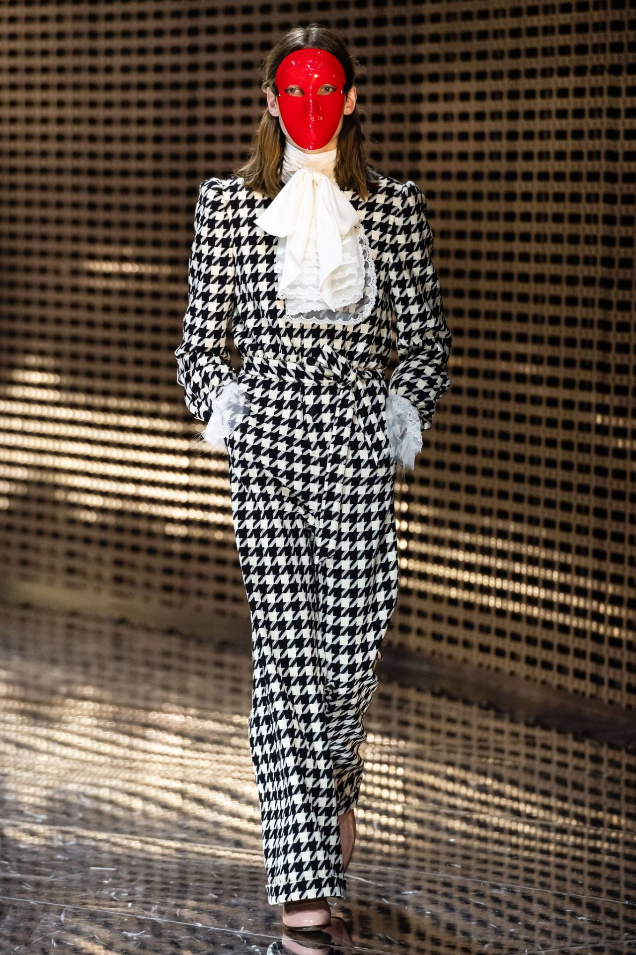
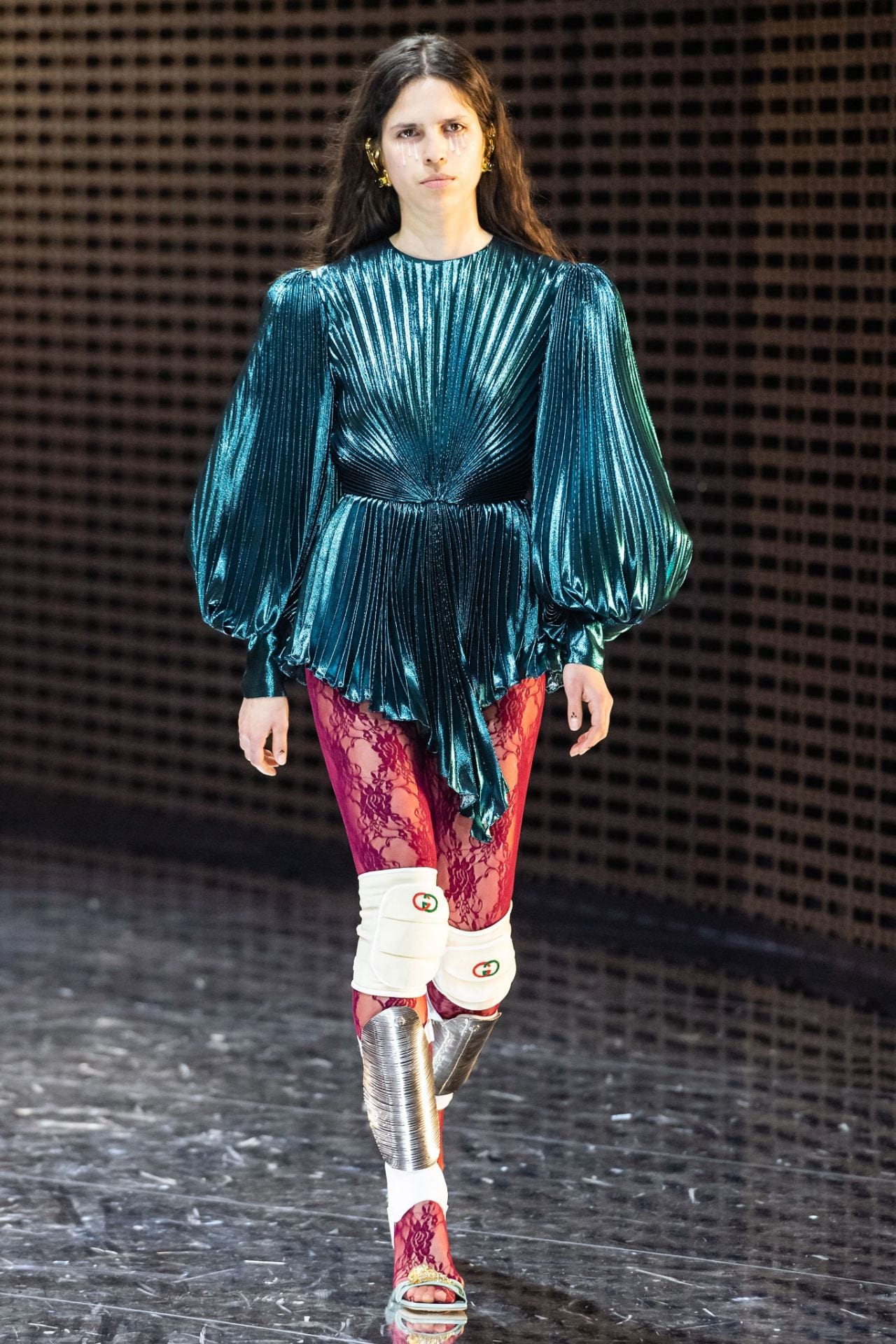
This runway is the exact sense of styling i want to portray in my shoot. The use of bold block colour that runs from head to toe, contrasting each outfit’s garment with the next. I absolutely love how Gucci manage to break through gender boundaries and although this isnt the issue i want to achieve in the shoot, somehow i think using similar prints to what is shown here may lead it this way. The outfits shown here reflect a very obvious 80’s era with careful thought on silhouette, using shoulder pads and gold chain mini belts that tighten the waist in a completely new direction. The contrast between glam and sport here is also something i noticed as it is seen as a very unconventional styling addition, particularly the knee caps. The signature look of block, pattern tights i want to use in my own shoot as it not only becoming a very typical technique of mine, but it is becoming a very ontrend idea and overall, help filter through modern day aspects of a past era fashion trend. Previously, i spoke of an editorial that had been styled using bold prints against block colour, typical of retro eras and ones of which would help pull through a notion of cinema – probably because the styling would compliment styling of photography. So, i think using a print such as this large, excessive dog tooth with block colours that are used religiously without is an effective idea. I also want to try and keep the location and props within the shoot a similar colour to the clothes so that the entire image coordinates.