ARMANI JEANS COMMERCIAL


Further research into a 90’s style approach for the shoot i came across this Armani fashion film which depicts a couple, obviously wearing denim, running around a rooftop in the rain. Although location wise, this is something completely different to what i want to achieve, how playful and light-hearted the couple are portrayed to be is the element i want to take away. I just feel that this effect will fit strongly within my magazine’s overall theme.

90S LEVI FILM


I felt that this film for Levi’s created in the 90s was a helpful example of how the ad can become quite playful but still prioritize advertising the brand. It also shows the similar aesthetic that i want to achieve through film photography, with grainy layering to present an idea of maybe pulling from an old archive of my chosen brand.

90S CALVIN KLEIN IN VOGUE


Calvin Klein is obviously a very well known brand for its denim garments and has been, clearly from these examples, for a long period of time. I am always drawn to 90’s CK ads and in particular these, due to the simple styling of plain t-shirts and jeans that still remain really effective and obvious of the era. Similar to the previous example of denim brands, this type of styling remains very school-like and casual, yet very playful which i think will work best for this theme. Both men and women could wear similar examples of these garments and i can mix and match with the clothing for both gender models to help emphasize the theme of androgyny. These have clearly been scanned in from a vintage Vogue and most probably taken on film. However, i am interested in taking the photos in a similar way to suggest a very vintage aesthetic like Calvin Klein’a here. This could also help represent the eccentric style that i want to make obvious throughout the magazine.

MARITHE ET FRANCOIS GIRBAUD


After discussing this topic with jules in my tutorial and exploring a potential masters degree later on, it became obvious i should definitely create adverts that express either my personal style or ones that depict brands from the master’s location – such as Paris. I found this really helpful, especially in expanding my knowledge further than just my favourite designers or ones that suit my style best. Marithe & Francois Girbaud is a french label that was founded by two stylists; which makes it even more apparent to my studies which i think mainly focuses on denimwear. Compared to many denim brands, i found their adverts to be very interesting and of a very unique nature. I am still unsure of why these images are taken to seem upside down, however it immediately caught my interest and straight away i became aware of the focus of denim. I also like how the colour scheme is kept consistent through terms of styling, clothing and the backdrop, really emphasizing a tone of voice for the brand. The compositioning of the images are also well thought about and very obvious to me, where garments of block colour are positioned depending on the contrast to the background. After examining these images, i want to approach this theme with a quite playful aesthetic and composition. To me, i get a type of school like feel to Marithe et Francois Girbaud’s ads here with a very retro style. Maybe this is because of the style of image but it is an idea that i want to further into.

A.P.C


A.P.C is a french, ready to wear brand that is best known for its clean and simple designs where their logo is nearly of prime focus in many of the garments. Very similar to Carhartt, the brand’s characteristics seem like working menswear or takes inspiration from military garments which is an aspect of the brand that i think is really appealing, especially when it comes down to androgynous styling. These images showcase various ads from the brand that i feel really express their best androgynous garments on both men and women. This type of overall made from denim could be an effective approach in my styling to really get the point across and i think that having both models in similar garments like this would compliment each other. Looking further into how such a big brand like A.P.C accomplishes this type of androgynous clothing through denim, in particular, should be useful for me to really identify a specific brand for an advert and also in achieving the best possible androgynous wear.

ADER ERROR ADS


Again, it has been really difficult to discover any type of androgynous wear surrounding males, especially using male models. I think that this is probably a really misunderstood topic and within the industry itself, only surrounds a sort of tom boy styled girl wearing male clothing. However, it should cross both genders. Ader Error is a brand that i actually use a lot throughout my work and personal style. It is a Korean brand that primarily focuses on breaking the barriers of gender roles and helps contribute to genderless clothing in fashion. These images i chose to show mainly because of the androgynous looking model, who at first glance is a mystery to whether they are male or female. The model shows signs of both gender characterstics and is emphasized through the styling on top. I do however feel that a blazer set is a very obvious sign of gender neutral clothing and is a styling technique that i seem to always fall back on when styling menswear. So, after recognising this approach from Ader Error, i definitely want to encourage myself to do something different from this obvious look. I do like how every aspect of Ader Error challenges gender roles even to the shoes and jeans. Denim could be a very useful approach to achieving androgynous styling if done effectively and additionally, i can involve a really eccentric denim brand from a location that i have said my future magazine will be sold in – in my media pack. I also feel that it could be made into some kind of advert to really address this. Next i think i should look into surrounding ads or brands that approach denimwear in an androgynous way.

ID MAGAZINE

“You got this girl”


It seems to be quite difficult to find any fashion editorials in particular that cover both male and female androgynous themes, instead female looks are becoming very common within my research. Maybe this is because of how menswear is only now becoming a much more explored fashion in the industry or that gender terms are still very uncommon within fashion and this is how it is starting to open? Regardless, throughout these editorials, similar techniques occur on how the stylist has shown an androgynous feel. Layering of various garments seems to be the most obvious technique that stands out for me when it comes to my research and should be reflected within my shoot massively. I also really like this idea of oversized jeans that are clearly a typical menswear look, but recently they have become a hot trend for women. Looking into blending these items that both have male and female characterstics could be ideal for exploring androgyny.

TEETH MAGAZINE

“Im on my own again”


When i came across this editorial, i felt that i can really relate most of my styling work to date to these images. They oppose a very unconventional, unique style with the use of layering and how some garments are made to feel unfinished – an idea that i always enjoy playing on too. But, in terms of androgyny i thought that not only has Teeth portrayed a very obvious androgynous model but uses both typical feminine and masculine clothing to blend within one another such as the shoulder padded blazer under a string back corset. Additionally, the style of photography i became very aware of which seems to really highlight all parts of the model, facual and body areas, especially against the strong plain background. I should definitely get into contact with a photographer to ask about this sort of photography as i think it could work really well for an advert for the magazine and probably need to know more about it in general.

WSJ MAGAZINE MARCH 2017


I felt that this editorial was a perfect example in portraying androgyny through a female styling or perspective. Although the term androgyny doesn’t just support females who wear masculine and feminine clothing, it supports all genders in becoming a bit more neutral within their clothing so this editorial could have maybe played on that too. However, i was initially drawn to this image because of the silhouette created with the oversized shirts and long cuffs that hang upon the end of the sleeves. The broad top half now created by the clothing used helps create such a strong approach to androgynous clothing and the viewer becomes aware immediately of the theme behind the shoot. The oversized shirt creates a huge contrast between the top half of the body and the bottom half, almost highlighting this androgynous theme of blending both feminine and masculine looks. I also like how the clothes look as though they have been pulled out from possibly her dads or a much taller or larger man’s wardrobe, as they are tied so tightly around her waist and the shirt sits on her top half with such big spaceual areas. I feel that this loose fit is a really effective styling technique and almost adds layers within itself because of the oversized garments and how they fall on the model’s body.

ANDROGYNY IN RENAISSANCE ART


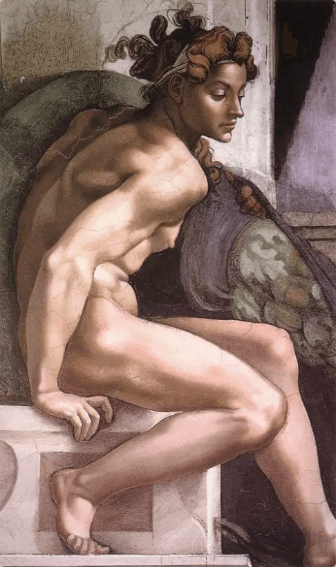
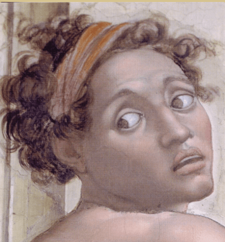
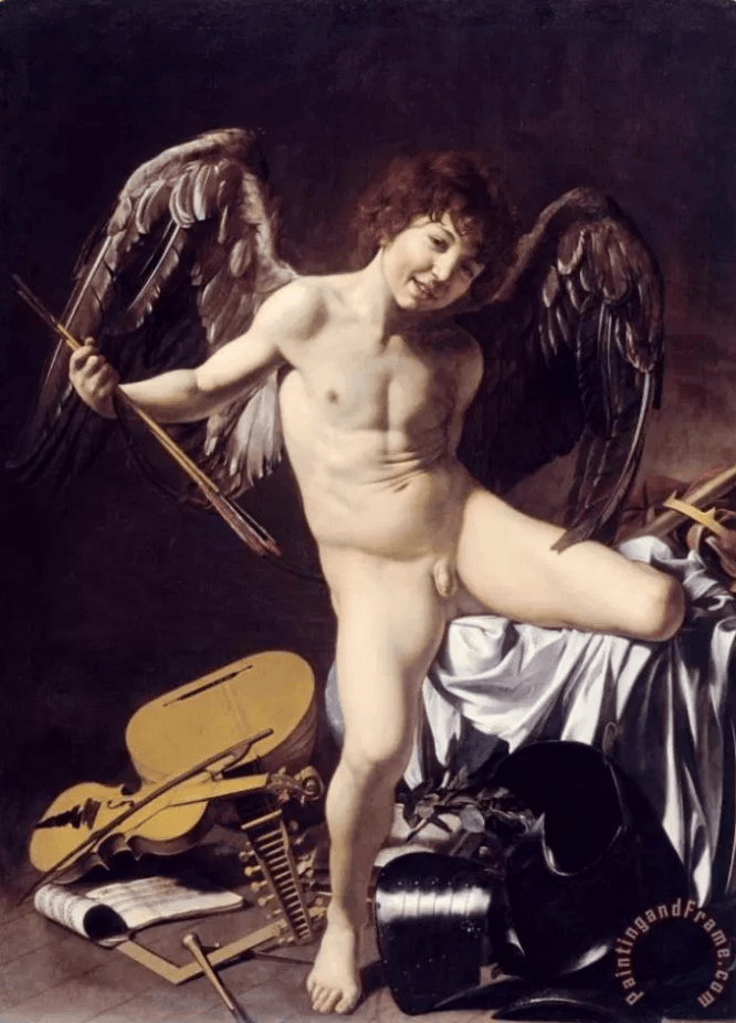
Throughout Renaissance art, the figure of angels or cupids are very common in many different painters work. However, they were purposely made to seem androgynous in how they were pictured. Their genitals may show in some circumstances but are then contradicted with opposing gender features such as larger breasts or feminine/masculine type hair. For example here, “Cupid Carving His Bow” shows a figure with wide, fleshy hips and a very narrow upper body – showing hints of breast below the upper arm. Cupid here may seem to be painted quite provocatively, contrasting against the previous paintings idea of the angel needing to seem very peaceful with no sexual occurrence. But, in an overall image, the depiction of a cherub or cupid remains commonly neutral and had to be shown with no sexual needs around the other characters.

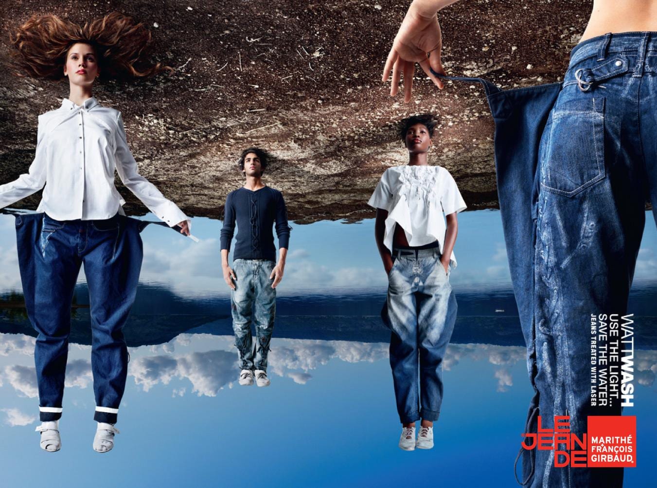
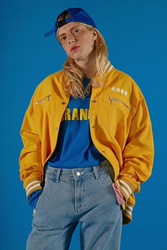
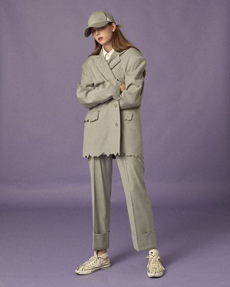
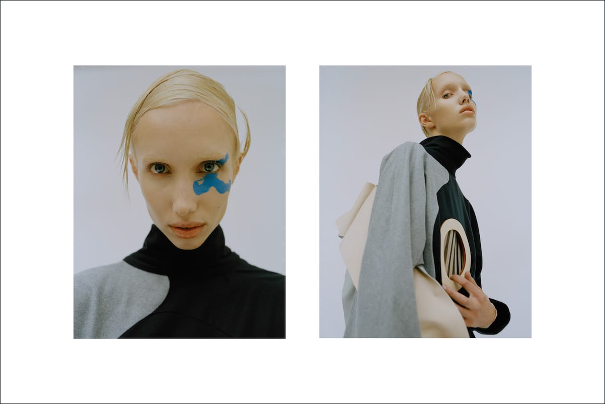
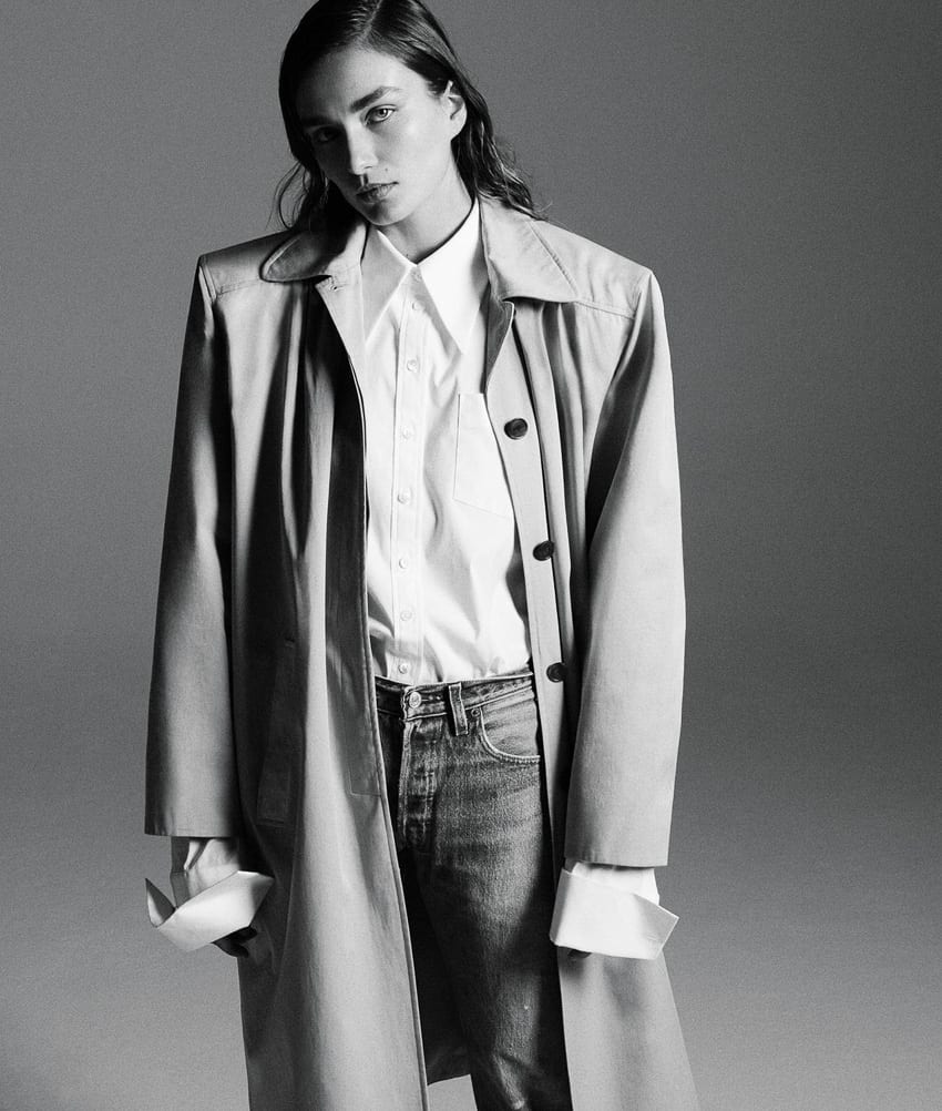
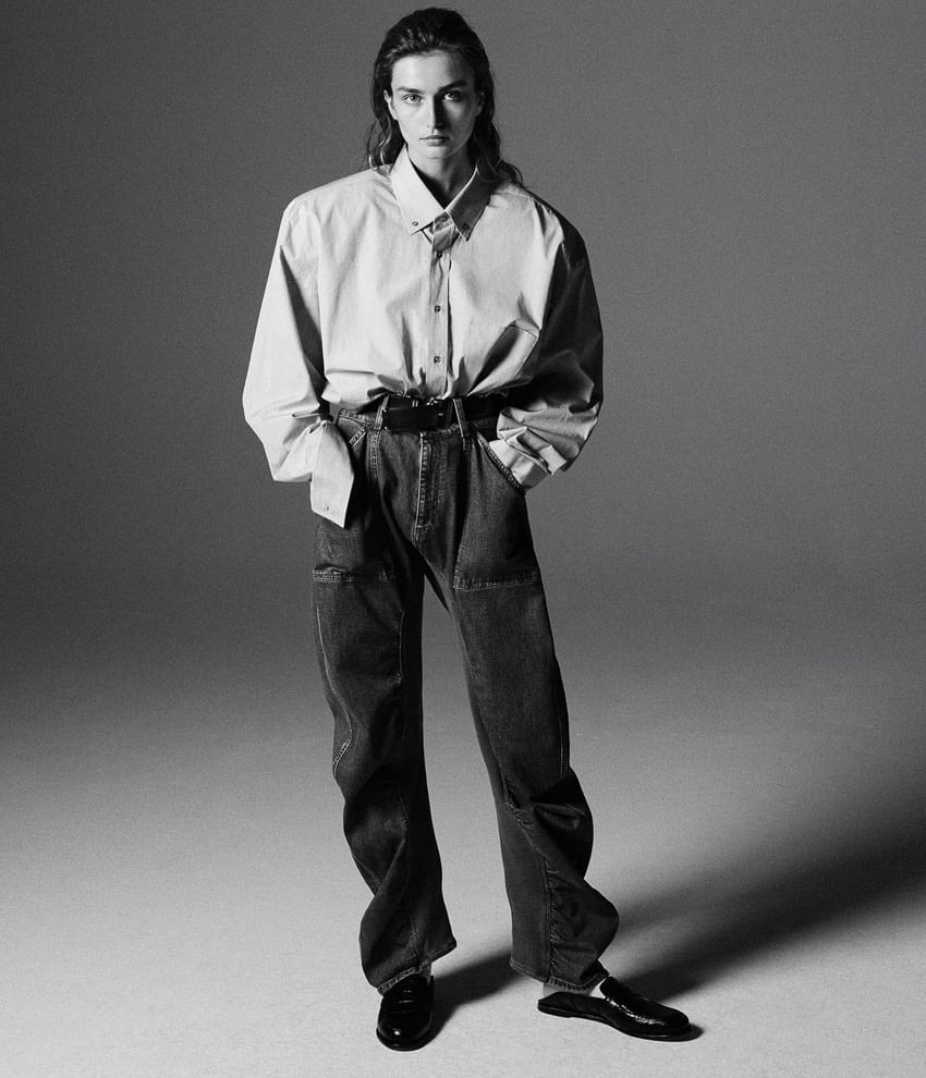
I think focusing on an androgynous theme that i could take from the painting will be an ideal theme to really push my personal style and styling techniques into my present work. Looking at designers who base their work around these concepts or images that present an androgynous or even a genderless role would be really beneficial. I immediately think of recently found brands such as Art School who push genderless roles into their runways and garments. Also, Helmut Lang or Jean Paul Gaultier who are obviously very known brands that can be approached as androgynous, developing clothing for both men and women to wear.