
“ADORATION IN THE FOREST”
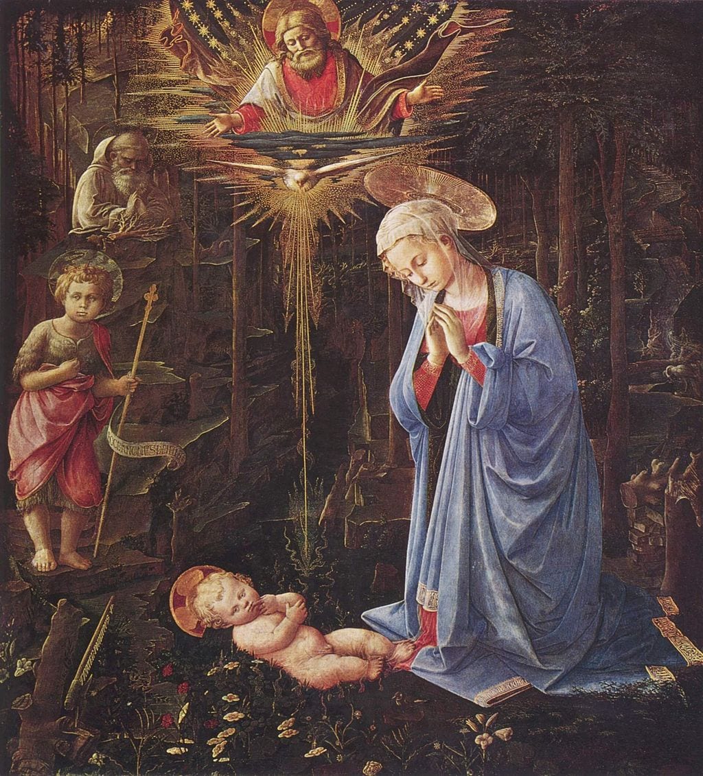
Lippi was an Italian painter, born in Florence in 1406. From my research it has become evident that most of his history and upbringing – even possible reasons behind concepts of his paintings – came from being passed throughout highly religious families as a child. This painting in particular has always been of interest to me, primarily due to its very dark and gloomy atmosphere of which i found very different to say, Botticelli’s painting. Not only this immediate aesthetic but after researching further into a more conceptual theme behind the painting, it became obvious that his depiction of the Nativity steers different from traditional standards. This includes the subject matter and of course, the characters involved. It lacks characters such as Joseph, Kings or Shepherds and even the extent of any animal iconically involved in this story. I found this interesting as it creates an entirely new, unique story for such a historic setting. One quote i found that i loved was that “Lippi creates a whole set of mysteries, and then preserves them”. Furthermore, Lippi’s style was majorly influenced by a previous artist named ‘Masaccio’ who identified his work as a realistic form of Biblical movements. The characters used amongst his paintings were only depicted if they could be formed as realistic. Apparently, this way of work helped Filippo progress through the Renaissance. It gave him a new way of thinking about representation, and how dark, moody shadows could be shown as a most important feature to highlight the placement of figures or objects or landscapes. This is most probably the reason behind why he leaves out so many traditional characters within this painting.
Not only did i find this concept fascinating, but also the actual historic movement of the physical painting itself. As it was once painted by Lippi for one of the wealthiest bankers of the Renaissance period, in Florence, named Cosimo De Medici which was a very common idea of this time. However, it later on had a very turbulent history. Hitler ordered this specific painting to be hidden sometime throughout WW2 and it became part of the story of a mutiny in the US Army – of which they refused. The gloomy background behind the transitions of movement in physical painting is the most relevant matter that stands out for me to develop my own take on. I love how mysterious and dark the entire painting is, really contrasting from my first painting development of “The Birth of Venus”. It could be interesting to play around with this idea of gothic appearances and highlighting shadows and golden lighting to express figures within my photography. The colour scheme should be carefully considered because of the focus on golden lighting and dark shadows, especially with the interesting glimpses of reds throughout too. Looking into my photographer potentially using red gel lighting could be a great idea in replicating something so subtle in this painting, but making it quite a big deal in my own work.


