CHARLOTTE KNOWLES

S/S 19


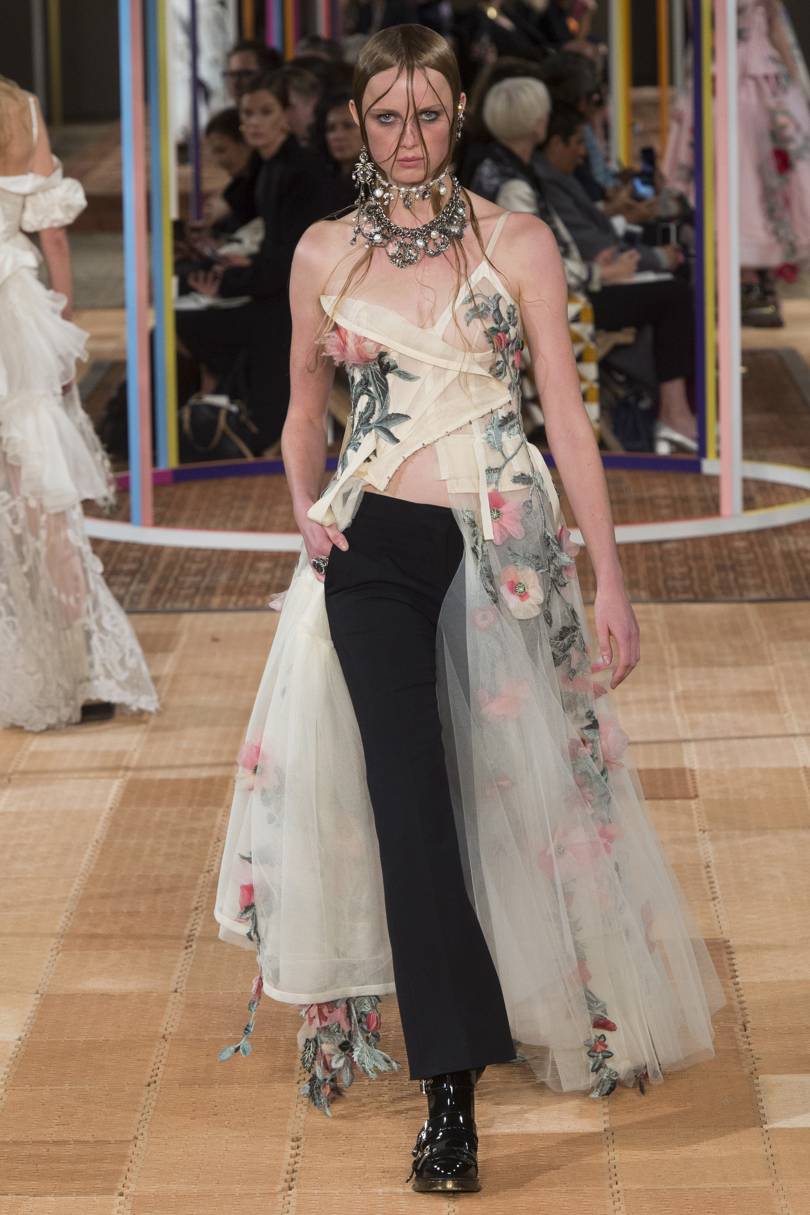
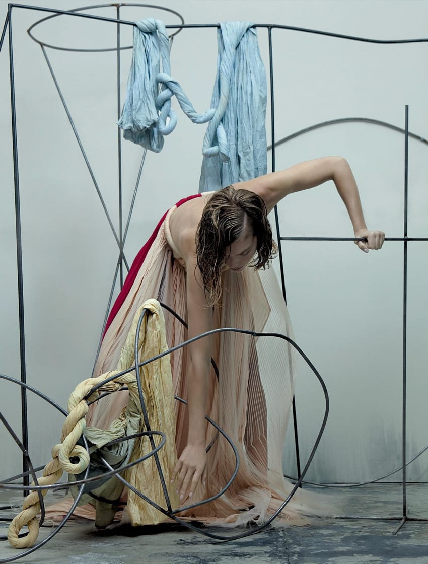
Charlotte Knowle’s is a really contemporary vision of deconstructed clothing, where her themes are mainly to reinvent garments that would be most likely appear for the male gaze. She aims to reinvent these typical designs into ones women can feel more comfortable in and more of a casual, everyday item, focusing mainly on lingerie and swimwear. I have always been interested in how she creates these designs and she is a designer that comes up religiously in my research. But, for this shoot, i want to understand the various types of garments she places on the body that manage to connect through use of tie strings. This could be such an effective way in executing my theme as these strings could represent trying to connect the segments of each deconstruction made within the clothing, meaning women’s standards are being broken through. I really like how each part of the body is almost cut up into pieces using the different layers of clothing. The variation of materials and opacities are able to create seperate dimensions for each part of the body and overall, i think it is promising for a futuristic approach to deconstructed fashion.

ALEXANDER MCQUEEN

S/S 18


This collection was actually based around the aesthetics of England and its typical aspects within the summer’s countryside. This idea is really obvious throughout the looks due to the materials focused on; lace, silk and even within the smaller details like the hanging embellishments. However, the deconstructed coats and bustier tops stood out for me as most relevant to my project. I find the silhouettes of the garments, particularly this image on the left to be most inspiring. I really like how the lace underlays the silk bustier, but covers the entire length of the body, leading to the floor. To deconstruct my garments, i think it would be useful in examining these as i practice styling. This is because of the interesting silhouettes made from the clothing and may help me make the outfits more fashionable, instead of really conceptual and unusual. I also like this use of layering a dress or long top over trousers and building up multiple bottom or top clothing ideas on top of one another. Maybe this could work well with skirts and shorts too and i now want to get onto experimenting with these ideas to create something similar.

MAISON MARGIELA

S/S 90


Since establishing in Paris in 1989, Margiela has always conveyed such a strict, avant garde approach to the fashion the brand produces. It was always based on discreet principles and concepts that maybe aren’t as clear as other brands but still very responsive and favored. What i found interesting about this collection – which was one of the first outcomes for the brand – is that it truly does represent such an unfinished image. Where there are a range of unusual fabrics such as plastic, overlayed with frayed white stitching from a cut up shirt, it creates such a strict identity for the designer brand. It is recognizable still today of the creative talent built from within Margiela and i find this collection really inspiring. I am always fond on androgynous clothing and representing this through my styling techniques so this brand is always a major inspiration. Although, this theme isn’t something i am focusing on for this exact shoot, i am also inspired by how the clothing is still very high end – image wise – and how the females shown in these images seem confident and content within wearing such oversized garments that are excessively layered with random parts of fabrics falling from either side. This is something that links to my theme of women’s standards made from society, as i want my styling to present the model in a really content form where the deconstruction of the clothing isnt made aware.

JESSICA WALSH

S/S 15


Looking into how this technique of using excess materials effectively. I really like how the strings are falling to the floor from various different layers that the model is wearing. They become part of the image without it looking unfinished or not really understood. Hopefully, i can play around with my garments, especially if i am aiming to cut and sew into them myself, and the outcome will achieve unfinished additions like these pieces of string.

SAMUEL YANG MA SKETCHBOOK DEVELOPMENT


These images taken from inside a developing sketchbook are obviously ones that have been scanned in and then various textures and materials have been added on top to create diversity in levels and to probably show more detailed imaginations of the clothing designs. However, i was immediately attracted to the bold, black shapes that are sat around the figure on the backdrop and sometimes within the clothing designs. The contrast between the black and white tones is probably the initial attraction i noticed, but i also feel it could be used in my work for a more subtle response to deconstruct a backdrop. Similar to how the designer has added the materials on after the images have been scanned or copied, i could add the materials – say blocks of cardboard – around the model in position to how they are stood. This would allow the focus to really be found on the clothing and concept of society’s standards, but also have a very imaginative background. It may not work but i think i will experiment beforehand!

ARCHITECTURE INSPOS


I came across these two architect drawings that would be used to design a landscape or building before the creation of it. As i noticed, each one has layers of overlapping shapes and lines with lots of variations of tones in colour, which is why i was drawn to the aesthetics of each one. I felt they could be useful in helping me depict a deconstructed backdrop as i could follow similar lines and positions for my chosen material and replicate similar composition to the painting through planned architecture forms. They are obviously the initial steps to construct a building or whatever is going to be made, and i want to do the exact opposite and deconstruct, therefore looking into their forms could be really helpful.

NUMERO MAGAZINE


I have started looking into various backdrops and locations that could be ideal for getting across a deconstructed theme without taking the attention from the clothing and concept away. I thought it could be an effective idea in trying to bring the composition of the Renaissance painting into my work as Raphael’s packed out aesthetic is a key technique of his movement in work. I thought maybe i could create a setting or backdrop that matches the character’s positions around the main focus character within the painting which would allow his painting techniques to filter through more into my work and the theme of the Renaissance would become more obvious this way. I was interested in the shapes created with the metal back drop here, almost resembling an instrument that is of thick barbed wire. The shapes allow the fabrics and textures to become a lot more fluid through the composition which i need to consider when deconstructing my garments so they dont become too sharp and apparent – more like they are supposed to be like that. This could also be achieved by using a setting that seems quite packed out with various layers such as an art studio with frames or cardboard. Maybe i need to experiment with own made backdrops where i have used similar fabrics blended into it like these images have, so it ties the pictures together instead of creating seperate levels between model, clothing and setting.

STYLING TESTS

Flora Symmons “Consumerism” Theme

Shot by Flora & styled by myself


I have recently styled for a former student who’s project surrounded the theme of consumerism and excessive purchasing of clothing. This theme actually can fit into this running theme for my next shoot due to the idea of standards for women and maybe this is why consumerism is at a prime when it comes to fashion buying. However, it was more the styling i wanted to focus on here and how i have established a slight style for layering – linking to my research on how designers have layered and created new functions for their garments. I wanted to make sure in each outfit i exaggerated on either the type of garment, the pattern or the colour to really get across function and the photographer’s initial theme of consumerism. I can now reflect on these ideas and put them to use for this project as i feel the styling is quite successful in replicating a theme of constructing a person through the various elements of styling. Adding and taking away parts of the clothing here creates a completely new outlook for the original piece of clothing, which really helps me now because i can see what works and what didn’t so much leading to a more successful outcome.

YOHJI YAMAMOTO

RUNWAYS


Yohji typically acts on the theme of beauty and sexualness for his runways, showing the feminitiy of the women through subtle glances of skin and delicate silhouettes. He states “showing the body is very delicate. When you show it too much, it becomes nothing” which is something i should consider when thinking to cut into my garments and actually strip back a women’s appearance through terms of clothing. I found it interesting how the outfits are styled on his runways specifically, as they do show glances of skin, but it is more how he does this with the use of re-functioning a garment’s purpose or positioning them very uniquely on the body. Deconstructivness is subtly shown through each runway from this idea but in a much more sophisticated sense, maybe even more luxurious than the previous examples. I should look into designers who use this technique too but in a much more high-end, glamour sense to determine which i think would worst best for my theme and magazine content. It would be more beneficial for my future work for it to seem possibly more high fashion but with the edge of this on-going unconventional theme.

YOHJI YAMAMOTO

EDITORIAL BY MATTHIAS PASQUET


These images showcase Yamamoto’s designs without them actually being worn. They are either hung from trees, scattered on the ground or layered on top of one another to create a human like figure. I thought it was interesting because it shows how clothing can seem deconstructed even without a figure wearing them. This way, it highlights the various shapes that are naturally formed within the clothing., the creases and bumps that would normally fall flat on a model. I just felt it was a really individual way of showcasing work and for me, an influence on how to dress the model in the clothing to portray this sort of thrown on aesthetic.