ANTIDOTE F/W 15


Developing research into fashion editorials that have used candle light has been difficult which is maybe telling me to stay away from this subject, however it will be useful in experimenting with the idea in a chosen location to be sure. This effect seems to be made from red lighting or even a very warm yellow light and then later edited through post-production. This could be a more effective way in relating my work to the painting aesthetic wise, but also encouraging focus on the styling instead of the powerful candle light.


MEREDITH ROSE “PERSONAL”


Immeditely thinking about location, i thought about how the lighting could be used as a key factor in replicating the painting. Considering how the story surrounds a candle, candle light to compliment a very intimate setting could work really well in creating a very mysterious atmopshere. To me, these images portray a mood of betrayal or sorrow with the only source of light being candles. It also helps highlight the focus on the red or warm colours used throughout the series. However, I am unsure whether candle light photography will be promising and may take away focus on the fashion – which is a main source of content for the magazine.

JACOPO ZUCCHI

AMOR AND PSYCHE


This painting depicts goddess ‘Psyche’ and her husband, Amor. It some greek traditions to is said to have been a secret relationship, where when finally revealed family members of Psyche grew envious towards and became jealous of her lifestyle – when they started to meddle between both characters. The initial story behind this painting is that Psyche’s sisters developed jealousy towards her relationship and told Psyche that her husband must be a snake and that he had been lying throughout their marriage. The goddess then dismissed her trust for her husband and whilst he was sleeping in the dark, she held a lit candle over him to study whether he was truthfully human or snake. The candle light dripped over him, waking him to her standing over him. This made him angry and he abruptly left. For days, Psyche searched for Amor in distress and knew that she had to find him to prove her love. However, she could never see him, only hearing his voice chanting ‘love cannot live without trust’.

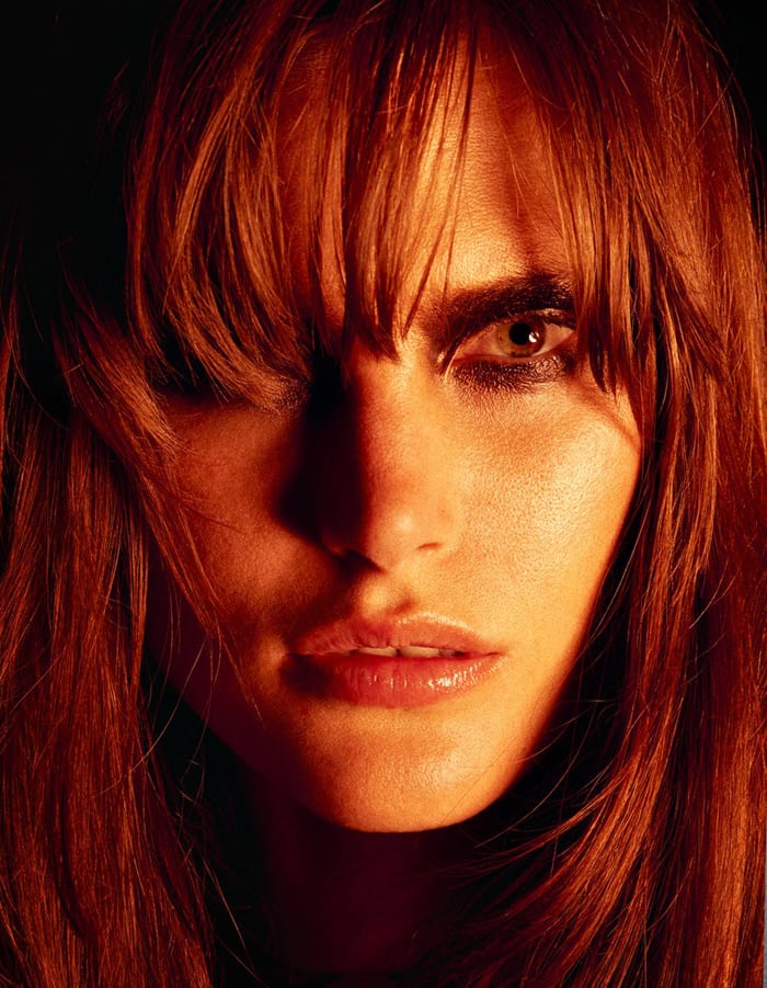
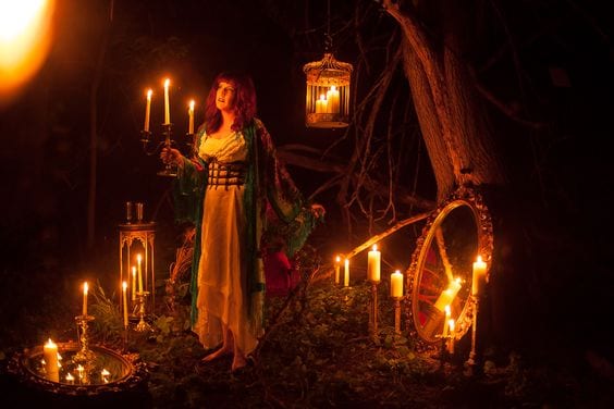
The story continues further surrounding their relationship and is a very common myth within greek history. Psyche is supposedly meant to also be an allegory subject, meaning the actual mind or soul of your body; not your actual brain. So, the goddess could actually be invisible or imaginary – only standing for someones worship towards truthful thoughts or spiritual actions. Not only is the story interesting to me, but how Zucchi has portrayed such a bright painting in a supposedly candle lit room. I feel that this could be a really effective link in recreating the painting into my work as candle lighting can create a really romantic mood in photography and overall, highlight this theme of love. lust, possibly even their betrayal too. My outcome could end up with a more gothic approach to renaissance art due to its particular aesthetic shown here and can give my work a different dimension, something completely different to my previous shoot – in regard to colour, lighting and actual theme.

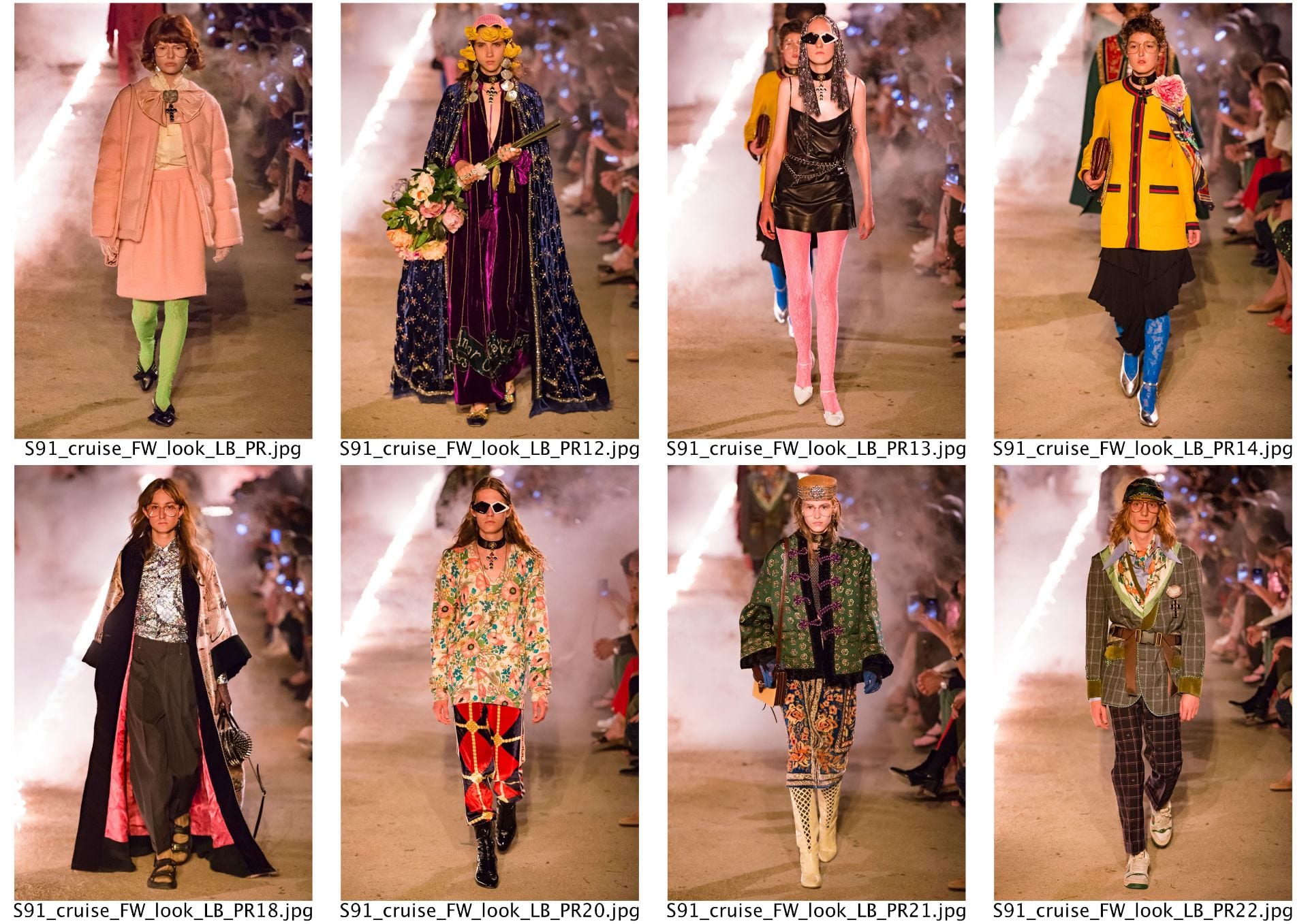
Additionally, playing around with this idea of ‘love cannot live without trust’ in text format could be effective in linking both pieces of work. This could filter through a more modern approach as it could seem quite gothic and dark; but making it more fashionable in the sense of how Gucci uses text or subtitles in their campaigns now. There are clearly many objects or props painted too which should be symbolic of something relating to the story and i should look into this. I already know from previous research, white flowers typically are meant to signify nostalgia or a sense of longing for the past. Either these specifically or the theme of nostalgia could be worked on in addition to my other motives as i feel it is a stronger surrounding idea i can take from the painting to develop on through my styling.

NEITH NYER S/S 19


Nyer’s designs are a true inspiration for me and typically this lookbook where the functions of general garments have been flipped and changed into a completely new idea. Not only is the complete aesthetic and colour scheme of this season complimentary to my own idea from The Birth of Venus, but it shows signs of modernising traditional garments into the designers own ideas. The choice of layering here is something i want to now consider along with my swimwear garments as by placing a mixture of swimming garments on top of one another can create a sense of chaos but in an effective way. It is also a very modern and now trend to introduce multiple clashing layers into an outfit and this way i would be filtering through contemporary fashion which is an objective for my magazine’s content too.

IOANNES EU S/S 19


Realising that the potential styling for this shoot is developing a style i am not that keen on anymore and one that is becoming completely different to my typical styling choices, i decided to look into designers who use a type of deconstruction to make their garments work. Ioannes’ designs show off a contemporary style of swimwear which also looks as if it is modernising standard safari or similar location wear. I love how eccentric and exaggerated the patterened gloves are which contrast against the entire gym like theme of the designs. The layering is what mainly stands out to me from this lookbook as although the majority of what is underneath the outside clothing layer is still shown, the garments placed on top act with a new function, for example a vest top as a layering skirt. This is something im definitely going to take away to develop the retro styling of the shoot to something that shows more of my personality.

VERSACE SPRING 18


Amongst this collection, i find myself being drawn to the subtlety of the last three looks, where the pastel colour is prioritised throughout the entire outfit and portrays such an angelic mood. The colour balance of the collection relates to the Birth of Venus entirely, through use of blue and pink shades; possibly reflecting this typical style of femininity. The prints Donatella chose to adapt into this collection were taken from Versace’s archives from 91-95, a period where his work centralised his most iconic designs and his “feminist learnings”. The overuse of textile prints in the collection is something i want to maintain throughout my looks because it seems like pastel colour schemes are more able to adjust to clashing patterns and tie an entire outfit together. I typically work with as little pattern as possible, due to personal style choice, so this technique will be interesting for me to play around with and hopefully develop for later careers. Although the textile print is very on trend in current fashion and links to the 80s/90s more, subtle hints of this chain type pattern could be filtered through to make characteristic links towards my inspo designers.

GUCCI RESORT 19


Gucci seems to be a constant and relevant source for all my work through this year and when it comes to studying use of pattern balance, the resort 19 showcases various forms of this. Not only the pattern, but the link towards the 60’s could be quite present here due to the block coloured tights in bold colour of which was a major trend in this period. Obviously, Gucci is known for their reflections of past historic movements, even showing signs of typical renaissance developments but this runway in particular manages to depict many signs of the 60s. In addition to the tights, the retro, floral designs layered on shirts and jackets that clash with other garments on the model, to me, reminds viewers of a typical old-fashioned carpet or sofa. Something evident to see in vintage inspired editorials or even films as it is a factor for millennials that will stick out from these past periods. I have now confirmed that this style of floral textiles is what i should look out for when sourcing my garments, ones that hopefully could match block coloured tights along with head garments that also reflect both modern day and 60’s trends.

MARNI SPRING 18


According to designer Francesco Riso, the inspiration for these designs actually came from “two english gardens in the eyes of Tim Burton” – completely irrelevant to my actual theme, however the creativeness and vibrancy of this image is completely an aesthetic i want to fulfill. Writers have also shared that this runway shared a celebration of fashion history, from the 1920s to current day – so within this, the 60’s period is also considered. I felt that this runway was relevant to my idea because of the carefully shaped bodice tops thats could also have similarities to 60s period swimwear. The curved waist and widened bottoms reflect the standard swimsuit from this era where womens curves were of main priority in fashion. Although this idea of femininity isn’t conventional to modern day interpretation of beauty, curve structure of the models posture is something that i aim to achieve in my work through the way they are positioned. This could be in really odd standing positions or entirely pushed together to create one big form. The specific pattern use on the designs is another element that i will take influence from as i feel it is perfect for my idea, reflecting the same colours and textiles with priority of pastel or lighter colours and then subtle hints of boldness to contrast.

MARC JACOBS SPRING 18


As i want to focus primarily around styling for my FMP, i need to start looking closely at the vogue runways for insporation and designs that are relevant to my research. There are many links to the 60’s period through recent and previous trends but mainly surrounding the source of actual fabrics like corduroy or velvet. These are useful in developing ideas for the possible structure of an outfit, however, i need more influence on actual pattern and how pattern is being used in modern day fashion. Marc Jacob’s spring 18 runway showcases a major use of striking patterns that have a similar use of clashing colours and designs as the look i would like to achieve. The written summary of the show by Jacobs stated “reimagining of seasons past somewhere beyond the urban landscape of New York City”. This could represent the influence he had taken from nature surrounding city like locations or to me, it represented how he has taken inspo from past seasons such as the 60’s itself. I am really fond of the eccentric towel or turban shaped hats that coordinate with the outfits and how they are even more exaggerated by the oversized accessories the model holds. I also like how the way the fabric falls over the figure of the model, especially on the one shouldered outfits. Adjusting this idea of oversized fabric to fit within my swimwear theme could be effective in filtering through the huge throw that the ‘Hora of Spring’ character holds in the original painting.