MAGAZINE LAYOUTS
.. FRONT COVERS ..
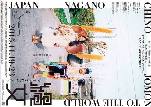
From my own opinion, simplistic covers work best: ones which prioritise the masthead and tagline whilst also managing to promote the theme inside. These layouts act perfectly for a base where the font is bold and statement – all in the same colour – so the front image is shown through. The colour swatch is made clear for the inside of the magazine by its little use of either bright, bold or dark shades. Undoubtedly, i will take how each magazine adjusts to a target audience because of this – presuming a range of 18-30 years which is similar to my own.