These are the posts I want to put forward:
Language (Dis)Abilities and Representation
Language, Identity & Social Media
Discourse & Idiology
Week 1: Introduction
These are the posts I want to put forward:
Language (Dis)Abilities and Representation
Language, Identity & Social Media
Discourse & Idiology
Week 1: Introduction
https://www.telegraph.co.uk/education/2018/04/17/emojis-ruining-english-language-young-people-rely-communicate/


My comment:
The English language will forever be evolving in order to adapt to the modern climate. Like many living organisms, the ability to change is what enables it to survive. Modern communication is now instant. In most low register communication, conversations are short, swift, and to the point. This means that writers must find new ways to show meaning as efficiently as possible, and as they say “a picture is worth a thousand words”. Emojis are the fastest way to show meaning whilst only tapping once on the screen of your phone.
Although some may argue that the use of emojis is ruining the English language, leaving the newest generation with poor communication skills. However, the youth’s latest iconographical argot is simply a modern adaptation of what we all did in our younger days. Much like our parent, parents of today are out of the loop and do not like it.
My analysis:
My comment above argues that the introduction of emojis to the English language is simply a modern adaptation of how the younger generation uses images to communicate.
The positive simile, referring language to a living organism, is an example of pathos, as the audience creates a personal connection with language. The use of pathos increases the chances of the audience agreeing with the writer’s statement.
The following sentence “modern communication s now instant” presents a metaphor as if it was a fact (logos), giving the audience no opportunity to argue with the sentence. Furthermore, the short sentence structure demonstrates how fast information is presented in the modern ages.
After which I have used the term “low register communication” in order to increase my credibility. By including the jargon “low register” I am seen to have knowledge in the English language beyond the common speaker, creating ethos. This effect is echoed in a later sentence when stating ” the youth’s latest iconographical argot is simply a modern adaptation…”.
I do address the opposing view that emojis are ruining the English language, but I make it appear to be a hyperbolic view, held by those of the older generation who are “out of the loop” and are merely echoing the concerns of the generation before them. This reduces the credibility of the opposing view by making it relatable to most audiences who have experienced a battle on the language they used at a younger age.

I have chosen to create a flyer to promote an 80’s night at The Haunt in Brighton. The flyer shows white typography in a modern, funky font which suits the 80’s disco theme. The font size is significantly larger than the rest of the text on the flyer, this draws the audience’s attention to the key information.
Repeatedly using the number 8 links in with the 80’s theme, including the opening time of 8pm, the date “8 May” (which when transferred into a numerical date makes 8-05, looks like “80’s”.
I have included additional information about the event on the right side of the leaflet (as humans naturally read from left to right) in a smaller font. This makes sure that the attention is not drawn away from the larger main text on the left.
The bright lights and colours mimic the lights used in a disco. This shows the audience what they can expect from the 80’s night. The bright colours create connotations of fun, excitement and enjoyment which would appeal to an audience of 18-29-year-olds.
Finally, the inclusion of the social media icons in the bottom right corner of the leaflet allows the audience aware that the event will be promoted online. The audience can also find further information about the events on social media, and share the information with their friends.
The T.V. series “American Horror Story” (AHS) is no stranger to controversy and chilling stories. In this post, I will be looking at one of its star characters of the first series, Adelaide ‘Addy’ Langdon, played by actress Jamie Brewer.
Brewer’s character is seen multiple times throughout the series, each time expressing the same desire “I wanna be a pretty girl”. This drives her whole character ark as she sneaks into the neighbour’s bedroom, admires beauty magazines and influences her choice of Halloween costumes.
“One way to work on increasing your sense of belonging is to look for ways you are similar with others instead of focusing on ways you are different.” (Karyn Hall Ph.D, 2019)
Hall’s comment can be seen in Brewer’s character. Due to her differences, she is isolated by her mother (played by Jessica Lang) only letting her out on Halloween when she masked as a “pretty girl”. This horrible representation of societies attitude to people considered different are treated is countered by the relationship between Addy and Violet (played by Taissa Farmiga).
Farmiga plays Addy’ neighbour, however, almost plays more of a ‘sister-role’ to Addy. She treats her neighbour like any other person, looking past what makes her different. The scenes with this kind of interaction are always wanted juxtapositions to the typical dark, gothic shots used through the series. This reflects the positive results made by the acceptance and inclusion of people who are different from ourselves.
Overall, I believe AHS shows a realistic representation of what those with disabilities face in life. The desire to fit in and accepted by others being a large focus of Brewer’s character, she tackles many problems that the ‘typical’ girl would: appearance, love, friendship, and family. For all most of the series, Addy’s disability is not presented by herself, it is presented in how others treat her.
Refference:
https://www.psychologytoday.com/us/blog/pieces-mind/201403/create-sense-belonging
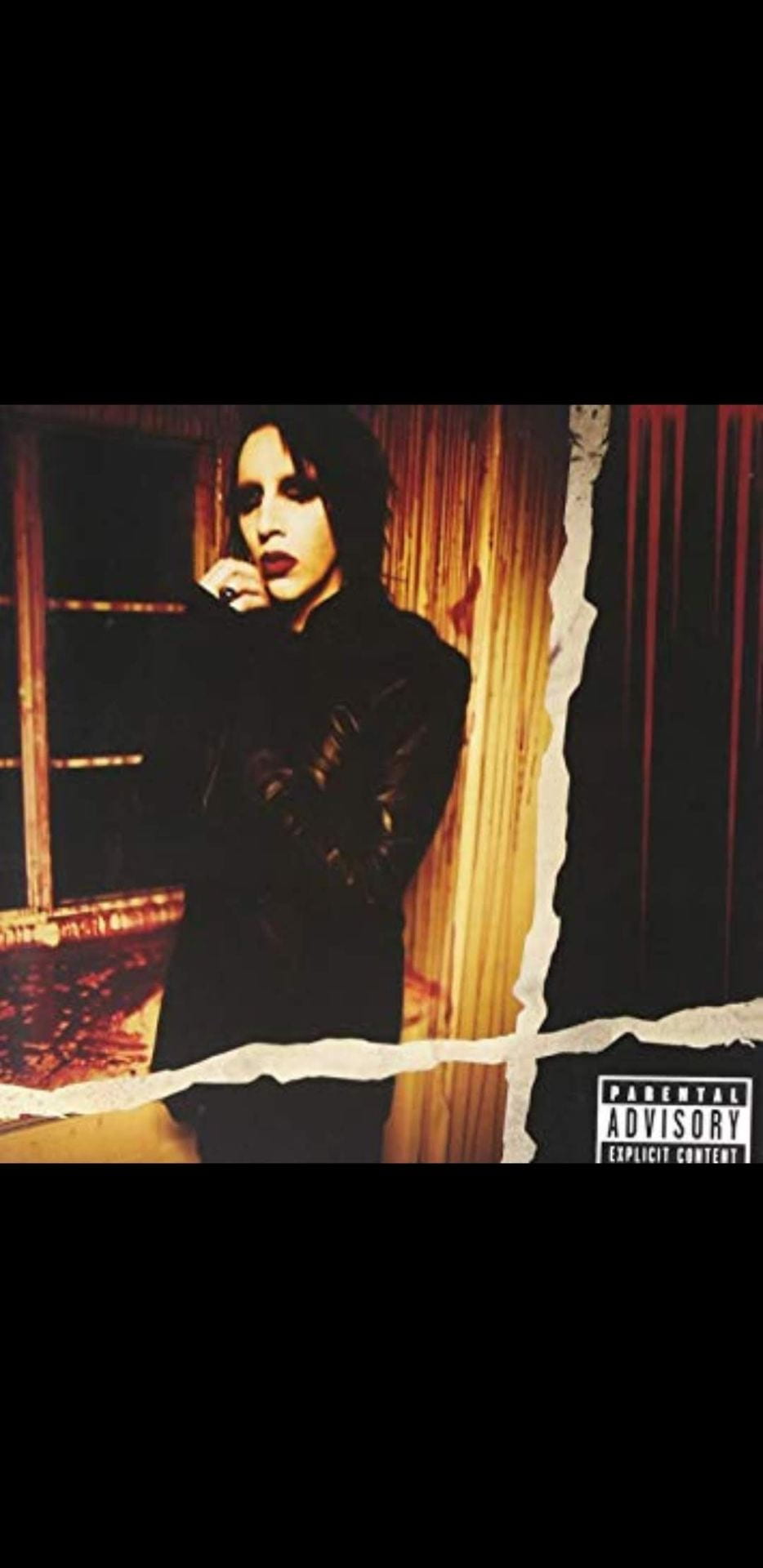
The album cover for Marilyn Manson’s “Eat Me, Drink Me” shows lead singer Brian Warner (aka Marilyn Manson) standing by a darkened window in a blood-soaked room. Manson is facing to the side slightly with one hand to his face, this demonstrates Erving Goffman’s theory of ‘Feminine Touch’, putting Manson in a submissive position.
The image is divided by two large tears, one going vertically while the other goes horizontally across the image. This creates an inverted cross shape that dominates the foreground of the image. This metaphor directly links with Manson’s reputation as “The Anti-Christ” which stands in the foreground of his personal image.
In the top right corner of the album, there are six long drips of blood that are not diegetic to the shot. These cleverly show the initials of the singer’s persona, “M.M.”.
Through the use of limited diegetic lighting only showing part of the image, it creates connotations of isolation and claustrophobia, making the subject of the image appear unapproachable.
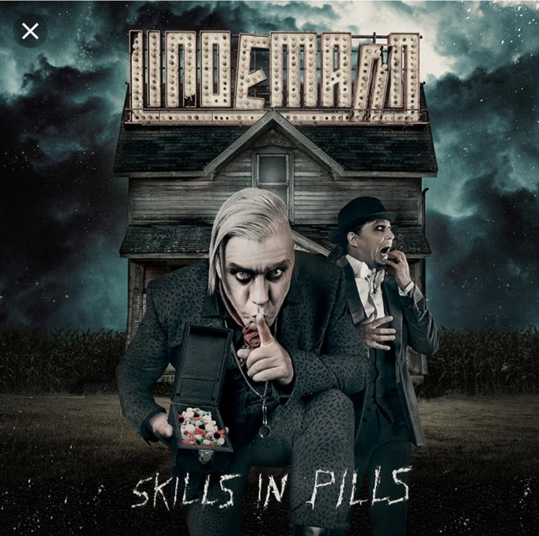
The album cover for Lindemann’s ‘Skills In Pills’ follows a very dark think with contrasts of white, this is very typical of the gothic/metal genre. In this foreground we have a medium shot of the singer (Rammstein’s Till Lindemann) crouching low with, holding a box of sweets, his finger to his lips, maintaining eye contact with the audience. This pose places him in a dominant position, as he is required to crouch in order to get to the level of the audience. Along with the pose of placing his finger over his lips, he mimics the common hand gesture used to ask for silence or secrecy. This creates a relationship between him and the audience as if he is communicating with us directly. However, as a child seeing it, we may trust him, as an adult, that trust is questioned.
Right behind Till Lindemann is the only other member of the band, Peter Tägtgren. He is positioned in an almost slap-stick style of fear. This removes part of the seriousness of the image, giving the impression that the music may not be typical of the metal scene.
In the background, we see a tall, old, secluded house with the name “Lindemann” in lights above it. This plays on the questionable morality of the band as a home is commonly associated with safety and shelter. However, the fact that it is secluded and only two large, scary men are two be seen, the audience is left feeling on un-easy about the situation they are put in.
In the foreground of the image, there is the title of the album “Skills in Pills” in a very thin, edgy font. This pushes thoughts of scratching or etching to the audience, however, the lack of uniformity in the typography shows that the text was rushed. This enforces the typical horror genre that this style of music follows.

As we can see in the image above, the subject (sign) is following Goffman’s (1997) theory “Licensed Withdrawal”. Although typically found in photos of female subjects, this male subject is looking away from the gaze of the camera. This gives the impression that the photo was taken naturally without the subject being aware. This has a signified meaning that the subject is not a vain person and that no effort was used in his pose.
Looking at the idea of “Body Display”, Goffman states that women are “wearing revealing, hardly any, or no clothes at all, which is often associated with sexualised images of women” (Lindman, 2004). As you can see from the image, the subject if fully clothed, revealing only between his face and upper chest area. This shows connotations of masculinity, however, the subtle exposure of the upper chest area may suggest hints of femininity, relaxation, and possibly sexuality.
The subject is positions in focus on the lower left side of the frame, wearing colours of black and grey. This is in contrast with the blurred background which denotes the image of a green forest. The juxtaposition of the industrial grey scale and the natural greens correlates with Sigmund Freud’s theory of ‘The Uncanny’ (Das Unheimliche, 1919). The obvious distinction of colours and visibility forces the audience to focus on the subject in the foreground.
“About me: English Language Course Rep at Brighton Uni // Kayak and Paddleboard Instructor // I would tell you about my favourite film, but that goes against the first rule // Memento Mori & Carpe Diem”
The language used in the “About me” section of the subject’s profile is broken down into very short, easy to read sections. This fast conveyance of information may reflect the fast-paced lifestyle of the subject. The first statement “English Language Course Rep at Brighton Uni” shows a sense of priority. The use of colloquial shortening of words such as “Rep” (Representative) and “Uni” (University), presents the idea of an easy-going person and approachability. However, the overall intention of this phrase is to show credibility and intelligence. The subject is almost bragging and showing pride in his achievements and credentials.
Following that, is the phrase “Kayak and Paddleboard Instructor”. The subject is mimicking his previous aim of boosting his credibility, however, he includes the water sport activities “Kayak and Paddleboard” to encourage the idea that he is adventurous and outgoing. This may increase his approachability, but also may make him seem for interesting, water-sport instructing is not a common skill.
“I would tell you about my favourite film, but that goes against the first rule” is the first attempt of comedy used by the subject. The reference to the movie ‘Fight Club’ (David Fincher, 1999) uses intertextuality to create a relationship between the subject and those of the audience who have seen the film. This may increase the likability of the subject as there is a shared interest between him and the audience.
The subject finishes off his “About me” section with the Latin phrases “Memento Mori & Carpe Diem” (Remember, you must die & seize the day). This reflective analogy goes back to the idea of intelligence, pushed by the subject’s knowledge of Latin. However, the two well-known phrases put together presents a message of adventure and excitement. Leaving the audience with the final message to summarise and to create a hook to remember the subject by. The overall power-play by the subject conveys connotations of approachability, intelligence, and fun, all aspects looked for in a friend.

Actor Hugh Grant
5 Simple things to look for in YOUR Prince Charming:
1) Style!
You need to choose what kind of Prince you are after. Are you a classic Disney’s Prince Phillip kind of girl? Or do you like a bit of lovable rogue Flynn Rider?
2) Hair!
There is no point you taking care of your hair if your Prince is going to share the wild locks of Tarzan. Get yourself a Prince who knows how to look after their hair, and will pack a spare hairdryer.
3) Strong!
Who do you want to give you a piggy-back when your feet are sore (trust me, girls, we’ve all been there and yes, those heels are just too cute)? Prince Charming? Exactly! Get yourself a Prince who can bench 100kg and has the abs to prove it.
4) Ambition!
Even Aladdin had dreams of becoming a Prince, so don’t settle for a guy who aims for anything less! Nobody wants a Hans in their life!
5) Romantic!
Do you remember the movie Tangled? Of course, you do! Do you remember the feeling of supreme jealousy Flynn took Rapunzel out on a boat, so they can watch the fire lanterns fill the night sky? *sigh* Yeah I do too. Make sure your Prince Charming goes above and beyond to show you how much he cares.
Commentary:
I have created my blog in the form of a list of 5 things to look for in a “Prince Charming”. I chose to do it in the mode of a list as it has the connotation of simplicity and clarity, this would appeal to the stereotypical audience of Seventeen Magazine (women aged 12-17). Furthermore, the chosen mode reflects a (dated) view of femininity, conveying the idea that women strive for a male romantic partner, or “Prince Charming”, and that it is achievable in as little as five steps.
Throughout the text, I have made references to the popular children’s film company: Disney. This is so that the audience identify themselves in connection with a Disney Princess. This ties in with the ideology that women are typically weak and require saving by a masculine figure. However, I have presented this list in a way that places the female audience in a position of power, as it is they who chose their “Prince Charming”.
I have tried to challenge the traditional ideology of masculinity in my post. For example, “2) Hair”, which stereotypically would be a very feminine focus for men. Traditionally men care less about their appearance, particularly their hair. This juxtaposition to tradition shows that values and goals have changed when looking for a romantic partner. With the introduction of aspects like social media, appearance has a much higher credit than traditional characteristics shared by an older generation (such as honesty, nobility and the ability to provide for a family).

Empire Magazine releases monthly editions providing its readers with all the information regarding high topic films. Looking at this issue, you can see that Empire is focusing this month cover solely on the anticipated Game Of Thrones release.
At first look, the obvious blue and white theme is used throughout the cover. This cold aesthetic echoes the well-known words of warning given by the fictional house Stark: “Winter is coming” which has been a presented through every season so far. This makes the audience believe that the much-anticipated threat of “winter” to be finally here.
In terms of verbal signs, the page cover is very minimalistic. This makes sure that the focus is not drawn away from the action and imagery of the piece.
The comic-like art style would appeal to the larger fanbase of the series, being more of a “nerdish” group. This is typical of the fantasy genre due to the works of writers like J.R.R. Tolkien and C.S. Lewis. The art and genre promise the idea of adventure and heroic challenges.
At the foreground of the cover, you can see an army silhouetted by the light in the centre of the page. In focus, you can see six characters with their backs to the audience. This draws in the attention of the audience as the detailed figures may present some idea of their identity (providing information about what will happen in the coming series). However, the contrasting dark lighting on these characters reinforces the prospect of mystery, which makes the audience question the morality of this army. Are they the last line of defence? Or are they the enigmatic force brought upon us by “winter”? Keen fans of the show will notice the shadow of a giant among the army, and two horsed soldiers perched on cliff edges either side of the army. This hints towards previous shots in the series where the enemy is presented in the same powerful pose.
Bringing your focus to the centre of the page, you can see a flying dragon blasting down a huge ice structure (known as “The wall” throughout saga). Since series one, The Wall has always been referred to by its strength and size, defending the kingdom from the threat of the Wildlings. The fact that the dragon is destroying such a symbol of stability not only enforces the power of the threat, but also creates a metaphor for what the audience can expect from the upcoming series: Winter is coming, and it’s going to leave a huge impact.
GUY FAWKES FRIGHT!
Parliament under fire from youth political terrorist organisation, leaving casualties queuing for help. The rebel group known as “Guido”, gained there name after their first recorded terror attack which interrupted the loved Lewis Bonfire Parade. Since then, they have announced further attacks on British cities in the name of “Redistribution of power”.
Yesterday’s onslaught left 20 innocents wounded, however, London police force was quick to intervene before more passers-by got injured. Commissioner of London’s Metropolitan Police Service, Cressida Dick had this to say in support to everyone involved:
“The London Police Service is taking steps towards the apprehension of the terrorist group, but until then security around local landmarks will increase”

Comments:
– The title “Guy Fawkes Fright” uses alliteration to play on the common name for November 5th, “Guy Fawkes Night”. This sets the theme for the story of this article. This theme continues with the name of the terrorist organisation “Guido”, being the real name of Guy Fawkes.
– By using language with negative connotations like “Rebel”, “onslaught”, “terror” and ” under fire”, the article is showing strong opinion against the group Guido.
– Having a quote from a high ranking member of the police service shows the first-hand experience when reporting the incident, increasing the trust towards the article and enforces the idea of expertise from the reporter.
Welcome to your brand new blog at University of Brighton Blog Network.
To get started, simply log in, edit or delete this post and check out all the other options available to you.
For assistance, visit our comprehensive support site and check out our Edublogs User Guide guide.
You can also subscribe to our brilliant free publication, The Edublogger, which is jammed with helpful tips, ideas and more.