Creating The Website
This is my first time using Bootstrap and so I wanted to be able to build the website all myself so that I could understand what was in the html/css. Instead of picking a ready made layout template with all sections done I picked a starter template with a just a fixed navigation bar already in place. I decided to pick a template with a navigation bar on the template as this is the most important part to the website and I wanted it to look professional and responsive.

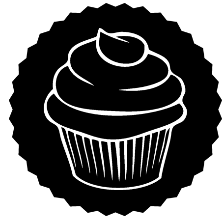
Logo
When making the logo I wanted to make sure users instantly knew what the logo was for and that it looked professional. I decided to make a stamp with an outline of a cupcake in the middle as of course it represents Lauren’s business successfully.
Just like the font that looked handwritten, that gave off a hand made effect, I wanted the stamp to have Lauren giving her stamp of approval on her products. To make the logo I used Photoshop, I got an image of an outline cupcake from google and made it all white. I then got an outline of a stamp from google as well, this I made all black. I decided to use black and white, as firstly, the two colours contrast and so make the logo bold but also as all the colours on the website would be pastel colours therefore the logo would stand out which is what I want. As well using colours such as black and white have a simplistic, formal look, which is what was important to Lauren.
Carousel
When making the carousel, slideshow header, I wanted to make sure the images on there showed off Lauren’s sweet treats appropriately and made users want to explore the website and look at more of her products. I got all of the coding for html/css off W3school and changed sections into my own code so that it suited my website. The carousel automatically goes to the next picture, or users can click on the arrows to go to the next image. As Lauren’s logo is quite small in the navigation bar I wanted to make sure users knew what the website was straight away. Therefore I added the handwritten text to a pretty pink background with an image of one of Lauren’s desserts by it. I made this the first image of the carousel , the bright pink makes the image eye catching and with a clear image of a dessert beside engages users to want to see similar products.
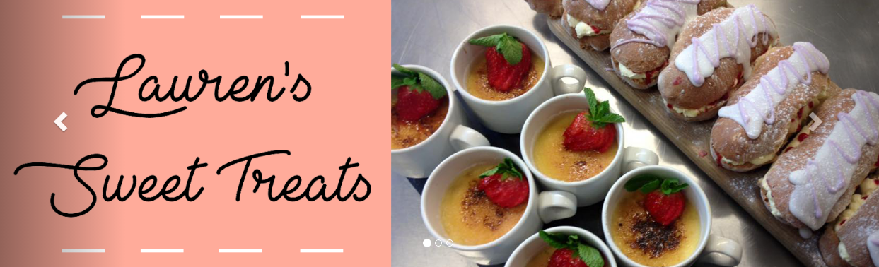
the second image is of another product of Lauren’s, as the slideshow header purpose was to show off Lauren’s products I thought it was appropriate to add this so that the user immediately sees Lauren’s products without having to scroll down the page, which for some users if they have to find what the product looks like they may not bother but if it is in front of them it can attract the users to find out more about Lauren’s business. The last image i used on the carousel was Lauren’s logo as mentioned before as the logo was in the navigation bar it was quite small and users couldn’t see it in detail. Therefore by having the logo as the last image users can in detail see the logo and represent that with Lauren’s business.
Section Divider
To make the pages flow into one another I decided to make a section divider, the section divider was made by making 3 columns in html and adding each image to their column,

In Photoshop I made a line, which would go in the first and third column then to add emphasis on Lauren’s website being about baking I decided to make a gif of a bowl mixing, By adding a gif makes the website more interactive for the user. On Photoshop I used the timeline animation and made two layers, on the first layer the bowl spoon was to the left and on the second layer the spoon was to the right and when saving I made sure this movement looped.

Image Gallery
The image gallery was the main part of Lauren’s website, Lauren sent me images she wanted on her website and so I had to make sure all images were clear and attractive. I decided to use a row and columns to make the image gallery. I was going to have the description underneath each image but this took away the user looking at the image and to keep the attention just on the products I decided to have a mouse over event. Once the user hovers their mouse over an image a grey screen will transition from the bottom with white text saying that the product was. Having an image gallery likes this successfully shows off Lauren’s products and users are able to gather information needed.
Using Illustrator
When deciding what to put in Lauren’s about me section I thought it would be a good idea to make a flat design character of her. I decided to use illustrator and made her look like a baker holding a cake. I thought this would add some character to her website and users would know what she looked like as well. Adding the cartoon as well made her about me section more interesting as before the cartoon it just featured text.
