I have created a rough prototype of how Lauren’s website would look, in my email I explain further what each page contains so that she can understand and imagine what the website will look like.
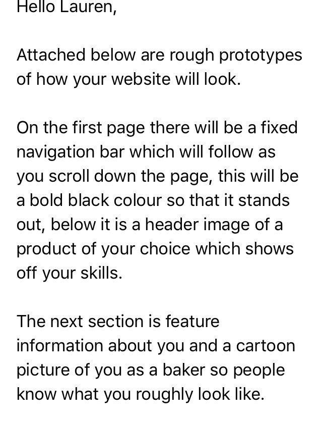
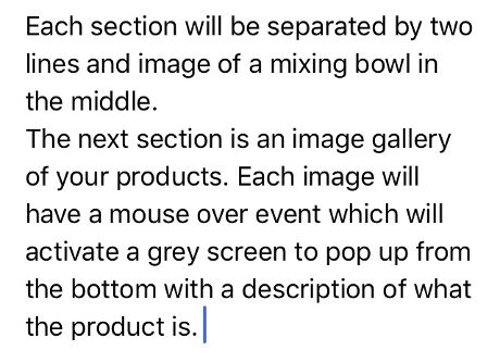
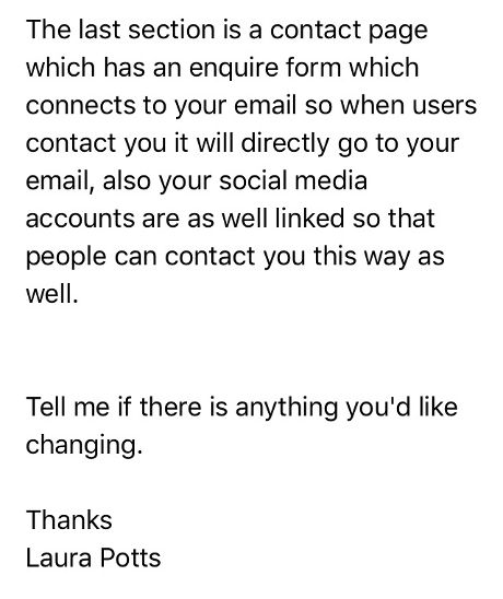
(My Email)


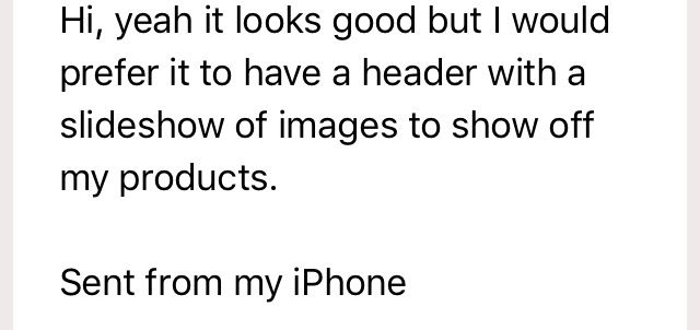
(Lauren’s Reply)
Rough Prototype


From Lauren’s feedback I am pleased that she likes the layout of the website, however Lauren would prefer a slideshow header so that more of her products can be seen by users, this is a more effective way to attract users when they first enter the page. Her competitors also have have slideshow headers and they fit into their website well.
As mentioned in Lauren’s email she would like a formal and pretty look and so I have user Dafont.com to find suitable fonts, below are formal fonts that I liked which would suit her website.
Section Title Fonts
Fonts below are typically what I want to use for section titles such as Products, About and Contact.

Coco Gothic
The first font I looked at was called Coco Gothic, I liked this font as it has thinner letters and it is slightly more curved. I think curved text would suit Lauren’s business more as typically curved text has a more delicate look and also would suit Lauren’s idea of having a website that looked pretty.

Couture
The second font I looked at was called Couture, this font was the opposite to the one above as the text is thicker and the letters are sharper. Having a bolder text would be ideal on as a title as users would be able to identify what section they are on and the title wouldn’t blend in to paragraph text. However sometimes having a font that is too bold can take away the attraction from other aspects on a section such as images or videos.
Overall my favourite font out the two was Coco Gothic as I liked how the font wasn’t too bold which can sometimes take the attention away on the page also as mentioned the curved text would suit Lauren’s website as the letters aren’t so harsh.
Logo Fonts
Fonts below are what I would like to be featured as a logo in Lauren’s header image.

Lie To Me
The first font I looked at was called Lie To Me, I chose to look at fonts which had a handwritten effect as her bakery is all handmade it made the title more personal as if she had signed the page. This text is easy to read but also it’s own quick such as the elongated parts to letters such as the ‘S’ and ‘L’.
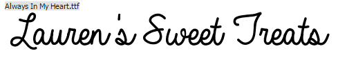
Always In My Hearts
The second font I looked at was called Always In My Heart. This text has had a hand written effect but was a bit simpler than the one above.
Overall I prefer the first font as it has a quirk to it and is slightly easier to read then the second font, although are both similar I think the first font would perfectly fit in Lauren’s header image.
When looking into fonts I made sure to focus on bright colours which would be attractive to Lauren’s users. I chose to look at pastel colours as they are easy on the eye and stereo typically have a pretty look which is what my client highlighted was an important aspect for her.


Above are two pastel palettes with colours that I think would suit Lauren’s website. The two palettes are contrasting as the first one has darker colours and the bottom brighter. I chose to look at darker and brighter as sometimes bright colours can be too harsh on the users eyes and I want the website to flow well and not have sharp blocks of colours on each section. The darker colours would bring down the harshness from the bright colours but also can take away the idea of Lauren’s website looking pretty. The best colours on both palettes are the pink, blue and lilac as I think these will all flow well on the website. Also to make sure the colours aren’t too bright for users I will edit the opacity on the website.
http://flour-pot.co.uk/

trufflesbakery.co.uk

Above are links to two websites I have found which would be a competitor for Lauren.
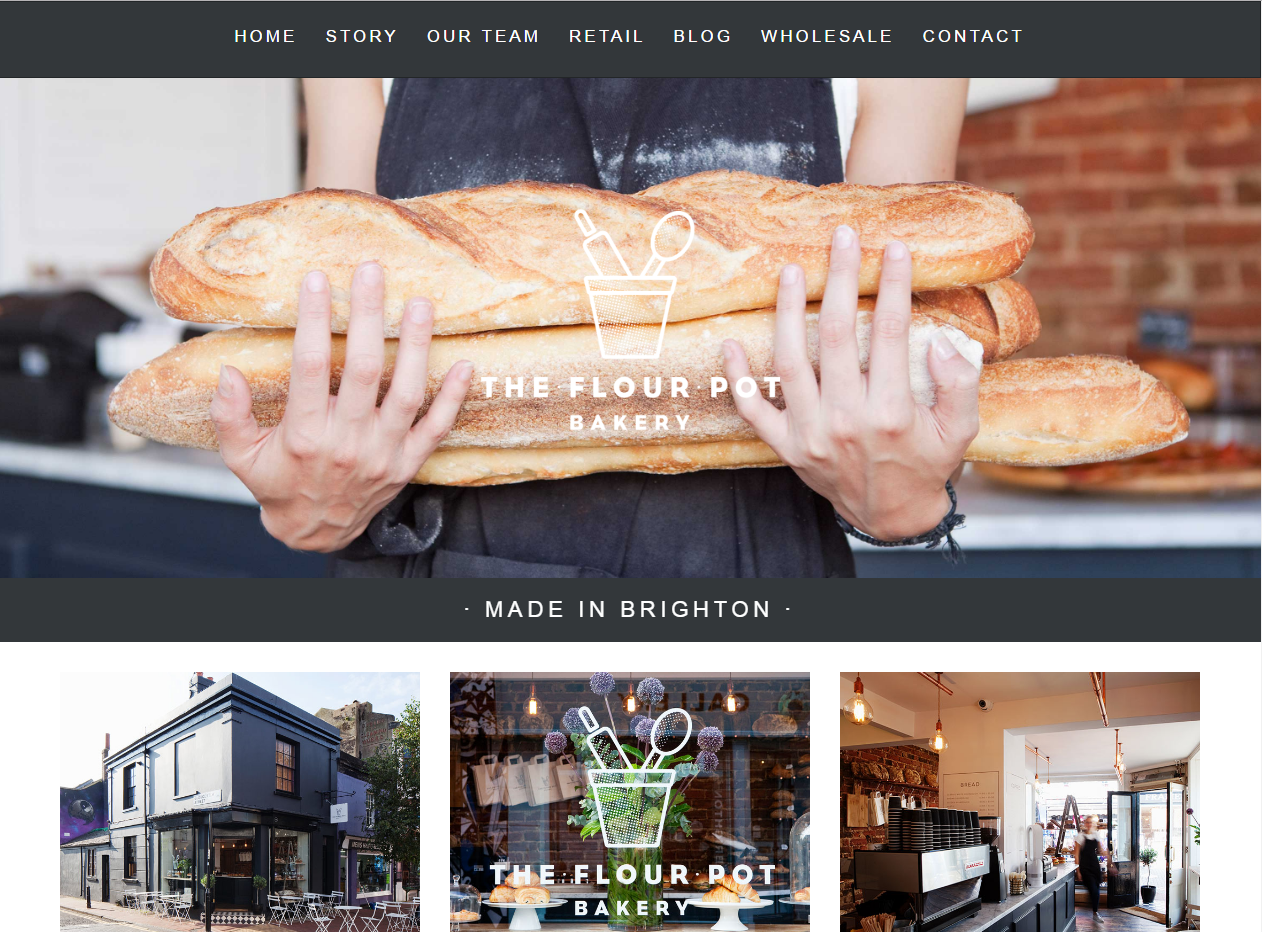
The first website I looked at was Flour Pot Bakery, based in Brighton that deliver to wholesales and also have their own bakeries/cafes. Their website was easy to navigate around and when scrolling down flowed well. All the information about this business was easily accessible and images of their products where of high quality which is important for users to see what their bakery goods look like. Colours used were dark but worked well as they were contrasted with lighter colours. The type of navigation used is something I would typically like to use when creating Lauren’s website as the nav bar is bold and clear and users can get to all pages as soon as they enter the page, however for easier navigation I am planning on having a fixed nav bar so that users are able to get to other pages without having to scroll all the way back to the top or by having to click an arrow which would make the page navigate back to the top. The layout of this site was not cluttered with too much text, images or videos and showed enough information for users to understand what the business does and who they are. My favourite thing about this site that they had a clear theme and that all the colours blended well throughout the whole website and so made the websites content flow. One thing I wasn’t so keen about is the navigation bar wasn’t fixed so navigating around the site was harder than it should have.
The second site I looked at was Truffles Bakery who are based in Sussex, they have quite a few bakerys and cater for many businesses. Truffles has a similar layout to Flour Pot as they also have a header which is a slideshow that presents images of their products from their bakery. I think this is an attractive header that I should look to feature on Lauren’s website, as by having a bold image as a header would intrigue customers as they will see her lovely products that will interest them in looking further into the website and Lauren’s business. Truffle’s nav bar is fixed and so navigating around the website was easy, as Truffle’s business is bigger they feature more pictures and information than Flour Pot. Truffle’s have less text on their home page than Flour Pot but feature more images which I think is more aesthetically pleasing for users as they can see straight away the businesses products and are more likely to be attracted to images than text. My favourite thing about Truffles bakery is their clear bold pictures as it is something users are attracted to straight away and know if their service is suitable for their needs. This is something I would like to have featured on Lauren’s website as I think it is important for her users to see her products clearly so that users would look further into her website as they would be interested in seeing more. One thing I disliked about Truffles Bakery is that the home page is a bit too cluttered with images. Although the images show off their products and services I prefer more white space as if users are greeted with too much information they may not be able to clearly see other information which could be hidden.
From looking at Lauren’s competitors it has enabled me to gather ideas of how her website should ideally look like and how in some aspects it shouldn’t. By having this information I can now confidently started designing Lauren’s website.
Before starting the draft prototype of Lauren’s website I thought it would be important to understand who her audience where so that the design suited the users. When researching who would ideally be Lauren’s main target audience I discovered that she would have quite broad users viewing her site and using her service. Typically users of an older age, 25-50, would be viewing her site as they would be using a catering service for special occasions or their business. An audience of a younger age such as 10-18 would be unlikely to visit a website to make such a purchase as they wouldn’t necessarily need to use this type of service . Emphasising on the idea of a broad audience, gender wouldn’t be limited to just female or male as Lauren’s products are something that can be aimed at both.
In terms of the design suiting Lauren’s audience I would need to take into consideration that her website will be used by businesses needing catering and so I would be focusing on a formal, as mentioned in her email, so that her website is inviting for businesses wanting to use Lauren’s service. Lastly as Lauren’s audience is wide ranging within ages and gender I would make sure that colours and fonts suit all users.