ISLE OF DOGS & GENERAL WES ANDERSON CHAT
(AD139: VISUAL PROMOTION)
My first stop in London was to the Isle of Dogs Exhibition. I thought it was incredible and as I was patiently awaiting for it to come out it was even better! Isle of Dogs is the latest of director Wes Anderson’s films and his second stop motion animated movie after Fantastic Mr Fox.
Wes is well known for his storybook style and incredible dialogue that is funny and subtly asks the audience questions through its themes.
The film is set in Japan and focuses on a cat loving dynasty during the reelections of their president whilst a dog virus is causing all the dogs of the nation to be cast away to ‘Trash Island’. The story follows a young boy who goes on a quest to find his lost dog.

(Figure 1)
The sets were so incredibly detailed and it really was astonishing to see how small and detailed the set could be. The multiple faces and details that could be added or taken away from the set for small changes were so clever and this exhibition really showed how unbelievable the stop motion process is.

(Figure 2)
Isle of Dogs as a movie was also incredible. Everything about Wes’ films was in this one. The dialogue, the actors (voices) and the themes that aren’t thrown in your face. Anderson has a way of making a film that teaches you a lot about how your own mind thinks. There are no main themes of politics or friendship, however his films can be interpreted differently by different people and this makes the viewing experience different for everyone.
Something that I really love about Wes, visually, are his colour palettes. The soft hues of pink and blue were key in Isle of Dogs as they gave the ‘dirty’ sets of Trash Island a pop of colour.

(Figure 3)
The movie itself was really enhanced considering I went to the Exhibition prior to having seen it. Although to some it may ruin the ‘movie magic’, to be it really enhanced my appreciation for Wes and the people who worked on this movie because you realise how clever it all is.
Other Wes Films I love:
I also wanted to talk about other Anderson films that I love as they are a constant influence to way in which I work and think about my projects.
Moonrise Kingdom (2012)

(Figure 4)
Moonrise Kingdom has a super enhances nostalgic and storybook-esque feel to it as it uses a childish storyline to open up larger and wider questions for the audience.
Moonrise Kingdom’s colour palette is also something that I would like to use to inspire my project. The sages, yellows and natural colours partnered with soft salmon pinks really marry together perfectly and I feel as though they really embody the nature element that is such a big part of Gucci.

(Figure 5)
The Royal Tenenbaums (2001)
The Royal Tenenbaums is a film that follows a dysfunctional family and their story. The colour palettes within this film are similar in their natural and etherial feel, however they really have a ‘rose tinted glasses’ feel too. I really love the simplicity and nostalgic feel they give off.

(Figure 6)
This is one of my favourite Wes Anderson films, not only because of the colours, but the story and the different and eccentric costume.

(Figure 7)
Figures
Figure 1-3 – Photos by Kynza Kendall-Jones of the Isle of Dogs Exhibition, London.
Figure 4 – Moonrise Kingdom Movie Poster 2012, https://www.imdb.com/title/tt1748122/mediaviewer/rm550183680
Figure 5 – Moonrise Kingdom Colour palette, https://www.pinterest.co.uk/pin/741123682403425600/
Figure 6 – The Royal Tenenbaums Colour palette, https://www.pinterest.co.uk/pin/185280972149774161/
Figure 7 – The Royal Tenenbaums Cast and Costume, https://www.pinterest.co.uk/pin/215680269632179018/
DOES A PERFUME DO MORE THAN JUST SMELL NICE?
(AD139: VISUAL PROMOTION)
When I was researching Gucci’s key signifiers and symbols that reflect their heritage, I found that their main signifiers are personified through perfumes. I thought this was more than just a coincidence and easy money-making scheme, therefore I wanted to look closer at the reasoning for Perfumes and the high production campaigns that portray them.
The reason for luxury brands creating perfumes:
Perfumes are a relatively easy product to make and they are a way of reaching a younger or a slightly more economically challenged individual. They give a customer a tiny piece of being a part of the luxury fashion world without much effort and still keeping the exclusivity for the regular customers of the expensive apparel.
Gucci’s perfumes:

Gucci Guilty Absolute 90ml eau de parfum £ 79

Gucci Guilty Platinum 90ml eau de toilette £ 62

Gucci Guilty Platinum 50ml eau de toilette £ 74

Gucci Flora 1966 100ml eau de parfum £ 150

Flora by Gucci 75ml eau de parfum £ 90

Flora Gorgeous Gardenia 100ml eau de toilette £ 78

Gucci Bamboo 75ml eau de toilette £ 76

Gucci OUD 75ml eau de parfum £ 135

Gucci Made to Measure 50ml eau de toilette £ 55

Rush 75ml eau de toilette £ 70

Gucci Guilty Absolute Pour Femme 90ml eau de parfum £ 95

Gucci Bloom 150ml eau de parfum £ 125
I would personally say their most famous are Gucci Guilty, Gucci Flora, Gucci Bamboo and Gucci Bloom. All of these names and fragrances personify key semiotic elements of Gucci as a brand. To do this is an obvious move from Gucci as a company, however the way in which the perfumes are portrayed is very important. For customers who cannot afford Gucci’s apparel or any more expensive products, having the perfume lets them have a sneak peak into the world of luxury fashion, therefore the campaigns/adverts for these perfumes are very important and are also ways in which Gucci can show their artistic and collaborative personality.
The latest Gucci Guilty campaign (2016) ‘starring Jared Leto, the story unfolds in Venice, a city that in the past allowed its people to transgress society’s norms, its liberated aura still circling its streets today. Filmed as a set of flashbacks by Glen Luchford, the campaign builds sensual intrigue around an intimate experience between three people.’1
Gucci Bloom’s campaign (2017) also by Glen Luchford gives such an abnormally natural feeling to the viewer as the models, Petra Collins, Dakota Johnson and Hari Nef journey through nature.
“I wanted a rich white floral fragrance, a courageous scent that transports you to a vast garden filled with many flowers and plants, a bouquet of abundance. The garden is as beautiful as women are; colorful, wild, diverse, where there is everything,” Alessandro Michele.
Gucci Flora’s campaign by Chris Cunningham still has his quirky touch, yet is still set in a beautifully etherial meadow and tells a strange story that one wants to know more.
One Gucci Bamboo campaign features a stronger and more powerful performance by Gal Gadot and would empower the viewer and they would want to become the character she is playing.
The most recent campaign for Gucci Bamboo is in keeping with Alessandro’s fantastical tone, and creates a sense of being in a dream and features the calm and etherial tone that is in the first three campaigns that I mentioned and is directed again by Glen Luchford.
I think that a fragrance, especially for a luxury brand such as Gucci, shows the exact representation of the brand that the Creative Director wants to portray. This etherial, natural and somewhat quirky existence that appears within the campaigns I have mentioned, apart from the one featuring Gal Gadot, really embodies what it means to be Gucci. The key signifiers and semiotics of the brand are personified through these fragrance campaigns.
References
1 “Gucci Guilty Director’s Cut” Gucci, 2016. Youtube. Web.
All fragrance figures and information from-
https://www.gucci.com/uk/en_gb/ca/beauty/fragrances-c-beauty-fragrances?utm_medium=cpc&utm_source=google_uk&utm_campaign=coty_gucci_uk_brand_core_exact&utm_term=gucci_perfume
THE IMPORTANCE OF A SWOT ANALYSIS
(AD139: VISUAL PROMOTION)
After carrying out a series of brand analysis’ for Gucci, I felt it was important to carry out a SWOT Analysis. This is because doing so, shows you what is missing from the brand and this allows you to spot a niche spot in the market to create a subbrand. Because I am making a subbrand for Gucci, it is important that I know about its competitors so that my subbrand is effective and unique, this could also allow me to do something that any other brand could do, first. I carried out a SWOT Analysis for Chanel, Dior and Burberry and main competitors as they cover a variety of target markets and share similar price points. I found that there wasn’t particularly a premium brand in the same market as Gucci that shared its eclectic style and seeing the way Chanel, Dior and Burberry are attempting to diversify, in accordance with their brand, it really showed me the gap in the market for a Gucci subbrand.
Please view my Gucci SWOT Analysis in my sketchbook.
Here are my SWOT Analysis’ for my competitors:
SWOT Analysis of Gucci Competitors
GUCCI Brand Analysis Reflection
(AD139: VISUAL PROMOTION)
So I obviously began with doing a brief analysis of three different brands: Gucci, Comme Des Garcons and Burberry. However, by the time I had done this, I had already had lots of thoughts about using Gucci as the brand I wanted to base my sub brand on.
I carried out a moodboard on pinterest of what I already know that I like from Gucci as a brand and the image they portray. I found I mostly love their recent collections and imagery from Alessandro Michele, however I do have a love for Tom Ford’s era at Gucci.
I put together a moodboard to show what I loved initially: https://www.pinterest.co.uk/kynzakendalljon/gucci-as-a-brand/
Therefore, I furthered my analysis of Gucci straight away instead of wasting too much time on the other brands. I first did the basic analysis, which is what you can tell about the brand without looking too closely at the brand. Then I carried on with analysing Gucci’s Heritage through it’s semiotics and key visual signifiers. I found this was a good place to start as many of these such as the horse-bit and floral design is what I have always loved through all of Gucci’s collections. This was a good place to start as my mind is more visual, therefore it was building up my vision of what I might like my sub brand to be based on what already exists.
I also carried out a little moodpboard featuring these key signifiers to relate to my research in my sketchbook. https://www.pinterest.co.uk/kynzakendalljon/gucci-semiotics/
Then I wanted to look closer to what Gucci has to say for themselves and look at how they want to portray themselves. This, I think, was the most important thing I did to clarify what I wanted to do with my subbrand. I looked at their website, because seeing how a brand defines themselves is important because they could or could possibly not be fulfilling the image they want to broadcast. I took some notes from Gucci’s Corporate Sustainability and Responsibility section on their website and then I took the points that interested me the most and did a little brainstorm of how I would like to incorporate them into my project.
To clarify my thoughts on Gucci as a brand, once I researched further, I did a mind map and brainstorm describing how I viewed Gucci now.
Doing all of this research really helped me evaluate where I needed to go to carry on with my project and how I wanted my Gucci subbrand to be portrayed. So now I am ready to do some more analytical studies on Gucci as a business model and focus on their strengths and weaknesses by carrying out SWOT analysis’s and so on.
What I know so far:
I would like to focus on a collection that in inspired by Gucci’s natural semiotics and use this to create a sustainable and ‘vegan’ collection that is driven by charity work and focusing on a good business model.
I am happy with where I am at this point and I am ready to move further and be more thorough with my research of Gucci as a business.
TREND FORECASTING RESEARCH
(AD139: VISUAL PROMOTION)
Trend Forecasting has always seemed like such an alien concept to be because it didn’t used to seem possible that Trend Forecaster’s could possibly know what is going to happen in the future. However, although it is not 100% clear now, after having researched and after having been taught in lectures, the concept makes a lot more sense to me now.
I read quite a bit of the book ‘The Trend Forecaster’s Handbook’ by Martin Raymond, and I took some notes to help me understand the concept more clearly. (These can be found in my sketchbook under the title of ‘Trend Forecasting’.)
Then I started with looking at the WGSN website at the Future Trend Predictions for 2019. I read through each one and took in the information and it was clear that after this, one of them in particular stood out to me.
The Vision 2019: Creative Manifesto really spoke to me as a ‘creative’ and really made me excited for our near future. Another Trend Prediction I particularly liked is Action/Reaction. It’s concept was very futuristic and I reading through and having lots of ideas about my project. I found it really interesting, the in way in which the Future Trends Macro Presentations were laid out. Especially considering how mind-boggling I found the topic initially. They were presented in a simple way that made it clear as to what they were describing, with few words and lots of concisely chosen images. I thought it would be cool to look into doing my own one for this project as an extension of one of the four macro trend boards I will have to create for the submission of this project.
I have written up some notes of what I thought about these two Trend Boards and what I might like to reference in the future.
References
Raymond, Martin. The Trend Forecaster’s Handbook. London: Laurence King Publishing Ltd, 2010. Print.
‘Future Trends; Macro Trends 2019: ‘The Vision 2019: Action/Reaction’, …’Creative Manifesto’, …’In Touch’ and …’Common Ground’. WGSN. 2017. Web. 15 April 2018.
CULTURAL CAPITAL
(AD139: VISUAL PROMOTION)
To begin, I found the term ‘Cultural Capital’ difficult to get my head around. However, I did a bit of research to look further into it and it now makes complete sense to me!
I wrote some notes to help me remember:
Bourdieu argued that capital formed the foundation of social life and dictated one’s position within social order. The more capital one has, the more powerful a position one occupies in social life. Bourdieu extended the idea of capital beyond the economic and spoke of it more in the symbolic realm of culture.
Bourdieu’s concept of cultural capital refers to the collection of symbolic elements. Such as: skills, tastes, posture, clothing, mannerisms, material belongings, credentials etc. that one acquires through being part of a particular social class. Furthermore, sharing similar forms of cultural capital with others creates a sense of collective identity. However. Bourdieu does speak of cultural capital being a major source of social inequality.
Bourdieu says that cultural capital comes in three forms:
Embodied, such as one’s accent
Objectified, such as a luxury car
Institutionalised, such as credentials and qualifications e.g. a degree
Now that I understand the theory behind the meaning of ‘Cultural Capital’, I can now interpret it into a way in which fits my project and make my own ideas up about what Cultural Capital means to me, both personally, in terms of society and in the business world when representing a brand.
I see Cultural Capital as something that is inevitable in the shaping of society nowadays. This is because the majority of the populations of first world countries especially, judge and value people via this theory. This is because a great percentage of society allows their lives to revolve around trying to better themselves in a variety of ways to increase their quality of life and their hierarchical status in society, this is done by increasing/growing their cultural capital.
Obviously everyone is going to want to have the best quality of life possible for themselves and their loved ones, however, I personally think that the things in which they need to do and have to fulfil this, has been skewed by society’s excessive consumption and greed. The amount they have to have and do to reach a higher ‘status’ is greater.
Furthermore, I think that at this moment in time, lots of the simpler ‘symbolic elements’, of which Bourdieu speaks of, such as education, are getting forgotten and their importance is lessened.
Anyways, enough about my opinions!
I personally think that, when regarding brands, having a strong cultural capital and a strong ‘sense of self’ really improves the way in which customers view the brand. What I mean by that, is if a brand has no meaning or passion for what they are producing, then it is not as ‘attractive’ to customers. When a brand has a history, a passion and a story behind what they are producing, then the target market becomes clearer, therefore customers are attracted to the brand more easily.
I think that I would like to give my sub-brand a strong sense of cultural capital to make it’s production of its good more meaningful.
References
“Cultural Capital.” Routeledgesoc.com. 2016. Web. 19 Mar 2018. http://routledgesoc.com/category/profile-tags/cultural-capital
VISUAL PROMOTION
(AD139: VISUAL PROMOTION)
My initial thoughts about the brief:
So after receiving the brief, I first thought that this project might be lacking in creativity due to the importance of business related analysis and research. However, after having thought further about it, I think that the project is more suited to me than I first thought.
The way in which people in my field would go about beginning the research would include and perhaps even begin with the use of visuals.
Defining and researching a brand can be easy to describe verbally when thinking about the business aspects of the brand. However, trying to describe a brand’s values, target market and characteristics of their style is close to impossible without the use of extensive and precise visual descriptors.
Something I really like about the brand is that we are able to produce a multiplatform approach to our campaigns for our sub-brands. Furthermore, the fact that the outcomes that we need to produce are quite precise but allow for creativity and to be passionate about our project as they are all individual, is really good.
I will begin with looking at the list of brands and seeing whether any of these really interest me to base my project on those, however, at first glance, I have a feeling that I may branch out from this list.
THE MEANING BEHIND THE ELEMENTS OF MY ZINE – IMPERFECT
(AD138: FASHION ILLUSTRATION AND IMAGING – IDENTITY AND THE BODY)
I thought a good way to reflect on my final piece and the journey I took to get to this, it would be good that I talk through each element in detail. I think, although art is personal and should be left to interpretation so that it can feel more personal to its audience, especially for a project like this, I want to really discuss my thoughts and personal reaction to this zine.
So let’s start with the name:
As I have mentioned previously, I really like the way in which the title of the zine can be interpreted in many different ways such as ‘Perfect’, ‘Imperfect’ and ‘I’m Perfect’. I think it makes it interesting in the way people may thing its called ‘Imperfect’ until they read it and understand the message that we are all perfect. Furthermore, I think that it is cool that it is a talking point amongst my ‘audience’ as to what it is. All in all, I really love the name and I think it really defines exactly what I want to portray through my artwork in my zine.
The front cover.
I chose to do two different front cover images and also binding styles. Now I know that this is completely unconventional, however, as I looked at more and more zines, and zine-makers blogs and book binding addicts, I found that a lot of them bind them themselves, and they’re all slightly different. I LOVE this element of hand bound books/zines, because when you hold one and flick through, you really feel that someone has put their all into making it special and unique. I understand that considering I have only made two physical copies, that it just seems like I couldn’t be bothered, but I think that if I was to mass produce ‘IMPERFECT’, then they would all look completely different, yet still hold the same information to empower someone. I don’t know why, but this aspect of my zine really pleases me, especially as I put a lot of thought into it.
The chapter cover pages:
What I mean by these, is the image of the girl, photographed in black and white (Photographer unknown) and hand developed by me. I had a lot of fun developing these and experimenting with revealing and choosing not to reveal certain elements of the image. The reason that there are four of these images throughout the zine, all different, is that each image gets clearer, stronger and shows more and more. I felt as though this symbolised the way in which my reader grows and becomes stronger and more empowered as they go through the story of my zine. I really like this touch as it creates familiarity and repetition through my zine which is important when creating something like this. I like it even more because I think these images really bring a story forward to the reader and more and more meaning behind the themes and artwork that feature within the zine.


Empowered woman, empowering women.
To further and follow these chapter front covers, I wanted to add in my ‘strapline’/’slogan’ in a different way to most magazines. I wanted it to follow the images of the woman getting stronger and really remind the reader to be empowered and strong and remember how perfect they are.

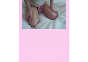
My first ‘article’:
I wanted to start my zine off really smoothly and slowly with some gorgeous images of women loving themselves, being happy with their bodies. I really love these photographs and the way in which they are edited as I believe they really show beauty, femininity and girl power.


I really like the togetherness of the two female models, just relaxed and happy within themselves.
(More information about the photoshoot, concept and editing of the images in blog posts ‘GIRLS (photoshoot)’ and ‘GIRLS (photoshoot editing) )
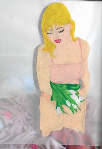
The tulips:
Following this, I really wanted to carry on with this vibe and tone of the magazine and focus more on the illustration side of things, show the less intimate parts of the girls, but focus more on the femininity of the girls. I love the way these illustrations and photographs turned out as they really embody what the whole zine is about.


FEMALE PARTS
Following from this, I really wanted to involve the discussion about female genitals, periods and body hair in a way that really dismisses the strange ‘we-don’t-talk-about-this’ attitude that society, particularly men have.
As I wanted to do with the rest of my zine, I want to take what is beautiful and natural and amazing about a female and really emphasise its beauty and show that is really is something to be proud of and call ‘beautiful’ and ‘perfect’.
I decided I wanted this chapter to be varied in media and I really wanted there to be a textural and tactile element to it.
Therefore I created the female genitalia using hand knitted pieces of material and pearls, two of the mostly ‘womanly’ things. I also wanted to create really cute and diddy illustrations really combatting the strange phobia people have of natural body hair. I also used photography and the symbolism of a flower as a period and also a pomegranate as female genitalia.
All I wanted to do within this chapter of my zine was to create beautiful imagery and take away the horrible way it can be portrayed my SOME men. (‘Some’ being the KEY word as I do NOT want to shame men as my zine looks to empower all<3 )


(For some reason, the colours within these images have changed as they have been added to my wordpress media library, please see the IMPERFECT ZINE at the end of this blog post)
BODY IMAGE
After having experimented with oil pastels to portray the female form, I really wanted to do some illustrations from life, of some close up curves and undulations of the female form. My concept behind this was to remove the identity of the body parts, and just have them as shapes being depicted with beautiful tones and hues of pink and just be beautiful. I really believe this proves the beauty that lies within the female form, no matter how it is to a personal woman. She is beautiful in every way.


The Back Cover:
I wanted the back cover to be simple and follow the theme of the zine, (with the same background as the inside front cover) and I wanted it to feature a giveaway that I feel represents the message of my zine. I made little credit card sized tokens that have the name of the zine on ‘IMPERFECT’ and also the word ’empowered’ as a reminder to remember the messages of the zine, no matter how long ago they read it. I thought it would be a really sweet giveaway to have as it really carries on the message that my zine was trying to show.

My thoughts and reflections of my process:
I am really happy, most of all, with my progress where illustrating is concerned. I really found illustration a daunting prospect and did not think that I would enjoy it as much as I did.
Furthermore, I feel as though this project has really helped me to work hard and all the time to get a project finished. I think that having to make two physical copies, with my idea of having a really hand rendered zine was a large task, but I am really proud of how I did and that I managed to make them.
A thought I have had is that my illustration style really developed and improved throughout the course of this project and I am so happy that it did. However, I do feel ‘sad’ that I did not manage to fit it into my zine to the extent I wanted. This was because I did not feel that my style fitted with the feminine, elegant and beautiful theme of my zine. I do believe though that I will never lose this developed style and I would like to carry it on further. Having to decide against portraying a certain style of mine was an important lesson to learn because as an artist/illustrator, you have to be able to embody more than one style and be versatile and make the right creative decision to fit the tone of the brief.
My Final Zine –
All work by Kynza Kendall-Jones
MAKING MY FLATPLAN
(AD138: FASHION ILLUSTRATION AND IMAGING – IDENTITY AND THE BODY)
My initial thought, was to make a flat plan by hand. I split a piece of paper equally into 32 sections, for the 32 pages for the 16 double spreads. I then put the front cover, back cover and inside covers and content pages on the back of this piece of paper.
I found doing a flat plan hard, as a few of my pages are tracing paper, therefore technically I would have to record the backs of these pages as part of my flat plan, so that I knew exactly what was going where. This then meant that there would be quite a few extra pages, but I did not want to count these blank tracing paper pages as part of my ’12-16 double spreads’ so I made two flat plans:
My hand rendered flat plan laid out every page that can content on, and my digital flat plan took into account the extra ‘blank’ pages.
I found that doing these flat plans made me really think about the flow and the story that I wanted to portray through my zine. I initially really disliked the idea of doing a flat plan prior to having finalised each page, however I now understand how important it is and how it helped me know about colour palette and the way in which I should portray my theme.
Here is a copy of my original initial hand rendered flat plan:

Unfortunately, it probably makes a lot more sense to me as I used a little code and drawings. As opposed to my digital flat plan that contained actual thumbnails of each of my pages:

Obviously I understand the importance of having a digital flat plan with accurate thumbnails so that lots of people can understand what the magazine/book/zine would look like, however, I actually found that doing my original hand rendered flat plan came in so useful throughout the making of my zine and it allowed me to test the flow, rhythm and pace of my zine before laying it all out digitally.
All work by Kynza Kendall-Jones
RUSSIAN CONSTRUCTIVIST WORK
(AD138: FASHION ILLUSTRATION AND IMAGING – IDENTITY AND THE BODY)
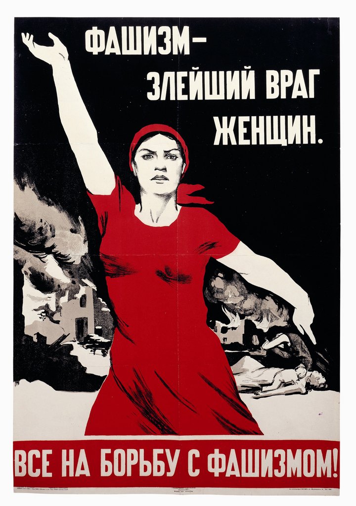
Although initially, I really did not think that Russian Constructivist history would be relevant to my project, as I looked deeper, I found that a lot of the strength and colours used within their posters and propaganda related directly to my work.
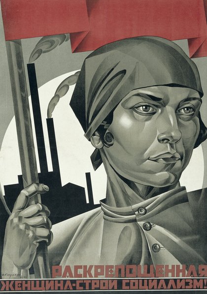
Here are some examples of the work I really like:
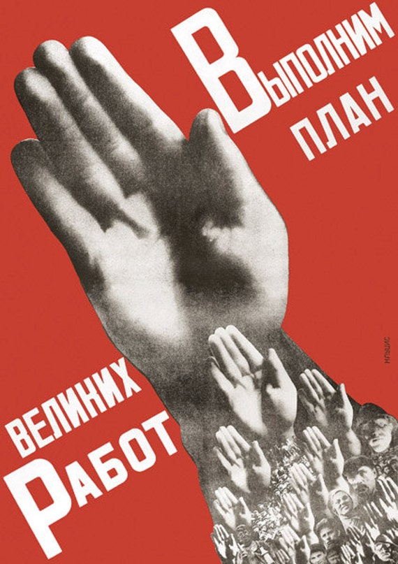
(Figure 1)
(Figure 2)
(Figure 3)
After researching deeper, and thinking back to my trip to Bratislava, Slovakia in which I did a ‘Communist Walk’ where I learnt about all the ways in which the people, the town and the architecture were influenced and effected by Communism and Russia at the time, I found a lot of things that I thought I could use within my zine.
An obvious aspect of the propaganda and posters is the colour red. The colour represents so many different moods and ideas and emotions such as: Power, Passion, Love, Hate, Anger, Sex, Menstruation. All of these ideas come into my work as I try and defy insecurities and empower women. I think seeing the impact that these posters make, resonates with the impact that i am trying to create by tackling these themes that relate to the colour red.
On my trip to Bratislava, I saw a lot of statues and sculptures of women. The tour guide pointed out the largeness of the women’s hands and feet. He explained that this was to show their ability and the importance of them working. Women in that time would be working in the same way as the men, due to the Communist Ideals of equality and utilitarianism. Clearly, it can be seen that these cultures that have gone through Communist Rule, are going backwards in time. People of all kinds are losing rights and appreciation in the eyes of the rulers. I think this is something I am combatting when I am demonstrating the power of women within my zine.
Furthermore, the poses and strength that is portrayed within these posters reenforces the ideas that I am demonstrating within my zine.
I decided to take influence from the fists and strong hands that are seen within the posters and propaganda and turn them into a repetitive feature within my zine to really emphasise the message I am trying to give to my readers.

(Figure 4)
I really wanted this symbol to become a repetitive feature to be in my zine to create familiarity and be like little reminders between the ‘articles’ of my zine to improve the rhythm and pace of my zine. I feel as though it works well for this, and again, it adds to the hand rendered feel to my zine, as each one is slightly different.
Figures
Figure 1 – “Russian Constructivist Poster.” http://rosphoto.org/events/photomontage-in-russian-constructivist-posters/.
Figure 2 – “Red Star Over Russia Exhibition Poster.” http://www.tate.org.uk/whats-on/tate-modern/exhibition/red-star-over-russia.
Figure 3 – “Russian Constructivist.” http://www.tate.org.uk/art/art-terms/a/agit-prop.
Figure 4 – By Kynza Kendall-Jones