Month: May 2018
AD139 VISUAL PROMOTION CONCLUSION
(AD139: VISUAL PROMOTION)
This project seemed so daunting to me when I first began because not only did I have to get creative with my ideas, but I also had to think academically to think about business strategies. I learnt the importance of making sure everything a brand is doing creatively has to make sense with the brand’s ethos. This involved a lot of brand analysis and I decided to really delve into that to increase my knowledge so that my project work was not one dimensional.
Then coming up with relevant ideas and trends for 2020 was difficult as it is so difficult to imagine what hasn’t happened before. However, after having researched into how macro trend boards are made, it became a lot clearer and the WGSN Macro Trends particularly inspired me for the project. Furthermore, finding images that represent things, such as charity, is a lot harder than it seems so creating my trend boards was time consuming.
The part I was most excited for, was the concept and carrying out in a variety of ways for my marketing campaign outcomes. I knew straight away that I wanted to make to do something really different and set myself a challenge, and I knew that I wanted to create a fashion film for my sub-brand. This is because, since starting this course at university, I have been a lot more aware about what brands are doing, and Gucci’s campaign films and social media presence has particularly been inspiring me.
I started with the concept for the fashion film, and then it all followed on from there. Creating the concept board and styling the outfits before the shoot was really good fun but also tricky. I journeyed into charity shops and decided to try my best with putting outfits together with what I had, and what I found. I mainly focused on colour as this is something I also tend to get drawn to.
Shooting the fashion film was difficult, but I made sure to plan it all out and manage my time efficiently so that there wouldn’t be any issues. I feel as though I did well to plan it all out, and considering there were only two of us to model and for me to sort the camera and angles, I am very proud with the outcome. Furthermore, considering I had never used Premiere Pro, and the editing of the film was an important aspect, I feel as though I did really well.
Although I perhaps could have just left my campaign film to be my final chosen marketing type, I decided to push myself further and also create a concept for the set design of a runway show and create a floorplan. This was really good fun and gave my final chosen outcome more to it than just a video on youtube.
Then, as I have mentioned previously, I decided I wanted to illustrate and animate my other two outcomes, my print and social media, when I started experimenting with fashion illustration.
I gave myself the challenge of trying new styles that I wasn’t comfortable with, but I ended preferring the outcome of these. I did however take longer than expected with my illustrations and animations as I had to teach myself how to try new styles and how to use After effects and Photoshop together to create animations. They were harder than they seemed before I started!
Writing my manifesto was also something that took a lot of time. This was because it was a style of writing that I am not used to, however writing it helped me confirm my thoughts about the type of subbrand I was creating.
Overall I am very happy with the outcome of my project, and considering how much we had to do, I feel as though I really did my best and came out with outcomes that I am proud of.
GUCCI KIND WINDOW DISPLAY DESIGNS
(AD139: VISUAL PROMOTION)
For my Print option of marketing, I decided to create illustrations for a series of Window Displays in Gucci Flagship stores.
It was a really interesting process and I felt it was a good way of linking all my chosen forms of marketing together as the set of the window display reflects the set of the fashion film and the beach element. The window display is an interesting form of marketing and I chose to put window stickers on the glass that advertise the instagram which features the animations and would be Gucci Kind’s main form of social media to communicate with their audience.
My Final Print Outcome:
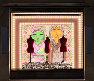

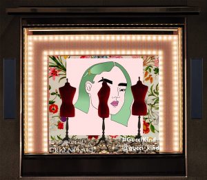
Please see my sketchbook for the annotations of each element of the window displays.
MY ILLUSTRATION AND ANIMATION PROCESS
(AD139: VISUAL PROMOTION)
I initially got inspired to do illustrations as part of an outcome for this project when I experimented with illustrating Alessandro Michele’s first collection for Gucci. This reminded me of my love for illustration and being able to adapt styles that each suit a brand is difficult therefore carrying out three different illustrations was a challenge that I wanted to set myself.
Carrying out illustrations in three different ways, but portraying the same clothing was really difficult for me as I have a style of illustration that I prefer to do. However, doing this made me get out of my comfort zone, and I actually tried a style that was very time consuming and I ended up preferring this style to what I was initially comfortable with.
Furthermore, because I didn’t want my form of Print to be wasteful, such as a billboard that could be just short term, or a feature in a monthly magazine, I really had to brainstorm a way of marketing my brand through print in an eco friendly way. I came to the decision that I wanted to do something different and this took me out my comfort zone again, as I attempted to create a window design. This was mainly because I really enjoyed the lecture with Sue Wen at the beginning of the term so this method of marketing and art direction was really only mind. Obviously I am not skilled with 3D window display design, so I came up with my own method that I found was really effective.
My final illustrations:

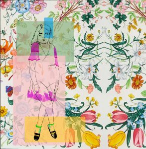
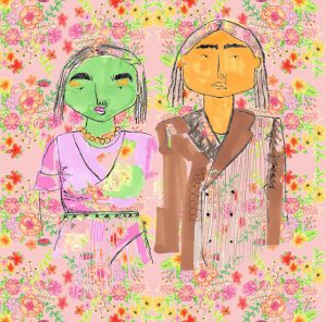
My favourite one is the last one, this one took me a long time and I tried a really different process than I ever have before so it was fun to try. I also feel as though each three fit the Gucci Kind persona. Obviously is this was a real subbrand, these three illustrations would have been done by different artists as part of the ethos that promotes young creative talent. It was really interesting to teach myself how to make a gif and carry out a productive illustration progress.
My final animations:
Obviously if this was real, these animations would be posted on a Gucci Kind Instagram and Twitter, and I have created a Gucci Kind Instagram, however only to post these Gifs, however I thought the most effective way of accessing the Gifs would be to put them on the Gucci Kind Youtube channel which I have linked above.

I am really happy with the way the illustrations and animations turned out and it really taught me a lot to portray the same collection in three different styles, but also for them to be in keeping with the brand in question.
References
“Gucci Butterfly Silk Scarf” Pintrest.co.uk.[n.d.] Web. May 2018 https://www.pinterest.co.uk/pin/316589048780572005/
“Gucci Silk Scarf Background” DNAIndia.com.[n.d.] Web. May 2018http://www.dnaindia.com/lifestyle/report-a-bouquet-by-gucci-1982111
GUCCI KIND SPRING SUMMER 2020 RUNWAY SHOW
(AD139: VISUAL PROMOTION)
I wanted to add more to my chosen form of marketing than just creating a fashion film. I felt as though this chosen type gave me more opportunities to do something really different as opposed to just doing the normal social media/websites/print types. I felt as though pushing myself to try and do something different was my aim for this project and this paper seemed like a good chance.
Please see blog post “GUCCI KIND: THE SPRING SUMMER 2020 CAMPAIGN FILM” for more information on the fashion film.
I wanted to design the layout and design on the runway itself and the set design because I felt as though creating an experiential fashion show would be a great way of marketing, especially due to the fact that something like this could really create a buzz for the subbrand. The social media Influencers and celebrities that would attend would be documenting it on their social media whether they were paid to or not as this is their lifestyle, however collaborating and having people to document it professionally through a colloquial media channel such as an Instagram Story would be a great way to market Gucci Kind, especially as the subbrand is directed to a Gen X and the Millennials.

This is the floorplan for my runway for the Gucci Kind Spring Summer 2020 show.
There would be limited seats to create exclusivity and so that the ambience in the room is not disturbed. The fact that the runway would be circular as well as the seats, creates an immersive environment. This would be taken a step further with the music and the scent that would be pumped into the room. Furthermore, the entrance and room would be surrounded by greenery and ‘live walls’ so to keep the experiential mood to the show. This would make the audience feel as though they really are in nature.
At the beginning of the show, the fashion film would be shown to set the narrative for the collection and the show itself.
Because I did not have access to a 3D Interior design software, I decided to create a concept board style that would be the pitch for the set design.

I really enjoyed creating all of this and it really allowed me to get into the events and set design side of the Fashion Industry. I did find it all a lot of work, but as I said, I wanted to really push myself with my third chosen style of marketing for this project.
Figures
https://www.pinterest.co.uk/kynzakendalljon/gucci-kind-runway-show/
MACRO TREND BOARDS: SPRING SUMMER 2020
(AD139: VISUAL PROMOTION)
I initially created mood boards for each macro trend board (which are linked in the figures) and then I gauged what fitted best with the mood I wanted to create through the trends. Therefore, the extra images in the mood boards that were not used were decided against. This helped me eliminate images that didn’t describe the mood of the trend well and really have a definite trend. I especially had two minds on the Research, Reuse, Rewear macro trend, but I am happiest with the neutral trend I ended up going with.
Earth Generation: Spring Summer 2020

Due to the latest generations, X and the Millennials, being very aware about the importance of being sustainable and being inspired by nature, Earth Generation is a Macro Trend that contrasts with the popular idea of the future being technology driven. This trend demonstrates the need for the generations of the future to go back to nature to find answers. Fashion will be influenced by this heavily due to the changes that will be happening in other sectors. Such as ongoing fads about certain natural foods, such as Turmeric and Avocado in the past. The colour palette reflects this also as it is inspired by nature and the colours of spring and summer flower.
Research/ Reuse / Rewear: Spring Summer 2020

This macro trend speaks about the way in which companies and brands will begin to invest more in invention and research into sustainability and new fabrics. This will also lead to the reusing of fabrics by brands for new collections. Then the rewearing of clothing and the ways in which garments will be designed will allow for items to be worn in different ways. The colour palette reflects the natural mindset behind this trend and it is about the clean technology along with the sustainable frame of mind, therefore the neutral tones balance the clean and the natural.
The Creative Renaissance: Spring Summer 2020

The Creative Renaissance is the trend that demonstrates the revival of the youths’ creativity. As previously it has been stated that creativity will be the catalyst for change in the world, now, it can be said that due to social media, technology and forward thinking brands, the new and upcoming creative artists, from a young age, will begin to influence the world and more macro trends themselves. The difference between this trend and previous trends that follow the creative frame of mind, is that this trend will be the awakening of the youth having so much more of an impact on all ways of life through their creativity, as opposed to the realisation that creativity will be important in the future. The colour palette reflects the eclectic accumulation of colours that represent a fresh new take on creativity.
Giving Back: Spring Summer 2020

Due all the bad happening in the world, spending time and dedicating loves to helping charities is something that will become done more frequently. Brands supporting charities will also happen a lot more, especially considering they have such a big voice in their industries. Furthermore, due to the ongoing rise of social media, the giving back process will become easier as links and technological advances occur. The colour palette reflects the natural colours of the planet and the areas in the world that need help, such as our oceans.
References
Figures
Earth Generation : Spring Summer 2020 – https://www.pinterest.co.uk/kynzakendalljon/earth-generation-ss-2020/
Research/ Reuse / Rewear: Spring Summer 2020 – https://www.pinterest.co.uk/kynzakendalljon/research-reuse-rewear-ss-2020/
The Creative Renaissance: Spring Summer 2020 – https://www.pinterest.co.uk/kynzakendalljon/the-creative-renaissance-ss-2020/
Giving Back: Spring Summer 2020 – https://www.pinterest.co.uk/kynzakendalljon/giving-back-ss-2020/
REFLECTIONS AND STRUGGLES
(AD139: VISUAL PROMOTION)
Understanding the term ‘Cultural Capital’ was my first struggle with this project as it seemed like a very academic theoretical term. But once I researched further and read more about it, I began to make my own definition of it to understand. I came to understand there are different types of Cultural Capital, but my modern day understanding of it made me find it a really interesting subject, especially because I have realised its value when thinking about businesses/brands. The added value a high cultural capital gives, means that customers and audiences can relate more easily to aspire more to want to be a part of the brand community. In reflection, I found this project and my work would not have been as deep or meaningful, had I never learnt about the importance of Cultural Capital.
My next struggle that i overcame with this project was tackling and understanding full what ‘Trend Forecasting’ meant. After reading ‘The Trend Forecaster’s Handbook’ and reading through the macro trend forecasts by WGSN, I realised it wasn’t an as daunting subject as I first realised. Before this project, I actually had always said that I never really wanted to ever be involved with Trend Forecasting, however, not only did I come to realise how important it is, but I also realised that it is actually really interesting and good fun. Although the Macro Trend Boards I created were not as detailed as the WGSN articles that display the macro trends for each year, I did think that had this project been longer and I had had the opportunity, I would have loved to really go deeper and further into my macro trends.
Brand Analysis was something that also seemed very ‘businessy’ and academic, so I was worried whether I would do well when doing this. However, a benefit of me choosing Gucci quite quickly was that I really had the opportunity to delve deeper into the external and internal factors of running and having a business in the modern day, especially since I was looking at starting it in 2020. Doing this brand analysis was also a lot of fun when looking at the visual sides that really represented Gucci’s heritage as this helped me discover more about Cultural Capital. Looking at Gucci’s Corporate Sustainability and Responsibility was also very important for me considering I knew I wanted to create a subbrand that is environmentally aware and friendly. This helped me see what was missing from Gucci to make my subbrand different and unique.
I really enjoyed practising my fashion illustrations and studying Gucci’s past fashion. I especially wanted to focus on Alessandro’s first collection as this was the beginning of what we know now to be the eclectic fashion of Gucci. I found it hard to go back to illustrating after such a long break from the last project, however this did teach me that I need to be doing it all the time to keep it up and improve. Something else I found was that I approached each drawing with a new style and doing this, really helped me realise which style I like the best and which I find more fun to do.
When I did some research into Sustainability, I did a response to my findings straight away and this really helped me secure my thoughts and what I wanted to do with mom project straight away, as opposed to forgetting my initial first impressions. I did the same when I studied the different Generations that would be affected by my subbrand and these both helped me develop some of my macro trends that I wanted to create.
Making a point of Defining my Subbrand also really helped me lock in my thoughts on what i wanted to create, and this helped me move forward with creating my marketing faster as I knew exactly which method of marketing would be most effective. I also created three potential User Journeys to make sure these methods of marketing would be suitable for my target market and also others to reach a larger audience. These also all had to be in keeping with my macro trends so that Gucci Kind was following these trends to be likeable to a large audience. I also did a Social Media Audit that helped me define where I wanted my subbrand to be within a year.
After having done this, I went to brainstorming and defining what types of print, social media and my chosen style of marketing would be.
I based these on the macro trends and they had to be in accordance with the ethos of the business, such as low waste, supporting young creative talent and being ecofriendly. It was a long process to carrying out each form of marketing as I had to teach myself new techniques.
Print: Carrying out illustrations in three different ways, but portraying the same clothing was really difficult for me as I have a style of illustration that I prefer to do. However, doing this made me get out of my comfort zone, and I actually tried a style that was very time consuming and I ended up preferring this style to what I was initially comfortable with. Furthermore, because I didn’t want my form of Print to be wasteful, such as a billboard that could be just short term, or a feature in a monthly magazine, I really had to brainstorm a way of marketing my brand through print in an eco friendly way. I came to the decision that I wanted to do something different and this took me out my comfort zone again, as I attempted to create a window design. This was mainly because I really enjoyed the lecture with Sue Wen at the beginning of the term so this method of marketing and art direction was really only mind. Obviously I am not skilled with 3D window display design, so I came up with my own method that I found was really effective.
Social Media: Because I was very conscious that my marketing campaign would not be as succinct as I would have wanted it to be, had I had the time to do every type of marketing such as every social media and website, I decided that it was fitting for my subbrand to promote the young creatives through social media and turn them into gifs/animations. I wanted to challenge myself and teach myself how to do these. Although they took a lot of time, I did feel it was necessary to teach myself this skill and I find it a really cool method of creativity.
My chosen type: I decided to design a runway layout, set design and create fashion film to play at the beginning of the show to tell the narrative of the collection. I had a lot fo fun doing all this and it was quite a large task to do for my chosen one as I wanted to do more than just a website or something only to do with social media.
WHAT CULTURAL CAPITAL MEANS TO GUCCI KIND
(AD139: VISUAL PROMOTION)
Bourdieu’s concept of cultural capital refers to the collection of symbolic elements. Such as: skills, tastes, posture, clothing, mannerisms, material belongings, credentials etc. that one acquires through being part of a particular social class. Furthermore, sharing similar forms of cultural capital with others creates a sense of collective identity. However. Bourdieu does speak of cultural capital being a major source of social inequality.
When studying Gucci as a brand, I found that it’s Cultural Capital was in the heritage and iconic and historic symbols it displays in its garments and collections. Furthermore it was in the reincarnation of old and iconic pieces and reinvention of them to always be timeless and in fashion. Furthermore the skilled Italian Craftsmanship, especially for the leather pieces really give Gucci a high cultural capital.
For my subbrand, Gucci Kind, the Cultural Capital is in its ethos and the way its taking Gucci’s legacy one step further. To create a higher cultural capital, there needs to be a buzz for the brand and this will be done through my marketing strategy of high social media coverage, a website, pop up in flagship stores, increasing footfall through the main Gucci store and introducing Gucci Kind to customers who are not aware of it yet. A high amount of press and social media influencers at the Gucci Kind Runway show. Collaborating with these social media influencers and celebrities at the Runway Show will increase Cultural Capital as potential customers will see that others with a high status are loving the brand. This is such an effective marketing tool, and with social media and the technological advances of 2020, this will improve Gucci Kind’s Cultural Capital as a new subbrand.
Another important step to having a high Cultural Capital for Gucci Kind is having a prominent cause and an active agenda, such as its ethos that I mentioned before. For Gucci Kind, there are key aspects to the subbrand that give it a relatable agenda and increases the Cultural Capital: Its low waste and sustainable production process, its minimal-profit scheme where the collections will be in support of a charity each season, and also the promotion of young creative talent through the marketing of the brand. All of these active causes are a main source of the cultural capital of the brand and make it more appealing to its audience and potential customers.
Furthermore, because of Gucci Kind’s active agenda, this forces conversation of its potential customers and the collaborators such as social media influencers and really raises it as a topic of conversation. This creates a buzz around the brand which instantly increases its Cultural Capital.
These are the main areas of increased Cultural Capital for Gucci Kind, apart from the obvious which is that it is a branch from the luxury and worldwide famous brand Gucci. This will be the beginning of setting the Cultural Capital bar until Gucci Kind becomes more known.
References
“Cultural Capital.” Routeledgesoc.com. 2016. Web. 19 Mar 2018. http://routledgesoc.com/category/profile-tags/cultural-capital