DESIGNING MY FRONT COVER
(AD138: FASHION ILLUSTRATION AND IMAGING – IDENTITY AND THE BODY)
Picking a front cover for my zine is very tricky in my opinion. This is because I feel as though I tried to fit in a variety of subjects within my zine, that I don’t know whether one photo can summarise the zine affectively. Furthermore, I am not sure whether I will be happy with just having a photograph on the cover, as I really don’t think that this shows my love for the hand rendered and tactile style that follows in the rest of the zine.
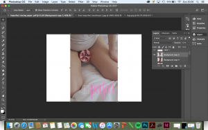
After having thought about this, I decided to try out a couple of photographs with the masthead and then I thought about printing this, and then I wanted to add some illustrations and texture using embroidery or drawings on top of this.

(Figure 1)

(Figure 2)

(Figure 3)
Personally, I really like the way Figures 2 and 3 work with the masthead and the theme of my zine. I am not sure about Figure 1 because the white outline of the ‘i m’ doesn’t show enough on the white background. Due to this, I think it might be interesting to have different front covers for my physical covers. I really think that this would make the zine feel more personal and hand rendered and personal. As if it’s a personalised message to the reader.
I then tried to edit Figure 2 so that it matched the colouring of the masthead:

(Figure 4)

(Figure 5)
I don’t think this worked though to change the colour palette of the photograph. Then I decided to change the colour of the mast head.

(Figure 6)

(Figure 7)
I really like the way Figure 6 looks with the pale pink mast head. I much prefer the pink than the red as I feel the red is too dark and bloody as opposed to the beautiful pink elegance that follows within the rest of the zine.
Having chosen this paler colour for the masthead, I decided to try this same colour for the other cover.

(Figure 8)
I really feel as though this almost seems to stand out more and it creates such a beautiful sense of femininity, softness and contrast within the photograph. I think this works better with what follows in the zine, as I ended up using this hue more than the ‘hot pink’ throughout the rest of the zine.
So my chosen final covers are:

(Figure 9)

(Figure 10)
All work by Kynza Kendall-Jones