ILLUSTRATIONS OF THE FEMALE FORM
(AD138: FASHION ILLUSTRATION AND IMAGING – IDENTITY AND THE BODY)
I really enjoyed working with oil pastels and I used a technique that came naturally to me, not inspired but other artists which was very interesting to do, as I was able to see how I worked naturally. Highlights and shadows are something I have always loved focusing on and working with, especially when it comes to the human form. I found this really good to work with as I was only using a red, peach and white oil pastel, it made me mix colours and learn how they work together. I found that using a really soft pencil (8B) to sketch out the shape was and wasn’t good for a couple of reasons. On the one hand, the pencil blended into the darkness of the red and the shadows, making them even darker, however this also took away the natural and realistic feel to the drawing as it was all ‘outlined’.

I really enjoyed doing this illustration (above) as the way the colours blend together is exactly how I wanted them too and I think the relaxed and confident line and strokes make the piece look good.

(Above and below) I am not so keen on these illustrations because of the lack of colour and the use of colour sparsely. I prefer the way in which the first illustration looks more like the feeling of skin as opposed to this which looks bare.


(Above) I really like the way the curves and the light within this looks, especially due to the lightness and youthfulness of colour within this illustration.

(Above) I decided to do a larger illustration from one of the photos with the pomegranate from my ‘GIRLS’ photoshoot. I am really happy with the way it turned out. I am not so happy with the way the light and shadow is distributed within this piece. I do think that because it was an A3 illustration, I found it harder to work with.
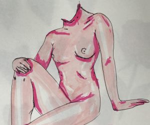
(Above) I tried to do another illustration using brush pens and fine liner to practise the shape of the body I was drawing. I like the way it turned out with the highlights, however the shadows are not perfect. 
(Above) I really like the way this illustration turned out because of the way there is not an outline around it. I also think the colour distribution and portrayal of shadows and highlights works well here.
I feel as though even though I carried out these illustrations consecutively, I improved vastly within each drawing and it was really good as I took time between each one to distinguish which aspects of the illustrations I liked and disliked.
All work by Kynza Kendall-Jones