I started off the project with 3 main ideas, one being how people represent themselves through style. Some people wear certain garments to either enhance or hide certain body parts. My second idea was how people feel comfortable with their bodies when practicing a certain sport. Individuals have been able to train their body to the point where they are capable of using it in any way, they feel is best in order to win a competition. My last idea was to compare past body types to the present and show what was achievable throughout and history and what wasn’t.
After careful consideration and further research, I decided to pursue body image in the sports world. Specifically, MMA. In the MMA world, fighter’s bodies are often associated with violence and aggression. But, in reality, their bodies should be associated with positivity since mixed martial artists work so hard and train their body to its best capacity.
Afterwards, I looked into boxing and MMA photography. I noticed every image focused on angles greatly. Every image approached the fighter differently. Many photos were taken above, on the ground, below…etc. I knew that I would have to replicate some of these angles when I took my photos with my Male Model. I also realized that most images were in black and white which I found very intriguing. I wanted to recreate the same effect those images gave me with my own.
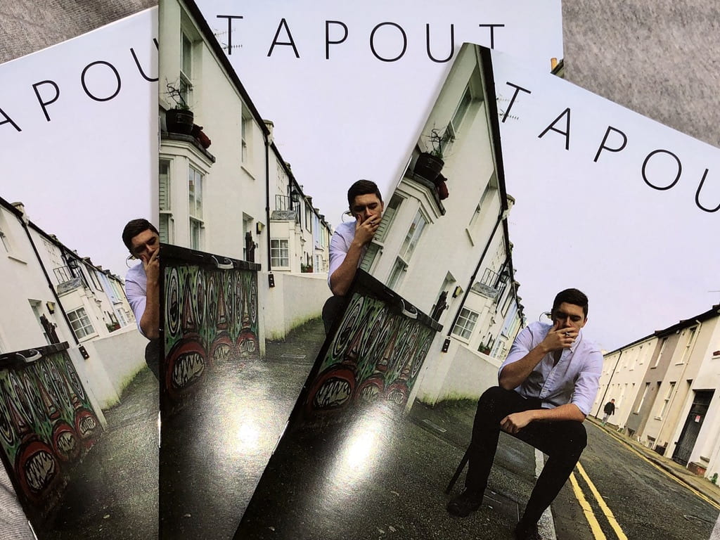
For my photos, I went to an MMA gym in Brighton after booking an appointment. I had my model do his normal training as I took photos. I then wanted to show my model in his natural, comfortable state. So, my model wore a suit and sat on a chair on the pavement. I took photos again at multiple angles. I took photos of my model barefaced whilst smoking a cigarette to represent him in his natural habitat. Then I took another set of photos of him with makeup on (replicating fighting cuts) in order to show the difference in how fighters can be misconceived.
I knew I wanted my magazine to be interactive, so the male model in my Zine is an MMA fighter. He trains every week. I did an interview with him in order to understand how he feels about the sport and the misconception that comes with it.
The inspiration for my zine layout came from looking at others work. I wanted to make my zine very simplistic and appealing to the eye. I mostly focused on the color scheme of black and white, however some images are presented in colour as I felt it suited them best.
The name itself for my magazine came from the idea of tapping out when a fighter can no longer fight. I found this suitable for the magazine as it depicts just how competitive the sport actually is.
