Olafur Eliasson’s “Forked Forest Path” at Fabrica Gallery, Brighton, 2021

Second Year BA Visual Culture student Piers Courtney completed the course-related work placement at the Fabrica Gallery in Brighton, UK, as part of a module called Behind the Scenes. Piers shares a review of a current exhibition at Fabrica.

I was placed in Fabrica Gallery for a work placement towards the end of the spring 2021 ‘lockdown’, participating in installing and running workshops. On the 18th of May until the 20th June, Olafur Eliasson’s Forked Forest Path opened to the public to celebrate Fabrica’s 25th anniversary, in partnership with Brighton Festival. The artist may be well-known, but the installation, one of his earliest works, will be new to many. I was inspired to write this short review.

The work has been loaned from the Towner Art Gallery in Eastbourne. The interior of the Fabrica Gallery has been transformed into an immersive, magical path that leads the visitor deep through twists and turns, mimicking the suspense and relief of being lost in the deep forests of East Sussex.

Eliasson has formed a career of bringing to light ecological and sociological issues with immersive, fun and educational “socio-sculptures” that connect with the natural world to highlight issues such as climate change, including his epic recreation of the sun in the Tate Modern Turbine Hall in 2003. Forked Forest Path is no different.

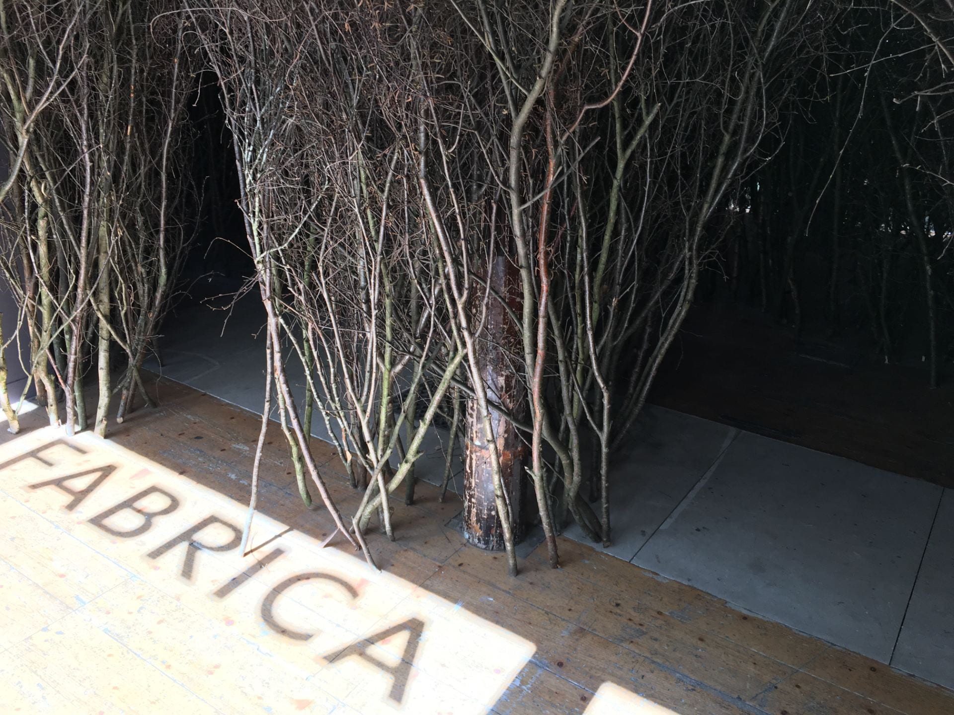
Olafur Eliasson, Forked Forest Path, Fabrica Gallery, Brighton, 2021. Photography by Piers Courtney.

Within the 5000 branches of birch, oak, ash (and others) sourced from Foxwood Foresty near Lewes, Stanmer Park, Wilderness Wood and Laughton Greenwood, the visitor is faced immediately with a question: ‘Which path do I take?’ This is both a literal and symbolic question. As you venture through your chosen path dodging twigs and smelling the rich earthy tones, the environment, alien to the gallery space, challenges you and takes you back to walks in your childhood. For me, to Yorkshire. You then may find yourself asking ‘which path environmentally shall I take, so that all our forests can
thrive to be this dense and immersive?’ This is the beauty in simplicity of the installation. Eliasson has captured both the sublime and the subliminal.

Other questions that arose, for me, at least, were as simple as ‘how in the world did they get these branches in here?’ to as complicated as ‘what does it mean to have a overgrowing forest within a disused church?’ Fabrica’s research team has collected many resources to satisfy the need for answers, and the volunteers are always happy for a discussion. Who knows? Maybe the answers were in the path you chose not to take.

Blinding Lights: spectra III by Ryoji Ikeda

Kevin Hayes, First Year BA (Hons) Visual Culture student anticipates a visit to see the work of artist Ryoji Ikeda showing at 180 Studios, London.

Ryoji Ikeda, spectra [london] (2014). Installation photo © Ryoji Ikeda Studio

When lockdown properly ends, one of the things I am most looking forward to is the Ryoji Ikeda exhibition at 180 Studios in London. Ikeda is a Japanese composer and conceptual artist who creates immersive light and video installations and soundscapes, many of which seem, to me, to be in part, a response to the difficulties of comprehension caused by the data-driven nature of 21st-century life.

Ikeda is probably best known to British audiences for his piece, spectra. Presented as part of the WWI centenary commemorations, it was a column of light, created by 49 searchlights by the Houses of Parliament, which dominated the London night skyline for a week in August 2014. Visible from over 12 miles away, it appeared almost like an illuminated pillar, but up close, the movement of moths and insects attracted to the lights meant that the individual beams seemed to be alive and moving.  As Ikeda said, ‘When you experience it, any kind of context is suddenly gone. From a distance, it looks monumental and solid, but when you are in it, it is entirely meditative.’

His new London exhibition will showcase 12 works, including spectra III, which I originally experienced at the 2019 Venice Biennale. spectra III could be viewed as the epitome of “but-is-it-art” minimalism, as it’s “just” an empty corridor, with semi-reflective white walls lit by fluorescent lamps. However, as you proceed through the space the work reveals itself. The combination of the reflective surfaces and harsh lighting produce a dizzying, disorientating effect that becomes more intense the further you go. By the time I reached the middle, I felt utterly dazzled, which is, of course, the point. This is a piece that leaves the visitor momentarily blinded, with pure bright white light achieving the effect we would typically associate with pitch-black darkness.

Ryoji Ikeda, spectra III (2019). Installation photo courtesy of La Biennale Di Venezia, The Artist and Audemars Puget © Ryoji Ikeda Studio

Something I have enjoyed about my degree so far has been the sense of “joining the dots” between art I’ve already seen and academic theory. Recently I was introduced to Georg Simmel’s writings about the alienation caused by the overwhelming stimuli of urban life, which reminded me of Ryoji Ikeda’s work (Simmel, The Metropolis and Mental Life, 1903).

In Venice, spectra III was shown alongside Ikeda’s video installation data-verse 1, which visualises scientific information from sources such as CERN and NASA. Both pieces appear to respond to the overwhelming “noise” of our constantly “switched on” modern existence but in opposite ways: data-verse 1 tries to make sense of the flood of information by converting it into imagery, whereas spectra III overloads our senses.

Both pieces will be in the London exhibition, and I’m really looking forward to seeing them again, this time with some more academic context.

RYOJI IKEDA is at 180 Studios, 180 The Strand, London, WC2R 1EA from 20th May to 1st August 2021. www.180thestrand.com

Strike an Iconic Pose: Exhibiting a dissertation


Graduating BA (hons) Visual Culture student, Kate Wildblood, reflects on the ways in which her personal, professional and academic interests intertwined in her dissertation, soon to be exhibited as part of Brighton Pride 2013.

Collages of gay club flyers constructed by Kate Wildblood

Having spent most of my professional career either DJing within or writing about LGBT cultural and social life, when I became a mature student at Brighton University in 2010 it was perhaps destined that I would bring something queer to my Visual Culture degree. As they say, you can take the girl out of the disco, but you can’t take the disco out of the girl. My dissertation topic, Strike A Pose, There’s Something To It: Imagery in gay clubbing 1989-2013 examined the event flyer designs of Club Shame, Trade and Wild Fruit, showing how they reflected the 1970s Gay Liberation movement along with the challenges of the 1980s and early 1990s when HIV and AIDS dominated the public, political and media perceptions and portrayals of gay men.

By exploring Roland Barthes’ semiotic theory of myth, my research revealed how the flyer designers Mark Wardel (a.k.a. Trademark), B_Art, Pete Hayward and Paul Kemp created new meanings by reappropriating cultural iconography and signifiers, gay or straight – be they Oscar Wilde, Grace Jones, Aubrey Beardsley, Alice In Wonderland, Metropolis, Tom of Finland or Herb Ritts – to deliver images that challenge heterosexual ideals of masculinity.

In creating new images or subverting existing images for their own ends, gay flyer designers signified certain meanings, rooted in historical context, that connect the viewer to a particular aspect of gay culture, be they childhood memories, icons, subcultures or ideals of gay male beauty. By visually representing my research through the collages Trading Poses and Fruity Benders, I too reappropriated the images of gay clubbing to create further layers of meaning. Having spent so long surrounded by gay clubbing imagery I was keen to strike new poses with the material and to represent the rich queer history we have all played a part in developing. If you will excuse the puns, I wanted to Trade in the glorious Fruit-iness of it all.

I’m genuinely delighted that my two collages will feature in the Icons exhibition as part of Brighton’s new LGBT arts festival during the Pride events of 2013, and am honoured that my work will sit alongside artists including Keith Haring and Mark Vessey. The purpose of Pride, for me, has always been more than a party; it’s about celebrating the people of Brighton and our shared pride in our city. The Icons exhibition is a perfect reflection of that pride and a showcase for the artistic achievements of our seaside city. As so many of the images I used in Trading Poses and Fruity Benders originate from Brighton’s gay clubbing scene, it feels like they are coming home.

The Icons Exhibition is at Brighton Jubilee Library, Jubilee Square, Brighton until 1 August 2013. For further information on the event, please see the Facebook page:

https://www.facebook.com/events/153509038156320/

For more information about Kate Wildblood’s writing and research, see her blog:

http://www.perfectdistractions.com/strikeapose