Exciting news! Our MA graduate Arisa Yamaguci wins a prestigious award

Reporting on MA History of Design and Material Culture graduate Arisa Yamaguci’s successes, including completing a PhD, winning a prestigious award and making important contributions to the study of dress history.

On March 26th 2022, Arisa Yamaguci, graduate from the University of Brighton MA in Design History and Material Culture, was awarded her PhD from Seitoku University, Matsudo, Chiba, Japan. She was also given the honour and prestige of receiving The President Award at graduation, which recognises highly esteemed accomplishments.

Allie joined our MA Design History and Material Culture programme in 2014, researching a dissertation titled: Japonisme in France, Japonisme in Japan: issue of the cross cultural design and consumption of silk textiles 1880 – 1914 and its related museum exhibition in Kyoto and Paris.

Her PhD from Seitoku University built on this MA research, but with a focus on the reception and use of the kimono in Britain in the late 19th and nearly 20th centuries.

Advertisement in the Bexhill Chronicle May 1914 for the local department store Miller and Franklin’s ‘real Japanese kimonos’.

Allie  is now a Lecturer at the University of Tsukuba. On March 27th she was a member of the virtual panel “Fashioning Misunderstanding – Transcultural Engagements and the Material Culture of Fashion,” chaired by Toshio Watanabe, University of East Anglia, at the annual Association for Asian Studies Annual Conference, with presentations by Elizabeth Kramer, Northumbria University , Sarah Cheang, Royal College of Art, Keiko Suzuki, Ritsumeikan University  and Arisa Yamaguchi, University of Tsukuba on “Fancy Dress Described” (1879-1896.)”

Allie is currently developing a book proposal for a UK publisher with a provisional title of Kimono Circulates: Sartorial Japonisme and the Experience of Kimonos in Britain 1865-1914.

Lesbian T-shirts in Lockdown: Winning the Costume Society’s Yarwood Prize

Eleanor Medhurst, student of MA History of Design and Material Culture, explains how she will use a prestigious prize awarded by the Costume Society.

In March 2020, before we knew what the spring and summer would hold, I applied for the Costume Society’s Yarwood Grant. The Yarwood Grant, as described on their website, is “aimed at helping an MA student engaged in high quality research into the history of dress and/or textiles with expenditure relating to the completion of their dissertation.” My MA dissertation, titled ‘Billboard Bodies: Dyke Theory and the Lesbian T-shirt’ is a study of lesbian activist/slogan T-shirts and their unique position as politically-charged signals. A large part of this study revolves around the close analysis of a number of lesbian T-shirts. I applied for the Yarwood Grant to assist in the cost of visiting the Lesbian Archive in Glasgow Women’s Library and the Bishopsgate Institute in London; at these archives, I planned to look for examples of T-shirts that aren’t posted online, and analyse them as physical objects rather than only the slogans or designs that are the main feature in online archive photographs.

I’ve been to the Lesbian Archives before, albeit briefly and without warning the staff and volunteers in advance, so I know that there are boxes and boxes of T-shirts in the collection to look through as a researcher. When I last visited, some were even out on display, one black, with “The Lesbian Avengers” printed in white, and one white with an inverted pink triangle on the front and the words “Fight 28” (referring to the controversial Section 28 law of 1988 that forbade the “promotion of homosexuality” in educational and local authority contexts). I have included the quick snap that I took of the Lesbian Avengers T-shirt in my dissertation research already, and I know that there’s so much more that my research could gain from the archives.

Fig. 1: Lesbian Avengers T-shirt, black with white text. C.1992-6. Glasgow Women’s Library Lesbian Archive. Glasgow, Scotland. Personal photograph taken by the author, Aug. 2019.

It was, honestly, a surprise to find out that I had won the award at the end of June. Not because I didn’t think my research to be worthy (after working on it for months, I know that it is a valuable study), but because I’d mostly forgotten even applying. This year has been a little bit disruptive, to say the least. Initially, I was thrilled, of course. After that, however, I started to worry. How could I undertake the research I’d initially planned? Archives are still closed, it is still not particularly safe to travel, and on top of that, I’ve already written a large amount of my dissertation, sans archival research.

Writing my dissertation has proved to me how important this topic is, and how much room it has to expand, even after the 18,000-20,000 word count. What I now intend to do is complete my dissertation to the plan I’m already following, but then undertake the archival research afterwards, when it is safe to do so. The grant, then, will still be contributing to my dissertation research, but it will allow it to stretch further. I’ll be using the new research that I’ll gather to rework and build on part of my dissertation, with the goal of submitting it as a proposal for journal publication. This means that the grant will support me not just as a Masters student, but also as a postgraduate researcher. I am very excited to continue.

Reflections on a Curatorial Research Opportunity

MA History of Design and Material Culture graduate Sandy Jones reflects on the study stages and career steps that led to a curatorial role in the Design, Architecture and Digital Department at the Victoria and Albert Museum.

Fig. 1: The Cast Courts, V&A. December 2019. Photograph: author’s own.

I had arrived early and wandered through the cast courts at the V&A. Passing time before the meeting with curators, I paused to take a photo of an intricate stonework frieze for a friend, texting it with the words, ’can’t believe it, working here’. The brief for the job was exciting: a three month curatorial research project to explore the design history of an everyday manufacturing material, working alongside another researcher who would, in parallel, identify the objects in the museum’s collection to tell the story. It also involved looking through an entirely different lens at a collection close to my heart, the Jobbing Printing collection of commercial print at the National Art Library, to find the contextual objects that would best illustrate the material’s cultural significance and use. This early stage scoping research was a proof of concept exercise: ‘what was the story, did the museum have the objects to narrate it and were there opportunities to reframe the way we think about this material?’ I reflected that my BA/MA study had, of course, enabled me to apply for this role yet there were other factors too: field specialisation, volunteering, the encouragement of tutors and colleagues, and right place/right time opportunities.

Fig. 2: Luxor Radio, Sweden, publicity material. 1930s. JP Box 25. V&A National Art Library Jobbing Printing Collection.

My interest in graphic design began when I worked in the design industry. As my Museum and Heritage Studies BA progressed I became particularly interested in design during the interwar period. Lectures such as Jonathan Woodham’s ‘American Design Between the Wars’ in 2012 (my notes to this lecture: ‘Streamlining. Speed whiskers. Aerodynamic corners. Faster, better’) brought into sharp focus how artists and designers were imagining this brave new material world. Commercial art, as it was called then, also underwent a radical transformation as modernist designers embraced new technologies such as photography and print production processes, and organisations began to recognise its value as a powerful tool for business and recovery following the Depression. An assignment to research an exhibition display from Britain Can Make It (V&A, 1946) extended my interest even further to the post war period and led me to discover the University of Brighton Design Archives. It was here that I found photographs recording the wartime exhibitions of emigré designer F. H. K. Henrion for the Ministry of Information and US Office of War Information, which became my dissertation topic.

Fig. 3: Aerobics at the De La Warr Pavilion. The People’s Pavilion: Our First 80 Years (2016). Photograph: Bexhill Observer, September 1983. Image: B2226/22. Courtesy: DLWP/Bexhill Museum.

I began volunteering early on in my BA to gain experience of working in the cultural sector and was briefly a gallery assistant at The Towner and a volunteer at the Design Museum, responsible for cleaning and packing objects for their move from Shad Thames to Kensington. I was also a regular volunteer at the iconic modernist building by the sea, the De La Warr Pavilion in Bexhill. Whilst there, I wrote the gallery guide for a Hayward Touring exhibition, helped out with admin and co-curated an exhibition, The People’s Pavilion: Our First 80 Years (2016). 

Fast forward to the first term of my part-time History of Design and Material Culture MA when the DLWP asked me to undertake curatorial research for their exhibition, The New Line Works: from the Jobbing Printing Collection (2016/17). A collaboration with the V&A’s National Art Library (NAL), the exhibition showcased some of the treasures from this commercial art collection assembled by Keeper of the Library, Philip James, between 1936-39. On display were works by some of the most prominent international designers of the period, such as Edward Bawden, Barnett Friedmann, Edward McKnight Kauffer, Herbert Matter, László Moholy-Nagy and Serge Chermayeff, the joint architect of the Pavilion.

Fig. 4: Installation shot, ‘The New Line: Works from the Jobbing Printing Collection’ (2016/17). De La Warr Pavilion. Photographer: Nigel Green. Courtesy: dlwp.com.

Once I’d completed this research, I knew I wanted to continue and hoped to make it my dissertation topic. I wrote to NAL curator Deborah Sutherland to ask whether there were aspects of the collection that would benefit from research. She generously invited me into the NAL to discuss three proposals. One in particular stood out, a collection within the collection containing rare Czech, German, Russian and Swiss works sold to the library by exiled German typographer and educator Jan Tschichold in 1937. It was significant as the only collection purchased for Jobbing Printing at a time when the museum did not actively collect Modernist material. I was also fortunate because Professor Jeremy Aynsley, my dissertation tutor, knew the collection well, having written about it in 1995 and exhibited works from it.

Fig. 5: Bochumer Verein publicity material, ca. 1925. Designer: Max Burchartz. JP Box 34 (a). Museum Number: 38041800366916. V&A National Art Library Jobbing Printing Collection.

In order to gain access to the objects I was sponsored by the NAL as a volunteer, this took a few weeks of paperwork relays and security checks. Even though I completed my MA dissertation in 2018, I have continued as a volunteer researcher whilst working part-time, cataloguing the works and contributing a blog post about one of its objects, a ticket to the party to inaugurate the Bauhaus school’s new buildings in Dessau, 1926. The collection continues to surprise us. Having shared a research presentation I gave at the Bard Graduate Center with the NAL team, a colleague discovered Philip James’ works list for his exhibition, Modern Commercial Typography (V&A, 1936/37), the catalyst for the Jan Tschichold purchase. This was such a find. Previously we had relied on press articles to tell us what he had displayed; finally we knew for certain.

The opportunity to work as a curatorial researcher for the Design, Architecture and Digital Department (DAD) at V&A was advertised in 2019.  The role was a part-time job share and I was responsible for design history research and uncovering some of the more unusual stories. My research partner was John Williams, Collections Moves Officer who was seconded from the Blythe House Decant to identify the objects in the collection that would best illustrate this narrative. We met on Tuesdays in the research department and used WhatsApp to share images, research and snippets we had discovered. I used the online resources of the museum and accessed contemporary journals, images and texts in the NAL and St Peter’s House Library to understand the cultural context.  We met regularly with senior curators Corinna Gardner and Johanna Agermann Ross, who provided direction and urged us to be critical. We visited specific exhibitions in order to analyse curatorial approaches and provoke questions about the different viewpoints we might take.

Fig. 6: Dunlop advertisement. The Illustrated London News, July 9, 1938. St Peter’s House Library, University of Brighton.

My deliverable was a timeline, report and slide presentation; John’s was a detailed object list containing images and descriptions. We shared our presentations with the team together with an online repository of our resources that John coordinated. What would I do differently next time? Set clearer parameters. With a subject so broad and endlessly fascinating, it was at times overwhelming. Working together remotely worked really well, although more face time would have perhaps produced a more unified final presentation.

I look forward to returning to the museum as an occasional volunteer when it re-opens, it will be great to see the team and Jobbing Printing. Having this project on my CV will be a great talking point as I continue to pursue other opportunities and personal research interests.

Selling Wallpaper: An archival history of interwar home decoration

Lucy Ellis, MA History of Design and Material Culture, provides a fascinating insight into the history of wallpaper. 

I have always had an interest in the history of wallpaper, and I also have a background in retail. When I started my MA in the History of Design and Material Culture at the University of Brighton  in 2017, I was keen to bring these two things together.  So I was delighted to find a publication called The Wallpaper Magazine in the Museum of Domestic Design and Architecture (MODA) collections at Middlesex University. MODA proved to be a fascinating resource for research into wallpaper salesmanship between the wars.

My research made me realise just how much rich history is contained within trade journals and magazines: all the voices of the trade are there, from management through to decorators. We see them at work and at play through the advice features, technical instruction, sports and social reports, jokes and cartoons, all wrapped up in these wonderful ephemeral objects.

Wallpaper Magazine, April-May 1927

Wallpaper Magazine, April-May 1927, Museum of Domestic Design and Architecture collections, Middlesex University.

The Wallpaper Magazine was published in Britain from 1920-1939 by The Wallpaper Manufacturers Ltd (WPM), the dominant wallpaper company of the first half of the twentieth century.  The magazine was an in-house journal that sought to unite the industry. It was a conduit for enthusiastic (and at times intensely didactic) advice on how to maximise wallpaper sales.

When the magazine was launched in 1920 the wallpaper industry was recovering from a slump brought about by war and shortages of raw materials. The wallpaper industry also faced a hostile design climate in which critics, enthused by modernism, advocated abandoning wallpaper for plain painted walls.

In response, WPM used The Wallpaper Magazine to inform, educate and motivate the wallpaper salesman to ‘better business’. It was a means of conveying the new USA-led science of salesmanship to the independent decorator on the high street in order to revive the trade.

The magazines chart the growing importance of branding as a means of selling.  I was intrigued by the changing cover designs and how the tone of the magazine altered over the 1920s and 1930s.  In the 1920s the salesman was encouraged to see his (mainly female) customers as ‘unbelievers’. It was thought that they needed to be ‘educated’ into buying wallpaper. By the 1930s, there was a more moderate and sophisticated assessment of the client based on psychological profiling, a change reflected in the tone and content of these magazines.

I am very grateful to the Wallpaper History Society for awarding me the Merryl Huxtable Prize to support my research into inter-war wallpaper salesmanship.

For more information about Lucy’s research, watch this film made by Middlesex University TV Production students. With thanks to the Museum of Domestic Design and Architecture for permission to reblog this content. 

The Importance of Being Serious?* A Stevengraph of William Ewart Gladstone

Maria Paganopoulou, MA History of Design and Material Culture, shares her research on a Victorian textile political portrait.

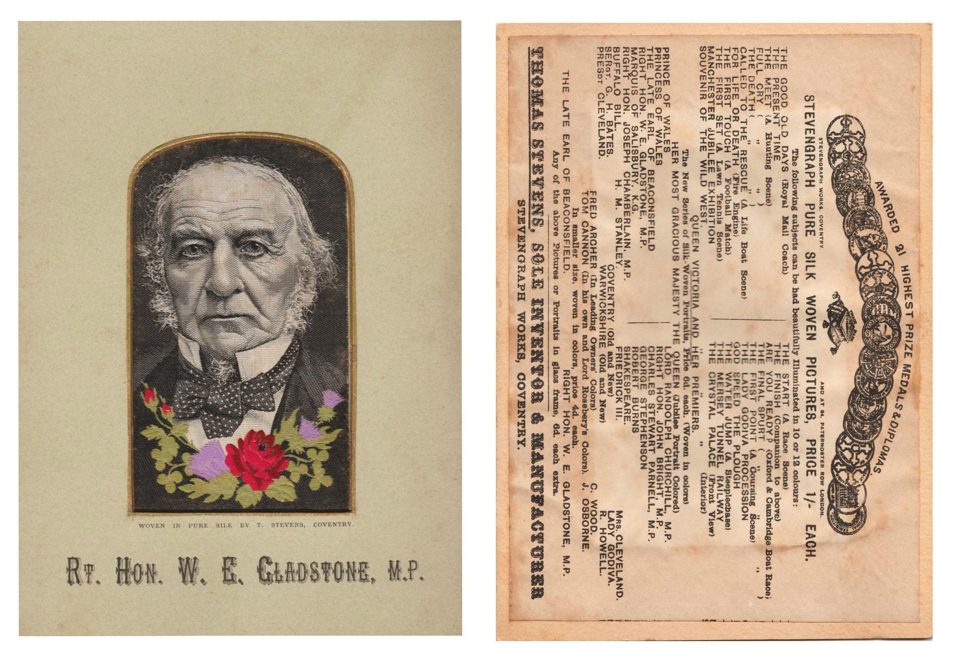
As a part of the MA module, Exploring Objects, students are required to select an item from the Dress and Textile History Teaching Collection at the University of Brighton. The task is to uncover its original history and to provide further interpretation. Since my knowledge of dress theory was still scarce at the point I undertook the module, I went for an object for which my background studies in the history of arts and crafts had already prepared me. This object was a framed silk image, a Stevengraph, depicting the British Prime Minister from 1868-1994, William Ewart Gladstone (fig.1)

1. The front of the Stevengraph (left) and its reverse (right). Stevens Company, Right Hn. W. E. Gladstone, Silk Picture, The Dress and Textile History Teaching Collection, University of Brighton, Photograph by Maria Paganopoulou, October 2019.

For the uninitiated, Stevengraphs were popular mid-nineteenth-century silk images, produced on a Jacquard loom which enabled multiple reproduction. Their name derives from their inventor, Thomas Stevens. Due to their mass production, I was able to locate a sibling to the Dress Collection example in Herbert Art Gallery and Museum in Coventry.

The Stevengraph was extremely visually interesting to me as it seemed to combine contradictory elements of seriousness and playfulness. Gladstone’s sombre expression, woven in black and white, was combined with sparkling threads and colourful flowers. These seemed incongruous, even comic.

My mystery object became less mysterious when I explored existing scholarship, such as that of Geoffrey Godden, who has comprehensively investigated the original contexts for Stevengraphs as a specific Victorian category of decorative objects. Stevengraphs were also used as a case study by anthropologist Michael Thompson in his 1979 book, Rubbish Theory: The Creation and Destruction of Value. Thompson amusingly thanks Godden for relieving him ‘of the tedious task of having to collect most of the historical data before analyzing them’.

2. J. Russell & Sons, The Right Hon. William Ewart Gladstone, c. 1880, albumen cabinet card, National Portrait Gallery: Photographs Collection Database, April 2020 © National Portrait Gallery

My first step in Stevengraph data gathering and analysis was to locate my object in space and time. Stevens’ company was based in Coventry and according to Godden’s rigorous dating method, based on fonts and frames, the birth of my object took place in that town between 1889-1891. As the image prepared for the loom was most likely not drawn from life, my next step was to search for its visual source.

After lengthy research in the digitised collections of the National Portrait Gallery (NPG), I was able to locate the original image, a nineteenth-century photographic cabinet card (fig.2). The striking similarity between the photograph and the Stevengraph did not leave much room for doubt and the interplay between the two nineteenth-century technologies, photography and mechanical loom, prompted me to find out more connections between them.

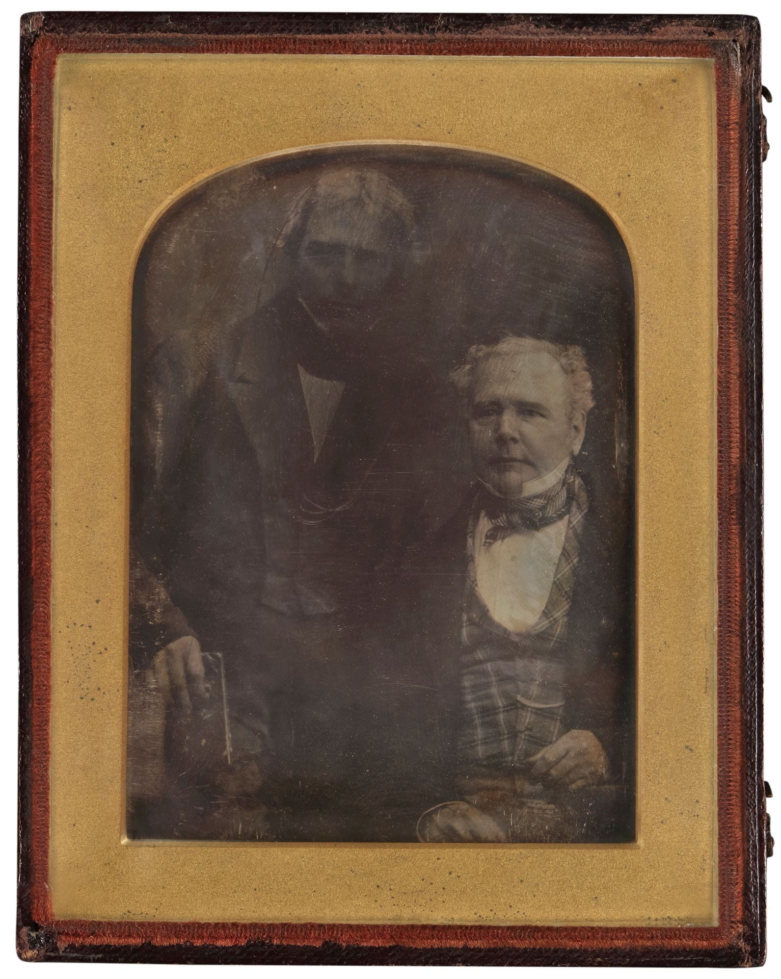
3. William Thomas Brande, Antoine Claudet and Michael Faraday, half plate daguerreotype, c. 1846, National Portrait Gallery: Photographs Collection Database, April 2020 © National Portrait Gallery

After examining previous types of photography in the online catalogue of the NPG and various books dedicated to the subject, I discovered many similarities in the way that photographs and silk images were framed. The bell shape of the frame can be found supporting various kinds of early photographs, including Daguerreotypes and Ambrotypes (fig. 3) and also later cabinet cards.

Furthermore, the way that Stevengraphs were framed has affinities to cabinet cards kept in albums (fig. 4), suggesting a similar use and display. It is evident then, that although made in silk, a luxurious material often associated with fashions to be worn on the body, Stevengraphs were produced and framed to be visually consumed, as with parallel display patterns in photography.

4. Framed Cabinet Cards, Four Reproduction in Asa Briggs, A Victorian Portrait: Victorian Life and Values as seen through the Eyes of the Work of Studio Photographers, London, Cassell, 1989, pp. 18-19 (upper), 82-83 (down). Print

The time had come to investigate my initial excitement about the Stevengraph’s apparent contradictions. I learned that seriousness in the sitter was not surprising in the period. Indeed, it is not usual to find smiles in Victorian photographs. Smiling in photographs is a cultural convention established in the twentieth century due to the popularisation of informal photography by Kodak.

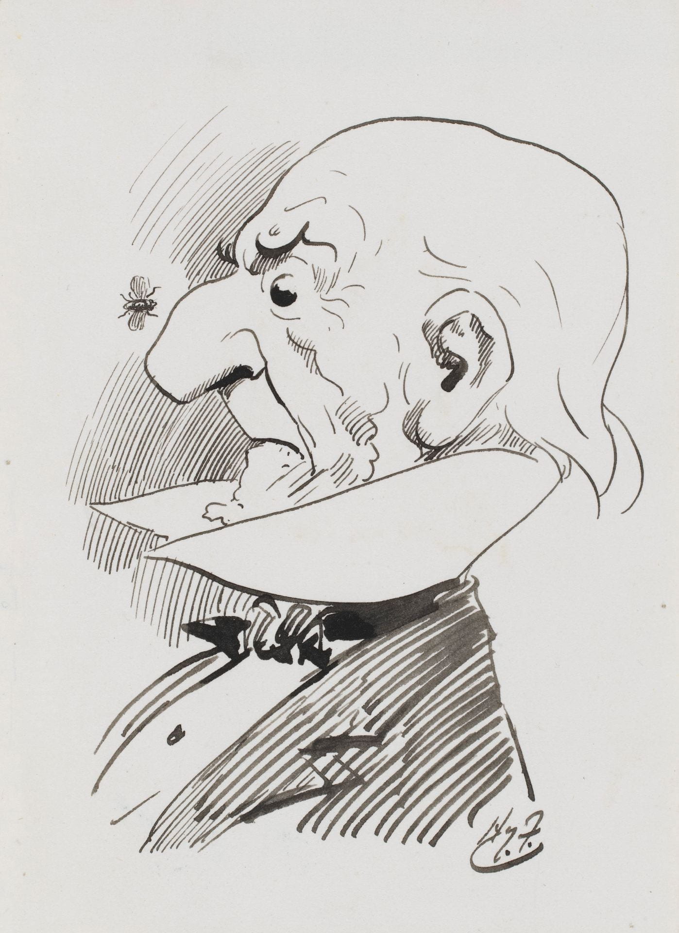
In addition, although politicians today brand themselves as approachable and even light-hearted, in nineteenth-century England seriousness was expected in the political arena. Nevertheless, humour had a distinct place in Victorian politics, with a special class-specific aspect especially reserved for mocking those of a non-aristocratic descent. Gladstone, having mercantile origins, was frequently lampooned by fellow politicians and cartoonists (fig. 5). It has been argued that his political persona was based on being consistent and serious as a way of refuting such attacks. This seriousness was also reflected to the way he styled himself when being photographed.

5. Harry Furniss, William Ewart Gladstone, pen and ink, 1880s-1900s, National Portrait Gallery: Primary Collection Database, April 2020 © National Portrait Gallery

As far as the other side of my seeming paradox is concerned, namely the colorful flowers of the image, they lost some of their playfulness when I learned that they are the official symbols of England (rose) and Scotland (thistle) respectively. Gladstone was half Scottish and had run a successful campaign in the Scottish province of Midlothian. It may even have been that this campaign gave rise to the production of objects depicting Gladstone in the first place.

This brought me to the matter of the object’s consumption. Stevens’ marketing strategy for his silk pictures promoted technological innovation as their main selling point. No explicit reference was made in advertisements to their visual subject matter. As a result, I had to turn to other sources. What emerged from further research was Gladstone’s carefully cultivated popularity, especially in the context of the Midlothian campaign which is considered to be one of the first modern political campaigns.

Popular admiration for Gladstone resulted in the production of an abundance of objects carrying his likeness, from figurines to printed plates (fig. 6). His popularity has been described as equivalent to a cult. This provides a framework for understanding why the Stevengraph might have been purchased and how it might have been used. It may have been bought to express admiration, and may have been placed in a photographic or souvenir album amidst other beloved political and public figures, whose likenesses were also issued.

6. Gladstone Plate, porcelain, in Asa Briggs, “Victorian Images of Gladstone”, in Peter J. Jagger (ed.), Gladstone London, Hambledon Press, 1998, pp. 3. Print

To conclude, the range of research directions that a single object can open up was far more than I had first anticipated. The variety is what made the research fascinating. Stevengraphs existed in a wide network of objects and people, the study of which opened new windows for me into Victorian visual culture, design and politics.

*My title refers to the article by Joseph S. Meisel (1999), ‘The importance of being serious: The unexplored connection between Gladstone and humour’, History 84:274, pp.278-300.

For more information about Stevengraphs, see Herbert  Art Gallery and Museum: https://www.theherbert.org/collections/social_and_industrial_history/18/stevengraphs

Website featuring ‘all known silk bookmarks, silk pictures and silk postcards manufactured since 1862’: http://www.stevengraph-silks.com/

Criticism of the Bauhaus from Within: The Dornburg Workshop

MA History of Design and Material Culture student, Maria Paganopoulou, reflects on lesser-known aspects of the Bauhaus in its centenary year.

While writing my undergraduate thesis on the Arts and Crafts movement, one of the things I found most frustrating was encountering academic writing that condemned the whole of the movement, considering it a failure in its social purposes, design reform and even in its attempted improvement of women’s rights. Very often those academics regarded the Bauhaus as the successful offspring of Arts and Crafts’, as the place where its ideas fully developed, although these narratives were often coloured by nostalgia. Those academics tended to celebrate Bauhaus’ embrace of the machine and mass production and consider the rejection of them by the Arts and Crafts movement as the ultimate reason behind its failure. Arts and Crafts has tended to be characterized as merely a bourgeois endeavour for the middle and upper-classes.

As a result of these debates and my study of them, I have been  irresistibly drawn to alternative narratives that challenged the authoritative status of the Bauhaus and consider it historically rather than wishing nostalgically for its resurrection. Needless to say, when I discovered an opposition to the turn that Bauhaus had taken towards the machine and machine aesthetics, especially one coming from within the Bauhaus, I was utterly fascinated.

Fig 1. Marcks in the beginning of his position in Dornburg, circa 1920

I made this discovery during my three-month internship at Gerhard-Marcks-Haus in Bremen, Germany, a museum dedicated to Gerhard Marcks, sculptor and also a member of the Bauhaus teaching staff. Gerhard Marcks was in fact one of the first three artists that Walter Gropius invited to teach in his newly merged/ founded institution, along with the infamous Lyonel Feininger and Johannes Itten. Marcks and Gropius knew each other from 1907 through Marcks’ brother Dietrich who, like Gropius, was an architect. The two young artists shared a vision to align art and craft and, according to Marcks, this was why he accepted the position of Professor (Form-Meister) in Bauhaus.

Fig 2. Renate Riedel, Thoma Gräfin Grote, Max Krehan and Marguerite Friedlaender in front of the workshop.

After the news spread about the establishment of the Bauhaus in Weimar, Max Krehan, a local potter who owned a workshop in Thuringia, approached Gropius for a potential collaboration. Gropius and Marcks visited his workshop in Dornburg and came to the conclusion that this was where the ceramics workshop of the Bauhaus should be established. In 1920 the plan was realized and the Dornburg Workshop came to life, 20 miles away from the central Bauhaus premises in Weimar, with Gerhard Marcks as its Form-Meister and Max Krehan as its Werk-Meister (master of technical aspects).

Fig 3. Cup made of burnt clay with a portrait of Johannes Driesch (student), made by Marcks in 1922

The intertwined life and teaching in the workshop were not ideal; on the contrary they were deliberately challenging. In Marcks’ writings, he emphasised the traditional aspects of the work of the workshop, especially in relation to the absence of advanced machinery and the physically demanding nature of the job that its absence caused. The potters’ wheels were operated by foot power rather than electricity. The ovens were wood-fired. However, the use of traditional equipment was perceived in a positive light. As Marcks wrote: “This was the purest nature”.

The learning procedure was long and for the first two years apprentices were allowed to experiment only with their decoration before they were considered ready to experiment “plastically” with the forms. To compensate for the hard work and the restrictions imposed, there were leisure activities, such as swimming and the collective reading of seminal texts. We can see, then, that this autonomous community, developed in the framework of the Bauhaus, functioned a lot more like C. R. Ashbee’s Guild and School of Handicraft in Chipping Camden in Britain, rather than a school dedicated to industrial design. Nature, traditional equipment, common life and the concept of rural escape employed in the Dornburg workshop therefore reflect previous ways of thinking.

Fig 4. Postcard for an exhibition of the Bauhaus, designed by Marcks in 1922

As far as what was happening in the central Bauhaus, Marcks didn’t hesitate to voice his dissatisfaction. In letters to Gropius, Marcks made clear that Bauhaus should be a workshop not a school. He also stressed the need for contact with materials and the making of objects. This differentiated him from other Form-Meisters in the Bauhaus who were more interested in painting or in the intellectual aspects of creation, leaving the teaching of technical skills to the Werk-Meister. Finally, Marcks stood at a clear distance from the mass production shift advocated by Theo van Doesburg. In his words “I cannot identify anymore with Bauhaus. Sooner or later Formalism is taking place. If I was in Weimar I wouldn’t still be in Bauhaus”. The tale of the end of the Dornburg Workshop is a short one. Bauhaus moved to Dessau and Gerhard Marcks wasn’t invited to continue teaching. Max Krehan also died in 1925, around the time of this decision.

Fig. 5. The interior of the workshop

Last year, the Dornburg Workshop opened its gates as a museum as part of the Bauhaus centenary commemorations. Despite this, its story is relatively unknown, even in Germany. The history of the Bauhaus comprises many lesser-known stories that run in parallel with the evolutionary narrative of the heroic modernist school which, it is claimed, came to succeed where previous movements had miserably failed. The dominance of this modernist narrative, it seems to me, is partly informed by the stylistic preferences of those doing the telling. As the case of the Dornburg Workshop shows, however, Bauhaus shared common roots with some earlier Arts and Crafts endeavours instead of overthrowing them entirely.

Fig 6. The interior of the workshop

Kind thanks to Gerhard-Marcks-Haus for providing me with access to their resources and archives.


Up, Up, and Away: The TWA Hotel

MA History of Design and Material Culture student Gabriela Schunn introduces a striking new hotel, which she recently appraised for Vintage Women Magazine.

Considered a marvel of neo-futuristic architecture, the TWA Flight Center opened in May of 1962 and was the brainchild of Finnish-American architect Eero Saarinen, who is best known for designing the St. Louis Gateway Arch. It was commissioned by the Trans World Airlines (TWA) in 1955 to be built as a separate terminal at the John F. Kennedy International Airport (JFK), which was still known at the time as Idlewild Airport. Idlewild was looking to court TWA, as they were known as a luxury airline in a time when air travel was already considered a luxury, so the expansion seemed eminently profitable. Renowned architect Robert A.M. Stern once referred to the terminal as the “Grand Central of the Jet Age,” as for decades following, passengers traveling out of JFK would lounge in the headhouse.

An outside glimpse of Saarinen’s building.

Unfortunately, after filing for bankruptcy twice in the mid-1990s, TWA sold its assets to American Airlines and officially closed the terminal in October of 2001, unable to sustain maintenance of the structure. The building had a brief life as host to an art exhibition in 2005, but was shut down again after guests began vandalizing the building. After this, the Flight Center was nominated as one of the 11 Most Endangered Places in America (with regards to historic architecture) and was shortly thereafter listed in the National Register of Historic Places.

However, when the JetBlue Terminal was opened behind the old Flight Center in 2008 to reutilize the lost space, restoring Saarinen’s building began to be re-considered. In 2015, it was announced that the TWA Flight Center would be turned into a hotel for airport guests, paying tribute to the era in which it was originally built. In its heyday, the airline was known for being the first choice of celebrities, servicing the likes of the Beatles, but sometimes found itself not reaching the average consumer because of its many indulgent impracticalities. The hotel has attempted to combat aspects of that legacy by working with company MCR Development to bring all hotel guests an accessible experience.

A display crafted by the New York Historical Society.

If you compare photos of the original terminal to photos of the structure at present, it is clear that they are very closely matched in their layouts. MCR kept all of the iconic features of Saarinen’s original structure, a few of which includes the following: the stark white wing-shaped thin-shell roof, the tube-shaped entrance hallways, the massive wall of glass windows facing the runways, the bright red carpeting, the spiral-staircases and thin arched bridge, and, of course, the iconic departures board that still functions, albeit purely for novelty purposes now. Saarinen said that he “wanted the architecture to reveal the terminal not as a static, enclosed place, but as a place of movement and transition,” which is reflected in the intricate winding pathways.

While Saarinen’s building itself contains the hotel lobby, shops, museum, and restaurants, his original tube-like departure corridors grant hotel guests access to the 512 rooms that are split across two attached buildings called the Saarinen Wing and the Hughes Wing, named after the architect and the famous business magnate that once controlled much of the airline’s assets respectively. All of the woodworking was completed by Amish family-run contractors, a testament to the hotel’s dedication to ethical locally-sourced production. The hotel also features a glass-walled pool and is host to the world’s largest hotel gym.

“Connie”.

Perhaps one of the most striking features of the TWA Hotel, however, isn’t located within the building itself. It is the airplane nicknamed “Connie,” known more formally as the Lockheed Constellation L-1649 Starliner airplane, which was transformed into a functioning cocktail bar. This particularly contributes to the sense of nostalgia, as many of the original features within the airplane were kept, like the signature airplane seats and Mario Zamparelli’s murals featured on the inside walls of the plane. The precise attention to details with regard to the TWA brand is notable.

For those more interested in the history of the space, one can visit the in-house museum. Crafted with assistance from the New York Historical Society, the displays scattered across the whole of Saarinen’s building highlight the history of the airline’s branding over the years. Free and open daily to the public, it showcases uniforms designed by a host of recognizable designers: Howard Greer between 1944 and 1955, Oleg Cassini between 1955 and 1960, Pierre Balmain between 1965 and 1968, Valentino between 1971 and 1975, and lastly, Ralph Lauren between 1978 and 2001.

A display of liveries designed by Howard Greer, Oleg Cassini, and Balmain.

MCR acquired over 2,000 artefacts of TWA history, including uniforms and paraphernalia from former TWA staff and their families to create these exhibits, and hope to continue such displays in the future. Some of the current wall texts feature anecdotes about TWA, like the fact that TWA hostesses in 1944 were required to wear victory rolls à la Veronica Lake because of the popularity of the film The Hour Before Dawn, that TWA hostesses were the first to show an in-flight movie in 1961, and that one of the original liveries designers Stan Herman designed the uniforms worn by current hotel staff, drawing upon all of the designs of his predecessors.

Atop Saarinen’s arched bridge in the hotel lobby.


In its few short months of tenure, the hotel has already been host to many midcentury-inspired photoshoots by amateurs and professionals alike, several weddings and engagements, a Michael Kors pop-up, the Louis Vuitton Resort 2020 runway fashion show, and is featured in the third season of the Amazon Prime series The Marvelous Mrs. Maisel. While not every element of the hotel is of the period, it is itself a living landmark to the history of travel. The entirety of the endeavour is testament to the power of nostalgia and the renewed interest within popular culture in the mid-century aesthetic.

All photographs supplied with kind permission of Ming Chen Photography

Instagram: @mingchenphotography

Reaching Out: Being a Student Ambassador

Emmy Sale, MA History of Design and Material Culture, explains her Student Recruitment and Outreach role.

Throughout my BA and MA degrees I have worked as a Student Recruitment and Outreach (SRO) ambassador. The role has provided me with the opportunity to work at a range of events organised by the Widening Participation (WP) and Outreach teams in the university but also to gain valuable and transferable skills alongside my studies.

One of the first sessions involved creating and planning a student-led taster lesson as form part of City Campus visits aimed at Year 9 students. The aim is to introduce students to subjects that can be studied at university as well as the ways in which they are taught. The taster I created was based on my favourite aspects of my studies, that is, object-based analysis and theories of material culture.

Fashion and Dress History student-led taster lesson designed by Emmy Sale, showing the garments and worksheet given to students for the ‘dress detectives’ activity.

Making the taster accessible to younger students was a challenge but with inspiration from Ingrid Mida and Alexandra Kim’s 2015 book The Dress Detective, I was able to produce an exciting hands-on activity in which the students followed garment clues and examined evidence.

Through a short lecture-style presentation, the students were introduced to Fashion and Dress History at the University of Brighton and its core concepts. They were presented with questions: Why do we study clothes of the past? How can studying clothing artefacts allow us to find out about the people who wore them? In small groups the students were then given a garment to analyse with the help of a worksheet that asks them to think about how it was made and constructed as well as when it was made and worn. For some unfamiliar garments this is tricky. The students are given ‘archival sources’ that help them to find out the answers to their questions. The taster finishes with short presentations from each group and a reflection on the jobs that these skills might lead to.

Political T-shirt activity created by Emmy Sale for Primary School Mentoring scheme.

The primary school mentoring scheme is another regular event organized by the Widening Participation team, where ambassadors go into a primary school with Year 6 students, once a week. Each week, we provided activities that helped the students to think about their futures and to learn about university. As part of this, I created an activity based on political T-shirts, thinking about their impact and letting the students design their own, inspired by issues that they are passionate about. Equality and homelessness were two of the issues that the students chose, but the activity also created thoughtful and important conversations about broader issues in society.

More recently, I was chosen to be part of a team of SRO ambassadors to support the Humanities Summer School. We were working with mostly Year 12 students, to support them through the timetabled days of taster lessons and activities with academics, such as a visit to the Bloomsbury set’s Sussex country home, Charleston Farmhouse, with History of Art and Design lecturer Megha Rajguru. The visit involved a tour of the house, which was exciting to many of the students who had not previously been, and then a reflective and creative activity thinking about the way stories of the people who lived there can be constructed through space and objects. In the evenings, we supported a range of residential activities to show the students university life in halls, what Falmer Campus has to offer and Brighton’s seafront.

Trip to Charleston Farmhouse as part of the Humanities Summer School (Emmy Sale in Student Ambassador T-shirt).

Overall, the SRO role, and my contribution to related events, has been a greatly rewarding experience alongside my studies. I have gained important skills in leadership, adaptability and confidence in public speaking. It has also encouraged me to extend my post-university job search to include Widening Participation and Outreach roles.

The Widening Participation team usually recruit new SRO Ambassadors twice a year. Ambassadors receive training and are paid for the work they do. For more information: https://blogs.brighton.ac.uk/sroambassadors/ 

Volunteering at the Old Police Cells Museum

Caroleen Molenaar (BA Fashion and Dress History) and Emmy Sale (MA History of Design and Material Culture) reflect on the skills they have acquired on the job.

The Old Police Cells Museum opened in 2005 as a mayoral project instigated by Brighton Councillor Pat Drake. It was initially run by a dedicated and knowledgeable team of volunteers and ex-police staff. In 2018, the museum entered a new phase. MA History of Design and Material culture alumnus, e-j scott, was hired as the curator with a mission to help the museum achieve national accreditation status. As part of this process of development, volunteers were recruited to work to improve the museum to the standard required.

Caroleen Molenaar, BA (Hons) Fashion and Dress History

When I started my volunteer position at the Old Police Cells Museum in October 2018, I was assigned to be a part of the Costume Collection Team due to my experience, knowledge, and interest in fashion history and wanting to acquire hands-on museum experience.

Within this role I have had a variety of different tasks to complete. In the autumn, along with other Costume Team volunteers, I was responsible for a collection audit of all the costume-related objects that were located within the women’s cells. (At the moment the objects in the women’s cells are not strictly related to women’s policing but encompass both men’s and women’s policing. The name of the women’s cells originates from when the museum was used as a cell and both women and children were held in that part of the building.) This duty included completing accession forms for all items on display and checking in the collections database that all objects on display had been accounted for. Various types of objects were included: men’s and women’s uniforms, police helmets, handcuffs, buttons, epaulettes, whistles, belts, and truncheons.

Since January 2019 my role has shifted into another aspect of collections management. Alongside other volunteers, I have begun to conserve the police uniforms within the collection. This type of conservation is a multi-step process that takes place over several weeks. It involves wrapping the police uniforms in plastic for protection; placing them in a large freezer for two to three weeks to kill any bugs or bacteria that may be on the uniform; unwrapping the uniforms; cleaning the uniforms which a specific conservation vacuum (Figure 1); wrapping them in acid-free tissue paper; and storing them in plastic storage boxes. Condition reports, which include information such as markings, measurements, and overall garment condition, as well as accession forms are completed for each object.

Figure 1: Museum conservation vacuum. Photograph by Caroleen Molenaar. 3 June 2019.

My volunteer position at the Old Police Cells Museum has provided me with invaluable hands-on skills and knowledge about costume collection management within a museum environment. This will be invaluable when pursuing future employment within the sector.

Emmy Sale, MA History of Design and Material Culture

I became involved with the Old Police Cells Museum as a way to gain first-hand experience in a museum environment and to apply the theoretical thinking about museum displays from seminar discussions into practice. The role assigned to me was object and displays researcher for the women’s cell. This includes producing informative A1 text panels alongside displays of objects and images from the museum collection that tell the history of women police in Sussex.

Screenshot from “U.K.: London Policewomen Get A New Uniform.” 1967. British Pathé. https://www.britishpathe.com/video/VLVAA0A0KX6PDW06WVAAKHN7FFVPE-UK-LONDON-POLICEWOMEN-GET-A-NEW-UNIFORM/query/women+police

I was keen to produce a display about women’s uniform and was delighted to find out that not only had celebrated couturier Norman Hartnell designed a women’s police uniform in 1967 but that the museum has an example of the hat that was part of this uniform. A British Pathé video of the press day (Figure. 2), revealed how they wanted to contrast the new ‘modern’ Hartnell-designed uniform with the uniform previously worn. We were able to translate this comparison into a display with both hats mounted in a cabinet alongside a text panel (Figure 3), explaining the significance of Hartnell’s role and how his design was unfortunately unsuccessful due to some impracticalities in its tailoring.

Figure 3: Display about the 1967 women’s police uniform designed by Norman Hartnell. Old Police Cells Museum, Brighton. Photograph by Emmy Sale, 30 March 2019.

The role has offered useful insight into the challenges of working with a museum wanting to achieve accreditation, particularly in terms of appropriate word counts for text panels and copyright issues surrounding the use of images. Research into police history was not something I had undertaken before but it has been an exciting challenge that tests my research skills and the application of them to new subjects. My next project for the women’s cell is to produce a timeline charting the history of women in Sussex-based police services since 1915.


Victor Papanek’s Social Design Legacy: A Book Review

Karen Fraser, MA History of Design and Material Culture, reviews a new book that explores pioneering ideas and practices in global social design.

Victor Papanek [1923-1998] was an Austrian-American designer, author and activist who was concerned with design and its social, environmental and ecological consequences.  His pioneering attempts to disseminate the word of social design meant he led a peripatetic lifestyle, and as a result he left traces in institutions around the world. Victor Papanek: The Politics of Design is a 400-page catalogue published to accompany the exhibition of the same name held at the Vitra Design Museum from 29 September 2018 to 10 March 2019. The catalogue could be said to animate the archives; it seeks connections amongst the photographs, drawings, documents, and objects that Papanek created or in some way left his mark upon over a career beginning in the 1940s and continuing through the 1990s. Through essays, interviews and a series of provocations offered by contemporary designers, the catalogue aims to answer the question: what is Victor Papanek’s legacy for the twenty-first century?

Fig. 1: Daniel Streat. Cover of Victor Papanek: The Politics of Design. 2018. First published by Vitra Design Museum and Victor J. Papanek Foundation, University of Applied Arts Vienna.

The front and back covers offer an ambiguous visual introduction. White shapes appear to refer to things in the real world, but it is not immediately clear what those things are. Through five themed sections, it is revealed that some refer to objects designed by his students, some to things he has collected, and others to diagrammatic visualisations made in his notebooks. Further still, one points to a contemporary designed object, the Nike Pro Hijab, which was launched in 2017 and carries functional and symbolic significance for its intended wearers, female Muslim athletes. This inclusion addresses a gap in Papanek’s legacy: for all his merits, he paid little attention to the intersection of design and gender. As curator Amelie Klein notes in the catalogue’s opening essay, there are five contemporary design projects included in the exhibition that expose assumptions about gender, but they stand apart from the works by Papanek and his contemporaries. However, in exposing the Nike Pro Hijab’s potential for becoming a lucrative commodity, the curators link it to an aspect of Papanek’s record that is surer footed, that of his critique of consumerism. Contributor Dr Garnet Hertz identifies that Papanek’s work to ‘shift design from a type of marketing into a type of public service’ is deeply relevant to the late capitalist moment we are in now. As such, the catalogue contextualizes Papanek’s life and career in a way that recognizes its strengths and reckons with its failures.

Fig. 2: Nike Pro Hijab. Advertisement. 2017. Nike News. 30 May 2019. https://news.nike.com/news/nike-pro-hijab. JPEG File.

One aspect of Papanek’s work that offers much to reckon with today is his role with the International Council of Societies of Industrial Design (ICSID), established in 1957 by European and American designers who aimed to professionalise design through the development of international standards and design education across political and economic boundaries. Among its contributions, The University of Brighton Design Archives provided an image of the Ahmedabad Declaration on Industrial Design for Development, presented at the 1979 United Nations Industrial Development Organization (UNIDO)/ICSID Design for Development Congress. Professor Alison J. Clarke, who is the Papanek Foundation’s current director and who previously taught at the University of Brighton for several years, acknowledges that Papanek’s contribution to the congress reflected the way socially responsible design was thought of at the time, where the Global South provided ‘fresh fodder for design’.

Fig. 3: Ahmedabad Declaration on Industrial Design for Development. January 1979. ICD-6-4-4-3. ICSID Archive, University of Brighton Design Archives.

Thoughtful treatment of controversial topics such as this one characterises the catalogue and, as Vitra Design Museum director Dr Mateo Kries writes in his foreword, ensures that Papanek’s significance within the history of design is developed in a manner that is detailed and academically sound. Alongside many contributors who reside globally, two University of Brighton researchers lent their expertise to the exhibition and catalogue: Dr Tania Messell, who drew heavily on the ICSID Archive for her PhD in the School of Humanities, co-supervised by Dr Lesley Whitworth, Design Archives Deputy Curator, and Professor Jeremy Aynsley; and Dr Leah Armstrong, current head of archive at the Papanek Foundation, whose collaborative doctoral project was based in the Design Archives and was supervised by its former director, Professor Catherine Moriarty. These connections reveal some of the local, national and international networks of researchers whose insights made Victor Papanek: The Politics of Design possible.

This catalogue stands solidly on its own and will be of interest to those familiar and unfamiliar with Papanek’s legacy. Students and practitioners of design and its social, political and global history will find many points of connection to make between the complex issues that concerned Papanek and his collaborators and those that confront us today.