Why Grandma and Grandpa wore what they wore: Fashioning Everyday Lives In London and New York


Fashion history is about much more than elite garments. Amy Hodgson has been intrigued by the everyday fashion choices of ordinary people in the final year of her 
BA (hons) Fashion and Dress History studies.

The option module ‘Fashioning everyday lives in London and New York’ has been essential to my understanding of fashion and dress history: observing and questioning the ordinary over the extraordinary, theorizing the overlooked and mundane, asking how fashion and modernity is seen in the ordinary and average areas of society, and how modernity, post-modernism, geography, capitalism, or globalization could affect everyday fashion choices. It has been taught by Professor Cheryl Buckley and is based on new research that she is carrying out. Professor Buckley has just joined the University of Brighton, and it is great that BA students are taught by staff who are leading research in the subject.

This option has helped broaden my understanding of how we look at the average person and their choice of dress. I have learned that fashion isn’t just about the most modern or groundbreaking clothing, but can be seen on the streets on ordinary people going about their daily lives. Questioning the everyday highlights differences. As Ben Highmore observes in his introduction to The Everyday Life Reader, ‘in its negotiation of difference and commonality it might, potentially, find new commonalities and breathe new life into old differences’. Negotiating the different and common, or modern and traditional is witnessed repeatedly when observing everyday fashion; how people may choose to consume the latest fashion on their own, possibly more traditional, terms may uncover issues of gender, race, ethnicity or generational differences.

This option touches on a broad range of subjects, from mass-consumption and ‘fast-fashion’, to geography, feminism and museum studies. All serve the purpose of highlighting how fashion changes and is used on a day-to-day basis. Understanding how fashion is consumed in everyday terms offers insight into society and how, for example, mass-consumption may allow a broader range of people to consume and partake in fashion on their own terms. Geography and fashion cities also play a large part in this option: how fashion operates within a city, and how this in turn affects the peripheral towns has been a key element in uncovering how fashion, and the modern, is witnessed in areas that may be deemed unfashionable or less modern.

Grandma and Grandpa photographic collage

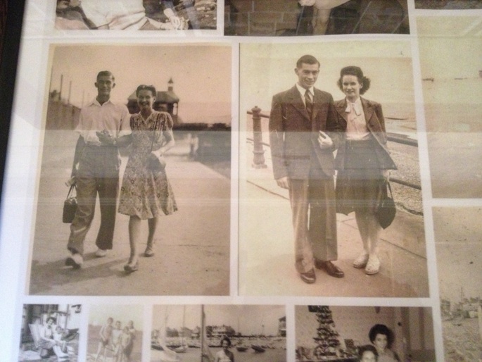
‘Grandma and Grandpa collage’, 1940s, accessed 29/05/14, JPEG, Authors Personal Photograph.

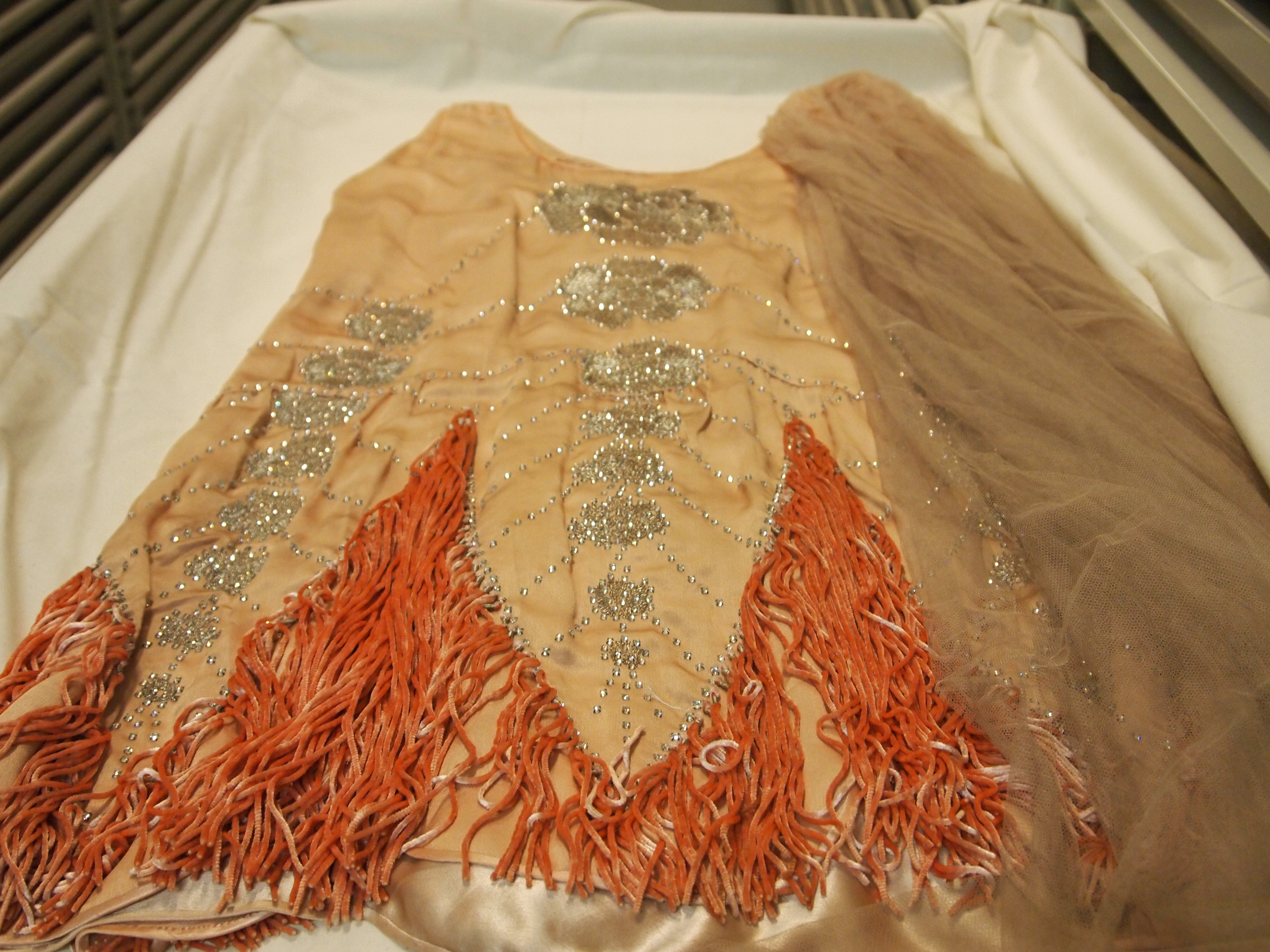
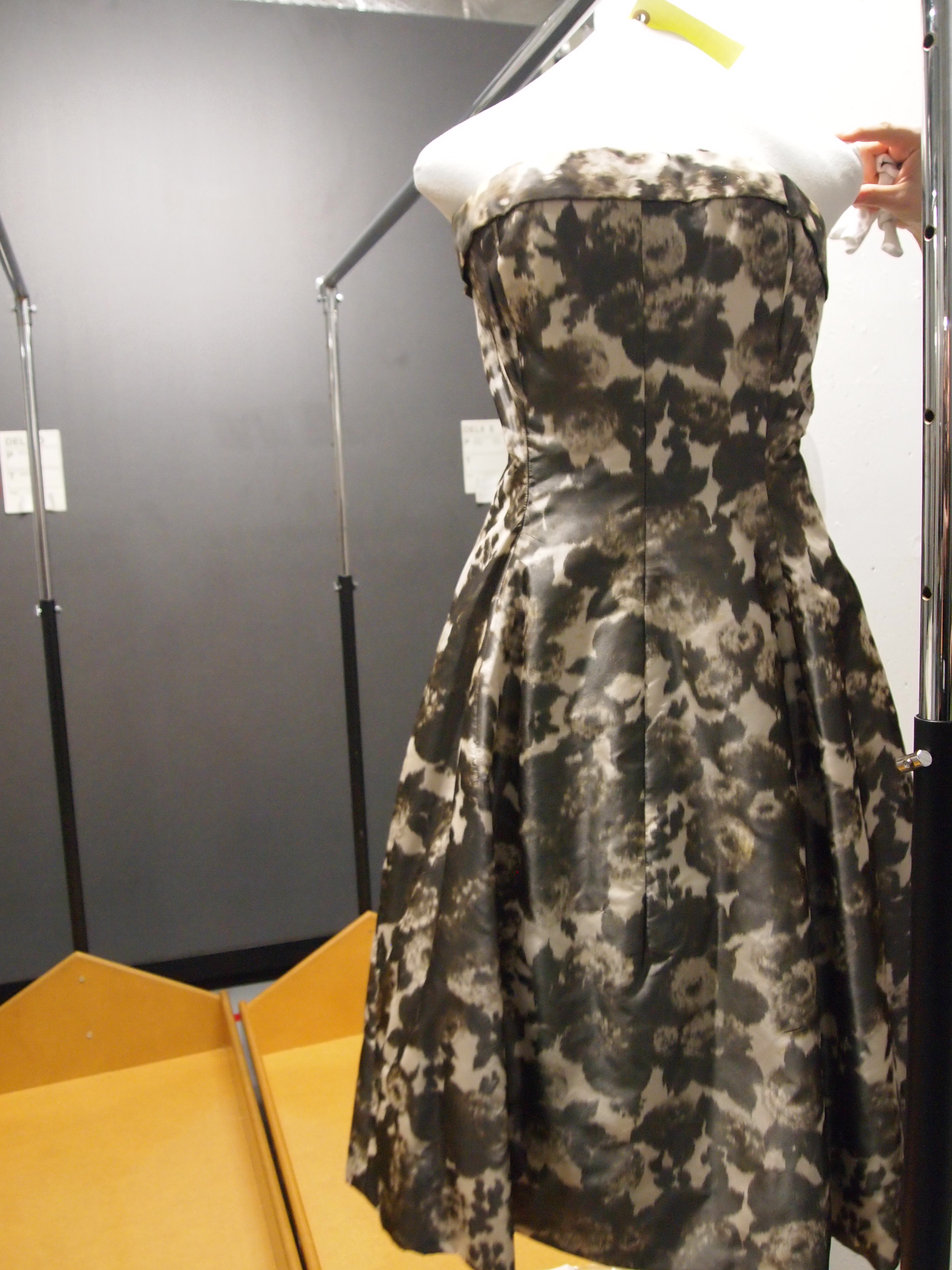
My favourite aspect of this module is studying images: images of ordinary people on their way to work, shopping, partaking in the mundane, everyday chores that may be overlooked by many. Students on the course enjoyed this aspect of the module, choosing to study their own family photos, such as the ones above. Personal photographs of grandmas and grandpas, for example, brought to light various issues of class, modernity or geography, that were then discussed in presentations and class debates. This un-picking of images highlighted how society consumes and chooses to engage in fashion, challenging the understanding of fashion as structured. Studying a variety of images highlighted how a mix of old and new silhouettes are constantly seen through all decades, proving that fashion is a constant recirculation, and that there are no clear boundaries.

This option has opened my eyes to the everyday. I no longer walk down the street and take my surroundings for granted. I am aware of shopping and my sartorial choices. I now question the ordinary practice of getting dressed in the morning, and how like many, I chose to represent myself to the outside world. Studying Sophie Woodward and her book, Why Women Wear What They Wear, has highlighted this aspect of everyday choices, as Woodward concentrates on theorizing these simple acts and the ‘imagined projections of how others might see them’.

This option has helped me apply various theories to the everyday, and the everyday fashions that everyone engages in, and how subjects such as, modernity, post-modernism, geography, capitalism, or globalization affect people’s ordinary choices and are witnessed in their day-to-day projected self.

Volunteering at Fabrica: contemporary visual arts in Brighton


Fancy volunteering in the visual arts? Student Rosie Clarke (BA (hons) History of Design, Culture and Society) gives a taste of her experiences a
t Brighton’s Fabrica.

Over the last year or so I’ve been involved with some of the events and exhibitions which happen behind closed doors in the cool, quiet atmosphere of an old church on Duke Street. You may have been inside Fabrica, or you may have walked straight past like I had countless times before, but now I urge you to stop and have a look.

It’s a wonderful building, with walls so thick that even the busiest Saturday Brighton tourists are muffled, and a roof that vaults high into shafts of sunlight. Fabrica hosts contemporary visual art exhibitions and holds all manner of events, from films to workshops to talks. It’s an organisation which commissions art works in relation to the building itself, creating a feeling that is unique to Fabrica.

My role as a volunteer means helping out during exhibitions: I talk to the public about the current artists on display and the work that Fabrica does elsewhere. So far I’ve been involved with The Blue Route (by Kaarina Kaikkonen), Resonance (Susie Macmurray), and A Cold Hand on a Cold Day (Jordan Baseman). When I applied to become a volunteer at Fabrica I wanted to learn how a gallery functions, meet some new people, and perhaps be inspired in my own creativity. However there is so much more to being a Fabrica volunteer than just standing in a gallery.

One great opportunity was being able to contribute to The Response, a magazine put together by Fabrica volunteers alongside each exhibition, featuring our own artwork or writing. It was great to be a part of the editing team and have the chance to get my work read by hundreds of visitors. We responded to Kaarina Kaikkonen’s The Blue Route, which used reclaimed shirts to project ideas about loss and longing. You may have seen some of Kaarina’s work wrapped around the clock tower in Churchill Square. We used the shirt as a starting point, and the magazine content grew from there.

During the set-up of Resonance I found out how to put together an installation, by spending a few days stitching reams of sheet-music into cones for the final piece – getting to know many interesting people along the way. It felt like time had stopped, if not for the fact that every time I glanced up there would be another huge new limb of the paper sculpture suspended above, the product of our labour. This photo was taken halfway through…

Installation of Resonance by Susie Macmurray. Fabrica, 2013. Photograph by Rosie Clarke.

There are also plenty of evening events that are held in conjunction with the current exhibitions, such as panel discussions and film screenings. In October I invigilated for “Nothing Lasts Forever (Nor Should It)”, a frank and heartening discussion about death and dying to compliment A Cold Hand on a Cold Day. The series looked at ways of dying (inevitable as it is) and raised the question, why are we so averse to talking about death? I remember one of the speakers describing pain, as “a vessel of grief.” Its moments such as this that I appreciate the depth and essence of Fabrica’s work, which goes so much further than the visual arts.

So within all these experiences, I’ve learnt that by engaging with unfamiliar things there’s a lot to be discovered. The best aspect of Fabrica is their willingness to encourage new ideas, and allow volunteers such as myself to take on more responsibility. If you’d like to get involved too, you can download an application form from Fabrica’s website, or come along to one of their events to find out more. Fabrica’s next exhibition features Jacob Dahlgren’s On Balance and it runs from 5 April to 26 May 2014.

A pilgrimage to the Vitra Campus


BA (hons) History of Design, Culture and Society
student Stan Portus takes a trip to Germany and considers the relationship between a Modernist heritage and a Postmodern present

This year marks the 20th anniversary of architect Zaha Hadid’s first commission, the Fire Station at the Vitra Campus, located just outside Basel in Will-am-Rhein, Germany.  A new installation outside the building, entitled Prima, was commissioned from Hadid by Swarovski to mark the anniversary. Her original drawings for the Fire Station were used to create the five angular components of the sculpture, embodying ideas of action and speed. Hadid believes buildings should float: observing the juxtaposition of these structures, it is difficult to deny that this had been achieved.

Vitra is a company with quality and ‘good design’ at the forefront of its ethos. Entering the Campus as an architecture and furniture fan, it was hard to be disappointed. Since the site largely burnt down in 1981, Rolf Fehlbaum, son of Willi Fehlbaum the founder of Vitra, has transformed the site into a ‘playing field’ committed to ‘experimentation and artistic excellence’. The architect Philip Johnson described Vitra Campus as the first place since Weissenhofsiedlung in Stuttgart in 1927 to bring together the most distinguished architects in the western world.

VitraHaus, Herzog & de Meuron, Vitra Campus, Will-am-Rhein, 2010.

VitraHaus, Herzog & de Meuron, Vitra Campus, Will-am-Rhein, 2010. Personal photograph by Stan Portus (August 2013)

Rolf Fehlbaum’s personal collection of furniture forms the basis of the Vitra Design Museum, housed on the Campus in the building of another Pritzker winning architect, Frank Gehry. Opened in 1989, the same year as London’s Design Museum, Gehry’s first building outside America took a radically different approach to its British counterpart. Unlike the London structure, a re-clad warehouse on Shad Thames that harks back to the Modernist style of Le Corbusier, Gehry’s building represents the contemporary Postmodern deconstructivist style he would explore further in his later work, notably the Guggenheim museums. Ron Arad, when asked what the best and worst things of 1989 were by Design magazine (December, 1989), praised Vitra’s Museum and complained that at the ‘safe’ London building ‘visitors don’t see anything they haven’t seen before’.

The pedigree of the architecture and design represented at Vitra sustain the company’s image as the home of ’design classics’. Vitra recently acquired Artek, the Finnish design company co-founded by Alvar Aalto in 1935. At its core Artek is comprised of Aalto’s work, including his Armchair 41 and birch wood furniture. This acquisition is an example of Vitra ensuring their position as holders of a strong canon of 20th century designers. Vitra arguably became synonymous with the Eames since acquiring the rights to manufacture their work in 1957; in another 60 or so years they will likely be synonymous with Aalto and Artek as well. However, there are arguably some issues relating to Vitra in regards to their ideas on what constitutes classic design, what they choose to manufacture and their outlook on what design should be.

In his book Project Vitra, Luis Fernández-Galiano, explains how Rolf Fehlbaum wrote a doctoral thesis on Saint-Simon before taking over the family business. The interest in a utopian socialist from Napoleonic times, who believed in the new religion of industry, left a lasting impact on Vitra’s design canon. Industrial production of furniture was the aim of designers such as Charles and Ray Eames and Aalto, which was seen as a means to supply many with ‘good design’.

The Campus contains other buildings from architectural history such as Jean Prouvé’s petrol station from 1953 (acquired in 2003) and a Buckminster Fuller geodesic dome (1975), formerly used as a car showroom in America and brought to the campus in 2000. Fuller’s dome adheres to Modernist ideas of utopianism and Prouvé’s Petrol Station is also a strong example of rationalised design, a fundamental tenet of Modernism. It was one of the first serially manufactured petrol stations and could be assembled easily by two people, thus reducing labour time.

Petrol Station, Jean Prouvé, Vitra Campus, built ca. 1953 and brought to Vitra Campus in 2003

Petrol Station, Jean Prouvé, Vitra Campus, Will-am-Rhein, built ca. 1953 and brought to Vitra Campus in 2003. Personal photograph by Stan Portus (August 2013)

It is strange to see Modernist ideas of ‘good design’ so strongly expressed at Vitra, a company also engaged with contemporary designers and architects. Postmodernism acted as a reactionary movement against such ideas. How we understand the role of the designer and material culture has changed dramatically since 1950s Modernism, where the designer was seen as able to dictate taste and often had societal aims at the centre of their work. Revealed is a complex relationship between the heritage and the contemporary work of Vitra. Walking around Vitra Haus, Vitra’s onsite show room and shop designed by Jacques Herzog and Pierre de Meuron, one is left with the feeling that the Modernist history of design Vitra represents and manufactures will always be present, regardless of how dated the ideas of ‘good design’ apparent in some of the products are. Yet one also has to consider that Vitra has always provided a space for the new and exciting and continues to do so.

Eames wire chair seating outside factory building on Vitra Campus

Eames wire chair seating outside factory building on Vitra Campus. Personal photograph by Stan Portus (August 2013)

 http://www.vitra.com/en-gb/campus


The Universal Addressability of Dumb Things: Writing the gallery guide


Second year BA (hons) Museum and Heritage Studies student, Sandy Jones, explains the process by which she came to assist on a show described as a ‘mash-up menagerie’.

Installation view of the Universal Addressability of Dumb Things. 2013. Photography courtesy of the De la Warr Pavilion.

What do a ten metre high inflatable Felix the cat, William Blake’s Ghost of a Flea, a replica Sputnik satellite and a singing gargoyle have in common? They are all part of The Universal Addressability of Dumb Things, an exhibition at Bexhill’s De la Warr Pavilion curated by Turner Prize-winning artist Mark Leckey. The exhibition is part of the Hayward Touring programme that brings exhibitions to over 100 museums and publicly funded venues in Britain every year. This summer, I was fortunate to work with the DLWP on the gallery guide for this thought provoking exhibition.

The De la Warr Pavilion is a contemporary art gallery and live performance venue situated on the seafront at Bexhill. Designed in 1935 by architects Erich Mendelsohn and Serge Chermayeff, the Grade One listed historical building remains an icon of Modernist architecture and a celebration of the International Style. Described by Mendelsohn as a ‘horizontal skyscraper’, the building was restored and redeveloped between 2003-2005 with funding from the Arts Council Lottery Fund. Rather than house a permanent collection, the DLWP flexes its spaces to support a dynamic programme of art and performance, showcasing experimental and inter-disciplinary works from emerging artists and big names like Andy Warhol and Antony Gormley.

The gallery guide project came about after I wrote to the DLWP to ask whether they had any volunteering opportunities over the summer. They wrote back saying they needed some support with the guide and as I’d worked in design before, they thought my experience would be helpful. Before I met their curator, David Rhodes, I carried out some research and discovered that the exhibition was inspired by the concept of techno-animism, the idea that everything that is in (and of) this earth is being animated from within. The show is an exploration of how technology is changing our relationship with everyday objects and is creating an ambient environment around us where non-living things are brought to life. Paradoxically, these advances in technology reconnect us with our ancient past where objects and environments were thought to possess magical and divine powers. This was quite a concept to get my head around and it took a fair bit of reading to understand it. The method of curation was also alternative, approached by Leckey as ‘an aggregation of things’ and ‘a network of objects’, rather than a display of personal taste. Using the internet as a digital archive to research and select works over a period of two years, Leckey meticulously sourced and filed words, images, sounds and video into a conceptual matrix of humans, animals and machines to create a hybrid; an exhibition where the objects are – as he describes it – ‘in the physical realm but come from the digital realm’. His concept for the show can be seen on You Tube, in his trailer-like film, Proposal for a Show. Watch it and think about the challenge that faced the curator, finding all those things for what critic Erik Davies has described as ‘a post modern cabinet of curiosities’.

Leckey is often described as a pop cultural anthropologist, and I can see why; he samples across cultures, eras and media. Fortunately, David (the DLWP curator) and Chelsea Pettit (the curator from the South Bank) brought clarity to my task by advising on the most important themes. We agreed that I would research and write about 12 selected works and that the design would be simple because the subject matter was so complex. David also suggested that I join the team on a visit to the Nottingham Contemporary (another great gallery, by the way) to see the exhibition before it arrived at Bexhill. This helped enormously although when it came to writing the copy it was challenging because there was so much I wanted to say, but no space for it.

I visited the DLWP during the installation process and observed the curators as they worked with the artist to agree where and how the works would be displayed. One highlight was watching the courier, responsible for transporting an ancient Egyptian canopic jar and mummified cat, unpack and examine each one closely with a torch, checking that they conformed to their condition report and testing the environmental conditions. Another highlight was watching the team inflate Felix’s giant head and position it within the stairwell at the front of the building. For a gallery that last summer had rigged a bus to be half on and half off the roof, in homage to the closing scene in cult film, The Italian Job, this was a breeze.

The team at DLWP were extremely generous with their time and were great to work with; I enjoyed every minute. Catch the exhibition if you can: it’s on until 20 October 2013. www.dlwp.com

Felix the Cat at the De la Warr Pavilion, Bexhill. Personal photograph by Sandy Jones. 13 July 2013.

Strike an Iconic Pose: Exhibiting a dissertation


Graduating BA (hons) Visual Culture student, Kate Wildblood, reflects on the ways in which her personal, professional and academic interests intertwined in her dissertation, soon to be exhibited as part of Brighton Pride 2013.

Collages of gay club flyers constructed by Kate Wildblood

Having spent most of my professional career either DJing within or writing about LGBT cultural and social life, when I became a mature student at Brighton University in 2010 it was perhaps destined that I would bring something queer to my Visual Culture degree. As they say, you can take the girl out of the disco, but you can’t take the disco out of the girl. My dissertation topic, Strike A Pose, There’s Something To It: Imagery in gay clubbing 1989-2013 examined the event flyer designs of Club Shame, Trade and Wild Fruit, showing how they reflected the 1970s Gay Liberation movement along with the challenges of the 1980s and early 1990s when HIV and AIDS dominated the public, political and media perceptions and portrayals of gay men.

By exploring Roland Barthes’ semiotic theory of myth, my research revealed how the flyer designers Mark Wardel (a.k.a. Trademark), B_Art, Pete Hayward and Paul Kemp created new meanings by reappropriating cultural iconography and signifiers, gay or straight – be they Oscar Wilde, Grace Jones, Aubrey Beardsley, Alice In Wonderland, Metropolis, Tom of Finland or Herb Ritts – to deliver images that challenge heterosexual ideals of masculinity.

In creating new images or subverting existing images for their own ends, gay flyer designers signified certain meanings, rooted in historical context, that connect the viewer to a particular aspect of gay culture, be they childhood memories, icons, subcultures or ideals of gay male beauty. By visually representing my research through the collages Trading Poses and Fruity Benders, I too reappropriated the images of gay clubbing to create further layers of meaning. Having spent so long surrounded by gay clubbing imagery I was keen to strike new poses with the material and to represent the rich queer history we have all played a part in developing. If you will excuse the puns, I wanted to Trade in the glorious Fruit-iness of it all.

I’m genuinely delighted that my two collages will feature in the Icons exhibition as part of Brighton’s new LGBT arts festival during the Pride events of 2013, and am honoured that my work will sit alongside artists including Keith Haring and Mark Vessey. The purpose of Pride, for me, has always been more than a party; it’s about celebrating the people of Brighton and our shared pride in our city. The Icons exhibition is a perfect reflection of that pride and a showcase for the artistic achievements of our seaside city. As so many of the images I used in Trading Poses and Fruity Benders originate from Brighton’s gay clubbing scene, it feels like they are coming home.

The Icons Exhibition is at Brighton Jubilee Library, Jubilee Square, Brighton until 1 August 2013. For further information on the event, please see the Facebook page:

https://www.facebook.com/events/153509038156320/

For more information about Kate Wildblood’s writing and research, see her blog:

http://www.perfectdistractions.com/strikeapose

Behind the Scenes at the Musee Galleria, Paris


Second year BA (hons) Fashion and Dress History students Amy Hodgson, Nicola Goodwin and Nicola Hayward describe their ‘once-in-a-lifetime’ insight into the historic dress collections of Paris.

As part of our second year option, A Trip to Paris, we were given the chance to go on a five-day study visit to the culturally and historically rich French capital over Easter 2013. As student dress historians it was unfortunate that many of the permanent fashion museums and exhibitions were closed during our time there. However, the Musee Galliera had exhibits in various locations and venues around Paris. One of these was the Paris Haute Couture show at the Hotel de Ville, an enlightening and informative experience which showed not only examples of couture garments but also gave an insight into their elaborate and innovative design techniques. This show included many designers who are not household names, and provided a broad selection showcasing fashion throughout the eras to enthusiastic crowds of visitors. After witnessing this exhibition by the Galliera we were curious to understand the work that takes place to create such a vision.

Luckily we were given the rare opportunity to visit the Musee Galliera costume stores. Despite the renovations that were taking place, our tutor Dr. Charlotte Nicklas was able to arrange the trip through a colleague and curator who was working there. Under heavy security we began our tour of one of the largest dress collections and restoration facilities in Europe, featuring thousands of garments, photographs and historically significant records. Needless to say we were overcome with excitement at the prospect of being allowed to witness this fine collection.

Figure 1.  View of the Restoration Room and early 20th Century Dancing Dress. Musee Galliera Store Rooms, 2013. Personal Photograph by the authors. April 22nd 2013.

Figure 1. View of the Restoration Room and early 20th Century Dancing Dress. Musee Galliera Store Rooms, 2013. Personal Photograph by the authors. April 22nd 2013.

Firstly, entering the conservation room, we were faced with an early twentieth century dancing dress being restored by expertly trained seamstresses and members of the highly regarded team of conservators. Every item is meticulously studied, conserved and catalogued before it is considered for the collection. The store rooms even feature a room dedicated to garment cleaning; steamers, hoovers and washing implements are used to make sure all garments are immaculate and at no risk of insect infestation.

Figure 2. View of Martin Margiela 2006 Menswear Invitation. Musee Galliera Store Rooms, 2013. Personal photograph by the author. 22nd April 2013.

Figure 2. View of Martin Margiela 2006 Menswear Invitation. Musee Galliera Store Rooms, 2013. Personal photograph by the author. 22nd April 2013.

As well as garments, the museum also acquires significant documents, photographs, and accessories. All of these elements are essential to creating an understanding of the fashion industry throughout history. One of the examples we were able to see was a Martin Margiela 2006 Menswear show invitation, which offered a glimpse into the post-modern, conceptual fashion world, where the invitation is the first insight into the illusion and theme of the fashion show. The numerous records and photographs that are gathered by the Musee Galliera are easily overlooked, but are equally as important in understanding the culture, images and innovative work that surrounds, and are sometimes created by, many of these designers.

The next stage of the tour was the storerooms, where we were asked to wear shoe protectors to prevent outside germs entering the controlled space. The room is kept at a consistent temperature and monitored constantly. We were faced with rails upon rails, as far as the eye could see, all holding historically significant garments from a range of eras, and each holding their own stories. We were guided through a maze of storage containers. It was unlike anything any of us had ever seen or could have imagined, and was quite overwhelming in its scale.

Figure 3. View of a Worth 19th Century Opera Coat. Musee Galliera Store Rooms, 2013. Personal photography by the authors. April 22nd 2013.

Figure 3. View of a Worth 19th Century Opera Coat. Musee Galliera Store Rooms, 2013. Personal photography by the authors. April 22nd 2013.

We were shown three garments that had been chosen to represent their particular era, from the 19th century and early 20th century to the 1950s. All were excellent examples, embodying the style and design of the their time. A late 19th century Worth opera coat, for example, acted as a potent symbol of bourgeois decadence and the luxurious lifestyle that this social standing entailed. The second example we were shown was a 1920s dancing dress, adorned with rhinestones and velvet fringing, by an unknown designer.  Again, this piece evocatively embodied the changing notions of femininity for which the 1920s are well known. It also exemplified the innovative design and skilled workmanship that is involved in creating such a heavily embellished garment. The third and final garment we were shown was a dress that was part of Yves Saint Laurent’s first collection for Dior in 1957/58. The dress echoes Dior’s New Look style, with hidden corseting and a full skirt, creating the recognisable 1950s fashionable silhouette.  The monochrome floral print gave the dress a photomontage effect and the motif appeared quite modern because of these elements. This small selection provided a glimpse into the varied and impressive collection at Musee Galliera. The final room that we visited showcased the museum’s selection of mannequins and the workmanship that is put into displaying garments. Differing body shapes and changing attitudes towards the body must be taken into account, giving a historically authentic form for when the garments are exhibited.

Figure 4. View of 1920s heavily embellished dancing dress. Musee Galliera Store Rooms, 2013. Personal Photograph by the authors. April 22nd 2013.

Figure 4. View of 1920s heavily embellished dancing dress. Musee Galliera Store Rooms, 2013. Personal Photograph by the authors. April 22nd 2013.

Figure 5. View of Yves Saint Laurent for Dior 1957-1958 Couture Dress. Musee Galliera Store Rooms. Personal Photograph by the author. April 22nd 2013.

Figure 5. View of Yves Saint Laurent for Dior 1957-1958 Couture Dress. Musee Galliera Store Rooms. Personal Photograph by the author. April 22nd 2013.

We were delighted to be offered the opportunity to have a once-in-a-lifetime insight into the inner workings of one of the most important and vast dress collections in Europe. Even though the garments that we saw were spectacular, to be given the chance to observe the conservation, organisation, display and management of the collection was truly insightful. All of these elements demonstrated the vast amount of work undertaken by the highly regarded team of specialists who understand the importance of building and maintaining this internationally important collection.

Figure 6. View of our Protective Footwear that must be worn whilst inside the Store Room. Musee Galliera Store Rooms, 2013. Personal photograph by the authors. April 22nd 2013.

Figure 6. View of our Protective Footwear that must be worn whilst inside the Store Room. Musee Galliera Store Rooms, 2013. Personal photograph by the authors. April 22nd 2013.


Design and Culture in Spain, part III: Almudena Cathedral


Alice Power, first year student on the BA (hons) Museum and Heritage Studies degree pathway, completes the short series of blog posts resulting from a recent study trip to Madrid by examining the distinctive traditions of Spanish Catholic art.

Fig 1. An interior arch in Almudena cathedral, Madrid. Amy Lou Bishop. 13 February 2013.

Fig 1. An interior arch in Almudena cathedral, Madrid. Amy Lou Bishop. 13 February 2013.

As we stood outside the Almudena Cathedral in the heart of Madrid, I turned to my student colleagues and set them a challenge, asking: ‘How old do you think this building is?’ Here was a chance to put into practice what we’ve been learning in our first year History and of Art and Design lectures by looking at a building of which none of us had prior knowledge. The four of us looked carefully at the decoration that adorned the ornate exterior.  It didn’t seem to fit clearly into any style or movement that we were familiar with.  There were certainly Baroque influences, which complimented the neighbouring Palace nicely, but as a whole it looked too fresh to be from that period. Our collective brain power estimated that it probably dated from circa 1875. We weren’t far wrong. Construction started in 1879. However, due to despites over decor and the turbulent political conditions in Spain during the twentieth century, it wasn’t completed and consecrated until 1993.

Fig. 2. Exterior of Almudena catherdral taken from Calle Mayor , Madrid. Amy Lou Bishop. 13 February 2013.

Fig. 2. Exterior of Almudena catherdral taken from Calle Mayor , Madrid. Amy Lou Bishop. 13 February 2013.

The interior was, somewhat unexpectedly, neo-gothic in style. Nevertheless, the bright whiteness of this still-young building gave it a very different atmosphere to the countless neo-gothic churches I’ve visited in the UK, Ireland and France. The ceiling decoration was very fluid and modern, marked with the bright colours that one often associates with Spanish imagery.  We visited on Ash Wednesday, so the space was active with worshippers as well as tourists. Despite this, the space felt somehow bare. Due to its age, it isn’t cluttered with tombs and monuments. One of my fellow students mentioned that it felt more like an art gallery than a place of worship.  With little uniformity in the scale and style of art displayed in each chapel, it was easy to view them as exhibits. As I had been educated in Catholic school, I’m fairly familiar with what each of the religious signs are meant to indicate, but here things weren’t so typical. Christian art, as a category, is vast and ever changing, yet within Catholicism, traditional styles and forms usually dominate.

Two years ago I visited a church called Parroquia Nuestra Señora de la Encarnación in Marbella. It was situated down a rather unassuming alleyway in the old quarter of the town.  I found the style of the interior, however, to be completely overwhelming. Many of the statues were life-size, draped in velvet robes and featured real hair. Each one was richly decorated with gold. They were extreme examples of what I’d anticipated. The iconic, highly decorative images of Catholic saints produced in Spain and other Hispanic countries are globally recognised as distinct to their cultures. Hispanic-style images of the Virgin Mary are a staple of any tattooist’s repertoire and are also often recreated in kitsch novelty items.  Examining the chapel of Ave Maria Purisima sin Pecado Concebida  in Madrid’s Almudena Cathedral, however, challenged all my preconceived ideas about Catholic art in Spain. The chapel was focused on an oil painting of the Madonna. Instead of highlighting her holiness by covering her in regalia, this Madonna was depicted in white with her head exposed, carrying a light. The most striking aspect to me was how clearly youthful she was. The gospels say that Mary was in her early teens at the birth of Christ, yet in most of the art created in her image she is more like a doll than a child. The painting did exactly what religious art is supposed to do. It made me think. Although I’d heard the gospel passages countless times, I don’t think I’d really ever connected the stories to the condition of a modern day young mother. Above the painting was a stained glass window made up of strikingly modern angular shapes. This is something I’d often seen in Protestant churches, but never in a Catholic cathedral.

In many Western cultures, the presence of a cathedral is still an unofficial sign of city status.  Yet, for centuries, Spain’s capital lacked an operational Catholic cathedral.  As an outsider I found this peculiar. I’d always assumed that there was something almost innately Catholic about Spanish national culture. In reality, Spain’s religious identity is a result of a long standing power struggle between Jewish, Islamic, Protestant and Catholic traditions, as well as the amalgamation of many strong regional identities. Nonetheless, 92% of people living in Spain consider themselves Catholic although many infrequently attend church. In some regions, parishes broadcast masses on local television networks. Perhaps this explains the diversity of the art in their churches. While in the UK, we’re predominantly interested in preserving the past, in Spain religion is much more connected to the present.  Not long after I returned from Madrid, a news story about a Catalan church that commissioned local graffiti artist to paint its dome was widely reported: www.bbc.co.uk/news/magazine-21529832. This shows that modernising trends are evident in churches all over Spain.

Ultimately, Madrid’s Almudena cathedral is not just a place of worship and tradition. It is a boast that Catholicism survived attempts by other faiths to become dominant. As a site that incorporates elements of the past and the present, as well as local and universal iconography, it’s also a showcase for the diversity of Spanish national history and culture.

Design and Culture in Spain II: Museo del Traje


Karen Scanlon, a first year BA (hons) Fashion and Dress History student, continues a short series of blog posts on hispanic material culture by examining Spanish dress, past and present, at Madrid’s Museo del Traje.

Entrance to Museo Del Traje, Madrid, Spain. Photograph by Karen Scanlon

As part of a recent study trip to Madrid, I made a visit to the city’s fashion museum. Although not as conveniently located within the centre as most of the other museums, this shouldn’t put anyone off from visiting, as a short underground journey from the city centre to Moncloa station will get you there.

The city’s clothing collection began with an exhibition called ‘Regional and Historical Costume’ in 1925, held in the Palace of the Library and National Museums of Madrid. By 1934, this exhibition had merged with the Museum of the Spanish People and was arranged by the government of the Second Republic in the hope of creating a display that would reflect different Spanish traditions. The museum was open on and off between 1940-44 and again between 1971 -73. From then, the collection went into storage until 1987 when it was moved to its current location and site of the Spanish Museum of Contemporary Art (MEAC) with a plan to reopen the collection to the public. Museo del Traje started as a project that would bring traditional, historical and contemporary fashions together as a site for reference and research.

Having never been to Spain before, my knowledge of Spanish dress was, I admit, very limited. Thoughts of flamenco dancers, boleros and other ideas of traditional dress were the only images that came to mind.  However, from the moment I entered the museum and began to look at the exhibits, I realized there was much more to Spanish dress than that. In fact, the museum’s permanent collection is arranged with an overview of the history of costume in Spain from as early as the 16th century right up to the 21st century. The purpose-built interior enjoys wide open spaces to move around comfortably and without the overuse of placards, displays appear to be less cluttered than in other museums. Although signage is limited, the use of interactive touch-screen terminals provides visitors with access to further information about a particular costume, designer, accessory, and so on. That said, although objects may appear better presented without labels, the terminals are a bit finicky and can be time-consuming to use.

Space has been well organized and items are chronologically arranged, including, for example, a section on the Neoclassicism style resulting from the French Revolution and its effects on dress in 18th century Europe as a whole, and a display showing a typical 19th century Spanish domestic interior. An in-depth view inside some garments is offered; a corset for example, is shown in an x-ray image, allowing a closer examination of its construction. Another display features a partly-cut garment to reveal how the bustle’s construction was used to define the desired 19th century silhouette. Each display is a feast for the eyes and each direction offers the viewer one beautiful arrangement of costume after another. As the museum guides the visitor through its historical chronology, there is also an offshoot from the main trail, which leads to a section on regional dress. At once I recognized these clothes as fitting my original impression of typical Spanish costume. This exhibit, covering the late 19th to early 20th century, features items of dress and accessories which represent historical ceremonial dress, typical work clothes indicating specialist trades, and dress used in festival or traditional dance (in fact, the latter styles can still be seen in Spanish dance performances today).

One example of dress that was particularly striking was from the region of Montehermoso, the north west province of Cáceres, Extremadura. The museum display shows a woman sitting in a chair with colourful, multi-layered underskirts, beautifully embroidered with motifs of birds, rosettes, carnations and other flowers. The woman also wears a particular gorra, a bonnet made from very colourful straw, adorned by ribbons, buttons and pompoms. The bonnet sits on top of a colourful kerchief, which is visible from a slight slit in the back of the bonnet. This flows downwards to cover the women to her shoulders. If worn traditionally, the bonnet would appear slightly tilted forward, a result of a type of regional hairstyle that has since been abandoned. The cuffs of her sleeves and her flat, ballet-style shoes are all richly embellished with embroidery. This elaborate use of embroidery also decorates the flamenco dancers’ manton de manila, the silk shawls and fans associated with Spanish culture and the typical matador’s costume.

Approaching the end of the permanent gallery there is a section covering haute couture, and most importantly, Spain’s own contributions, including the work of couturiers Mariano Fortuny and Cristobal Balenciaga,both enormously important to the trade in their own right. Fortuny, an accomplished designer who invented innovative processes for dying and pleating silk fabrics, is featured. Also highlighted is Cristobal Balenciaga, regarded as the most influential Spanish couturier of the 20th century. Balenciaga, from the Basque Country, used Spanish culture, art, and religious dress as inspirationfor many of his evening gown and coat designs, such as the colourful, extravagant robes of cardinals in the Catholic Church. Balenciaga’s creations suggest the grand sweeping movements of a flamenco dancer or matador. The use of sashes, tassels, embroidery, boleros, brocades and hats throughout his collections reinterpret traditional Spanish culture for 20th century European fashion tastes.  Moving on from haute couture are displays on the growth of Spanish ready-to-wear, marking the end of the museum’s historical journey.

Looking back, it appears to me that the art and craft of embroidery indigenous to Spanish culture is a key signature feature of Spanish dress. The preference for materials of rich colour also undoubtedly creates a vibrant museum display. After being treated to such fashion profusion, don’t expect any ordinary ‘exit through the gift shop’ at Museo del Traje. Visitors here are invited to leave in style via their very own catwalk. With loud music pumping in the background, a walk on the red carpet awaits, surrounded by bright lights and your very own (simulated) audience. What more could you ask of a fashion museum?

The catwalk front row: From left to right; Chaqueta y zapatos, Vivienne Westwood. 1985 – 1990; Vestido, Jean Paul Gaultier. ca. 1980; Capa, Roberto Capucci. ca. 1980. Photograph by Karen Scanlon.

Design and Culture in Spain I: Templo de Debod


In the first of a short series of posts about Spanish visual and material culture, Amy-Lou Bishop, a first year student on the BA (hons) Museum and Heritage Studies degree course, reflects on a recent international study trip.

As a guest of the University of Brighton’s BA (hons.) Design and Craft students, in February 2013, I found myself, along with seven other History of Art and Design students, on a study trip to Madrid. Having never been to Spain before, I was travelling with an open mind, with my expectations only informed by the Spanish imagery we all instantly recognise. Before we went we were told by our tutor to look out for the distinctive visual culture of Spain and try to identify what we think is their particular national cultural identity. We almost all had a ready check list of clichéd images of ‘Spanish-ness’: tapas and paella; matadors and bull fighting; flamenco dancers and their dresses, shoes and fans. We were told to look out for Moorish style and its legacy, and to see if there were any visible clues to Spain’s violent Civil War past. Being aware of Spain’s current economic crisis, there was a chance we’d see the effects of that on Spanish art, design and culture too.  So by the time we got to Madrid, map in hand and intent on seeing anything and everything, we were directed to an ideal spot from which to see the city. When we got there, however, we found something I had in no way been expecting: an ancient Egyptian temple. Whole and complete, floating on a pool of water, it sits high above Madrid. As pleasantly surprisingly as it was to see, my main question was: why was it there?

The Parque Oeste, Madrid. Photograph by Amy-Lou Bishop. 15 February 2013

The Parque Oeste, Madrid. Photograph by Amy-Lou Bishop. 15 February 2013

There was surprisingly little information provided at the monument, as if the locals were so used to it or it was so taken for granted that they didn’t need this anomaly on the landscape to be explained. Since getting back, however, I have found out that it is called Templo de Debod. After standing on the banks of the Nile for two millennia, it was relocated from Egypt in 1968 to thank Spain for their assistance in saving ancient temples from flooding during the dam building of the period. Along with another temple, sent to New York City, Templo de Debod was given to Spain and placed in the Parque Oeste near the royal palace in Madrid.

We visited the spot on two separate occasions and were surprised each time by the amount of people there. However, they were not in the park to see the unusual landmark. They were all gathering for the view behind it – the uninterrupted landscape and the ideal spot to view the sunset. Vast numbers of visitors come and turn their back on the monument, and instead pose in front of and photograph the brilliant, dramatic hues of the setting sun. It would not be an exaggeration to suggest that everyone has seen a sunset, and perhaps almost all of those will also have photographed one. The sunset in Madrid seems particularly spectacular, at least compared to ones in England, and I found myself in the same position as all the other visitors, taking pictures of something I’d seen hundreds or even thousands of times before. Of course, by doing this we were all guilty of the same thing – ignoring the temple. When the sun sets, you might expect the temple to regain some attention, but with the sun gone the people start to leave too, as if there is nothing left to hold them there.

Templo de Debod, Madrid. Photograph by Amy-Lou Bishop. 15 February 2013

Templo de Debod, Madrid. Photograph by Amy-Lou Bishop. 15 February 2013

Obviously not everyone ignores it; I am proof that they don’t. I think, on balance, I took more photographs of the temple than of the sunset, but I can say that on those two occasions I was almost the only one. There were others there using the space as they would any open space. There were families strolling, skateboarders passing, people just sitting on the water edge, even a man entertaining children by blowing giant bubbles; but for them it seemed that the temple wasn’t adding anything to their activities. Despite its ancient origins, sacred status and unusual location, thousands of miles from home, I could have been in any park and the scene would have looked exactly the same.

I wonder how the temple is viewed by the local madrilenos. Do they find it odd that a piece of Egypt is located slap bang in the centre of their city? Does everybody who visits find it as unusual as I did? Or do they just take it for granted as an added extra to their sunset snapshots? However it is seen, I felt it added something to my trip. And maybe, in a roundabout way, it helps to answer what Spanish national identity is: it can be a bit of everything, even a little bit of Egypt.