In the first of a short series of posts about Spanish visual and material culture, Amy-Lou Bishop, a first year student on the BA (hons) Museum and Heritage Studies degree course, reflects on a recent international study trip.
As a guest of the University of Brighton’s BA (hons.) Design and Craft students, in February 2013, I found myself, along with seven other History of Art and Design students, on a study trip to Madrid. Having never been to Spain before, I was travelling with an open mind, with my expectations only informed by the Spanish imagery we all instantly recognise. Before we went we were told by our tutor to look out for the distinctive visual culture of Spain and try to identify what we think is their particular national cultural identity. We almost all had a ready check list of clichéd images of ‘Spanish-ness’: tapas and paella; matadors and bull fighting; flamenco dancers and their dresses, shoes and fans. We were told to look out for Moorish style and its legacy, and to see if there were any visible clues to Spain’s violent Civil War past. Being aware of Spain’s current economic crisis, there was a chance we’d see the effects of that on Spanish art, design and culture too. So by the time we got to Madrid, map in hand and intent on seeing anything and everything, we were directed to an ideal spot from which to see the city. When we got there, however, we found something I had in no way been expecting: an ancient Egyptian temple. Whole and complete, floating on a pool of water, it sits high above Madrid. As pleasantly surprisingly as it was to see, my main question was: why was it there?
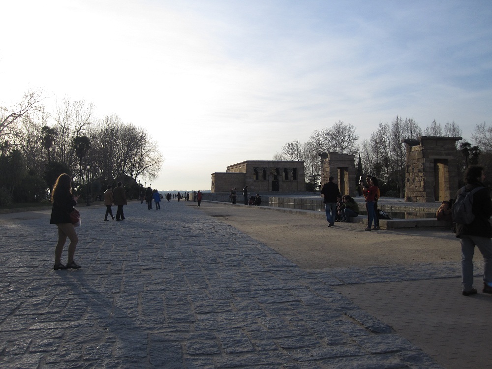
The Parque Oeste, Madrid. Photograph by Amy-Lou Bishop. 15 February 2013
There was surprisingly little information provided at the monument, as if the locals were so used to it or it was so taken for granted that they didn’t need this anomaly on the landscape to be explained. Since getting back, however, I have found out that it is called Templo de Debod. After standing on the banks of the Nile for two millennia, it was relocated from Egypt in 1968 to thank Spain for their assistance in saving ancient temples from flooding during the dam building of the period. Along with another temple, sent to New York City, Templo de Debod was given to Spain and placed in the Parque Oeste near the royal palace in Madrid.
We visited the spot on two separate occasions and were surprised each time by the amount of people there. However, they were not in the park to see the unusual landmark. They were all gathering for the view behind it – the uninterrupted landscape and the ideal spot to view the sunset. Vast numbers of visitors come and turn their back on the monument, and instead pose in front of and photograph the brilliant, dramatic hues of the setting sun. It would not be an exaggeration to suggest that everyone has seen a sunset, and perhaps almost all of those will also have photographed one. The sunset in Madrid seems particularly spectacular, at least compared to ones in England, and I found myself in the same position as all the other visitors, taking pictures of something I’d seen hundreds or even thousands of times before. Of course, by doing this we were all guilty of the same thing – ignoring the temple. When the sun sets, you might expect the temple to regain some attention, but with the sun gone the people start to leave too, as if there is nothing left to hold them there.
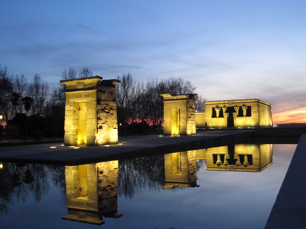
Templo de Debod, Madrid. Photograph by Amy-Lou Bishop. 15 February 2013
Obviously not everyone ignores it; I am proof that they don’t. I think, on balance, I took more photographs of the temple than of the sunset, but I can say that on those two occasions I was almost the only one. There were others there using the space as they would any open space. There were families strolling, skateboarders passing, people just sitting on the water edge, even a man entertaining children by blowing giant bubbles; but for them it seemed that the temple wasn’t adding anything to their activities. Despite its ancient origins, sacred status and unusual location, thousands of miles from home, I could have been in any park and the scene would have looked exactly the same.
I wonder how the temple is viewed by the local madrilenos. Do they find it odd that a piece of Egypt is located slap bang in the centre of their city? Does everybody who visits find it as unusual as I did? Or do they just take it for granted as an added extra to their sunset snapshots? However it is seen, I felt it added something to my trip. And maybe, in a roundabout way, it helps to answer what Spanish national identity is: it can be a bit of everything, even a little bit of Egypt.


