Breaking through: From History of Art and Design studies to History teaching

BA History of Art and Design student, Hannah Kempster, reflects on the value that a breakthrough prize has had for her confidence and career development.

I was very excited to find out that I had won the Anne Clements Breakthrough Award for my grades during the second year of my History of Art and Design degree. I hadn’t been aware of the award in advance, so I was extremely surprised to find out that I had won it. I loved the second year of the course and had wonderful experiences such as a trip to the Tate Modern, and a voluntary placement at Volk’s Electric Railway. Winning this prize felt like a fantastic end to a great year.

Breakthrough awards are given to second year undergraduate students to support and encourage them through what can be a challenging phase of their studies. The university also holds an annual celebration event for students and donors to celebrate the awards that are given in all subject areas. This is also an opportunity for donors to meet the winners of their prizes, and to see the impact that the awards can make in students’ lives. During the speeches, we were regaled with stories of the many ways the funds had been used. It was amazing to hear how students had used the awards for diverse projects including trips abroad and business start-ups. I left the evening feeling inspired and in awe of the amazing work that students are undertaking alongside their studies.

Hannah with other University of Brighton student award-winners, and the Vice Chancellor, at the annual celebration event, 18 February 2020.

Anne was sadly unable to come to the celebration evening, so I didn’t get a chance to thank her personally. However, her daughter Fiona was attendance. Fiona told me that Anne had had a career in design history and as a result wanted to support scholars in the same field. I am extremely grateful to Anne for this support. Winning an award represents not only financial backing, but a huge boost to my confidence. It gave me renewed enthusiasm and encouragement going into the final year of my studies.

Like many of my peers, I have had to work alongside my degree to support myself financially. The funds have allowed me to have some much needed time off work while I completed my final assignments and dissertation. While I had originally planned to also use the time to gain more work experience to enhance my employability, lockdown hasn’t allowed for this. This has been a blessing in disguise however, as I reflected on my career options and have decided to train to become a teacher. I am very pleased to say that I have accepted a place for next year to train to teach secondary school history. I am hugely grateful to Anne for the award, and the financial support that has allowed me the space and time to work on my studies. It has also given me the confidence and encouragement to pursue a career I know I will love.

Liberty fabrics in Country and Western wear: Historical research and creative practice

Janet Aspley, who recently completed her PhD, was interviewed by the fashion company Liberty about her love for their fabrics, and how her design company Dandy & Rose, where she makes bespoke Liberty print western shirts, links with her interests in the history of fashion.

WHERE ARE YOU BASED, AND WHEN DID YOU FIRST START MAKING SHIRTS?

I am based in Lewes, East Sussex, where I’ve lived for 25 years. I started experimenting with making western wear in the late 1980s when I first became a big fan of country music and started writing for Country Music People magazine. A couple of years ago, I was interviewing the Grammy-winning singer-songwriter Jim Lauderdale and plucked up the courage to show him a shirt I had made from a 1940s western shirt pattern. He loved it and started wearing my stuff onstage – and Dandy & Rose was born.

DO YOU HAVE A FAMILY HISTORY OF SEWING?

My mum Iris was an avid home sewing enthusiast – when I was growing up, she made all my clothes. She had learned her skills from my dad’s mum, who would make extra pennies by taking in sewing after she married my grandad, a coalminer. Sometimes when I see one of my shirts on stage or on TV, I wonder what she would have made of it. I bet she would have loved to have a workroom full of Liberty fabrics!

CONGRATULATIONS ON GETTING YOUR PHD – COULD YOU TELL US SOMETHING ABOUT YOUR STUDIES?

Thank you! About 10 years ago, I interviewed the tailor Manuel Cuevas, the ‘Rhinestone Rembrandt’, and realised his work would be a great basis for an academic study. ‘Nudie suits’ are made using incredible finesse of cutting and construction – but instead of the understated details that usually go with bespoke menswear, they are made in bright colours, embroidered with pictures and embellished with sparkling rhinestones. Walking into Manuel’s showroom is like entering a jewel box. In its 1950s heyday, the Nudie suit was a working-class version of luxury, an expression of rags-to-riches stardom. Since then it has come to be seen as traditional, and country singers wear their Nudie suits to show that they are the ‘real deal’.

HOW DID WORKING ON YOUR THESIS INSPIRE YOU TO START MAKING YOUR SHIRTS?

Studying dress means you need to understand how something’s made – for me, that means having a go at doing it myself wherever possible. The research and the making are an exchange, with each feeding the other. I did a lot of research at the Country Music Hall of Fame and Museum in Nashville, so it was a thrill when they included me in their ‘Featured Western Wear Designer’ exhibit a couple of years ago.

WHY DO YOU THINK AMERICAN COUNTRY SINGERS HAVE SUCH AN AFFINITY FOR LIBERTY FABRICS?

Gram Parsons, who is an inspirational figure to many modern musicians, had a Nudie suit made in 1968 embroidered with pictures of leaves, pills and poppies – a real product of 1960s counterculture. Parsons spent time in London and loved the iconic Kings Road boutique Granny Takes a Trip, which made the famous psychedelic William Morris print jackets worn by George Harrison and Jimi Hendrix. My Liberty print western shirts evoke this important ‘60s music moment – I’d love to find a photograph of Parsons in a Liberty shirt, because I’m sure he must have had one!

Musicians love Liberty prints because they’re beautiful. These are creative people, and they can appreciate the work of an artist in a different medium – which is what your print designers are. Tana Lawn™ is a great fabric for a touring musician. It’s very soft and light, and it doesn’t crease as much as most other cotton fabrics either. They can pull it out of their bag, put it on to go onstage and make an impact.

HOW DO YOU CHOOSE LIBERTY PRINTS FOR DIFFERENT MUSICIANS?

I try to help my customers pick out a print that expresses their personality. Sturgill Simpson chose the print Gustav and Otto – he had a song out called ‘Turtles All the Way Down’, so I cut the shirt so that the tiny turtles in the design ran all the way down the button band. Danny George Wilson is highly tattooed, so he loved the tattoo-inspired Wild at Heart print. I love connecting my customers with the stories Liberty can tell about each print.

Sometimes it’s Liberty itself that is the connection. A couple of years ago, I made a shirt for the actor and comedian Tina Fey. Her brother Peter bought the shirt for her as a Christmas gift, because he knew she had special memories of visiting Liberty when she came to London as a young backpacker. He chose the print Queen Bee, which I suspect was a family in-joke!

WHICH MUSICIANS HAVE YOU BEEN ESPECIALLY EXCITED TO SEE WEARING YOUR WORK?

Aaron Lee Tasjan has all the flamboyance of the ‘60s and ‘70s menswear moment, so I loved it when he got a ruffled Dandy & Rose shirt in a psychedelic print called Amelia Star. When Jim Lauderdale wore one of my Liberty shirts on the TV soap opera Nashville, I had a viewing party with all my friends. And I’ll never forget sitting backstage in the bleachers at the Grand Ole Opry, a historic Nashville venue for country music, and looking up to see Jim wearing a shirt I had made on the huge screen – it filled me with awe to think it had come all the way from my little workroom in Lewes.

There are still some musicians I would love to make for, so Lyle Lovett, Elvis Costello – if you’re reading this…

WHAT DRAWS YOU TO LIBERTY PRINTS?

The colours and details are amazing. I made a shirt in the print Wild Flowers, and was working to a deadline to get it ready for a show. Because I do a lot of pattern matching, I examine the prints very closely, but even so, I was right at the end of the make before I noticed that the designer had inserted the word ‘Strawberry’ into the print. I love that level of attention to detail.

An earlier version of this blog post originally appeared on the Liberty London website.

Selling Wallpaper: An archival history of interwar home decoration

Lucy Ellis, MA History of Design and Material Culture, provides a fascinating insight into the history of wallpaper. 

I have always had an interest in the history of wallpaper, and I also have a background in retail. When I started my MA in the History of Design and Material Culture at the University of Brighton  in 2017, I was keen to bring these two things together.  So I was delighted to find a publication called The Wallpaper Magazine in the Museum of Domestic Design and Architecture (MODA) collections at Middlesex University. MODA proved to be a fascinating resource for research into wallpaper salesmanship between the wars.

My research made me realise just how much rich history is contained within trade journals and magazines: all the voices of the trade are there, from management through to decorators. We see them at work and at play through the advice features, technical instruction, sports and social reports, jokes and cartoons, all wrapped up in these wonderful ephemeral objects.

Wallpaper Magazine, April-May 1927

Wallpaper Magazine, April-May 1927, Museum of Domestic Design and Architecture collections, Middlesex University.

The Wallpaper Magazine was published in Britain from 1920-1939 by The Wallpaper Manufacturers Ltd (WPM), the dominant wallpaper company of the first half of the twentieth century.  The magazine was an in-house journal that sought to unite the industry. It was a conduit for enthusiastic (and at times intensely didactic) advice on how to maximise wallpaper sales.

When the magazine was launched in 1920 the wallpaper industry was recovering from a slump brought about by war and shortages of raw materials. The wallpaper industry also faced a hostile design climate in which critics, enthused by modernism, advocated abandoning wallpaper for plain painted walls.

In response, WPM used The Wallpaper Magazine to inform, educate and motivate the wallpaper salesman to ‘better business’. It was a means of conveying the new USA-led science of salesmanship to the independent decorator on the high street in order to revive the trade.

The magazines chart the growing importance of branding as a means of selling.  I was intrigued by the changing cover designs and how the tone of the magazine altered over the 1920s and 1930s.  In the 1920s the salesman was encouraged to see his (mainly female) customers as ‘unbelievers’. It was thought that they needed to be ‘educated’ into buying wallpaper. By the 1930s, there was a more moderate and sophisticated assessment of the client based on psychological profiling, a change reflected in the tone and content of these magazines.

I am very grateful to the Wallpaper History Society for awarding me the Merryl Huxtable Prize to support my research into inter-war wallpaper salesmanship.

For more information about Lucy’s research, watch this film made by Middlesex University TV Production students. With thanks to the Museum of Domestic Design and Architecture for permission to reblog this content. 

Curating The Ladies’ Paradise: A Hidden History

PhD student Jo Lance offers a view of her exhibition on early twentieth century fashion illustration for department stores at Worthing Museum and Art Gallery.

The Ladies’ Paradise is a fashion exhibition in the Norwood Gallery at Worthing Museum and Art Gallery, September 2019- June 2020, which I created with support from the Museum’s curatorial team. Its core is a collection of Edwardian fashion drawings c.1905-1914 by an illustrator named Ida Pritchard [1889-1948].

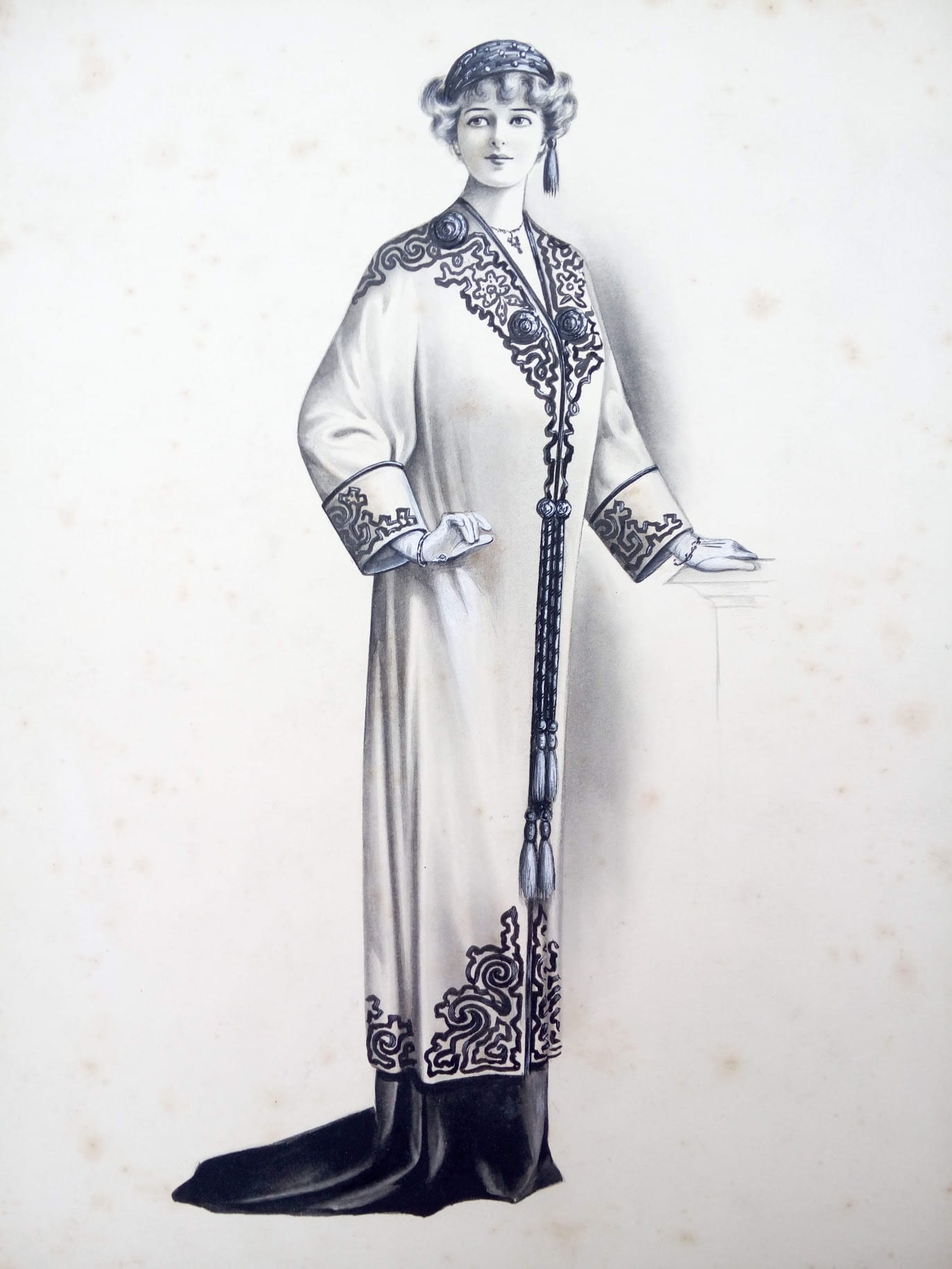
Figure 1. Ida Prichard. Illustration showing evening cloak, c.1910. Worthing Museum and Art Gallery.

I first came across Pritchard’s fashion drawings while volunteering at Worthing Museum and Art Gallery, prior to commencing my PhD studies. I was immediately intrigued by the drawings, as it seemed unusual for a young woman to have had a career as a fashion illustrator in the period before the First World War. We know from her relatives, who donated her drawings to the Museum in 1993, that Pritchard was raised and educated in London and that she worked as a commercial illustrator for Peter Robinson department store producing images for advertisements in fashionable publications such as The Queen, Country Life and The Ladies’ Field before she left work upon marriage in 1914. We do not know how common her career path was; little is known about female graphic artists in this era.

Traditionally, histories of early twentieth-century fashion illustration have looked at fashion plates by celebrated avant-garde artists to emphasise the relationship between fine art and Parisian couture. Such accounts focus on elite fashion and do not include the many artists like Ida Pritchard who worked in the rapidly expanding advertising and magazine industry. This exhibition was an exciting opportunity to show the work of one of those unknown artists, and to frame her work within the context of the department store phenomenon and ideals of femininity at the time. Pritchard had an amazing eye for detail and her work captures the sumptuous textures of the clothing and stylised, staged femininity of the Edwardian period.

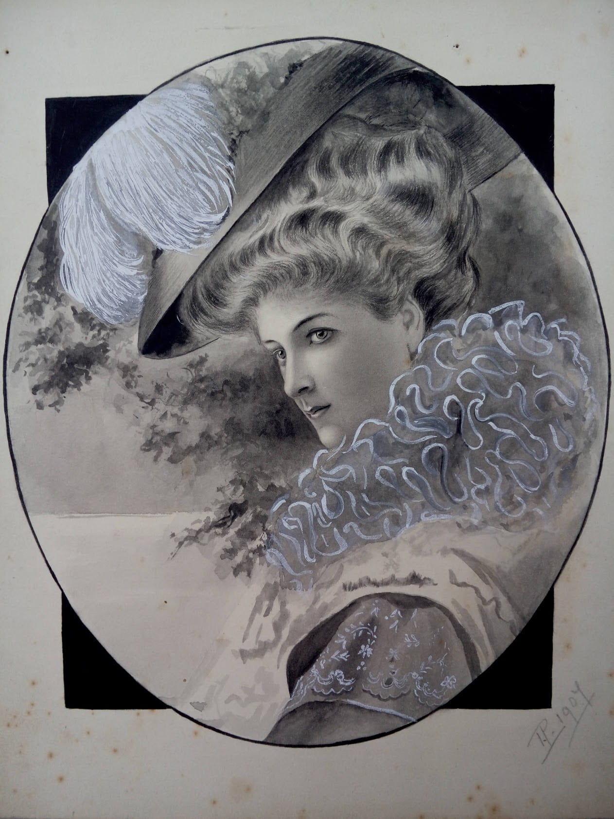
Figure 2. Ida Pritchard. Illustration of day ensemble with hat and feather stole, c.1905. Pencil / gouache on card. Worthing Museum and Art Gallery.

Pritchard’s drawings provide a valuable glimpse into the working life of a female commercial artist just before the First World War, in the heyday of the West End department store. She and her colleagues sketched from live models, who often posed in the large shop windows, wearing the latest fashions. The illustrators sat in the windows and sketched them. This was a clever publicity stunt that drew large crowds on the busy pavements outside.

Pritchard’s drawings skilfully capture the exaggerated characteristics of the feminine ideal of the 1900s and early 1910s, from the dramatically corseted “S” bend silhouette to the high-waist Empire line that replaced the hourglass style. The opulence of the Edwardian era, the layers of lace, feathers and furs are delicately modelled in a largely monochrome palette of pencil and gouache. A selection of dress from the museum collection, c.1900-1914, including pieces from Peter Robinson, is displayed in the exhibition alongside the fashion plates. A monochrome colour scheme, relieved by touches of pink and gold, reflects the colours Ida Pritchard used in many of her drawings. Where possible, outfits that echoed the silhouettes and textures of Pritchard’s work were juxtaposed.

The Edwardian period saw the commercial peak of the major London department stores, which were at the forefront of fashion retail for the rising middle classes in the early 1900s. Like many department stores, Peter Robinson’s had begun as a modest draper’s shop in the 1830s and expanded to become “Black Peter Robinson’s” mourning warehouse, capitalising on the Victorian cult of grief. The enterprise expanded rapidly in the late Victorian consumer boom and by the 1890s Peter Robinson was a prosperous business, with premises on Oxford St, Regent St, Great Portland St and Argyll St. A purpose-built flagship store was completed on Oxford Circus in 1912, which still stands, occupied today by Topshop.

Figure 3. Ida Pritchard. Illustration of three female figures showing lace blouses, c.1905. Pencil / gouache on card. Worthing Museum and Art Gallery.

The nineteenth century department store offered a new cultural space for women. Consumption was integral to the identity of the New Woman and shopping was seen as a form of liberation. During the Victorian period there were few public spaces which a respectable woman could enter unchaperoned or without the company of a male relative. Modern department stores such as John Lewis and Selfridge’s made use of new building technologies such as cast iron and plate glass to create open galleried spaces and large inviting windows filled with innovative displays, including fashionably dressed mannequins. Customers were encouraged to browse, try items on, relax and socialise in refreshment rooms. Shopping was a leisure activity and the new department store a place to see and to be seen.

Department stores offered a vast array of haberdashery goods and a comprehensive dressmaking service. They were also at the vanguard of ready-to-wear fashion production. Throughout the Victorian period clothing was made to measure but as the nineteenth century progressed, technological innovation moved the garment industry towards mass-production. Mantles and capes, gloves and hats were among the first types of women’s clothing to be ready-made and retailed in luxurious surroundings. Examples of capes, including an extravagant Poiret-influenced c.1910 opera cloak in gold and pale blue satin with Oriental motifs and embroidered silk tassels, made by Peter Robinson, were included in the exhibition alongside complementary fashion plates by Pritchard.

Department stores had large dressmaking departments with seamstresses producing outfits to order. Peter Robinson pioneered ready-made costumes with a seam left open at the back so that clothes could be adjusted to fit at home. Peter Robinson was also among the first fashion retailers to advertise in the press, taking out advertisements in the Illustrated London News for mantles and waterproofs as early as the 1860s. The second half of the nineteenth century saw an explosion in print culture and many new periodicals were aimed at a female audience, featuring columns of style and etiquette advice and, latterly, engraved fashion plates. By the early twentieth century, when Pritchard produced her drawings, the company were producing beautifully illustrated full-page advertisements. Worthing Museum is fortunate to have Pritchard’s original drawing, c.1908, of a satin petticoat, a copy of the magazine in which the advertisement was published and a near-identical example of a pink petticoat and camisole from the period, meaning that they could all be exhibited in conversation together.

Pritchard’s drawings, although they indicate subtle variations, adhere to a specific feminine type until c.1910. The fashions of the turn of the century were characterised by a dramatic hyper-femininity. Images of modish women in newspapers and advertising were shown swathed in luxurious fabrics and dripping furs. Hats were huge with ostrich plumes atop hair rolled around pads and augmented with hairpieces to increase height and volume. The increasing availability of commercially produced cosmetics and perfumes added to the general mode of theatrical artifice and exoticism, all of which is reflected in Pritchard’s drawings for a mass audience.

Ida Pritchard’s work had never been exhibited before in its own right. The Ladies’ Paradise was designed to complement the Female Voices exhibition, representing women through the collections, in the main Museum gallery. It shone a spotlight not only on an unknown female artist but also upon the subject she depicted, the fashionable woman on the eve of the First World War. Framing Pritchard’s work within department store culture of the period reveals how women were linked with modernity through the consumption of fashionable goods, and how shopping was linked to leisure and liberation (for those who could afford it). As the Suffragette banner on display in the Female Voices gallery reminds us, the period of unprecedented consumer temptations was the era of the struggle for female emancipation. This offers pause for reflection on the nature of choice, freedom and progress.

Update: As this exhibition has had to close as a result of Covid-19, a dedicated webpage including further images and exhibition texts has been provided by Worthing Museum.