What we lug around

This is the first image I have done in a while where I actually enjoyed the drawing,  I did it with ink and a menso brush, which was quite therapeutic because I really had to spend time on certain areas, if you push too much it ruins the line, so the right amount of force needs to be applied all the time.

For a while I finished the actual drawing but thought that there was something missing, so I added a background to get the final product.

Joba’s bigger verse

So this started out as a sketch- but I wanted to do it on a bigger scale. I am starting to get an appreciation for lettering too. More specifically, messy handwriting. But also how hard it is to space letters, in this image some letters are bigger than others, which works with the piece, but if the message of the image was different perhaps I wouldn’t be able to get away with it so easily.

The lyrics are from a song by the rapgroup/boyband Brockhampton, and resonated with me when I heard it which is why I wanted to continue experimenting more with this idea.

When Worlds Collide (Part 1)

I have never done Screen Printing.I only draw. So, when we were told we had to do screen printing, I was kinda nervous, but a little excited too.  Unfortunately, turns out I suck at it.

In pairs, we chose two words as the the theme of our Prints, ours being “Anarchic” and “Ritual”.

So to get the creative juices flowing, I started doing some sketches of angry people, or people who looked pissed off:

Once I was happy with a design, I started on the stencil, this took time, because I wanted to have the face be printed, meaning very thin lines needed to be cut out. The main problem I found was figuring out where I needed to cut so I wouldn’t mess up the whole stencil.  After I finished the stencil, I used some painted over it to get an idea of what the stencil would look like:


So after that, screen printing happened. My partner had done her stencils and we layered them on top of each other,  which I think overall worked quite well.

The problem I had with screen printing was that it was, to be blunt, incredibly boring. Having to clean the board every time you wanted to change a colour, then wiping down with a new paint colour ready to print the next stencil, and sometimes the wipe doesn’t go all the way through and you forget to wash your board sometimes and… Well you get the idea.

Overall I was happy with the final prints, and maybe if I do more screen printing, I’ll get faster at all the boring stuff, but for now, it’s not for me.

Drawing Upon Inspiration


Inspiration comes from all around us, even a photo from the 30’s.

This project started out, for me, by staring blankly at a photo of a woman awkwardly standing whilst everyone else happily ate their dinner. “What am I supposed to do with that?” I thought, as tears rolled down my cheeks as I pondered the very point of my art degree. I got stuck just by looking at the photo.

I started doing some small sketches, but still no luck. Nothing felt right, nothing felt genuine, I was just sketching faces and hoping for the best.

Then on a cool Friday morn, we had a guest artist that came in. I told her how I was struggling and didn’t know what to do, and she told me that the art that comes out of the project doesn’t have to be literal.  “What’s her story?” “She could be a spy, don’t write that down though, that’s my idea”

With this new sense of enthusiasm for the project I got to work straight away. Her story was that she was leaving this party, why? Because she felt awkward, in the way and so on.

But she doesn’t want to leave, why should she? Her inner voice is telling everyone to fuck off, and just cut the bullshit. Something I feel a lot.


With this idea in mind, the second piece I did explored this idea, but instead displayed all the possible emotions that she could be going through instead of just anger. Confusion, sadness, pretending not to care, screaming at how unfair situations are that you can’t control because that’s just the way it is.


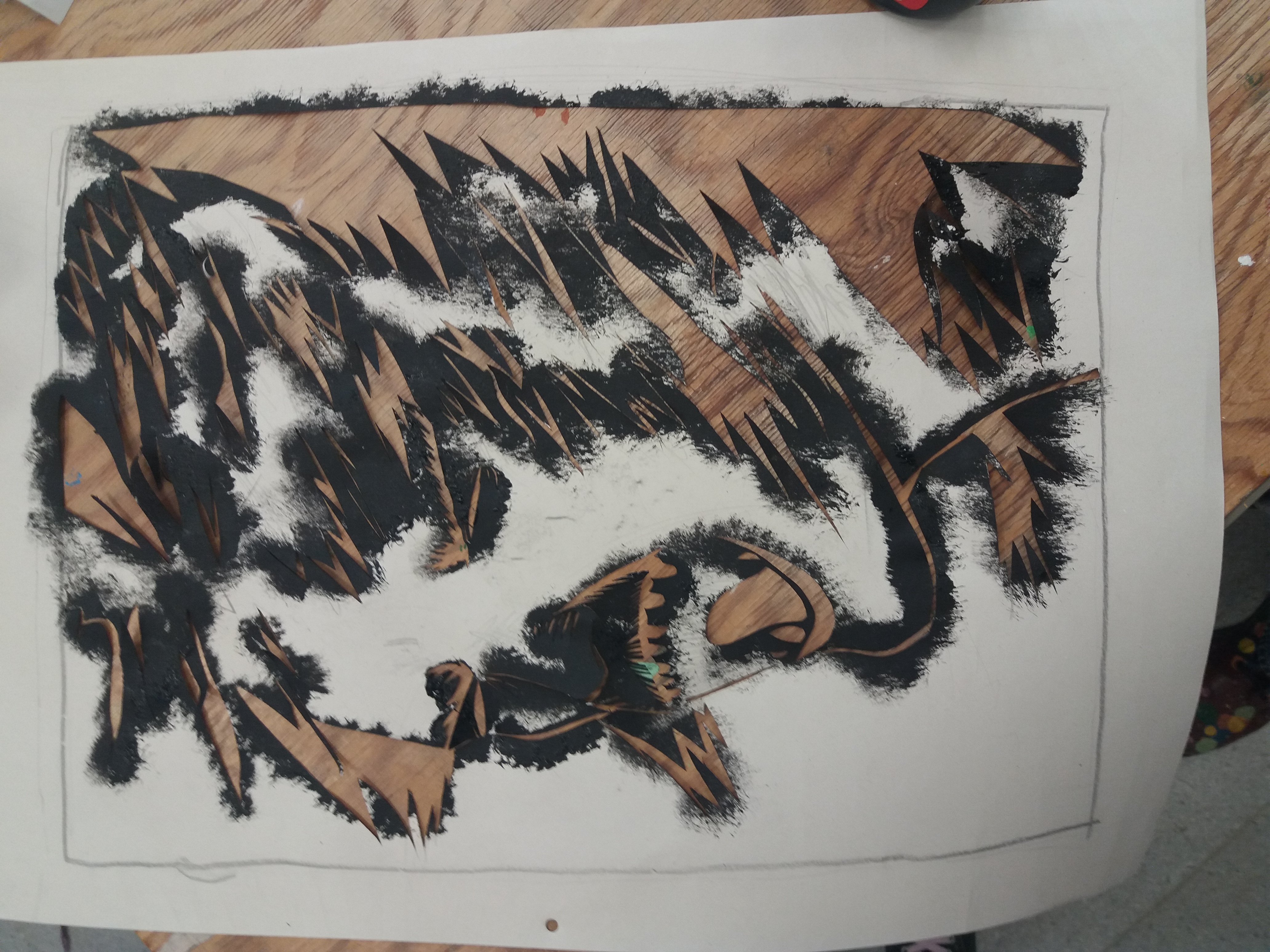
After finishing the bigger piece above, I had a chat with one of my tutors, who suggested it would be interesting to do the same idea on a smaller scale, in this case A4, which would be more restricting composition wise.


This the process of how the A4 piece took shape, I tried to emulate the bigger image, but I had to think more about where I wanted things to go.  I also wanted to change mediums, partially due to how small it was but more just to experiment a bit more. I think what came out was a minimalist version of the bigger piece.


I think this project was interesting. The project was structured in a way that meant I could focus on themes that I wanted to do, that I think are important, and I wasn’t limited creatively.

Summer Project

For the Summer project, I was asked to created 9 images to do with a topic. The topic I chose was observation of the self. After that, I kind of sat around for the whole summer until the end of August, when I realised, “oh crap this has to be due in soon”. I had done some research already, looking into the ideas of Alan Watts, more specifically his ideas on being self conscious. (Go watch Alan Watts, he’s great)

Anyway, with this in mind, I decided I wanted to focus my project on depression and all the lovely things that come with it. For example one of the images I did was a man looking in a mirror and seeing a more ugly version of himself. He doesn’t really look that bad, but he thinks it, so it becomes reality.  I also realised that doing 9 depressing images on their own would not flow well. What this project needed, was a main foreground image. My solution for this was to have a leech snake through all of the images, starting from where it was sucking on a brain. This morbid/cynical idea breathed new life into me, I felt motivated to do the project now I knew what I was going to do.

The leech sucking on a brain. Leaving only a shrivelled head and body
*Plays Man in the mirror for comedic effect*


Hopefully people identify with the images somehow, if not, Ah well, I enjoyed drawing it