Final Outcome

Narrative
       

Advertorial


Beauty


My final collection focuses on my concept; social isolation. For my narrative series I wanted to go to different locations and photograph everyday people doing their own thing in their own worlds. I wanted to photograph a range of people from different cultures and different ages to show it affects everyone from all walks of life.

My advertorials followed on with my concept. I focused on the cosmetic company MAC. I wanted to create a positive, body confidence series of adverts trying to make people want to be more confident in public by wearing bold make up therefore making them ‘stand out from the crowd’.

For my beauty series, I wanted to develop my advertorial concept but also stick to my black and white theme where I just highlight the bold make up. I wanted to use two photos from each look and highlight the lipstick in one and the eye make up in the other one to show experimentation.

I like how each collection is so different from the other as it shows diversity and also a good range of experiments.

Beauty Shoot Experiments


These edits were inspired by the MAC Cosmetics advert that I found. I think these experiments fit well with my social isolation concept. The black and white shows the isolation and then the hints of colour fit with my MAC adverts I created where I used bold colours to stand out from the crowd. I think this shoot was successful because it started off really intimate and then when the make up was applied the confidence began to show more. I wanted to have two looks for each look and highlight the eye make up and the lips to add a hint of bold colour.

Beauty Shoot


I started off by taking a shot without any make up because a lot of women feel like they need to be wearing make up in social places. I wanted to show how vulnerable people feel without their masks on. For this beauty collection I wanted to use two photos for each look. One shot with a medium frame and another with a close up to show the detail of the make up.


This is one of my favourite looks from the shoot. I like the contrast between the blue and the orange and I also like how the lips match the base eyeliner. I wanted to get a full shot and a close up shot of this look to show the details.


Similar to the other looks, I like the bold and vivid make up used in this look. It fits well with my ‘stand out from the crowd’ concept that I wanted to go for. Similar to my other looks, I wanted to get a close up of the details and a full view so you can get an overall look.


This is another one of my favourite looks, I like the contrast between the teal and the red make up and also the glitter under the eyes. For all of these looks I wanted to use influence from Kat Von D, such as the bold eye liners and lips. If I was to do this shoot again I would probably shoot in a studio with the same sort of lighting she used, but I wanted to try a softer look, to see if it worked well with my concept. I think this was a successful shoot.


For this shoot I wanted to focus on creating between 6-8 bold looks based on my influence from Kat Von D. My main concept for this shoot was to keep with my black and white theme however have bands of colour like in the MAC advert and highlight the bold colours of the makeup used. I think this was a really successful shoot because I got a variety of photos and a range of different makeup styles. I used natural lighting for this shoot because I wanted a softer look in comparison to Kat Von D’s harsh bright lightings.

Beauty Shoot Research

Nadia Murray-Ragg, 35 REASONS TO CELEBRATE VEGAN QUEEN KAT VON D ON HER 35TH BIRTHDAY, 2018

Kat Von D

Friendly Madrid, KAT VON D MAKEUP ARRIVES IN SPAIN, 2015

Najla Gun, Interview with Kat von D, 2015

I also looked into make up shoots by Kat Von D. I like how she creates vegan and  animal cruelty free make up. All of her images and adverts are so crisp and detailed with beautiful lighting, in my opinion she’s definitely a beauty influence.

For my beauty shoots I will use some of her shoots as inspiration. I will want to use bold colours, however still fitting in with my own concept.

Sarah Lombard, M•A•C Cosmetics Advertising Campaign, 2015

This is one of my favourite Mac images because of the hint of colour they have used to define the eye makeup. I think this will be a really nice concept for my own beauty shoot because the black and white will focus on the social isolation however the hint of colour will bring out a bit of depth to the image and give the subject more feeling and emotion.

Advert Experiments

I wanted to try something different with this edit. To create this image I duplicated the same image 4 times and just changed the hue on each one. I wanted to show a variety of eye catching colours with a slight vignette to keep the viewer’s eye on the centre of the image. Although this is a busy image it does have a Mac feel to it, but I would have liked to have used more of a variety of lipsticks or even other make up to give the image more of a range.

I think this advert was successful because I like how there’s just one lipstick in colour and the font matches this. I think it fits well with both my concept and also some of Mac’s adverts because they like to use hints of colour among black and white objects.

However, to improve this advert I should change the ‘Mac’ logo to a more bold colour or just stick with black and white. I think by using both black and white it makes it quite difficult to read. I just wanted to stick with their normal logo colours but on reflection I think I should have made it the same colour as everything else.


These four adverts I created I think fit really well with my concept of being isolated and with their adverts. I wanted to think of a couple of different adverts with the same basis just to show a variation of my idea. However, I think that my make up looks more cartoon like in comparison to Macs sleek style. To improve these adverts I should have added a reflective shadow and more of a variety of lipsticks.

Advert Research – MAC

Megan Guenther, Briana Irwin, Natalie Laneri, Ashley Fitterer, Kaitlyn Tymas, and Megan Fannin, Mac Powerpoint, Slideshare, 2010

 Antje Winkel, Beauty History Lesson How M A C Redefined The Makeup Industry, Limelight, 2017

Another brand I researched was Mac. I like how their adverts were bold on a black background. I thought this would be a interesting style for my concept because it fits with my idea of wanting to show people who blend into the crowd.

Advert Experiments

Here I have created my own advert for Canon by using inspiration from their Canon 5D Mark 3.

I chose one of my photos from when I went to Bali to fit with their high quality landscape photos. I wanted to stick with their “Full of” text but use a word that I thought fit well with my image. I then got the Canon logo and used the same typography to write “Delighting You Always” and then I used their EOS 5D Mark II however I changed the colour and added another “I” to make it fit with their other adverts I looked at.


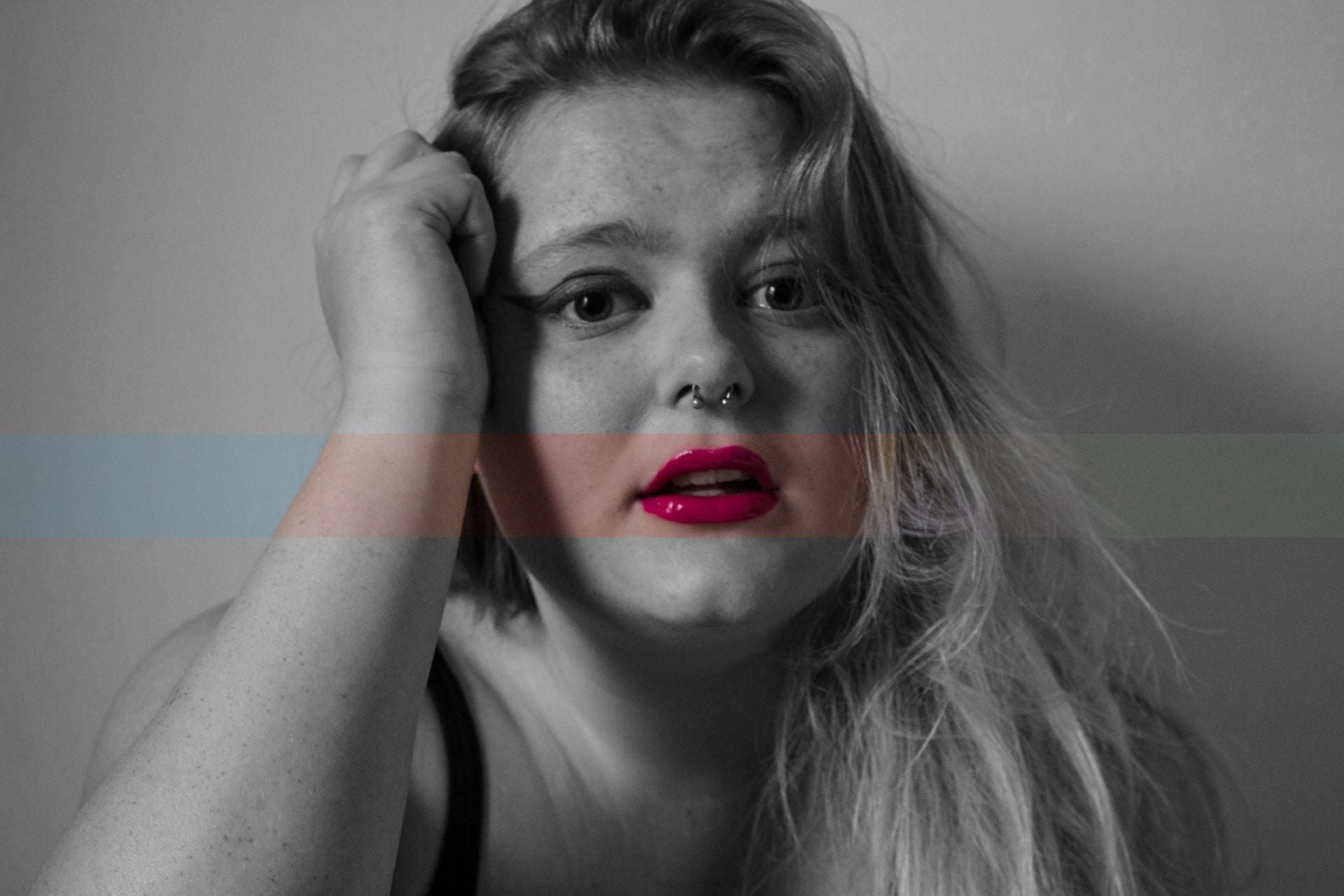
I wanted to do two experiments with each advert I created. For each advert I wanted to select images that fit with my research. I decided to use bold, vibrant pictures because whenever I think of Canon, I always picture really bold and detailed images.

I wanted to experiment with typography, so I stuck with their “full of campaign” and wrote words that I thought related to my images. I then wanted to change the colour of each adjective text so that it stood out and gives the advert depth by creating something to talk about.

For this advert I went to Chinatown in London and wanted to capture something opposite to my ‘tranquility’ edits. I decided to go to the busiest part of Chinatown because I thought it would create a nice atmospheric photo, with bold and vibrant colours. I also wanted to photograph in different locations for each advert because it would fit with my research of other Canon adverts. However, I used a different format to the other adverts so that the logo would be more visible. I also wanted to try a different layout of the advert to see what works best.

For this advert I wanted to try something different, so I decided to use two of my photos from when I was in Leicester Square tube station and layer them over each other. However I think this doesn’t fit in with canons adverts as they usually just have one strong image which is the main focus of the advert where as with mine there is a lot going on. However I quite like it because although there’s a lot going on it fits well with the message behind the image which is movement.

I didn’t think this advert was as successful as the other ones I’ve done. Unlike the other photos which were made in Photoshop, I created this one in Adobe Illustrator. The font is too big and because of the amount of detail in the image it was harder to read the font when it was smaller, I also had to add a stroke to the text so that it stood out more. If I were to try this again, I would probably add a fade layer over the image to try and make the font stand out more.

Out of the two ‘levels’ adverts I created, this is the more successful one. I like how the saturation is perfect on this image because it contrasts well with the pink in the typography. I also like the composition of this photo because of the different levels in it and I also like how the brick wall frames the beams. It is a strong and bold image like something Canon would use.

For my final set of adverts I wanted to focus on beauty and some sunset and sunrise shots I have taken in different countries. I wanted to use a similar colour typography to the sunset because its such a soft, natural orange which I think fit well with the theme. I like the composition in this photo because I like how the sunrise is slightly hidden by the Amalfi Coast hills. I also like that the only colour visible is different hues of orange. I think this is a nice effect because it doesn’t draw anything away from the focal point.

The second advert I created for my ‘beauty’ series was from Santorini and I chose it for the rich blues in the water in contrast with their white wash buildings. I used the same format as the other adverts I created so that they would fit my series and it is also similar to my research. I like how the viewer’s eye is led round to read the text by the path down to the bay, I think this is interesting because I haven’t used that in any of my other adverts.

My final advert for my ’beauty’ series is a sunset shot taken in Manchester. I chose this because of the rich tones in the sky and I thought it was quite similar to my first experiment, with the silhouettes  and the different orange and pink hue’s. I think this is a successful advert however, if I changed the colour of the ‘beauty’ type to blend more with the background I think it would have been a bit softer and also if I lowered the type to a bit further down I think it would have looked better on the page.


Advert Research – Canon

Canon – Live A Full Life, Version A, June 2012

Canon – Live A Full Life, Version B, June 2012

Canon – Live A Full Life, Version C, June 2012

I wanted to focus on Canon because I like their advert styles. I think they portray the brand really nicely by using really bold and vivid images. I also like how every advert has the same concept but is photographed in different locations relating to their slogan.

I also like their use of really bold and vivid images. I think it’s interesting how every advert series has the same concept but is photographed in different locations relating to their slogan. I chose these 3 adverts because I feel I can recreate them with my own images. I will experiment with this style of adverts however I will still follow with my concept and try and adapt my idea into this style of advertorial.

Chinatown Distortion Edits


I then decided that I wanted to completely blur the subject out of focus. I think this experiment fits the best with my concept. I like how when you look at the image you get a sense of uncertainty and confusion which is what you feel when you have social isolation. I like that these edits have the effect of a ghost in the crowd which is exactly what I wanted.

Chinatown Primary Distortion Edits


I then began experimenting with distorting the faces of people in my images. The first distorting effect I used was just fuzzing out the faces of the main figures in my edited images.

I thought this was a good starting point however, I only did this for a couple of images because I didn’t think it was a strong enough edit and it wasn’t what I was imagining.

The second type of experimentation I did was completely blocking out a figure in my pictures and replacing them with a glitch or a mixture of glitches. I didn’t like this image because  you cant tell what the shape is. I think to improve this edit I could have gone around the person rather than blocking them completely out.

Skip to toolbar