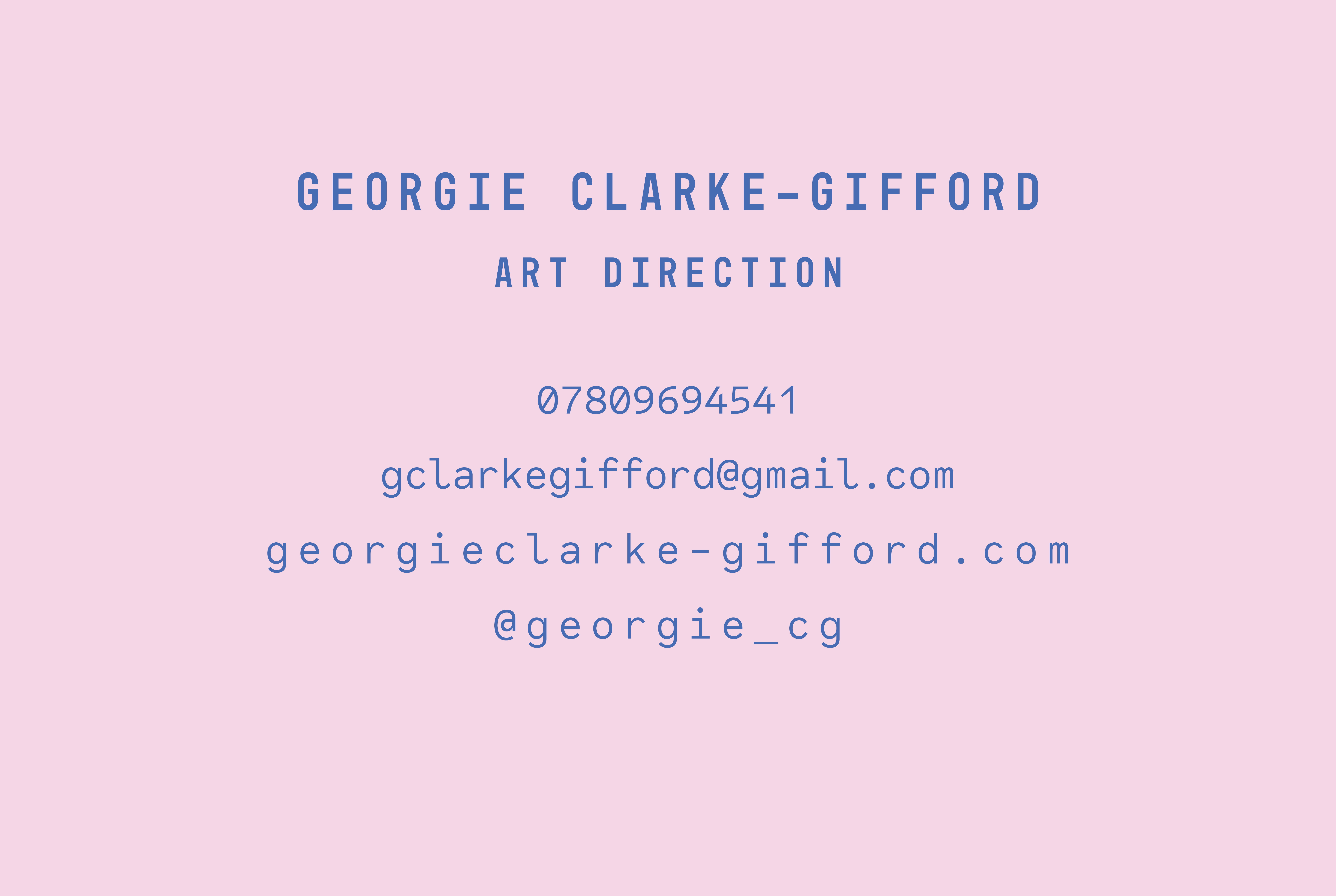
I chose this design for my business card because I felt it reflected my visual identity and overall creative style successfully. In other words, my work is often fairly clean and minimal in terms of aesthetic and layout which I feel is mirrored in the design below. For instance, the typography is spacious and the colour palette is subtle yet still has impact. The colour choices were also considered in a way which ties in which some of my imagery, particularly the chosen image for my postcard. I also think the idea of having just my name on the front in a stylised way with the key information on the back works well.
As mentioned in a previous post, I explored various printing companies in order to find the most suitable for printing my business cards and postcards. I decided to pick Mixam in the end as I had used them for my magazine so I was confident with their printing process and quality. They were also an affordable price whilst looking high quality, therefore being cost effective.
I decided to print my business cards on soft touch laminate 450gsm. The business cards have a smooth and matt finish whilst feeling thick and professional so overall I am pleased with the outcome.


It’s a nice card. 🙂 I always prefer to make my business cards colourful also. I remember I tried printing my own business cards, but it simply worked out to be too expensive long-term (e.g. buying cards, inks, etc. ).
These days I tend to use services like VistaPrint and https://www.theprinthive.co.uk/printing/business-cards/ for my printing, simply because it’s cheaper. Did you know, there are a tonne of online builders out there that let you design your business cards online too and save them as a PDF? 🙂