
Since the beginning of this project, and writing my statement of intent, I wanted to focus more on the elements such as wind, fire, earth and water. Including the pull on the earth and the effect this had on our bodies from the moons gravitational pull. While I knew I wanted to focus on women and hyper femininity my ideas of what this should be have changed so much since I began. I have now realised the difference between feminism and femininity. My project has evolved so much since the research I conducted in the beginnings. While I still stuck to the mother nature idea, following my final book titled ‘Mother’ the concepts and ideas have transformed themselves into different ideas of what the ‘Earth Mother’ is or behaves like. I took the ideas of ‘Mothers’ a protector which went into be looking at ‘Skin’ ‘Sister Relationships’ ‘MeToo Stories’ and ‘Beauty’ I have linked all of these shoots back to ‘Mother’ in a very conceptual way while still allowing myself to link back to the first initial ideas. Skin was about the protector in all our lives while being photographed in a very delicate and feminine way with nudity and soft fabrics caressing the skin. It also features raw meats to juxtapose the ideas of soft tissue. The sister relationships is something I have never experienced myself being an only child, I went all the way to Switzerland to photograph two sisters who have always been a part of my life, this shoot was where I really involved the different elements of the sun kissing the skin and cold water refreshing the mind and body. My portrait series really hit home for me I wanted to understand peoples relationships with one another and seeing how open people would be with a stranger allowing me into their worlds just for a second and documenting this on a film camera once again allowed me to use a different medium rather than just digital, this part of my project made me reflect on my past and how I have dealt with my own MeToo story Finally beauty, as any other 22 year old I am obsessed with makeup but changing the way we look for all the many different reasons we do, this project allowed me to look into how others define beauty I focused on ‘Beauty Papers’ and others who are trying to redefine beauty and a natural beauty. I did not see my project taking shape this way at all. I am so overjoyed with my final outcomes because a couple weeks ago I could not see how this was ever going to happen! My final outcome was comprised of four different photoshoots where I went into much more research than I have ever done before furthering my reading which I really enjoyed. I wanted to do less shoots and much more in-depth research and analysis while still allowing myself to do the best I could in the shoots. I also did six personal shoots along side this project for the New Designers and just personal work. My final outcome was a hard back book comprised within a magazine phonebook layout pushing myself with different layouts that I have never tried before. My favourite part of this project was the freedom of allowing myself to further understand who I want to be in the future and what kind of artist I would like and aspire to become. Without this university and final major I would be a very different personal I personally feel like I have grown so much since we began. I would like to take the time to say thank you to everyone who has helped me get to this point in my career. Jules and Mark have put up with me for far too long. So this thank you goes out especially to you both, I could not have done it without you.
Website: graceallenphotos.co.uk
Email: graceallenphoto@gmail.co.uk
Instagram: @graceallenphotos
These are some of the different Instagram layout options I have considered from online bloggers and photographers on the social media platform.
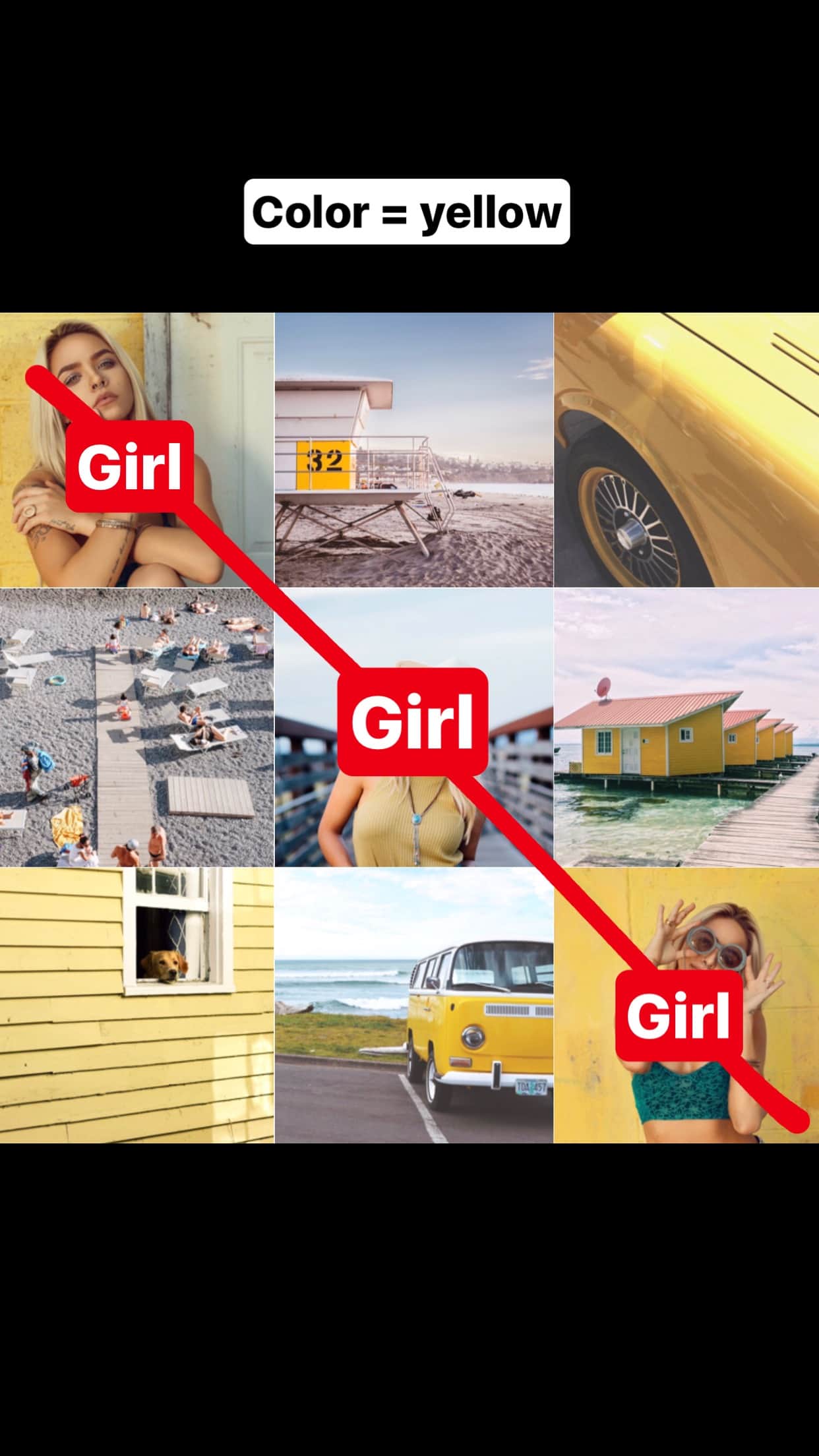
Design One: SQUARES
Each photo, one square at a time. You don’t have to stress out about your whole layout as such, as long as you stick to the same filter and color combination, which won’t work for me as a photographer trying to show off my many different talents and skills within photography. I would want the freedom of expressing black and white imagery with also colour from studio to location.


Design Three: TILES
For this Instagram grid layout, use each square as a tile.The most popular way to use this layout is by sharing a photo, then a quote, then a photo, then a quote. It is an easy way to have a consistent Instagram feed. Super easy. Your followers will know exactly what you will post next. If you have just posted a photo. They are expecting a quote after. I do like the idea of having not necessarily quotes on my Instagram as I feel it can be quite cheesy to look at. But I do like the idea of having maybe a working title on the right alignment but then this only allows me to have two images placed in the middle and on the left.


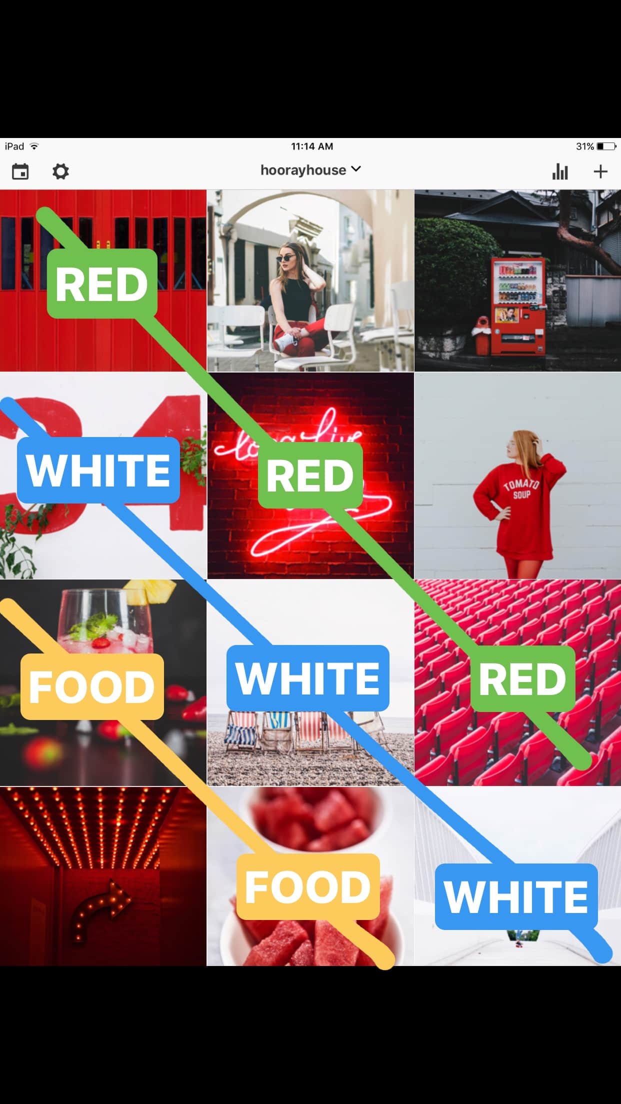
This is another creative Instagram grid layout. It is very beautiful because it looks like you are reading a book or a magazine. Our eyes naturally go from left to right to read. Again, you can get very creative and tell a story. One row = one story. For example, if you are traveling somewhere you could use a line to write about your travel tips, your experience or the name of your destination. This design is the one I like the most. The same way we read a magazine we look from one side to the other setting up three images in a row and being able to see it is from the same spread or editorial without saying anything else.


I had to chose between two different designs for my portfolio. Between a box or a folder. The box offers me single images that are a lot more tactile than the folder. They offer people the chance to lift up the images in the box and get a closer look at them. Making each image its own entity. With the folder I feel it is a lot more professional but almost business like. While the images can be seen in a double page and flipped through like a magazine, the pockets the images would slip into are often shiny with a gloss and looked at under lights would create a glare on the work which I do not what. From these two opinions I feel as though I am leaning more towards a box than a folder. It works better for my work of images that can me lifted up and looked at. It also means that I can reorganise my work with ease and take out work when creating a new portfolio for different clients.
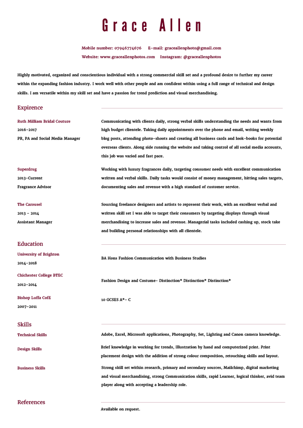
I have changed the design of my current CV. I found the older one too heavy on the page and the mass use of three different type fonts really distracted me from the core information that people would be after. I changed the style of the fonts on the right alignment and then reduced the size of the lines dividing the information.
This is my final portfolio the only thing not included within this PDF is the company database as it didn’t want to be included within my indesign file. So that database is on my blog only. I hope you enjoy looking through my work as much as I enjoyed creating it for myself and my self branding!
Link below.
Book
Ambrose, Gavin, and Paul Harris. typography. vol. 3, AVA, Lausanne, 2005. Book.
Ambrose, Gavin, and Paul Harris. Layout: N. an Arrangement of Parts etc. According to a Plan. vol. 2, AVA, Lausanne, 2005. Book
De Soto, Drew. Graphic Design: Know Your Onions. BIS, Enfield;Amsterdam;, 2011. book
Heller, Steven, and Lita Talarico. Typography Sketchbooks. Thames & Hudson, London, 2011. Book.
Haley, Allan. Typography Referenced: A Comprehensive Visual Guide to the Language, History, and Practice of Typography. Rockport, Beverly, Mass, 2012. Book.
Kaye, Joyce R. type. Rockport, Gloucester, Mass, 1998. Book.
Kaye, Joyce R. layout. Rockport, Gloucester, Mass, 1998. Book.
Loxley, Simon. Type: The Secret History of Letters. I.B. Tauris, London, 2004. Book.
Type Directors Club. typography 32. Harper Design, New York, 2011. Book.
Web
10 Amazing Sans Serif Fonts For Your Brand.” PinkPot Studio. N.p., 05 June 2016. Web. 17 Apr. 2018. <http://www.itspinkpot.com/10-amazing-sans-serif-fonts-for-your-brand.
Abrose, Gavin. “Fundamentals of Typography.” Cart208Fall12. N.p., 13 Sept. 2013. Web. 9 May 2018. <https://cart208fall12.wordpress.com/2012/09/13/fundamentals-of-typography-by-gaving-ambrose-paul-harris/>.
Chloe Drezen Represent.” TheCollectiveShift. N.p., n.d. Web. 3 May 2018. <https://www.thecollectiveshift.com/artists/chloe-le-drezen>.
Chloé Le Drezen.” Chloé Le Drezen. N.p., n.d. Web. 3 May 2018. <http://www.chloeledrezen.com/>.
Kayla Varley.” Amp Agency. N.p., n.d. Web. 16 April 2018. <https://www.ampagency.co.uk/artists/kayla-varley/>.
Home.” Fashion Workie. N.p., 10 Aug. 1970. Web. 9 May 2018. <https://www.fashionworkie.com/>.
Kick Pleat.” Go Forth Creative. N.p., n.d. Web. 12 Apr. 2018. <http://www.bing.com/cr>.
Morgan Locker.” Photographers Agent Advertising Photography and Production. N.p., n.d. Web. 10 April. 2018. <https://www.morganlockyer.com/GARROD-KIRKWOOD/Portraits/thumbs/1>.
Photographers Agent Based in London, including Illustration and CGi.” JSR Agency. N.p., n.d. Web. 10 April. 2018. <https://www.jsragency.com/talent/stuart-mcclymont/grid/photography>.
Photographers Agent London – Trayler & Trayler – Home Page.” Trayler & Trayler. N.p., n.d. Web. 10 April. 2018. <http://traylerandtrayler.com/>.
Petra Collins Home.” Petra Collins. N.p., n.d. Web. 10 May 2018. <http://www.petracollins.com/contact/>.
Skin We’re In Personal Photography Project – Photographer Elise Dumontet.” Trayler & Trayler. N.p., 15 Jan. 2018. Web. 11 April 2018. <http://traylerandtrayler.com/skin-were-in-elise/>.
Standing Out as a Photographer: 16 of the Best Photography Business Cards.” Ministry of Canvas. N.p., n.d. Web. 11 April 2018. <http://www.ministryofcanvas.com/273/standing-out-as-a-photographer-16-of-the-best-photography-business-cards/>.
I wanted to look into the costing for different online printers to get my postcards and business cards printed.
I looked at five different printers. These different printers were; Moo, SoloPress, Mixam, Vistaprint and Print Express. They are all varied in price. But what can be demerited is that the more you order from any of the online sites the cheaper it becomes overall! I decided to with Mixam for my final printing of business and postcards because this is where I got my final book from and I would prefer for all of the colours to look the same when placed next to one another. It helps with the final feel and look of my self branding. I ended up ordering 350 postcards of design one. 350 of design 2. Finally 500 business cards.