Text and Context 7: Designing accompanying material

As discussed in my previous post, I have gathered a lot of visual material for this project and want to utilise it. Throughout my animation I have had it dotted around, however, I want the pieces to be seen as their own piece. For this I am thinking a poster zine comprised of a poster advertising the animation on the one side and on the other screen-grabs from the animation. I have a few variations of ideas that I would like to try out for this  –

  1. Design and print it out in one go, computer to print.
  2. Design the screen-grabs and the type on the Photoshop and over print the poster using a photocopy lithograph.
  3. Design one side of the poster (screen- grabs) and leave the front to be overprinted using a photocopy lithograph and letterpress the title.

In a perfect world having time to experiment with the third option would be most satisfying. Yet, it is the most time consuming – I think the most likely would be the second option but time will tell.

To help with designing the poster I have been looking at sixties posters and album cover for inspiration on what defines sixties design. Also, I have been looking


Text and Context 6: Happy Accidents

For my module option Lithography, I have been making photocopy litho prints – to design them I needed some inspiration and thought about my Text and Context brief. I have been making and collecting a lot of visual material for this project and was unsure if I would have the opportunity to use it all (monoprints, found material etc.) as I was making an animation. So I thought this would be a great opportunity, here is my account of the day in my Lithography diary and the original photocopies…

“As I had finished my main double layer photo-litho plate in the previous session, today I worked on a photocopy litho print. I particularly enjoyed today’s session, the time flew by as I printed page after page. The photocopy print is created by spray mounting a photocopy on a piece of acetate, this is then pressed in the printing press to achieve a perfectly flat base to work with. Next, the photocopy is gummed and inked over gently, it is then put in the press.  I was impressed by how quick and simple the process was I will be doing in again for other projects. 

The outcome of the photocopy prints has a different feel to the photolitho prints, they’re not as sharp and clean; instead their beauty is in how the photocopy degrades use after use which gives it an imperfect tone and depth. I planned to make my photocopy print in response to my Text and Context project, in which I am making a video inspired by Franz Kafka’s Metamorphosis. I created my image on Photoshop using: abstract monoprints, scanned and edited imagery from an insect encyclopaedia, and found imagery of a sixties model. I enjoy re-introducing processes within processes and I feel that mixing the mono with the litho print gave a painterly look.

Mainly, I liked how easy it was to experiment with the photocopy print due to its ease of creation you could be haphazard with it without fear. I chose to cut it up and collage with it on the printing press, this gave an excellent embossing effect which was unexpected. I loved the prints that were made using this process and am considering making one for next week to overprint my photolitho prints.”

For the unpredictable litho prints I utilised another unpredictable method that I had come across by accident. I made a mistake while trying to export images from a PDF and accidentally exported all individual images found per page, this gave me snippets of words, diagrams and images. It gave a jigsaw of each page and some of the images are really interesting. Below are a few of my faves.


Rap ‘n’ Rhymers: Initial Ideas

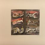
After meeting the children, I considered what poem or type of artwork I would like to work on. Initially I was drawn to the abstract artwork poems, as I knew that children would really think outside the box and write imaginative poems about them. Many adults fear abstract art as they feel they will never understand it and therefore fear that it will make them look uncultured or uneducated. Whereas, children don’t have these imposed fears on them, instead they want to impress their peers by coming up with wild thoughts about them.

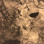
I enjoyed talking to Rhys, he wrote a poem on the painting Three Pomegranates. This particular painting is comprised of three black shapes which from the title are pomegranates. However, Rhys’ reading of the painting is humorous, imaginative and I think more interesting than the painting itself.

Below is the poem and my initial thoughts on what I could visually communicate through animation.

Rhys’ Poem

This is three pomegranates
But I don’t really agree
For in these 3 pomegranates
There’s a bit more to see

I enjoy how straight-forward Rhys is in this first verse. He quickly tells the audience that despite the artist naming the black shapes as pomegranates they could be many other things. In this verse I see swirling shapes culminating into what Rhys really thinks the painting is. The phrase “There’s a bit more to see” makes me think of the camera panning in deeper to the swirling shapes to represent looking deeper.

Maybe they’re black holes
Circulating and expanding?
Moving towards us
Soon enough they’ll be landing!

This next bit is one of my favourites, as the black shapes encircle the animation they get bigger and bigger until they transform into UFOs ready to land on the page, their lights beaming down.

Or maybe they’re blueberries
On a pure white table
Ready to be eaten,
Or maybe they’re in a fable?

I have a clear picture of this one in my mind, I want to use actual blueberries and use a stop animation of them being smashed one by one on a table cloth. The next bit “Maybe they’re in a fable?” relates to the next verse, I’m thinking that I could animate the table cloth being folded into a book shape and then written in like one. I could show drops of ink on the page.

It could be giant’s work
Testing his pen on a page
Writing a ___________________
___________________________
____________________________
____________________________
____________________________________
_____________________________________

This verse is unfinished however, I think it will be a good one. I love the thought of designing the giant character, showing him in his castle with feather and ink ready to write.

This is the”Three Pomegratates”
But I don’t really agree
For now you know
That there’s a lot more to see.

In the last verse I see the camera panning back out and leaving the pomegranates and coming back to a child’s face wrinkling his nose in an art gallery looking at the painting.  

Rap ‘n’ Rhymers: First Meeting

Our first meeting with the children was inspiring and motivating. I find that working on behalf of someone else is always a motivation, but to work on behalf of such amazingly creative children is a real drive. Meeting the children was great, I was especially drawn towards the children working on abstract paintings.

I’ve been thinking about what animation style I would like to focus on for the project. An animation which came to mind immediately was The Very Hungry Caterpillar, I’ve always loved The Hungry Caterpillar as a book but never seen the animation. It stays true to the book and I enjoy the collage style, this would be a fairly easy to animate through stop motion.


Patrick Thomas Lecture

In preparation for the Patrick Thomas lecture on the last day of term I have made a GIF poster. I utilised how Patrick and Thomas are each two syllables to create a rhythm in the GIF, and used images which related correspondently to Pat, Rick, Thom, Mas. I overlayed this with some monoprints and rubbings that I have been working on. Overall, I was pleased with the outcome and glad that I pushed myself to create a GIF, which is Thomas’ format of choice currently. To improve I think it would have been beneficial to include some handwritten type to add an extra element of originality.

Lithography, Session 7: 20/03/18

After being inspired by our trip to the Tate Britain last Tuesday, I was excited to finish my print off and see how I could further improve it.

The first challenge of the day was figuring out how to register my paper in line with my second print, this was a challenge but was easily overcome. I used acetate to print the second print over, next without moving the acetate (through placing masking tape) line up the already printed first layer print against the acetate print layer. Even with one print on acetate you could tell that the blue and yellow layer were going to overlay into a green which I was really pleased with.

I mixed a blue ink with ease, and although it took a couple of overprints it came out well and was transparent enough to let the yellow shine through. I’m really pleased with how the planned main print came out, the blue layer really completes the whole thing and makes the story come together. However, with inspiration from Rauschenberg’s prints I couldn’t help but think that another layer of predominately mark making over the top of the prints as an experiment would be a way to push my practice further.

Personal Project Proposal

Upon writing my proposal I wanted to make it clear that the project, isn’t just going to be about illustrating folktales as this is something that I know I can do and I want to challenge myself. Instead, I want to make an outcome which encourages storytelling and sharing amongst people.

Below is my proposal…

For my personal project I am eager to explore a long-time interest of mine, Folktales. I would like to research the structure of a folktale, how this can change and evolve from story teller to teller and how this resonates in modern culture. Folktales combine the mundane with magic and intrigue, they tell stories of local people, myths, traditions and the landscape to name but a few themes. I find that their rich history and range of topics serve as fuel for visual stimuli. For my outcomes I would like to create a body of work which explores experimental book illustration and bookmaking, utilising different bookmaking techniques to visually represent the concept of oral storytelling. With the extensive deadline I feel that it presents the opportunity to create some developed lino or lithography prints as part of the book illustration. I would like to challenge myself with overprinting the pre-designed book to add an element of chance much like the telling of a folktale is different each time it is told. To broaden my scope in this project, I would like to include the opportunity of using animations as part of the book with technology such as Aurasma. Overall, I want the project to be an experiment in modern storytelling in creating a book which gives the same excitement and spontaneity as the oral telling of a folktale.

Dada Project: Exhibition

To finalise my video piece for the exhibition I wanted to add sound and render the video. For sound I decided to use the FreeSounds service, for the beginning portion of the video I decided to use the background sounds of a house party – the hustle and bustle juxtaposed with the scripted advert well. I used a series of fingers snapping, I felt this split up the three sections of the video in the manner of which I made them.

Next I used the phrase “Let’s play hot bingo.” which I thought was funny and ironic, I then followed this with the background sounds of a bingo hall. Again, I used the sound of fingers snapping and then children singing nursery rhymes. I liked the sound of innocence for the ending of the video.

I was proud of what I created for the exhibition, I felt like it was a fully formed idea with a clear beginning, middle and end. I also think the found footage amongst the Dada poem helped it stand out against the other videos.

On reflection, the video has sections which could be cut faster, and some of the GIFs could have been finished in Photoshop to a higher standard. If this had been a longer project I would have been sure to rectify these issues. Overall, I am pleased with the look and feel it conveys how I feel during a creative rut – when I am feeling stuck looking for ideas. It portrays the feeling of breaking through the rut (represented during bingo) while it also shows the anxious thoughts of “Is this good enough?”, “Is this good design?” etc.

Golden Time Poster Collaboration

As part of our fundraiser I collaborated with Lily Weinbrand on a Golden Time poster. The theme was around school children and nostalgia, bringing the attendees back to a school disco type vibe but with a modern twist. Lily drew inspiration for the graphics from an old bull fighting poster, I thought this concept was interesting and enjoyed that it meant a large space in the middle for an illustration.

I was asked to complete one main illustration a series of faces and some graphic symbols like arrows and lines. For the main illustration I focused on children running out of school, eager to leave and in theory go to Golden Time. I used pen and ink to give it a appropriate feel. While I broke up the foreground and background with a split of white and grey.

Lily composed the poster and I’m happy with the outcome I think the concept comes through and I like the contrast between fairly traditional illustration and the modern graphics.

Lithography, Session 6: 13/03/18

To broaden our understanding of lithography and help the growth of our personal prints, we investigated a selection of prints from the private print rooms at the Tate Britain. These prints spanned across many different process methods, time periods and styles, it was interesting seeing them all together and making comparisons. Earlier lithographs, especially those created during the war, were more realistic and accurate using the dramatic quality of a lithograph to achieve stunning portrayals of planes catapulting through the air. These captured the atmosphere and narrative of wartime which appealed to British propaganda.

However, as the time periods moved on the lithographs utilised colour to present sprawling landscapes, and later still employed textural mark making and simplicity to create abstract work. Lithography became less of a method to record and more a method to express in which way the artist felt fit.

My favourite piece from the private exhibition was by Robert Rauschenberg, it was a monochrome collage using photographs, drawn graphic symbols, text and many other pieces of reclaimed imagery composed on top of graph paper. The effect is curious, its reminiscent of a newspaper but without rational. Similar photomontage pieces by Rauschenberg are described as having “a loose, poetic manner, creating an impression of visual flux that allows the viewer to free-associate” (Tate Text Panel on Almanac 2004). I think this is a fitting description of the lithograph as its use of printing medium allows layers of memorabilia and memories to be caked on creating confusion and wonderment in the viewer. This method has inspired me to create a third layer on my print and to experiment with my prints further.