Text and Content 2

Although I enjoyed looking into Frankenstein as a story, I felt stumped when it came to changing the story as I have never read the full story. I am one for keeping things authentic and I felt without fully understanding the original story I would be at a disadvantage.

So I considered looking into one of the other stories – The Metamorphosis by Frank Kafka. Due to this being a short story I felt confident I could read and finish it, needless to say I did. I found the story confusing and shocking but also funny and ironic. The story has many levels to it and therefore room to maneuver, some people may see the story as even funny. I wouldn’t go that far but I could see the appeal.

PDF of the text: The-Metamorphosis-1h4cuxs

I researched other material which is used to illustrate The Metamorphosis .

Below are images from My First Kafka, a children’s book by Matthue Roth.


I really like the point of view of these illustrations, straight from the bug’s level – which suggests that he does have a sense of humanity. Also, the black and white works so well as it is a dark and morbid story, it sets the feel. Admittedly, I imagined the bug as more of a cockroach? But, that is obviously left to interpretation as Kafka deliberately leaves it open.

Lithography, Session 3: 20/02/18

After the last session using the Zinc Oxide plate I was eager to have some time to plan my print better and identify my aims. As a group we discussed what can be achieved through using layers in a print, also we learnt how colours can combine and create different colours despite being on different layers. This is something that appeals to me, I like the thought of utilising the process of lithography to create something that I would normally be able to make, say through screen print for example.

To begin the process, I planned a simple collage which could be used on the photolitho plate. The collage is loosely based around my Manifesto project, as I felt this was a great opportunity to combine the two. With the Manifesto project revolving around protest and the print medium used prevalently for protest, I felt there was a strong connection between the two. Therefore, the collage is digitally made using images of environment damage and destruction. I thought this would be a great starting point to build my image from. This layer was printed on acetate, I then worked further on the layer on tracing paper; using similar drawing mediums to the first plate we created. On the tracing paper layer, I drew around the digital collage, I composed people, ladders and graphic symbols to imply that we are using our world as a playground without consequence and waiting for future generations to solve our problems.

I feel like this is a strong start to the planning of my print, I would have liked to get further with this today. However, it is not something to be rushed and I feel confident that with the extra time I can focused myself in the next session on finishing the plate design.

Manifesto: Factual Evidence

Below are some sources I’ve been looking at into climate change deniers, I was concerned that climate change deniers is an outdated term as most people will now admit that with more recent research that climate change is well and truly happening. Some articles date from 2010 and I feel like maybe that was a more current time for the term. However, I think that by bringing the term back in this campaign it will be suggesting how our everyday actions haven’t come that far to appreciating the immediacy of climate change.

Climate change and biocracy-1vqbyvo

Climate change deniers occuring more in Europe-uifwf0

Climate deniers and the media-17pn9fj

Climate deniers and who helps it-12ls8qx

Manifesto: Building on Research

To continue my research into the Manifesto I wanted to create I have been looking into footage of marches on the BFI website. This has been informing as it presents how humans react under pressures and how they protest. I’m interested in the visual language of protest, the body language, the faces contorted in shouts and chants and the raised fists. I feel like using this visual language will create a feeling of importance in my work. You can see the images I’ve chosen in my research book.

Climate Change deniers is an interesting subject because it includes many facades of social commentary. There’s the environmental side and how the longer we deny and avoid the subject of climate change the more our world is deteriorating. There’s the political side of world leaders communicating false commentary on climate change (yes I’m looking at you Trump).

May Day Protest

https://player.bfi.org.uk/free/film/watch-may-day-protest-march-1973-online

Knitwear Workers Protest

https://player.bfi.org.uk/free/film/watch-knitwear-workers-protest-march-1981-online

March!

https://player.bfi.org.uk/free/film/watch-march-1971-online

Lithography, Session 2 13/02/18

Our second lesson in Lithography was a fast-paced, practical introduction into using a Zinc Oxide plate. Although, I tried not to meticulously plan my print, as I knew it was a new process that I had never attempted before, I couldn’t help but have some expectations of myself. I had already determined from the last session that I wanted to utilise the quality of mark making that the Zinc Oxide plate creates. However, I didn’t know what I wanted my subject to be – on a whim I decided to use a recent landscape drawing I had drawn of Cuckmere Haven. Landscape drawing doesn’t come naturally so I didn’t feel precious over how I would recreate the drawing, it also had the opportunity for depth and texture to be worked into it using a variety of drawing materials.

The first part of the session was dedicated to creating the plate itself, this was slightly daunting as some of the drawing materials can’t be mixed with certain others. Also, I had to keep in mind that the plate cannot be touched as grease can make a mark which will transfer to the print. Despite, the difficulty overcoming new drawing techniques I enjoyed the plate I had made and felt that I had utilised many of the drawing mediums.

Inking the plate brought confusion for myself, I had trouble understanding how water could be continually applied to the plate while inking it. Now I realise that this is because the ink is oil-based and cannot be washed away with water. This was an important step to overcome early on and the same method is used to ink all plates. During the process, I had let the plate dry and inked over the top which had led to an excess of ink on the right-hand side. Luckily, it gave a nice effect to the print, also I asked my peers what they thought of the print and many saw images in the misprint that weren’t there but added to the image such as trees and people.

For an afternoon’s work I was impressed with my efforts and overwhelmed with the outcome. I had achieved in making it textural and graphic, while creating a sense of depth and perspective. I think the composition had some harmony which was improved by the ‘happy accident’ that happened during inking the plate. Also, I think it is the details in the mark making that make this piece interesting I’m looking forward to scanning the piece and using the details as larger pieces in my work.

Process:

  1. Draw and compose zinc plate, remembering not to touch the plate to ensure no grease marks are left.
  2. Make sure to dry plate.
  3. Dab over resin, delicately.
  4. Tap off resin.
  5. Dab on french chalk, brush off chalk.
  6. Brush on balm, with sponge, do not directly pour on plate.
  7. Wipe off balm with blue paper towel.
  8. Dry plate.
  9. Wash plate in white spirit.
  10. Wash with water.
  11. Brush off excess water with sponge, but leave it damp.
  12. Roll on ink (two charges of roller)
  13. Put on press.
  14. Up to four proofs.


Below is the print that I made in the session.


Cuckmere Haven, week long drawing project diary.

12/01/18

On our first day as a group we traveled to Cuckmere Haven, in the bus there we were told about how the landscape is changing and that the cliff face disintegrates by half a meter each year we were warned not to go to close to it. While at Cuckmere we began a group walk across the hills, taking photos as we went as we got further up the steep hill the landscape became more interesting and revealed itself to us. We sat and drew together for  a while, this was fairly successful I drew fragments of the landscape not feeling confident enough to go further. It was also very windy which was off putting.

We walked further into the landscape towards the beach, it was calmer down there and less windy, I tried to illustrate this in my drawing from this scene. I drew the scene in coloured pastel, I was proud of this drawing as it had a sense of the landscape to it and I felt happy with the effect of the pastels, as they aren’t one of my favourite medias to use.

Next, we went down to the beach here I collected a piece of sponge, a prickly plant and sheep wool. I also noted that surrounding the beach were full bin bags and assorted pieces of man made material – this reminded me of my idea for the Manifesto project, and how the environment is changing due to waste and global warming.

After going to the beach, we finished the trip with a hot chocolate. When we got back we talked through our drawings. I hadn’t created that many which disappointed me, however, I got plenty of photos and collected a few things to work from.

Below is a PDF of the photos that I took while at Cuckmere Haven, I was drawn to the landscape appearing to have layers and the sheep. Also I was looking for different textures in the landscape; the grass against the water and how to illustrate that successfully.

Photographs of Cuckmere Haven

Cuckmere haven photos.compressed-1kkw2bb

13/01/18

The next day we looked into how to use materials differently and had a short introduction into how to use ink successfully, as this is one of the areas Emma Stibbon works in. We cut the feathers we had found into quills and the sticks into drawing implements.

Emma made an interesting comment that using implements from the landscape to make a drawing of a landscape is a good way to make the drawing different and location specific.

I collected a lot of wool from the day as I have always been interested in textiles. I’m eager to look into how to use it in my work.

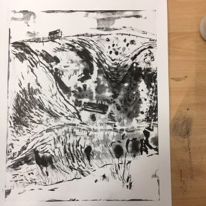
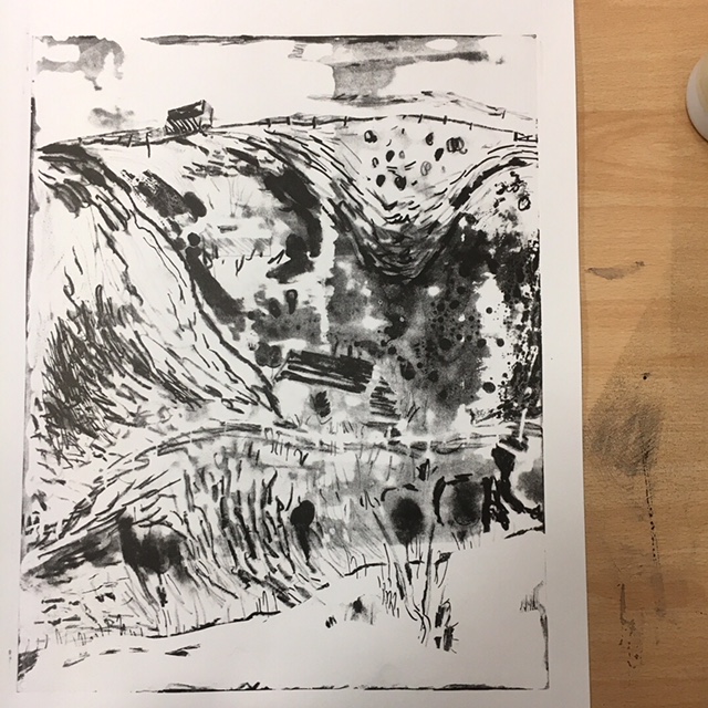
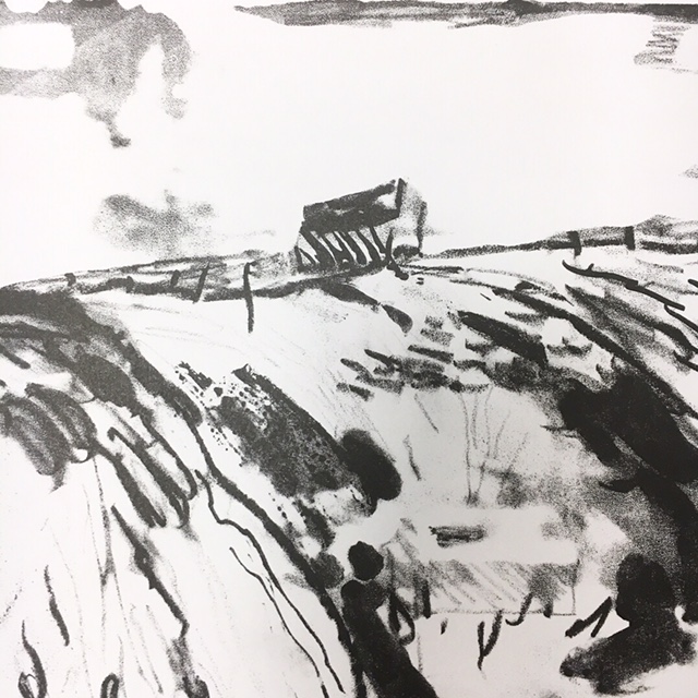
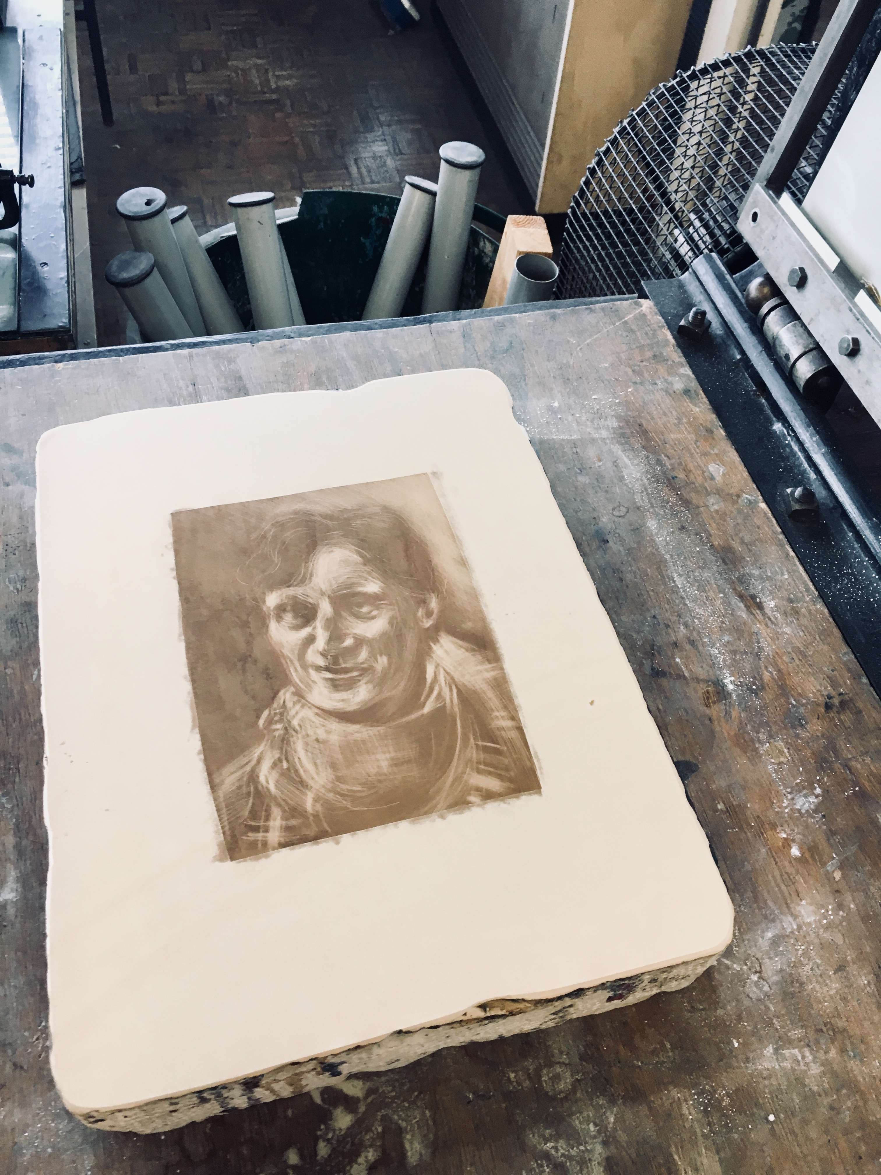
In the afternoon, I was in my module option Lithography. In that we were learning how to make marks on the zinc plate, I took it as a good opportunity to create a new landscape drawing. I made a response to the coloured pastel drawing I made and it came out really nicely. I am looking forward to trying to recreate some of the marks I used in it.

Sketchbook Work

Above is a sketchbook page utilising ink and water to recreate a similar atmosphere to what I felt in Cuckmere.

14/01/18

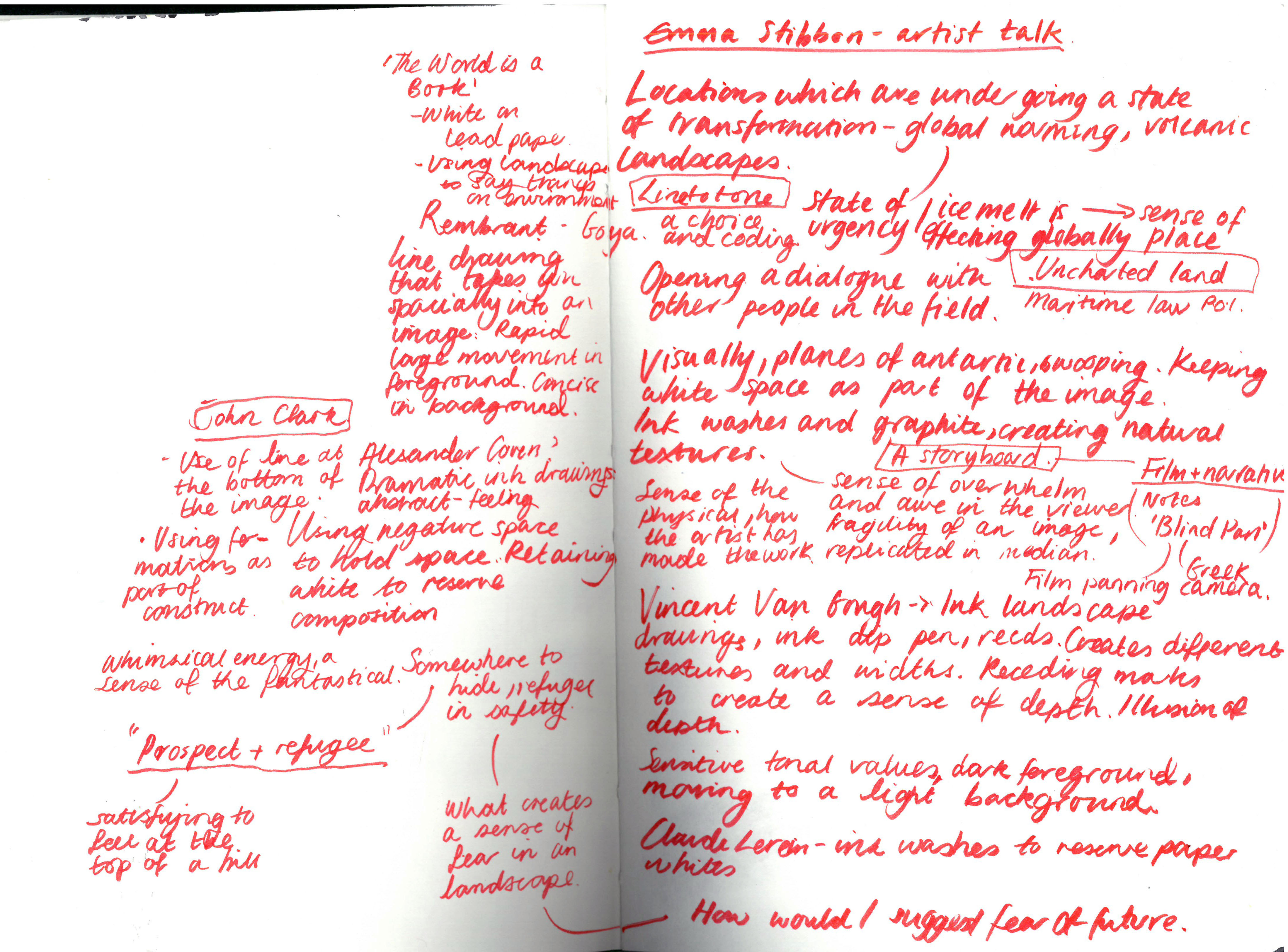
Below are my notes from a talk with Emma Stibbon, in which she looked at different types of landscape artists from traditional to contemporary and also discussed her own practice and where it has led her. I was most interested in Emma talking about enjoying landscapes which have a sense of transforming, in modern times most of our landscapes are changing before are very eyes. With the impact of global warming the environment is constantly evolving for better or worse and through illustrating this we are documenting these changes. This felt relevant to my current Manifesto project.

Emma Stibbon talk notes


15/01/18

We had an initial crit with Emma where we shared our ideas and discussed how to make them a reality, I was a little behind at this point but felt confident that I could finish that day.

Planning for a concertina book

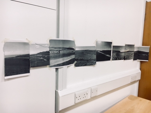
I decided that I wanted to create a concertina book. To help with planning this I made three example books (in portfolio),  I consulted with Emma on what form she liked the most. She gave me a new idea to create a concertina book which could present the images in a landscape format like my photos, this presented a challenge in the folding of the book. However, I made a successful practice model and continued designing.

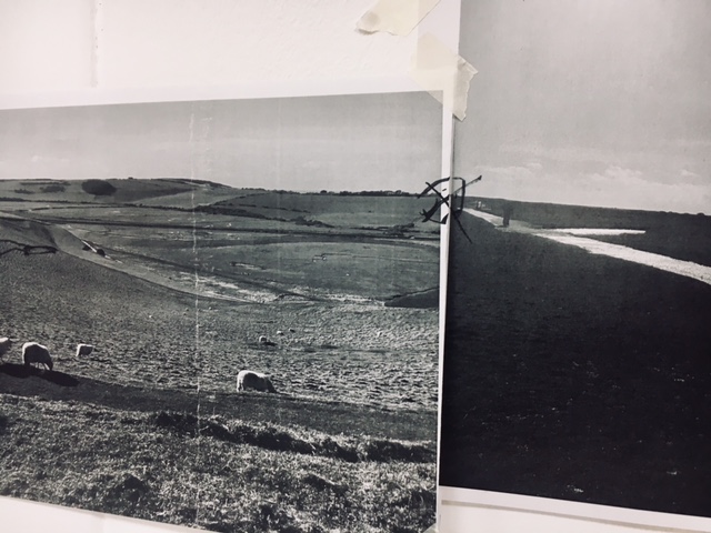
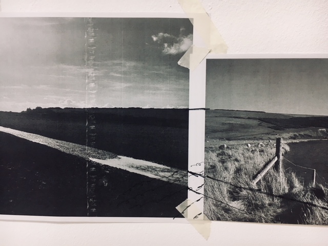
Below are photos from the planning of my concertina book, I stuck up the photos on the wall knowing that I had to create at least 8 pages for my book. As part of my process I tried to find something which could run throughout the book like a line or form. So I found focal points and adjoining lines that I could follow through the book (as shown below). In the overall crit of the project it was commented on that this worked really well and made the images work individually and complete.

Using my lithograph

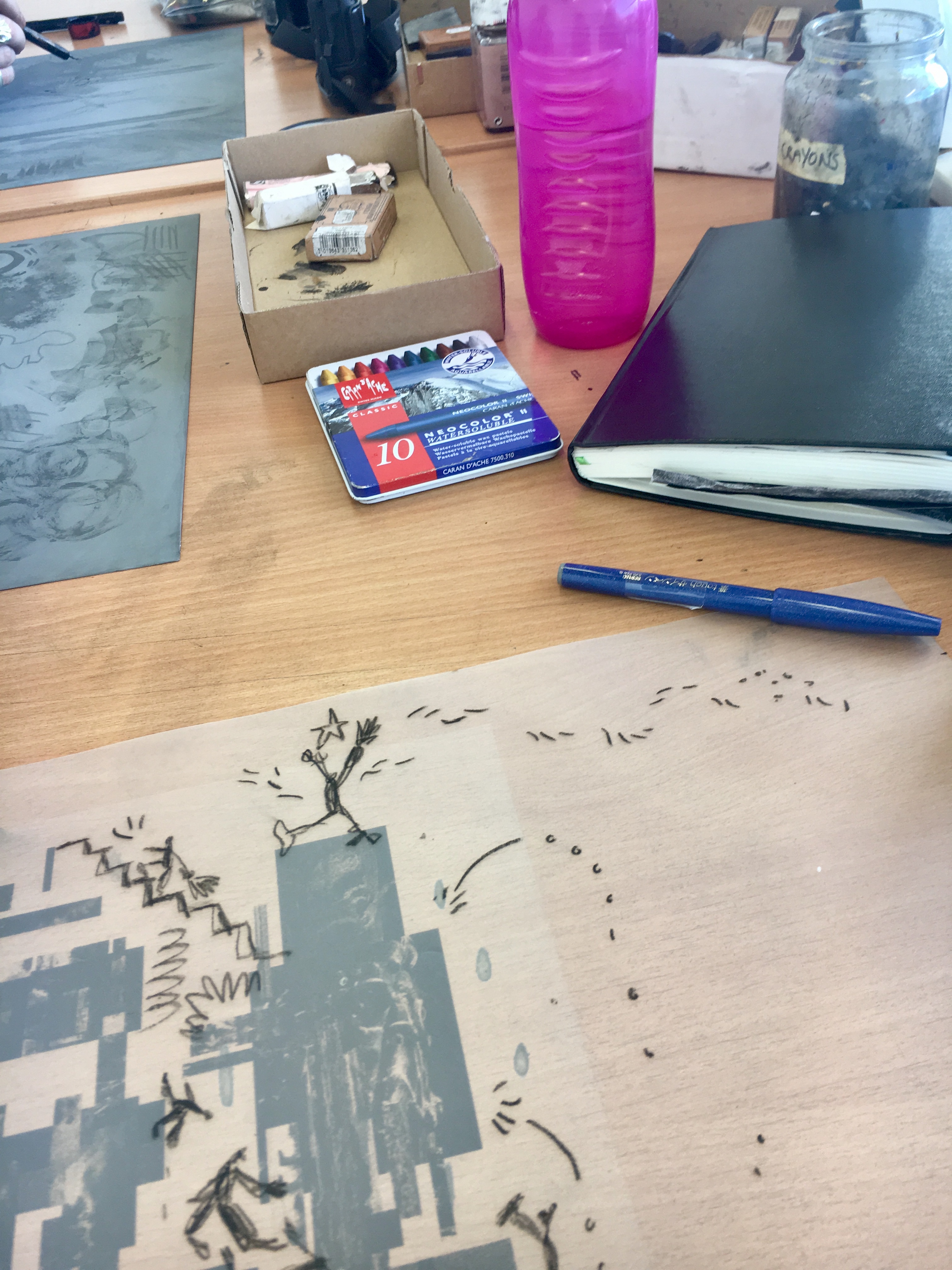
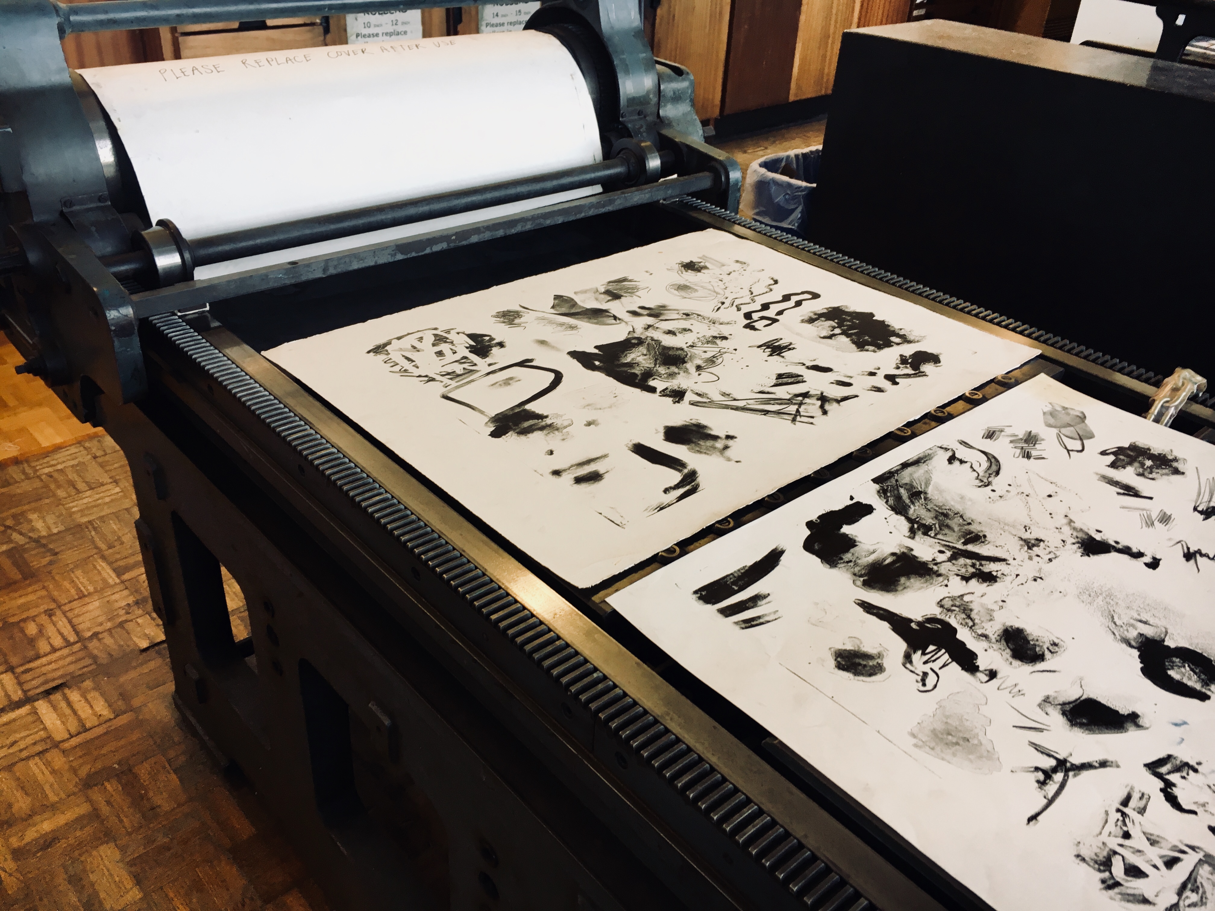
While completing my concertina book I had an issue with keeping the landscape interesting. I originally decided to make them all in ink and water washes with ink details, however, this became repetitive. So I looked into how I could use my lithograph to collage with and create some different mark making.

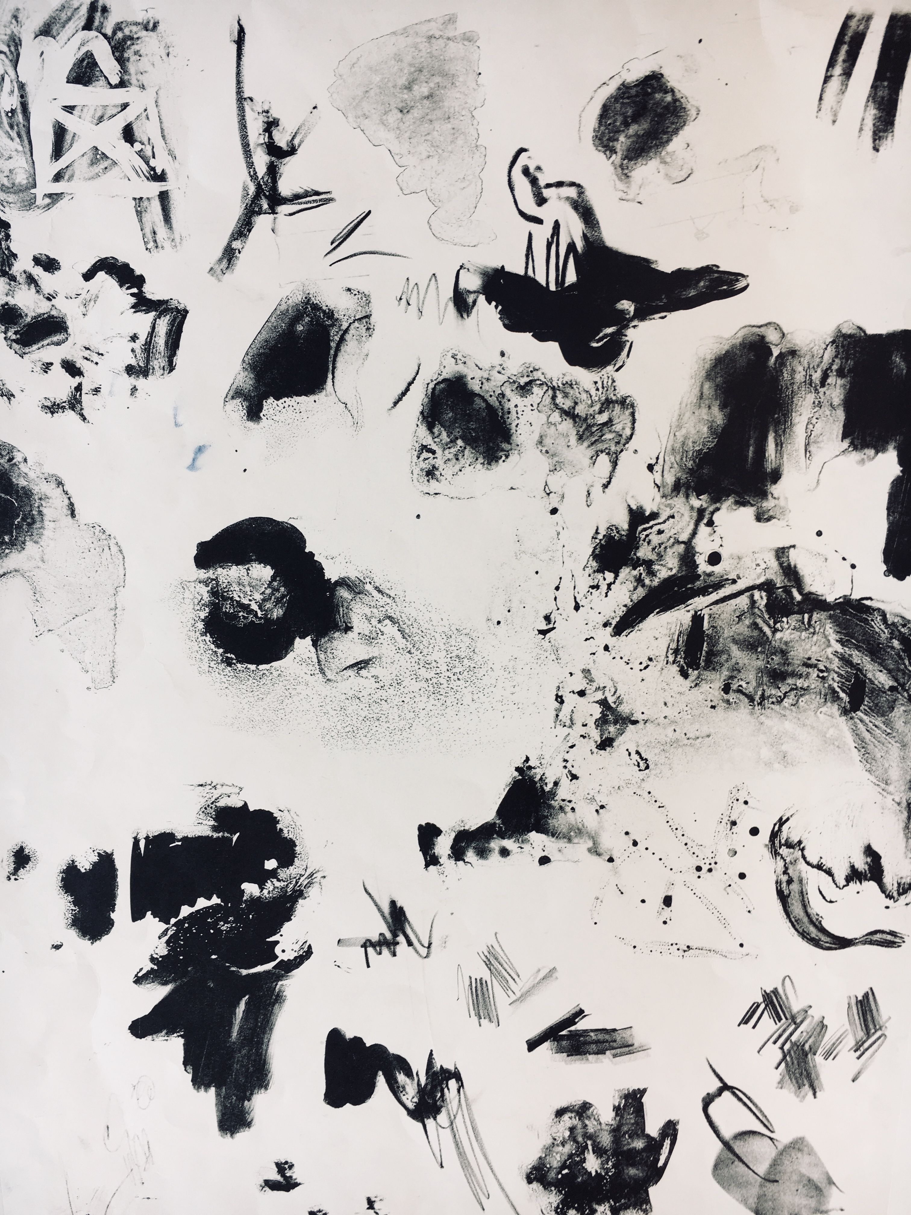
Below are some examples of the different textures I obtained from my lithograph, interestingly these are actually marks made when I made my first lithograph wrongly. I had applied the ink while the zinc plate had dried, which is a huge no in lithography. However, I really enjoyed the effect it created and it was one of my favourite parts of the image, it created a bubbling look which wasn’t expected.

Final Crit

The final crit of the project went well and it was really interesting to see how everybody had differently responded to the same landscape.

I completed my concertina book with drawings of 8 landscapes, using ink, water, pencil, charcoal and chalk. I decided to use many medias as it added variety to the landscapes. I think the concertina style book was a good choice of outcome, and Emma remarked that when composed in a + shape it could be compared to North, South, East and West. I’m really happy with the landscapes and was told that I knew when to hold back and stop, which kept the simplicity of the landscapes.

Lithography outcome


Module Option: Lithography

Upon choosing Lithography as my module option for the term I had many hopes and expectations. I’m looking forward to devoting time to printmaking, which I enjoy thoroughly already, but haven’t had the opportunity to submerse myself in to. I’m curious to learn about the printmaking process and how to utilise it in my current Illustration practice.

During our first session we were given an induction in using the Zinc plate, the Zinc plate is a useful tool as it utilises mark making and therefore tone, texture and depth. While watching the induction I was considering how this would work in my practice, we are always encouraged to use mark making, the lithography process highlights the quality of marks and brings them to the forefront of image making. The printed quality gives a great heightened contrast but also has room for subtle and gentle marks, this has been an opportunity to consider marks and methods to include in my own print.

Also, we were introduced to how the module will run, I am eager to create a body of work which acutely responds to a process. Furthermore, it will be an opportunity to design a print and consider composition, space and depth to work with and against the process of lithography.

Text and Image Workshop

For the text and image workshop I used a random word generator to create film titles. Surprisingly, the random words conjure many images and thoughts. For many I very quickly imagined what genre the films could be for instance; ‘Space Graduate’ is one of those 90s/2000s films like ‘Dude Where’s my Car?’ centered around college stoners, ‘Midnight Mother’ a ghost documentary, ‘Sin Clique’ chick flick like ‘Mean Girls’ while ‘Ego Doll’, ‘Future Report’ and ‘Heavy Steam’ are definitely cult and hipster.

  1. Space Graduate
  2. Whole Bathtub
  3. Favourable Observation
  4. Bare Orthodox
  5. Dance Pack
  6. Unlawful Cellar
  7. Heavy Steam
  8. Bus Result
  9. Future Report
  10. Midnight Mother
  11. Sin Clique
  12. Rational Core
  13. Ego Doll
  14. Federation Carve
  15. Reactor Belly
  16. Undress Residence
  17. Daughter Compact
  18. Strip Hour
  19. Fault Researcher
  20. Candidate Stereotype