
INTRODUCTION TO MAKING THE INVISIBLE VISIBLE, A LOOK INTO MAPPING AND WAYFINDING
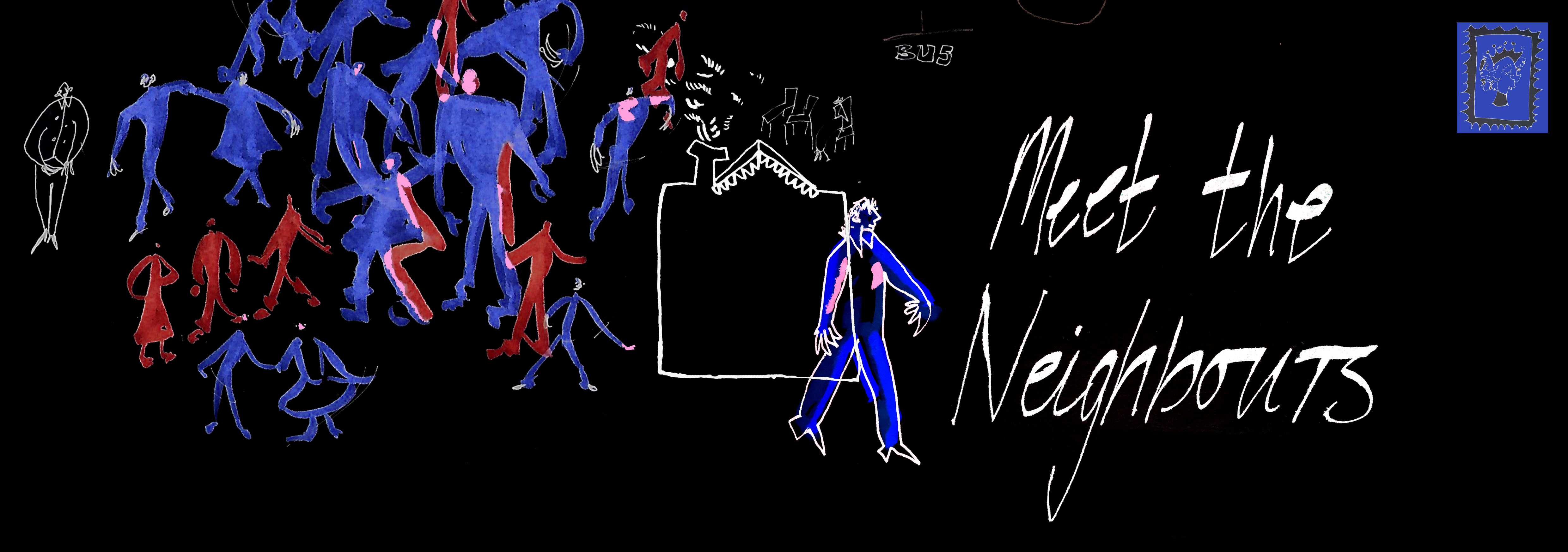
I’m always drawn to the mundane and alleviating it, trying to consider how it can be less every day; this thought process I think worked well for Making the Invisible Visible. From the beginning I wanted to make something around the concept of “meeting the neighbours”. During this time, I had been thinking how strange it was that I didn’t really know any of my own neighbours. While in first year I had put this down to not knowing whether I would live in the house for any real amount of time. Yet, here I am in second year in the same house, and looking to stay for a third. I’m going to have been in the same house for three years and not know anyone on my own street! This got me thinking about how technology and modern life is often blamed for the dissolution of a sense of community. So, I considered how an app could make it easier and more accessible to know your neighbours in a positive way.
RESEARCHING A COMMUNITY NARRATIVE
To consider how to make a community narrative trail I looked first at the city of Brighton. I researched Brighton Statistics and picked out areas I found interesting. Overall, it made it clear that Brighton is a open, forward thinking and creative city. I wanted to create something which I knew Brighton could handle unlike any other city. So created a concept for an app which would allow you to meet your neighbours without actually having to leave the house. I wanted to play with this concept and visually discuss how it is both unnerving and a probable outcome for the future.


VISUAL RESEARCH: LOOKING INTO BRIGHTON
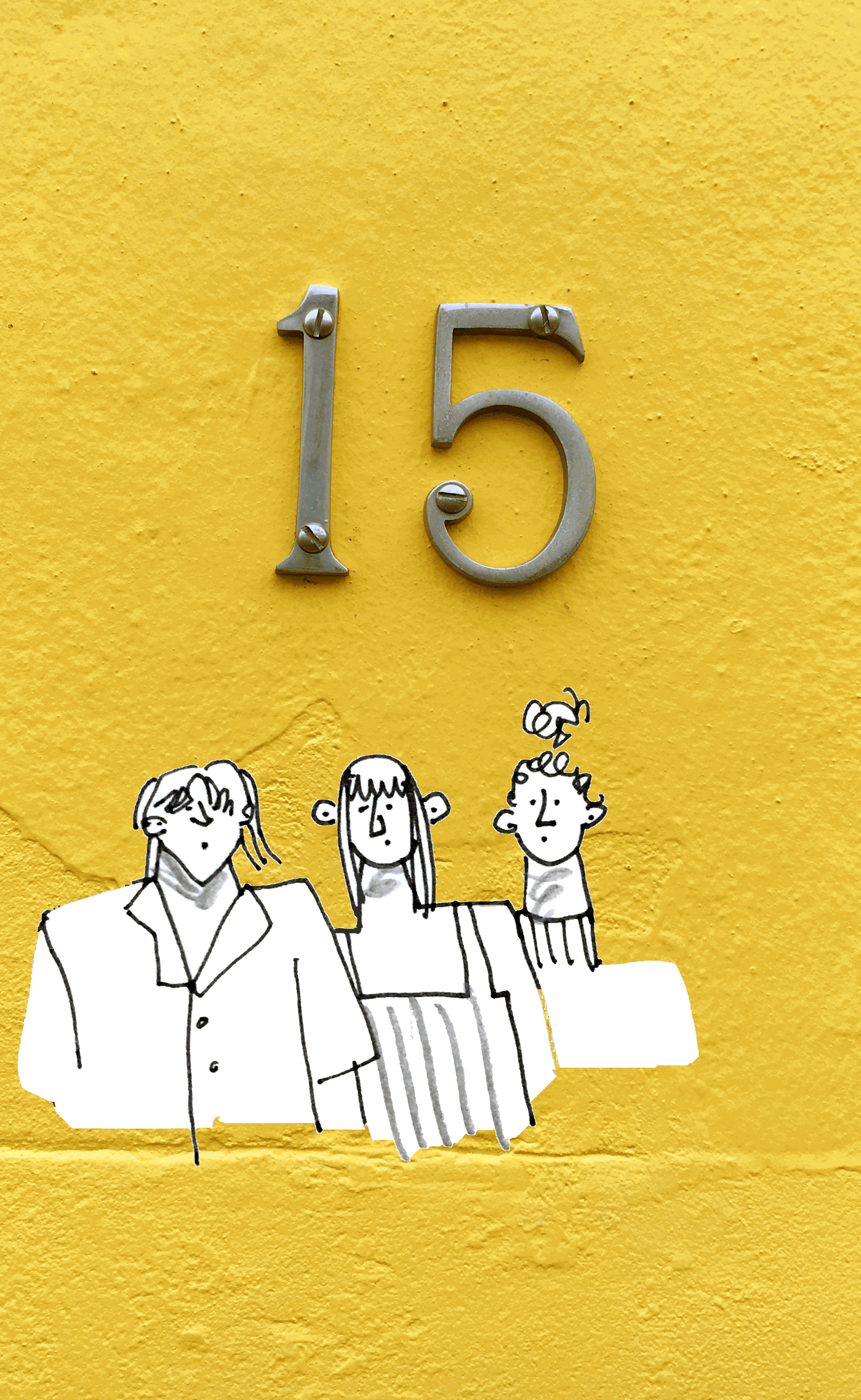
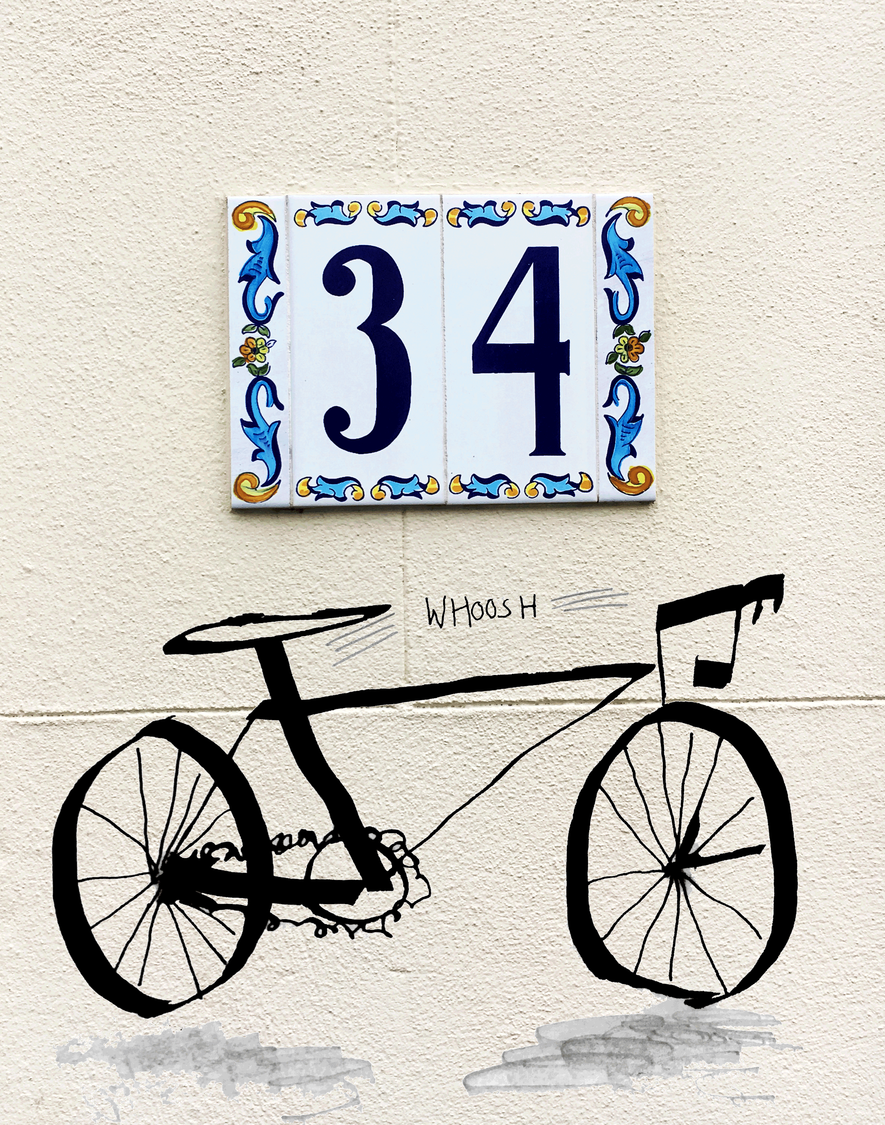
I looked around the residential areas of Brighton and discovered a lot of creative material including graffiti, graphic forms and colourful houses. I think the houses were what struck me first when I came to Brighton, I was comforted by the personality that each house exuded. HOUSE NUMBERS
I took photographs from house numbers which I later used as part of my colour schemes for the project.
Below are interesting sections I found from the Brighton and Hove Statistics Snapshot –
I found that cycling has increased, as has less carbon emissions and that Brighton has a large student population. Although I assumed these facts to see them in black and white to me made it clear. I decided to make these a focus for my GIFS as I felt they were central to the feel and atmosphere of Brighton.


I found choosing a location easy, knowing that I wanted to create a sequential narrative around an invisible community and having a personal connection to Picton Street (my street) I set out taking photos of the house numbers of my neighbours. I chose house numbers because I thought the graphic forms would work well on Aurasma as we had been advised and that they would be visually interesting to combine with illustrations.
RESEARCHING THROUGH USE OF THE APP
I had a few issues with Aurasma, understandably the technology is very good for a free service. However, the app can’t hold large files such as GIFS. Furthermore, I was surprised that my target photos for my auras weren’t working. After reading through some reviews of the app I learnt that graphic forms do work well as target photos, unless they are primarily white space. I’m glad that I tested the app before getting too deep into my work as I had to make some decisions at this point. I desperately still wanted to use house numbers as my target photos because I felt that it was integral to my concept. But, I simply couldn’t get them to work which was frustrating. So, I brainstormed two ideas – one was that instead of using house numbers I could use a different target and then add the house number photo as the background of the GIF. Luckily, this worked well and made the GIFS look more finished and gave them a sense of synergy between them. Secondly, I considered what I could use as a different target photo and a plan B.
 RESEARCHING ANALOGUE STYLE
I wanted the style of the GIFS to be analogue and hand drawn. But, I also wanted them to be fast and sketchy – so I looked to Quentin Blake. His style creates that wholesome feel combined with energy and movement which I was looking for. This style translated well digitally.

PROBLEMS SOLVED ALONG THE WAY
I tested out a few different target photos, through using the traffic light guide on the app. It seemed to dislike a large majority of angles from outside the house. The only thing I could get it to focus on was a section of the steps from outside my house – which wasn’t the feel I was going for. I also noticed that you need strong WiFi for Aurasma to work which I unfortunately didn’t. Therefore, I had to think of a way I could use it inside the house or a different place where I had WiFi.
Moreover, with all these issues arising I worked backwards and considered using QR codes instead. I made all the QR codes very easily and quickly, which I was impressed with. But, now I needed to consider what I wanted the QR codes to be, through a method which adhered to my concept. I considered a few options from putting them on houses (bad idea) to creating a Meet the Neighbours postcard (good idea). Since moving into the house, we have had a few things posted through the door from our neighbours as we have a very community driven street – these have always been in the form of a postcard. My first postcard I created around the thought that it would the idea of meeting your neighbours would be a confusing and off-putting thought to some. So, I used dark colours and the ominous guidance of “Use a QR reader to meet us digitally” to suggest a Black Mirror theme. Almost a Big Brother, you are being watched conceit. Although I liked this I didn’t think it matched the playful GIFS I had made. So, I reworked it to be more of a card the outside is still dark, but with more people on it which gives it more colour. I mainly changed the inside, leaving it white with illustrations around the QR codes and a bright illustration of people – this I felt gives it more of an uplifting feel with an undertone of eeriness.

QR CODE POSTCARD
The QR postcard worked really well and was a good solution to my Aurasma problem. It also went down well in the Crit as good problem solving. While filming the documentary for the app I think it works better than Aurasma all together as it fits with the theme and feel of the process I was trying to capture.
ANIMATION WORKSHOP
Practising my animation skills was a really great opportunity as it meant that I learnt how to use the boil technique. It also taught me to stick with my original hand drawn idea as these came out much better than my digital one.

INSPIRATION FOR MY DOCUMENTARY
For my documentary I wanted to create a advert for a trial run specially for Brighton of the new app ‘Meet the Neighbours’. To complete this aim I used a catchy, upbeat song, title pages and a voice over. I am really happy how this turned out. I filmed it point of view so that the viewer could put themselves in the shoes of someone new moving to the city. I thought this would resonate with the viewer because as found through my research a large concentration of Brighton’s population are students moving in. To create a dystopian view of the future I made the voice over creepy and foreboding – this I think showed my own personal struggles with how the app is a scary but practical view of the future.
I also got a lot of inspiration from the Mitchell and Webb sketch Remain Indoors. This sketch presents a hyper image of the world I was considering this app being used in. But the phrase “Remain indoors” struck a chord and I used a “stay inside” tagline for my own documentary.
Powerpoint of Making the Invisible Visible for Crit
![]()

Watch the documentary for Making the Invisible Visible.
EVALUATION AND REFLECTION
I really jumped into this project head first, it was the first project I had this semester and also I could see from first glance of the brief that it would take a lot of work. Surprisingly, I enjoyed this project, I think it stretched my digital skills while considering the visual communication of my analogue skills I enjoyed this challenge. It was also an opportunity to make research into function. My research allowed me to craft the project directly to Brighton – it has an upbeat and carefree attitude to it that I was looking for. While on the other hand it has an eeriness.
I felt torn while making this project – did I want the thought of Meeting the Neighbours to be creepy or futuristic. I tried to express this during the documentary and think I achieved it as it is a balance between the two.
In terms of wayfinding, mapping and sequential narration I think the trail works well. I wanted this to be wayfinding prompted by emotion. The person in the documentary has moved to city for the first time – I know how this feels and wish I knew more people around me when first starting out in Brighton. Therefore it was partly an a map caused by emotion. On the other hand the QR postcard creates a trail to be found, you look at the postcard find what you’re looking for and then look for it with Aurasma. Using this method both the features work in conjunction.
Furthermore, through visual research into the community spirit of the street and my own personal experience (street parties, Christmas parties, competitions etc) I felt like I was telling the story of a street. All the people make a whole street, where everyone is living very different lives – the GIF gives a small insight into this.
Overall I feel like the project does have the impression of a trial period for a new app, and that these are only the tip of the iceberg for digital solutions in the modern world.