
INTRODUCTION TO SUMMER PROJECT AND HEROES AND VILLAINS
After summer was over I wrote the following about my summer project…
“For Heroes and Villains, I initially I began with a succinct idea which I had been mulling over in my head for years. Lilith, a demon, first wife to Adam, the beginning of feminist discourse and an all round, misunderstood anti-hero. Texts written on her are so interesting and historical while wrapped in a shroud of folktales. Basically, it’s right up my street. However, I found it hard to find much visual stimuli surrounding her, as soon as you see the painting of Lady Lilith (Dante Gabriel Rossetti, 1867) its difficult to shake the impression that she is a beautiful, pale, red curly haired siren.
So I moved on to the mystery surrounding her, I did more research and was inspired by the idea that a red ribbon could protect a baby from the perils of Lilith. I enjoyed this image of a red ribbon around babies wrists and cribs, a good luck charm (otherwise known as a nachora bendel) and worked with that for a while. During this time, I watched The Beguiled remake – not a favourite film of mine but it was visually stimulating and the story line I felt connected to something that I was trying to express.
In the film, a school of women kill a man – while the audience is then convinced to feel sympathy for the women. However, in the original, vice versa occurs; which made me consider can heroes and villains play both roles depending on the viewer, short answer yes. In my work I am always considering the woman, I am sympathetic to Lilith thinking that yes she was wronged. My college final piece was about the betrayal of women through the witch trials – how good midwives and nurses were misunderstood and wronged by men. This line of thought felt very repetitive to me and I quickly realised I needed to back track out of familiar territory.
So I went back into looking at the red ribbon and other good luck charms, this felt off course but I went for it. In doing so I found a very interesting article on the Incubator Babies of Coney Island – babies brought to Coney Island as a last chance of survival; would come with good luck charms such as red ribbons and wedding rings from their mothers. This fascinating story really captured my interest – during 1903-1943 when incubators were scarce in hospitals, Dr. Martin Couney used the popular amusement park as a way to promote the use of incubators. Instantly, I was getting the visual fuel I was looking for, imagining this scientific and groundbreaking work inbetween cotton candy stalls and midget circuses was enthralling.
Article on the Coney Island Babies http://www.bbc.co.uk/news/magazine-36321692
Podcast called Life Under Glass http://www.bbc.co.uk/programmes/b07byvlq
This is where I am currently at, thinking about whether Dr. Couney was a hero or a villain- he saved lives but profited off the exploitation of children. As a continuation of this I have been looking into the early imagery of nurses as angel archetypes. I am really enjoying this direction and am looking forward to reworking some of the drawings I have already made into different mediums and processes.”
FINAL OUTCOME FROM SUMMER PROJECT (ALSO ON MEMORY STICK UNDER HEROES AND VILLAINS
I created this GIF to create an idea of the atmosphere surrounding the Baby Incubators of Coney Island. I used collage material that looked slightly like a cheque to suggest to the viewer to question whether Dr Couney was just doing it for the money or if he was a caring man. This was the balance between hero and villain.

INTRODUCTION INTO HEROES AND VILLAINS
I struggled with whether I should continue using material from my summer project as part of my Heroes and Villains project. I wasn’t ready to stop my research and jump to another project, and I didn’t want to see good work go down the drain. So instead I dove back into the research and endeavoured to find how it would relate to the theme.
RESEARCHING CONEY ISLAND
To begin I took out a book from the library called Cheap Amusements…by Peiss, Kathy Lee

(To see all pages please look in sketchbook)

This text was very important to my project as it pointed me in the direction of how peoples opinions and attitudes tarnished other people into being the villains of the time. For instance it was seen that young people were devilish due to their behaviour on the dance floor; something which others would say it harmless fun.
I found this concept interesting I could do the everyday heroes and villains of Coney Island, which was in itself everyone and no one.
While, I thought it would be difficult to find one piece of research I could fully brand as indefinite evil or indefinite good I came pretty close with Electrocuting an Elephant at Coney Island: Attraction, Story, and the Curious Spectator
It was decided that to show the power of electricity as a new invention, they would make a show out of electrocuting an elephant (that had killed 4 people). Stories like this seem untrue, they sound straight out of a film. But, it would appear that Coney Island was a place where anything would go from outright sexual behaviour on the street (blowing women’s skirts up) to the baby incubators. It was a place of two extremes, which is why it worked so well for this project.
RESEARCHING FUNNY FACE
I looked deeper and found this piece on the SteepleChase face or “funny face” as its nicknamed.
MY OWN THOUGHTS ON THE STEEPLECHASE FUNNY FACE

USING ARCHIVAL MATERIAL
Due to the nature of the project I used a lot of secondary research. I watched the videos and would draw from memory of what I was watching. While I used the archival images as part of my collages which would later go in the zine. This pushed me visually as I often don’t like using anyone else’s images, however this was liberating as it meant I could deface them and experiment with them in a way I would feel precious over my own.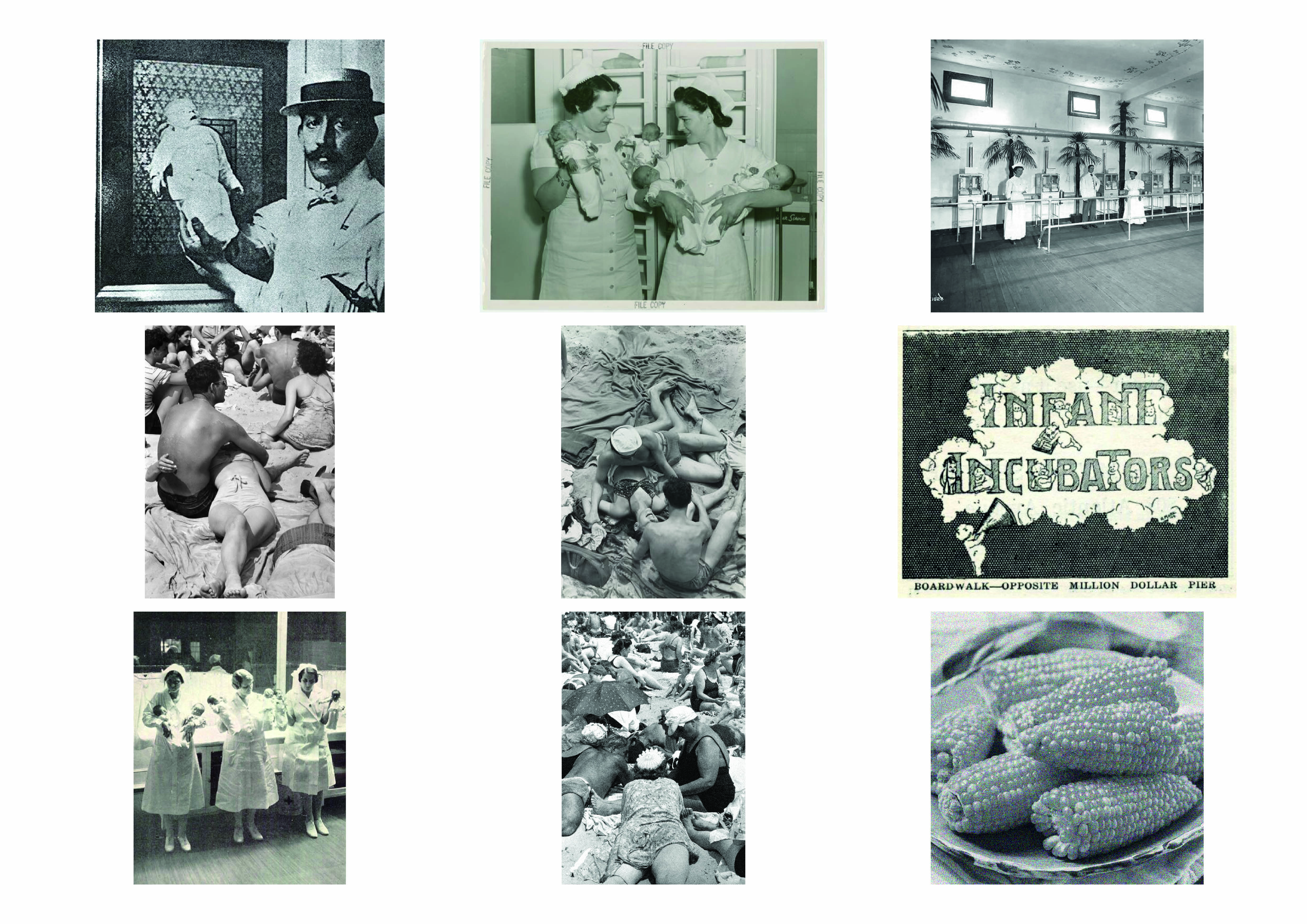
POSTER RESEARCH AND LOOKING INTO HANDWRITTEN FONTS
TYPOGRAPHY WORKSHOP
The typography workshop came at a great time in the project, as part of the brief was to include some handwritten type. Through drawing these sections of type from shop fronts I realised that for my own font I wanted something slightly more uniform. I wanted this to go against the confusion of Coney Island while the illustrations showed it as the mix it was.
MONOPRINTS
I was really impressed with how my monoprints turned out. Here was an entry from that day that I wrote:
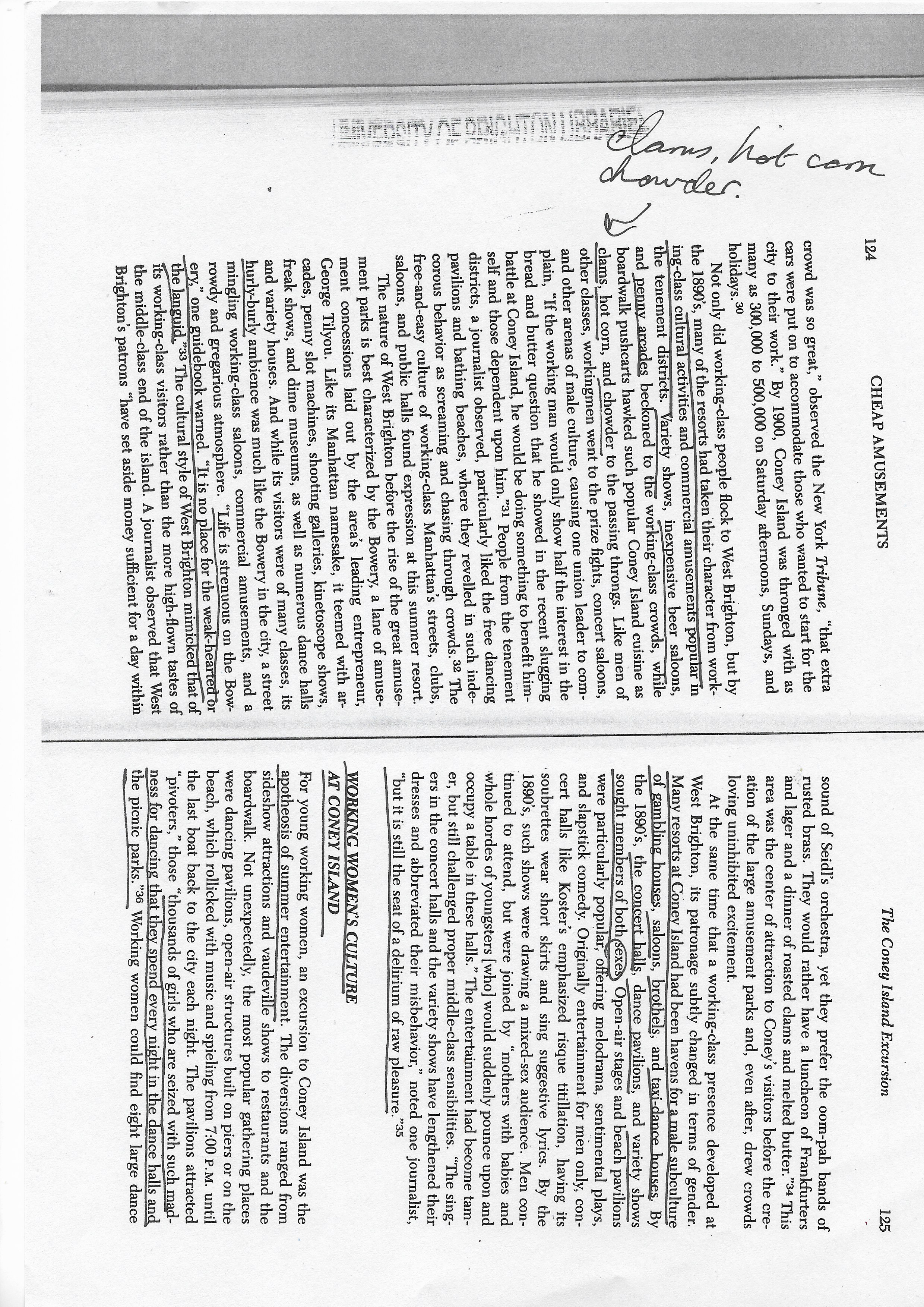
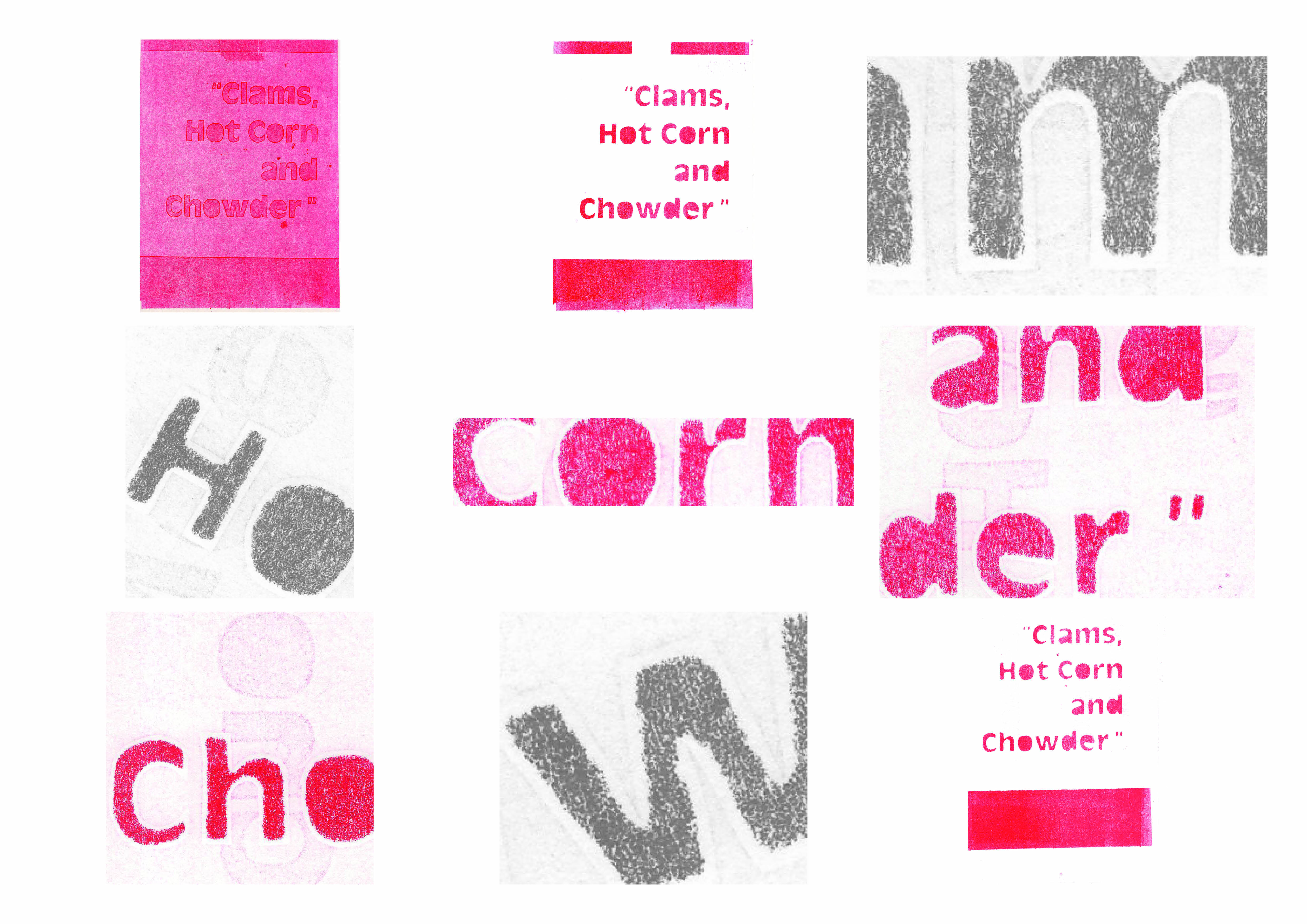
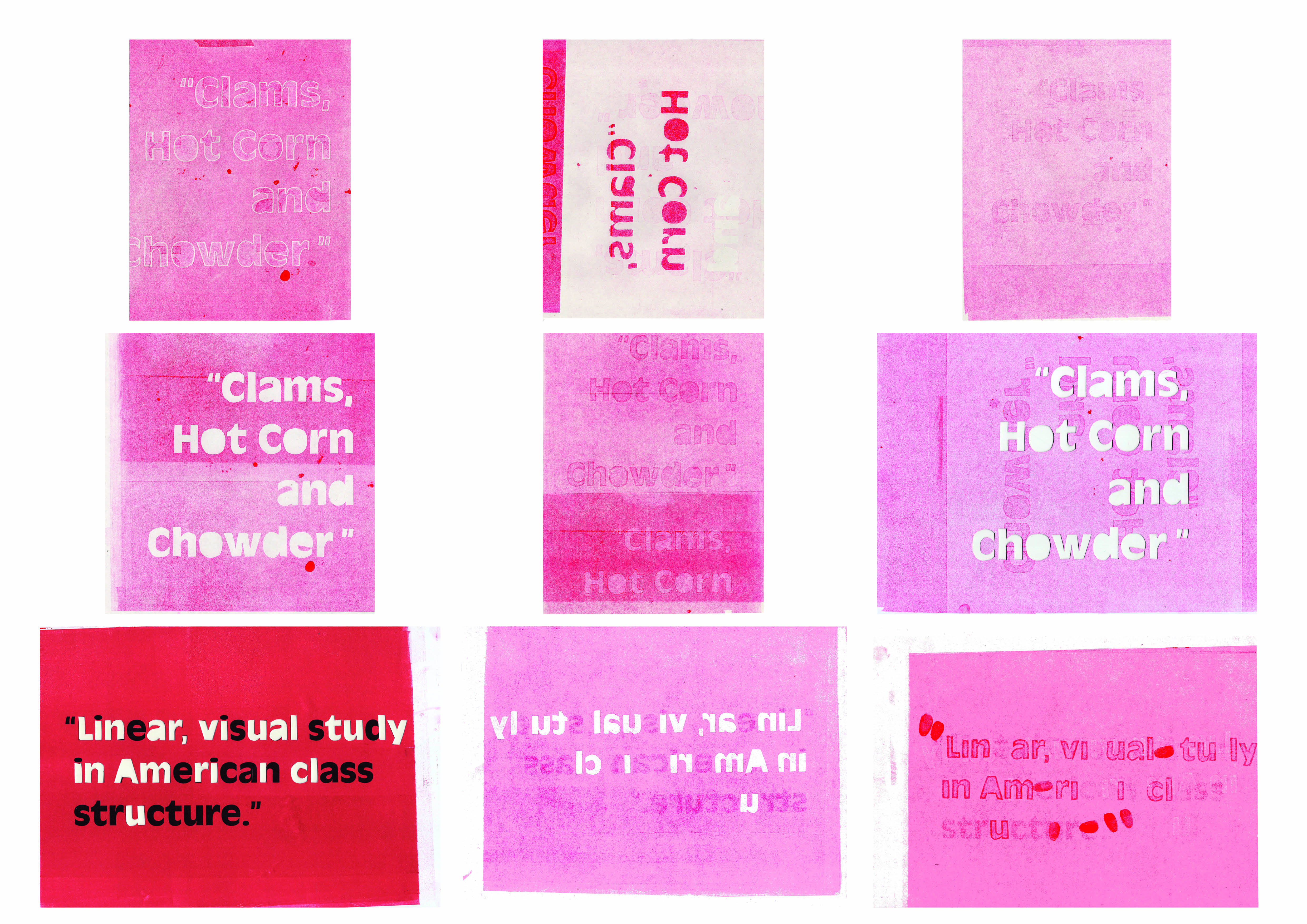
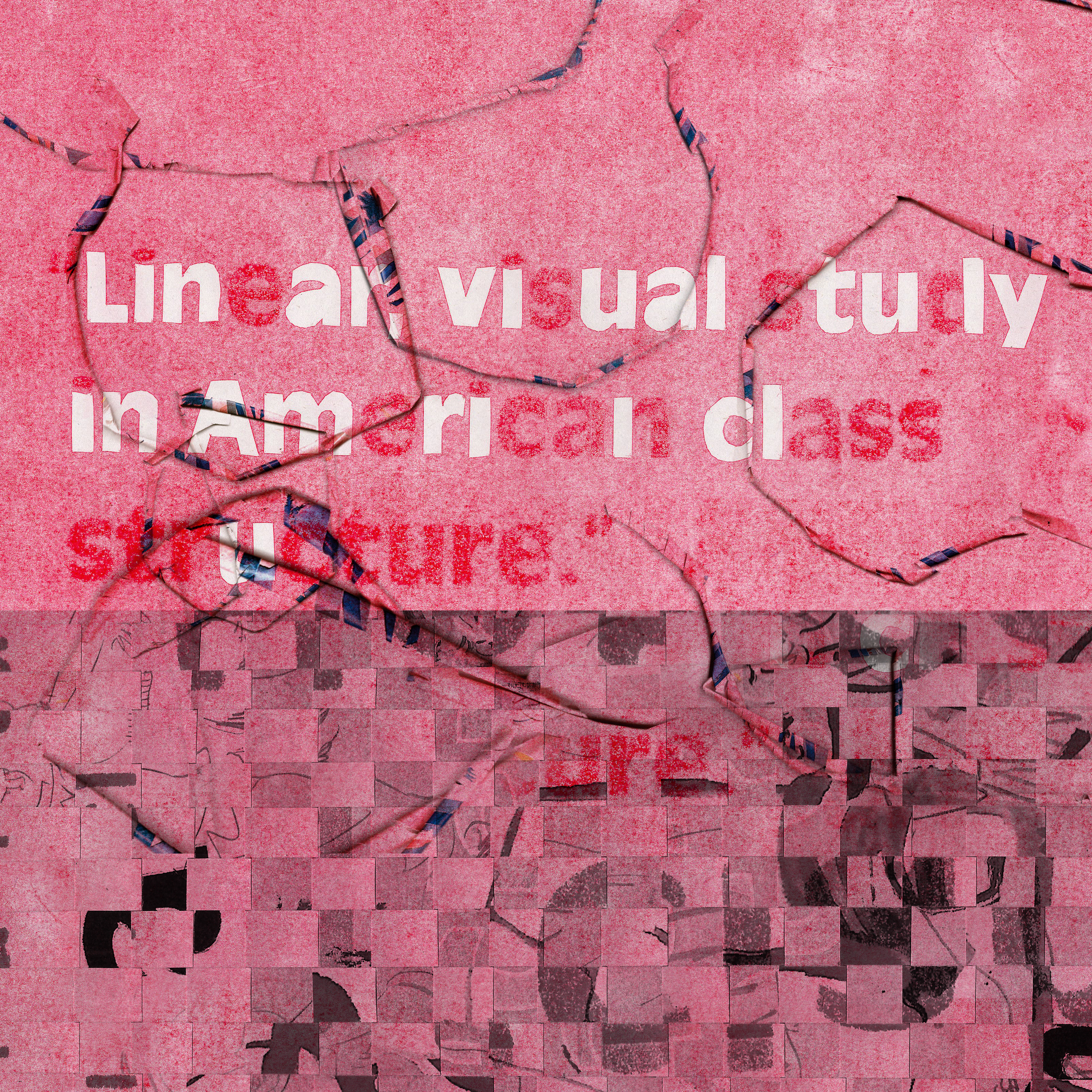
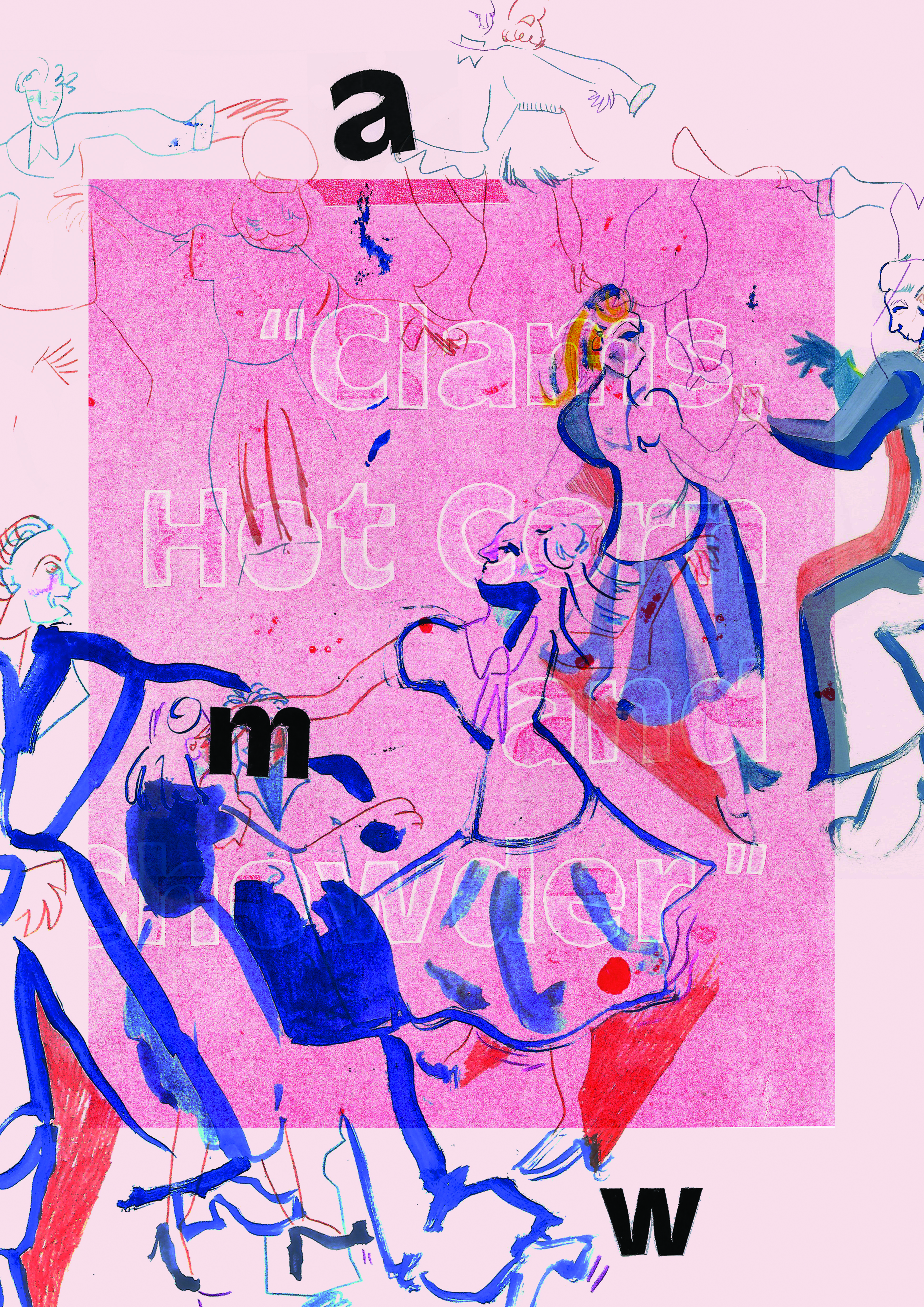
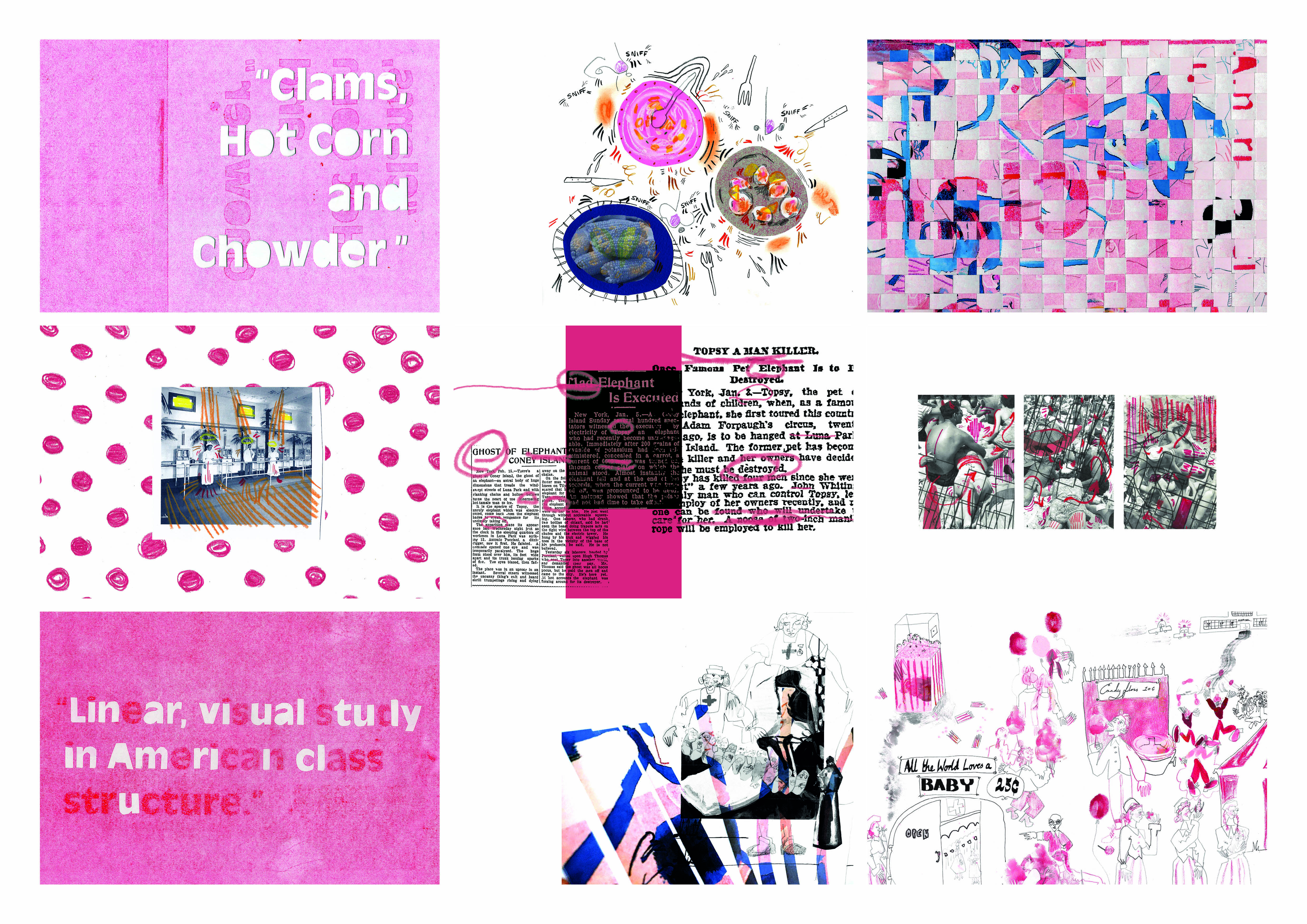
“Unedited scans from monoprinting yesterday, the text is taken from a book called Cheap amusements: working women and leisure in turn-of-the-century New York – this book has been valuable in my understanding of 1940s Coney Island. I chose one quote “Clams, Hot Corn and Chowder” on account of its banality; however, many patrons would remember Coney Island from its food.
While the other quote “Linear visual study in American class structure”, is referring to the geography of Coney Island. On one end of the boardwalk were cheaper amusements and was largely associated with “miscreants”, late night dance halls and promiscuity. As you moved across the board walk the tone was elevated from the ‘Steeplechase’, ‘Luna Park’ to the more middle class ‘Dreamland’ (which interestingly was the least popular out of the three). Giving the boardwalk a “linear visual study” of class.
I really enjoy the look of the monoprints, I focused on the colour pink while utilising overprinting. I used newsprint to create a used and mottled effect to the paper. It also picks up any little mistake in the inking which I wanted. I used stencils to create them, however I discovered that when inking over computer printed ink that it holds the shape – this creates a ghosting effect over the letters which weren’t cut out.”
CHANGES MADE AFTER CRIT


For one of my triptych I wanted to use the image of the nurse from Dr Couney Baby Incubator – as they are the extreme of hero in my own example. However, it didn’t shine as much as the other posters did, therefore I redid it.
Rather than try and make it out shine the others I wanted it to fit with the others. For instance maybe it shouldn’t stand out because heroes don’t boast or over shine. To make it better compliment the other posters I instead decided to simplify it. I took out the collaged mono print and left it at the bottom of the page to balance out the poster (something I learnt researching posters which you can see in my sketchbook). Also I used the same background colour as another one of the posters so they could match.
I also re-looked at my square format poster as this felt clunky and unbalance. Instead I created some new work for it. I wove together the two other posters and made some into strips, I scanned this in different shapes to look visually pleasing. The concept for this piece is that it will take a lot to unravel and unfold the past, but we can take strands of investigation out of it, just like I have done with this project.
INSPIRATION FOR NURSE IMAGE
We took a trip to the Tate and the Red Star Over Russia exhibition was enthralling, it had an abundance of visual material about a subject that I know very little about so it was interesting to see what the images alone were communicating to me. I was deeply interested in this piece the lady in blue above writing, her face is beautifully drawn and painted. To me she looked like some kind of everyday angel which is I wanted to create with my own poster.

FINAL SQUARE POSTER DESIGN
I feel like this one worked out really well, it’s not as illustrative as the others so as to not crowd the smaller square space. It also leaves the viewer guessing as it’s not telling you everything. This represents the mystery of the history of Coney Island.
FINAL POSTERS
I’m really pleased with how the triptych works together and feel like they utilise the mono prints well. Also I feel like it tells the story of Coney Island through three angles. First the heroes the men and women who worked a the Baby Incubator, while the dancing teens are the proposed villains and yet behind it all are the people who profiteer off both the good and the bad the people in power.

DESIGNING A ZINE
Next, came creating the zine. I took Jim’s advice for this after having a crit with him he said try not to think to much about a specific style and instead go for an overall feeling. Just pack all the content from my sketchbooks into it. I really enjoyed this process and designing the zine. At a mid point in designing I felt that I needed some new material so collaged some archival photos, drew more from archival footage and took some experimental scans. This really helped as I had some fresh images to work with. The zine was going well but I felt it didn’t have a pop, I had worked hard to have a candy pink colour scheme throughout. I chose this as I felt it would create a sickly, sweet impression of Coney Island which was covering up the bitter truth. It just didn’t appear like that on screen or when I printed it out. So I tried printing it on some green newsprint I’d just got, this worked really well and the contrasting colours played off each other.
I had also been trying to decide on what size to make the zine, printing them out in A4 I felt didn’t show off their vastness. So, I went with A3 and was really impressed by them, as they had that aged look I was looking for.
 EVALUATION
This project has to be my favourite of the semester, the opportunity to spend such a long amount of time on a project (from summer to now) meant that I could really dive into my research and push it for every piece of visual energy. I feel like this project is left open ended simply because it was such a wide area to try and culminate together.
I think I really tested my composition skills in this project and are better off for it. Also, I feel like the experiment with the green paper really paid off. Overall, I’m very happy with this body of work.
