
Dear readers,
In this blog, I have analysed an email I received from lookfantastic.com, a company that specialised in both, professional hairdressing as well as Rene Guinot beauty services. I subscribed to they’re newsletter a couple of years ago when I was looking for a particular product and I bought it from this company.
I think most people will agree with me that it is nice when one of your favourite companies remembers your birthday and treats you with a discount voucher or something similar. It is also nice that companies remember what you have been buying from them and send you information in regards to new similar products ‘if you liked this product, try these’. I have observed that the emails I have received from lookfantastic.com are not personalised, which to be honest, surprised me and made me feel a bit emotional :( as I am one of their customers and decided to subscribe to receive information about their products. To personalise their emails will help them to create trust and make customers feel valued and respected (click here to find out more about customer trust). However, that product and subsequent products that I have purchased have all been really good, which has given me confidence and trust in the company. Because of this I am happy that they keep emailing me with new products and offers.
If I decide I no longer want to receive their email marketing, I can unsubscribe easily (you can see the option to opt-out of their list on the top right of the email). Investors in email marketing need to make sure they fully read and understand the CAN-SPAM law regarding opt-out requests from customers, it is a legal requirement! (read this if you want a successful email campaign).

No personalisation and easy option to opt-out of their mail list
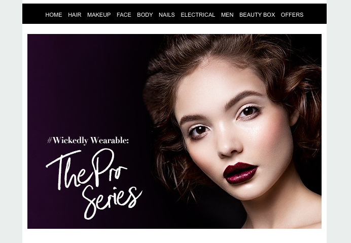
Wickedly Wearable, The Pro Series? What does this refer to?
Back to the emails from lookfantastic.com, the main image, (above) which is design to grab your attention presumably about a particular product that I could then search online, wasn’t clear as to what they are offering. The text says “Wickedly wearable: The Pro Series”. What does this mean??? No idea...I have noticed that they use a lot of bold in their information about the products in offer, which made me think they were hyperlinks but they weren’t. This is quite confusing… The layout of the email is not very clear, they make you look through the whole email to find different products. If you find yourself interested in one of them, you can click on the hyperlinks which will take you straight to their website, www.lookfantastic.com, and you will be able to find lots of CTA (Call to Action) bottoms, which encourage customers to buy immediately, add to shopping bag and/or to continue shopping. There are too many products in one same line and the hyperlinks are not in the same line which in my opinion, makes it look unclean and unprofessional.

Please, observe how the products, descriptions and hyperlinks are not in line

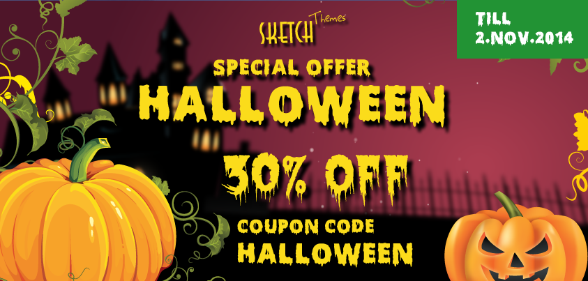
Halloween? What do you offer?
The company uses a different colour on the text to catch your attention. When I opened the email it was the first thing I saw, words such as ” save 20%, etc…” Marketers know that they only have a few seconds to engage customers to read their emails. The text is well written and concise with generous spaces between lines which makes the reading very easy and….( because I love my product that I previously bought from them)….. I wanted to read more!. However, when you read the text, it feels a bit pushy when they mention “be quick, the clock is ticking and time is running out to secure a scarily good deal in time for Halloween”. My first thought was “What does this type of company has to do with Halloween?” They are just trying to sale and they don’t care about customers needs, they must think customers just want to spend money for Halloween??? If they decide to use Halloween as an excuse to sell, I would recommend them to at least be playful, for instance:
All and all, it could be better but it could also be worse. I just think that with a few tweaks, it could be a lot more catchy and interesting, specially for costumers that already like their products and are interested in buying again. “Like myself!”
These changes that can seem small for some people, could help them engage with customers a lot better and potentially increase traffic to the site and sales.
Thanks for reading and see you soon!!!
Lara de la Rosa
REFERENCES
Brownlaw, M., (2010), Eight Ways to Improve your Email Marketing Analysis, [Online] Available: http://www.smartinsights.com/email-marketing/email-marketing-analytics/email-marketing-analysis/, [Accessed date: 29th October 2016].
Ellis-Chadwick, F., & Doherty, N. F. (2012). Web advertising: The role of e-mail marketing. Journal of Business Research, 65(6), 843-848.
Hinz, J. (2015) The Power of Customer Trust in Brand Marketing, [Online] Available:http://marketingland.com/power-customer-trust-brand-marketing-147355 [Accessed date:3rd November 2016].
Mohammadi, M., Malekian, K., Nosrati, M., & Karimi, R. (2013). Email Marketing as a Popular Type of Small Business Advertisement: A Short Review. Australian Journal of Basic and Applied Sciences, 7(4), 786-790