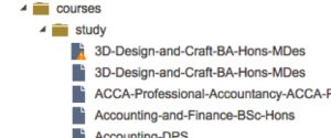
To find course pages open the Courses folder (click on the black triangular icon) and then the Study folder.
Course pages are different to other pages as a significant amount of the content you see on a page is created by making selections in the metadata. The notes here will take you through each panel in turn.
Once you are happy with your edits and want to make the page live, you need to select Submit from the Workflow menu – this alerts content managers/officers that your work is ready for them to review and approve. Adding a comment to each file submitted will help approvers know what has changed, and will speed up getting it approved.
Now we’ve got that over with, other gems of advice you will find on this page are:
1 Course page components
(each section is in a different panel)
- Banner
- Intro
- Course content
- Careers
- Entry criteria
- Fees
- Location
- Student views
- Stay in touch
- Statistics
- Related
- Search again
- Free panels (includes carousel)
- Unibuddy
There are instructions here if you need to archive a course page.
Ideally unique but not all of them are, being relevant is more important.
If a new banner image is required – talk to the content manager.
Instructions on inserting a banner image are available.
2. Intro
The left-hand column: up to 300 words or so summarising a particular course, with the first paragraph in bold. The bolding is done manually.
The right-hand column: may feature the following (you’ll need to Preview the file to see these):
- Key facts – Location / UCAS code (unless PG)/ Duration (manually edited)
- CTA (Call To Action) – Open days – automatically inserted
- Applying for 2018 – automatically adjusted (in metadata)
- Apply online – automatically adjusted (in metadata)
Key facts
This is editable copy (although it will rarely be edited), press return to make a horizontal line.
- For the UG courses, we list the location, UCAS code and full-time/part-time duration in that order.
- For the PG courses, we do the same but without the UCAS code.
- We can also briefly highlight accreditation information at the bottom where appropriate.
- Links not possible in this box.
CTAs
Calls To Action. These are controlled by razor views so you should discuss any changes with the Senior Content Officer.
Pull or Block quote
A placeholder has been added under the ‘Intro’ panel on each of the course page templates (apart from the one for partner college courses), and the two normal pull quote subtemplates can be used in it.
The page on General panels covers using blockquotes.
Pull stat
There is also a pull stat option (useful when the text you want to highlight isn’t a quote), which is similar to a blockquote but looks like this:
You can read more about the pull stat lower down this page.
This area is made up of tabbed panels (with occasional snippets), as well images and videos.
Find out more about tabbed panels.
If you want to get new images or videos into the CMS discuss this with the content manager.
Our latest news
Space to show school/course blogs embedded on page – ask webteam or content manager. The content manager maintains all the blog feeds for the course pages from a central file, as this makes it much easier to update them en masse if we need to.
Don’t try to add it yourself by dragging a panel onto the page and using the Edublogs Recent Posts Feature web control – that should only be used on non-course pages, such as subject pages or school pages.
Blank panel for copy and images. This panel can either be a plain panel where you just enter your text and images into the four placeholders provided (there are four placeholders here for historical reasons, but you can just use the top two of them for your content); or you can make it a tabbed panel by using the full-width placeholder below the four boxes. It cannot use BOTH types of placeholder – if you decide to make it a tabbed panel, you will need to delete all the content from the four normal placeholders, or transfer your content into tabs. Once you have created the tabs, make sure the four normal placeholders are left empty.
Tabs
To make the panel a tabbed panel, drag the tabs-container subtemplate into the full-width placeholder – you will find this at /_design/editor-templates/course-pages/tabs-container.
You can’t get rid of the empty placeholders above your new tab container, but it’s very important that you delete everything in all four of them once you’ve created the tabs. If you leave any spaces or empty paragraphs, it creates a big ugly gap on the course page. So preview, preview, preview.
Once you have put this subtemplate in, you can drag tabs into it the same as you would elsewhere editor-templates/section-tabs/.
You can find out more about tabs here.
Any alterations to this area should go via the content manager.
Some copy is made up of Snippets. This is a file that can be pulled into any page. Snippets are content that will be useful in more than one place.
Find out more about snippets.
International requirements
Some courses will have International requirements –
The appearance of this is controlled in the metadata:
Additional tabs are now possible, but will need to be discussed with the content manager.
Do not edit. Any alterations to this area should go via the content manager.
See Retail Management BA(Hons) for a standard example of fees.
https://www.brighton.ac.uk/courses/study/retail-management-ba-hons.aspx
When these need to be inputted (manually), the CMS will impose a format. To see this, type the location (eg UK/EU) and then the amount (eg 9000 GBP) and press enter. To complete the formatting, you need to apply the alignright class to the fees. You should only ever have to do this for PG fees: UG fees should be covered by the relevant snippet (_design>html-snippets>fees).
All auto-filled based on Campus metadata options (rarely change).
Any changes to the content of these options should go to the content manager.
After the Location panel you will see either a Student views panel or a pair of green dashed lines indicating where Student views could go – you can see the green lines on Applied Social Science BA(Hons). This area does not show on the live page unless it contains content.
To insert Student views from scratch you need to insert a Free-panel (editor-templates, course-pages, free-panel) by dragging the window icon into the space between the green dashed parallel lines. Insert a title and then place your desired panels before insert content in the usual manner.
>Quotes
If you choose to embed a video (which are best in a 2 column layout), you may wish to use the Blockquote styling (from the toolbar) for the other column.
There is more about blockquotes on the General panels page.
If you want to insert a statistic rather than a quote, there is also a new subtemplate for a ‘pull stat’, that does not use the quotation mark graphic. This is only intended for course pages and is not to be used elsewhere on the site.
You’ll find the subtemplate for it here:
/_design/editor-templates/course-pages/pull-stat-full-width
When contact information is standard, it should be filled in using the appropriate snippet (_design>html-snippets>Visits-and-contacts>file-name).
It always follows the same format: Find out more, name of department, phone number, email address.
No staff names, and we prefer generic emails where possible.
The right-hand column contents are not to be edited.
Often referred to as donuts, graphical statistics appear here.
Contact the Content manager if these need adjusting.
This panel contains the Discover Uni widget info and links to the programme specification documents, info that we are are obliged to provide. Text blocks are snippets.
Programme specifications are links to (publicly accessible) Sharepoint docs.
When the Statistics panel is left blank, it will not appear when the page is previewed or made live; it is the only panel to have this quality.
The Statistics panel won’t appear without the KIS code in the metadata – it is the unique identifier that we use to pull the widget from Discover Uni, and that links to csv files elsewhere in the CMS that hold data for the donuts and programme spec links.
KIS codes and programme spec links are updated en masse once a year by the content team.
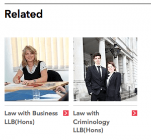
These are auto-filled based on tick boxes in the metadata: primary_subject_area and secondary_subject_areas.
Courses sharing the same primary subject area will list those first, secondary subject areas will appear afterwards. You can’t affect the order in which courses appear in Related.
Each course needs a thumbnail to appear in Related. Go to the Properties tab and find Thumbnail Image. Select the Browse icon, select the image you wish to use, Resize as usual and Save.
This is part of the page template.
13. Free panels (includes carousel)
There are empty placeholders between the panels on the course pages. This gives you the option of adding either a single image or a carousel of images at different points on the page.
If you ever want to check which placeholder is which, remember that you can place your cursor in it and then hover your mouse over the word ‘placeholder’ at the bottom of the CMS. The name of the placeholder will appear as a tool-tip, allowing you to check if it’s the right place to put the free panel:
You can also right-hand click in the placeholder and click ‘Placeholder information’ and it will show you the name in a pop up (along with the other details of what you’re allowed to put in the placeholder, image size restrictions, etc.
Adding a single image
- Drag this template into the placeholder: /_design/editor-templates/course-pages/image-panel-container
- Insert an image in the normal way. Dimensions of 812 x 320 pixels will be enforced. Please stick to these, and don’t put in an image less than 812 pixels wide as it will look stupid.
- Approve your page in the normal way, and the image variation will be approved along with it.
Adding an image carousel
- Drag the same template as above into the placeholder: /_design/editor-templates/course-pages/image-panel-container
- Instead of putting a single image into it, right-hand click in the placeholder and go to Insert Webcontrol > UoB tools > Course page image carousel
- The web control works very similarly to the image slider. You can put in up to 6 images, with an optional caption under them.
- The same as the image slider, any image variations you create will not be approved automatically when you approve the page, so you have to go and find them in the CMS and approve them manually before you approve the page. Otherwise the carousel won’t display on the live site, even if it looks fine in preview. Always check the live page after it has been published.
- If you put captions under the images, it’s best to put captions under all of them rather than just a few. The carousel looks a bit weird if only some images have captions, so either do all of them with captions or do none of them.
Important: Don’t go mad and put multiple carousels of six images in different places all on one page. They’re big images, so be conscious of the file size of the page overall and the effect that lots of large images would have on users with slow connections.
You can see an example here: /courses/study/craft-ma.aspx
Contact the relevant marketing officer if you need to get a Unibuddy added to a page.
2 Virtual tours / 360s
I know what you’re thinking, aren’t 360s / virtual tours considered course content? Well they are but they can be used in a number of panels so we’ve tagged them on the end here. So, without further a do…
You have a couple of options about how to add 360s depending on how you want them to look: an image you can click on (with an appropriate caption), or a CTA.
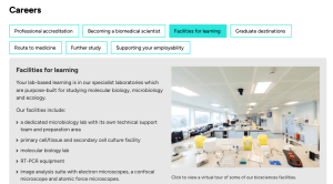
If you want to put a tour on as an image it will look like this:
To do this, right-click in the placeholder and go to ‘Insert Webcontrol > 360 tours > 360 in tabbed panel’:
You’ll need to have an image that you want to use and that you have already uploaded into the CMS. For tours that are already there you can just edit the web control, for example you might want to change the URL to point to your Matterport tour instead of the Kuula one. Note that you need to put a caption under the image once you’ve inserted the web control however, so people know it is a clickable element that goes to a tour.
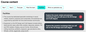
The alternative, which is more obvious, is to use a CTA to link to the virtual tour:
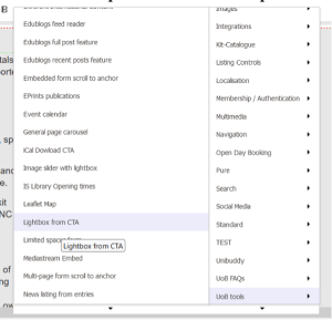
Clicking on the CTA will open the tour in a lightbox. Again, you can do that via a web control by right-clicking in the placeholder, then going to ‘Insert Webcontrol > UoB tools > Lightbox from CTA’.
With this method you don’t need an image as it just creates a CTA, and you can put whatever text you want on the CTA (e.g. ‘View our ceramics workshop virtual tour’). You should choose a secondary CTA rather than a primary one in the options.
Both of these methods will open the tour in a lightbox over the top of the page. When people click to start the tour on a mobile device it will force its way out of the lightbox and take over the whole screen, which is fine because it gives the tour more space.
