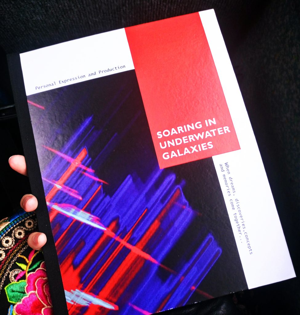
Overall, I am happy with work I produced this term and I have started refining my individual style. I was more careful with the research and did my best to utilise library, academic materials and reliable sources. I’ve also significantly improved my skills in various Adobe software and bookbinding. In future projects, however, I should experiment more: I’d love to use more printmaking or possibly 3D techniques.
Author: Anna Parilo
Pottery Workshop
Although I did pottery and sculpting before, it was my first time when I explored the traditional potter’s wheel. I was surprised that it is a relatively easy process, as long as you choose the right speed and use enough water. Pots are then being bisque fired up to 1080 degrees, then painted and glazed. Overall, I am quite happy with my result (the one on the right), but I would’ve worked a bit more on it if I had time.
Creative Publishing
In this magazine I have some successful projects I did in my 1st year at the University of Brighton. It celebrates my favourite techniques and areas of interests: this year I have started developing my original style highly inspired by underwater worlds, dreams, macro photography and abstract art with a strong emphasis on colour. In addition, this publication demonstrates improvement of my existing skills in various Adobe software and creative techniques. I gained a solid understanding of design-making process within the context, which will have a precious effect on my progress, skills, thinking and creativity in the future.
Next year, however, I’ll try working in other styles and explore more visual identities.
Bad Kerning at Happy Maki in Brighton
Better Typography. Rotation / Workshop
I am quite familiar with InDesign because I’ve used it for over a year, but Typography is definitely a discipline I need to improve. I’ve learned some advanced ways of Paragraph and Character styles, as well as hanging punctuation. H&J was extremely useful, it’s such a smart and beautiful way of making the paragraph balanced, I wish I could have learnt about it earlier.

Image from CreativePro.com
Saatchi Gallery: From Selfie to Self-Expression. Exhibition.
“”The title of this exhibition at the Saatchi gallery pits the diminutive term “Selfie” against that of the highfalutin “Self-Expression”; however, the show is a story of communion rather than collision from the outset. The Old Masters are transposed to new media as canonical self-portraits of Rembrandt, Van Gogh and Kahlo are presented on screens as Instagrams.”
However, I don’t understand why selfies are often seen as a negative thing, celebration of “vanity” and an example of the “terrible” pop-culture we live in. It is such a convenient and easy was of perpetuating beautiful and important moments in our life, and I personally don’t see anything wrong with it.
On the other hand, I found it funny how people were still taking selfies in the gallery, even though the whole idea is mocking it in a certain way.

Taking a picture of a picture of people taking a picture. How ironic.
Woodcuts and Wood Engravings from the Collection of the National Library of Latvia. Exhibition.
This temporary exhibition is organised by the National Library of Latvia and features woodcuts created in 15th-21st centuries in France, Germany, England, Russia, Netherlands, Latvia and USA.
I found it very curious how the style has changes with time: artworks made in 15th and 16th century are very realistic, detailed and decorative, when later ones (20th and 21st century) are highly stylised, distorted, minimalistic and expressive. This tendency is typical in many art disciplines and I’m not sure I like these changes, though.
Secret Life of Advertising. Exhibition.
This exhibition was organised and held at the National Library of Latvia and featured various ads back from 1020s-1070s. With its ubiquitous presence, advertising is one of the most significant image systems. It’s interesting how it shapes ideas of gender, which are especially emphasised in older ads. ‘’The interwar period demonstrates it particularly well, because many prejudices and stereotypes also fell during Great War, while consumer culture and its associated imagery reached unprecedented heights.’’ In terms of designing skills and aesthetics, most of them were actually well designed with appropriate and dynamic use of fonts and balanced layout.


Explain / Explain The Unexplained. After-crit improvement.
I have improved both of my projects, keeping in mind the useful after crit comments. My biggest mistake was that I didn’t really think about the way I combine text and image: at that stage I saw them as sort of separate things. In my improved pieces I chose to position text directly on the top of the image to create more holistic and dynamic compositions. In addition, I printed them in smaller format and make booklets, developing a finished look.
The Art of the Accident
This project was a great opportunity to explore a wide range of materials I don’t normally use and combine those which are not supposed to be used together, since the key point of the project was experimentation. My chosen theme was smells: after doing some research on what smells actually are and their characteristics, I tried to visualise them. I used watercolour combined with sunflower oil, cotton, glue and some printmaking techniques including foam cut-outs and real leaves. My final outcome was an accordion book: I thought it would be a nice idea to link them all together and develop the finished look.


